Play game
Mouth's itch.io pageResults
| Criteria | Rank | Score* | Raw Score |
| Originality | #49 | 4.333 | 4.333 |
| Overall | #215 | 3.556 | 3.556 |
| Presentation | #252 | 3.667 | 3.667 |
| Gameplay | #468 | 2.667 | 2.667 |
Ranked from 15 ratings. Score is adjusted from raw score by the median number of ratings per game in the jam.
What do you like about your game?
I enjoyed working on a Second Person Game, was a nice challenge along with working on things outside of my field.
Leave a comment
Log in with itch.io to leave a comment.


Comments
This is great! I don't think I have played a second person game before. The monster's teeth and breathing were very cool! One think I should note is that I found sometimes the game crashed when I went too close to the red door. It also crashed when I went through it after it was unlocked.
fun concept but controls/collisions are a bit janky (i got stuck on edges?) that and the cameras issues other mentionned. also the teeth take a lot of space on screen, might be a bad idea considering the lack of visibility already from 2nd person camera.
seeing the character through walls (csgo cheat style) might be a way to solve a part of the lack of control that come with lesser visibility?
woah, i really love the concept behind this game! never had a chance to play a second-person game before, but this one felt nice! i agree with some of the comments that said the camera felt disorienting and troublesome to have be in your favor, but regardless the transitions made it really feel like you were in the perspective of the monster, seeing the camera move frantically through tight crawl spaces and turning corners to curiously watch its prey, it adds so much to the atmosphere, well done! it also made things easier to just understand the second person monster perspective as just a contextualized version of the old Resident Evil camera system (with transitions) xd. though quick side note, i encountered a bug where the game would crash on me when i tried to interact with the red door by pressing E, not sure if that is where i had to go next.
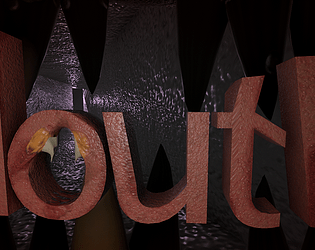
also just want to comment on the art because i love the aesthetic! the whole environment and assets has the crafted/bumpy texture look, almost like it came out of a claymation or stopmotion film, it looks really nice! the mouth is also well modeled, making the perspective add this interesting visual coolness to it! the ambient noises also add a lot to the atmosphere, though i wish there was an additional sfx for dying since sometime idk if i would get stuck on something or if i was actually caught.
overall, amazing concept! i'd love to see an expanded version of this game, has a lot of potential! great work!
I've seen a few of these second person horror games floating around the net for a while but, I like the camera movement and traversal through the vents on this one, feels very alive. I also like the view from out of the mouth, great stylistic choice.
I will agree with others about camera troubles and leave it at that.
Congrats on the release!
Very interesting idea. I played for a few minutes but I was feeling I was going in circles, and I didn't know what to do (maybe it was because the camera angles hide the path you should take). I saw in the comments that the monster can attack, but it never happened to me, even when the monster was right next to the character. But the idea is very cool and original.
Wow, a second person view. 0_0
Saw the same mechanic on YT, but never played myself. Nicely done!
You should probably add some more points for camera + sound of monster killing you
I really don't want to repeat criticism, but the camera is probably the biggest issue. If it faded out and in when transitioning between spots, it might have helped. This game has a cool idea, but it also ends up being kinda confusing too, as sometimes you can get killed without knowing as to why the monster got you. If you continue making this game, I think that giving some better camera angles, as well as the fade in-out. Also, I noticed that sound effects were missing, which could have added to the atmosphere. That being said, the graphics are actually quite cool! It's got that lower-poly aesthetic and it certainly works in the favour of the mood. Overall, this game has some quite well done graphics and atmosphere, but it falls short from some janky gameplay that is hard to see.
Thank you for the feed back!
The monsters attack was only a randomized jump forward to attack the player, the way to avoid it was if you saw the screen begin to turn red you just needed to duck to the left or right. I would have loved to provided more messaging with sound effects and animation but I had run out of time sadly. As for the sound effects I don't fully know what went wrong there, some just wouldn't play while other were fine but I did both make and implement them in the last 2 hrs I had at like 1 in the morning.
Thank you for playing and i'm glad you got to enjoy it!
That makes sense, 1 in the morning coding sounds terrible! I had no sound effects at all for some reason, though the ambience persisted. maybe the audio radius was too small? That monster mechanic sounds cool! Making that possibly a QTE sequence would be even more thrilling (if you plan on updating this game) and I also think the whole second person part is really interesting. Thanks for responding!
The idea is really interesting and fun. Unfortunately the camera is a little too nauseating, my guess is that it was a “Physical Camera” with a collider when it should probably be a Camera purely moved by script with some fading effects.
So yeah, really cool idea, would be an absolute banger if the camera worked as intended
Thank you for playing! Yea I do wish I spent a little more time on the camera but I only gave myself about 8 hours total to program the game so I either had to focus on the camera movement or player movement more, I chose the player as I didn't want anyone getting stuck. The camera is moved with just code but I have also later noticed that the camera moves differently on different computers due to me neglecting to use Time.deltaTime which might explain why it's nauseating on some perspectives comparably to others. Over all had fun making it and I'm glad you got to give it a go.
Love the creepy title text. I like the concept of seeing out the monster's mouth, although the way it moves around might be a little too disorienting. I'd love to see this expanded upon
Thank you, I too would of loved to have improved the camera, I just didn't leave myself with enough time to program it as I focused mostly on art this Jam, glad you liked it though :)
Well Well, Good graphics, horror vibe gave me chill. haha. I liked how the camera is transitioning. But One thing i felt lack is the instructions of what to do. Otherthan that I liked the visual part. Best of luck.
One thing I try to do when I make games is try to make games without tutorials intentionally, trying to lead players to a goal through map design and leading visuals. I felt for the first half of the game I had achieved this but I believe I made a mistake by not having a light turn on in the hallway when plugging in the battery to the socket and I should have also had the socket more visible in the foreground to the camera. Thank you for giving it a play though, I'm glad you enjoyed it :)
I really like the 2nd person concept, cool game!
Thank you very much, I had always wanted to work on one as I've liked the concept for some time so I'm glad I brought it to fruition. Thank you for playing and enjoying :)
I just wish there was a graphics criteria in the ratings section...so I could rate 20 stars on it!!
Amazing job this one, I have no idea of how you achieved such awesome visuals in this short period of time. It runs a little bit slow in my laptop, but that's normal, since it is not a good laptop.
I can only hope I will someday get this good with visuals for my game haha
I'm not traditionally an artist as I'm an game dev Engineer at work but I learnt how to create 3D object and texture them back in university. I used this Jam as a refresher on my skills and had a lot of doing it, glad you liked it but yes I apologies for it being slow. I programmed the game in about 8 hours so I kind of slapped it all together due the rest of the game taking about the other 40 of my hours I had available to me.
Perfect game! probably going to win