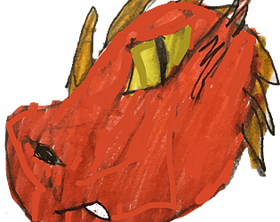
One of my favorite games in the jam. I loved the art-style, as it reminds me of mix between the Warrior Cats and Secret of Nimh. The puzzles were ok, I liked the ones about fixing the motorcycle, but the one with collecting wood was a bit too easy, and I wish there was more do to at the dam. One thing I was curious about was that I noticed a bush in the first level with a bunch of string in it? Is that supposed to be where the crow lives? I'm asking because it keeps making me curious since I can't get over there. Aside from that, I loved your game and I can't wait to see the full game.
William Tyler
Creator of
Recent community posts
I actually really liked this game, the story was intriguing and I had fun navigating through the level. The only real I had with the game was the combat. The attack animation is great, but its range is too short and it's really difficult to hit the enemies. Plus the enemies somehow can damage me when I'm barely even close to them. It got to the point where I'd rather avoid the enemies more than fight them. I also have to agree with Evan in that the backgrounds occasionally blended with the platforms, as there parts of the background that look like platforms and vice versa. At the end, for example, I didn't realize I could stand on the thorn like platform until I saw the wolf standing on it. Aside from that, I really liked your game and wished there was more. The music was amazing, the platforming was fun, the art style is gorgeous, and overall a really great experience. I can't wait to see where your project goes next.
So I went into more detail on discord, but there's a lot of issues I had with this submission. You mentioned that you ran out of time, which I understand, but there's a lot about this game that needs to be fixed. The main issue currently is with the resolution. For some reason, the screen is zoomed which makes it impossible to read the text upon starting the game and makes it harder to figure out where I'm going while I'm playing the game. I also don't really understand what I was supposed to be doing as all could really do was go around destroying buildings. I understand if you had issues with developing, and I appreciate that you're going to add more content and polish the game. I like your idea and there's a lot of potential. I can see you guys are passionate behind this game, and hope to one day see God Storm become the game you wanted to create.
Hi, I already gave some feedback in the discord server, so I'm going to summarize and maybe add some new things that I came across.
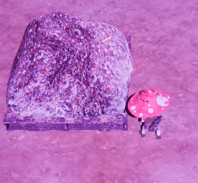
I do really like what you have so far in terms of the museum and fungus level. However, a new issue I came across while replaying the game is with the enemies spawning randomly in the fungus level. There were times where I was swarmed by 5-6 trash monsters upon starting the level, with two more running towards me when I defeat a few. While I was able to last longer thanks to the enemies dropping health ups, it gets really annoying to be dog piled by enemies just because of they somehow spawned close to each other. There was also an instance where an enemy spawned inside one of the piles of garbage, which made me unable to finish the level due to not being able to reach the last enemy (look at picture to understand what I'm referring to). I also came across a glitch where pausing the game somehow disables the dodge roll.
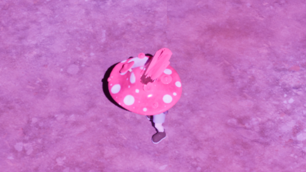
As for the visuals and animation, most of them are well done, but it's hard to see the main character's due to much of him being obscured by the mushroom hat. Speaking of the mushroom hat, I noticed that part of the model is stretching, which is shown in another of the images. I also recommend adding a loop to the idle as the child just freezes after a bit.
Aside from that, I still enjoyed your game and can't wait to see the next two levels.
I can see the idea of your game, and I like the designs of some of the npcs and the design of Bristle himself, but there are several issues that I think need to be looked into.
Some things I would recommend:
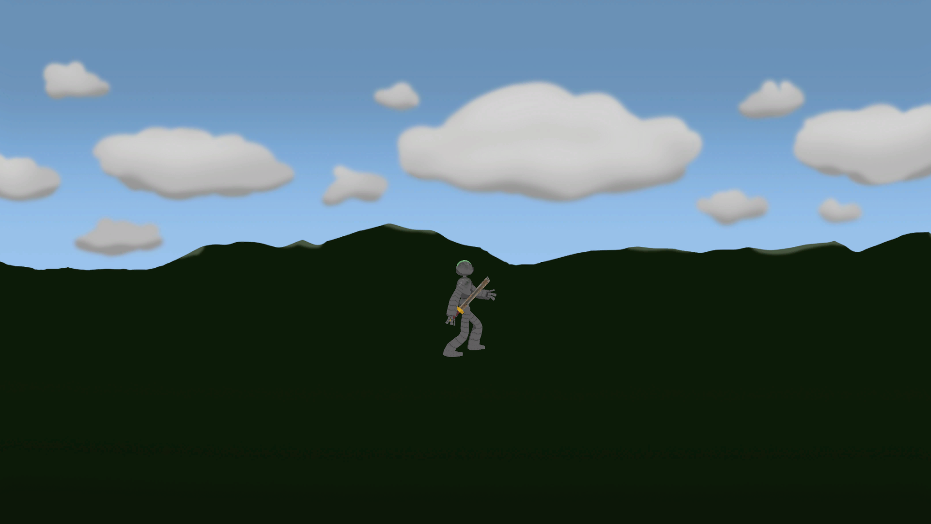
Npcs: The first I saw upon starting up the game was a png rocket clipping into the ground (Refer to image). There's also a realistic looking dog floating in midair. While I do like the designs of the wolf and deer, they seem to be cropped out and the wolf is also floating in midair. Are some of these placeholders? I'm asking because some of these just feel out of place and put in at the last minute.
Combat: I think the combat needs to be reworked or at least better explained. I have to agree with Me_gan that you need to list the controls somewhere, or at least have one of npcs explain how combat works. I was also confused about the controls, as the pressing left mouse just made Bristle do what looked like a block animation and then a vertical slice after clicking left mouse a few times. I could also only defeat the venus fly trap enemies, while the ants were just impossible to kill.
I would also suggest adding a reset button, as there were times I fell off the map and got stuck running in place.
I don't me to be critical, as I can see that you have quite a lot of passion for this game. I love your concept and some of the models you've made are amazing. I just know that you could do better, and there's a lot that needs to be done by the next sprint. Either way, I look forward to seeing how your game develops from here.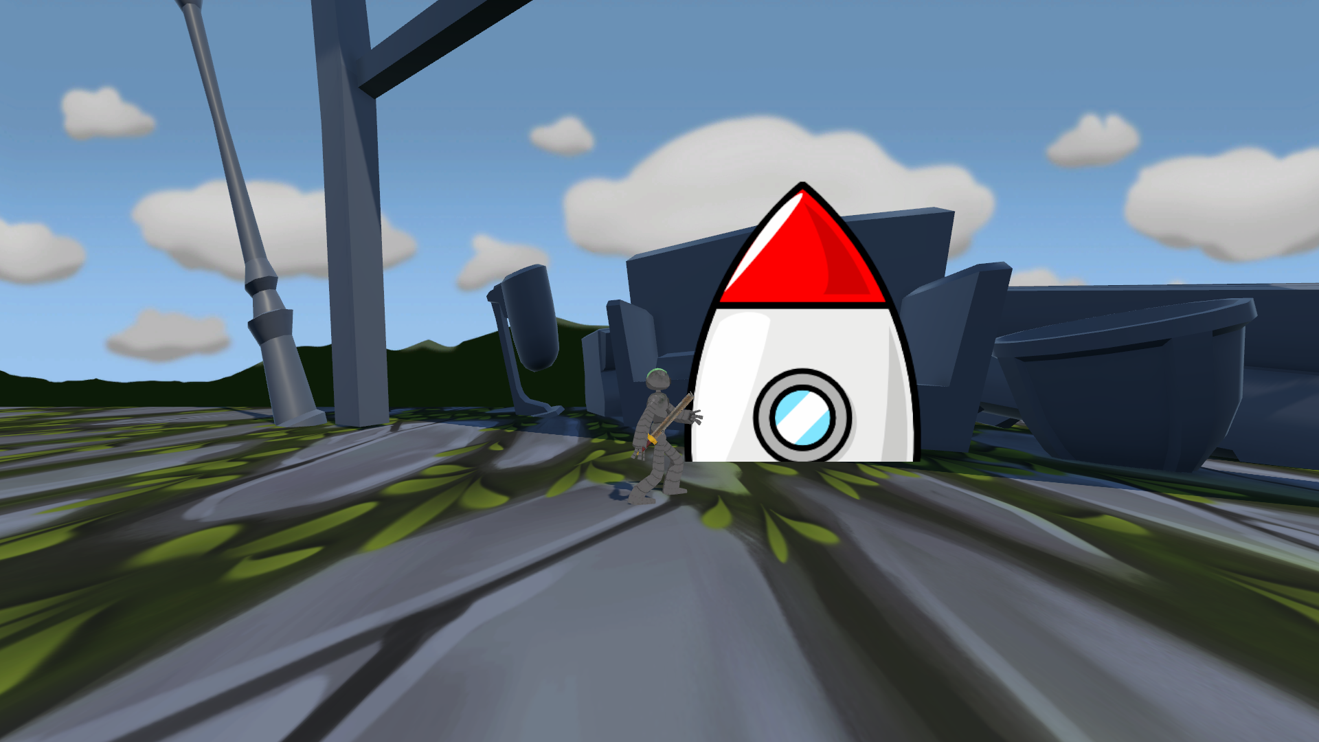
It was a bit of a challenge for to protect the reefs from all the incoming fish. I was really intrigued by the story, and the dialogue at night was really comforting. Seeing all my hard work pay off with the reef growing was so nice. One thing that I find odd was why Malcolm was in a different art style compared to the rest of the game, as he's the only pixelated character in the game. He just feels out of place in the game. There was some issues with the music, but that was probably my computer against you. Overall, you did a great job with your game and it fits really well with the theme of the jam. Amazing work!
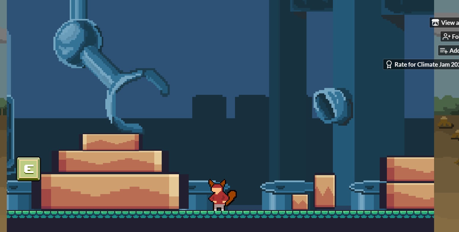
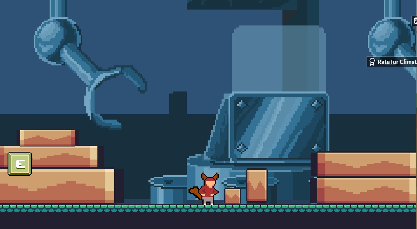
Sure thing, so on the first level the background cuts off near the end of the level. While on the second level, in the part where you push the boxes, I noticed that the background randomly jumps to showing the claw-like arm, which then disappears if I walk a few steps back. I went and took some screenshots to show the areas I'm referring to. I still enjoyed your game either way and it was mostly just something I noticed.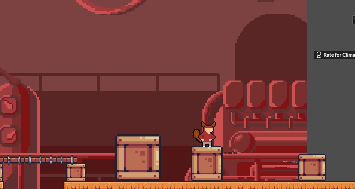
The pixel art style is well done, and I your prototype was fun to play. Fortunately I use Chrome so I didn't have any issues playing it, but thanks for the warning regarding Firefox none the less. The aesthetic and gameplay were fun, and I especially enjoyed the wall climbing mechanic with the platforming. Whether or not this was intentional, as a Hollow Knight fan, wall climbing is such a fun mechanic. I could see how you plan on implementing the theme from your documents, as the main character is trying to Petition to help fight the consequences of climate change, and I can't wait to see how this is seen in your game. I'm a little confused about the timer though, as it doesn't stop even after exiting the tab. Aside from that, I enjoyed your prototype and look forward to seeing the full game.
I love the aesthetic/feel and I can see the plan you have in mind for your game by playing your demo. Although I just wish there was a better explanation for what I'm supposed to do with all the wooden planks I was getting from the forest, because all I could really do with them was stack a bunch on top of each other to the point that they stretched across the entire screen. However, I'll let this slide as this is just a prototype and it's still playable. Looking at your game design doc, I can see you plan on implementing the theme through hazard cards and can't wait to see them in action. Either way, your game looks fun and kind of reminds me of Catan, I can't wait to see how your game evolves over the jam.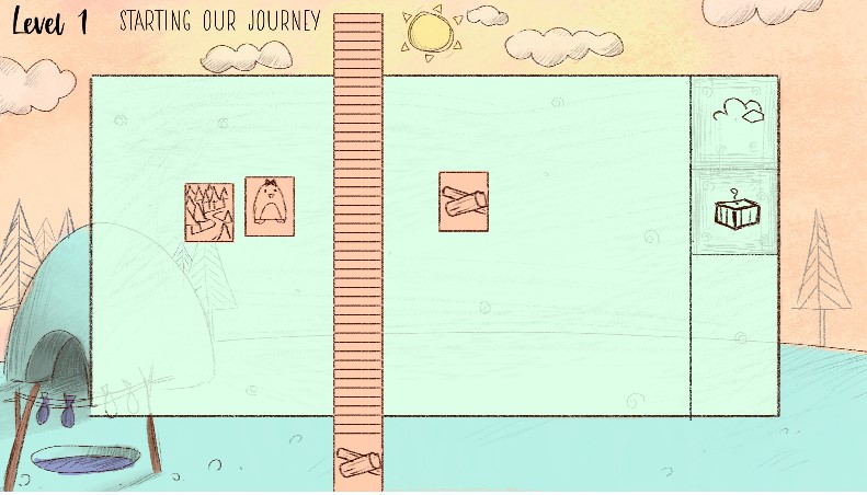
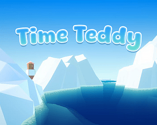
Hello again, I got to check out your prototype and I like what you have so far. The art style is cute, but I still don't understand what the tiki guys and the space teddy bear. Are they placeholders? The gameplay looks fun, and aside from there being a bit too much gravity on the jump and some weird stuff with the background of the background, I really enjoyed your game and played it twice. I still can't wait to see what comes next.
Your games sounds fun and the idea of a playing as a fox spirit is really interesting. I love the concept art and visuals you provided and you do a great job explaining the idea behind your game. My only concern is that the scope might a bit large, but you seem to have a plan on how to approach development, so this isn't really that big of a concern. Overall, I really like your game concept and did a great job explaining your idea. I look forward to playing your game and learning more about Rue.
Your art style is so cute and it does remind me of Night in the Woods, which is my favorite games. I also like your choice of tackling the issue of light pollution as that's an area of climate change I haven't really considered. My only critique is that I would like to see more about your development plan so I can get a better scope of how you plan on approaching your game in terms of development. Aside from that, you game looks cute and promising and I look forward to seeing your finished product.


