Play game
CardCaster's itch.io pageResults
| Criteria | Rank | Score* | Raw Score |
| Gameplay | #10 | 4.156 | 4.156 |
| Music | #12 | 4.067 | 4.067 |
| Overall | #28 | 4.089 | 4.089 |
| Theme | #63 | 4.133 | 4.133 |
| Art | #66 | 4.000 | 4.000 |
| Originality | #140 | 3.622 | 3.622 |
| Is the graphics 1 bit? | #197 | 4.556 | 4.556 |
Ranked from 45 ratings. Score is adjusted from raw score by the median number of ratings per game in the jam.
Please enter the age limit.
12
Write down what effects you used.
Lens Distortion, Vignette, Chromatic Aberration
Leave a comment
Log in with itch.io to leave a comment.




Comments
What worked:
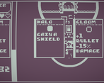
The gameplay feels smooth. The different enemies make sense and work well together. I'd be annoyed at the enemy projectiles if it wasn't for the piercing effect (I wonder if it might be better to be able to destroy their projectiles though? Maybe at high enough damage?) I like the constant decisions and trade-offs on offense vs defense and being able to see. It makes the decision on power-ups that much more intriguing and tactical. Sometimes I might take a power-up I don't want as much just so I can see which is really interesting.
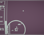
The game also looks great visually. I really like how the light areas function with the way they look and meld together.
What didn't:
Light upgrades feel a bit too weak. I know that they're supposed to be weaker since you get the added benefit of being able to see, but I would often only pick light upgrades only to increase my view area. Shields and dodge percent are fine, the dashes are weak upgrades compared to dark upgrades. Maybe this is more of an issue of there just needing to be more (expanded game)?
On the topic of the strengths between the two choices, dark upgrades felt necessary, but I never felt that I needed light upgrades. One example of this was the boss fight, where it can spawn so many minions that it's impossible to survive unless you've been upgrading your attack (damage, fire rate, piercing, etc.).
I would have liked to see some way to restore health. Maybe even at the cost of taking an upgrade, or a bit of health after a boss.
Bugs:
Dash can still be used when standing still. You won't go anyway, but you won't be able to move for a little bit. Not technically a bug, but also probably not intended.
Great job! (best - 191)
So polished and enjoyable to boot! This game feels complete. Great job.
Love this.
Almost missed the whole light radius trade off when choosing an upgrade at first. Makes the decision making a lot more interesting.
The music speeding up on the final heart is a nice touch too.
Super tight and highly polished.
This game is very well made. It's almost ready to be released as it's own game. Not much to say about it other than it was very fun to play!
this is so polished. id say this should really be a game but it already is.
God I love games involving card <3
Very nice mechanics and visual style with fitting music. Feels very polished and the darkness adds that extra layer of difficulty to it :)
This was very fun to play! Would love to see this being expanded into a longer game, with more mechanics and more enemies!
really cool game!
Really cool game, nice !
Really cool game! Keep up the good work.
That was great!!!!!! nice job, any game that makes me want to continue past the first level is a winner in my eyes :)