Indie game storeFree gamesFun gamesHorror games
Game developmentAssetsComics
SalesBundles
Jobs
TagsGame Engines
A jam submission

Afterlife GladiatorView game page

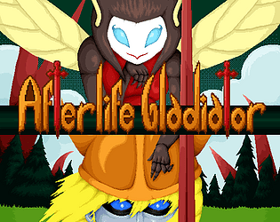
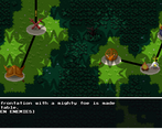
A fantasy turn based RPG about dead people fighting each other.
Submitted by Bakar (@Bakar_Zu) — 2 days, 23 hours before the deadline
Add to collection

Play game

Afterlife Gladiator's itch.io page

Leave a comment

Log in with itch.io to leave a comment.

Comments

Submitted(+1)

Played for a bit, had a crash and tried again with a different build. Video: 

I played from the spot I left it last time. I noticed that finn's protection spell now has the armor as part of the base skill, which sounds good. 

Dialog cannot be advanced anymore by clicking outside the "next" button, but if you want to speed up the text reveal the click has to be outside the button. Pressing the button skips to the next dialog, which is not ideal. I think the button should behave like the enter key (press once to change dialog, press again to speed up text reveal).

I got a crash on the game again, same place as last time.

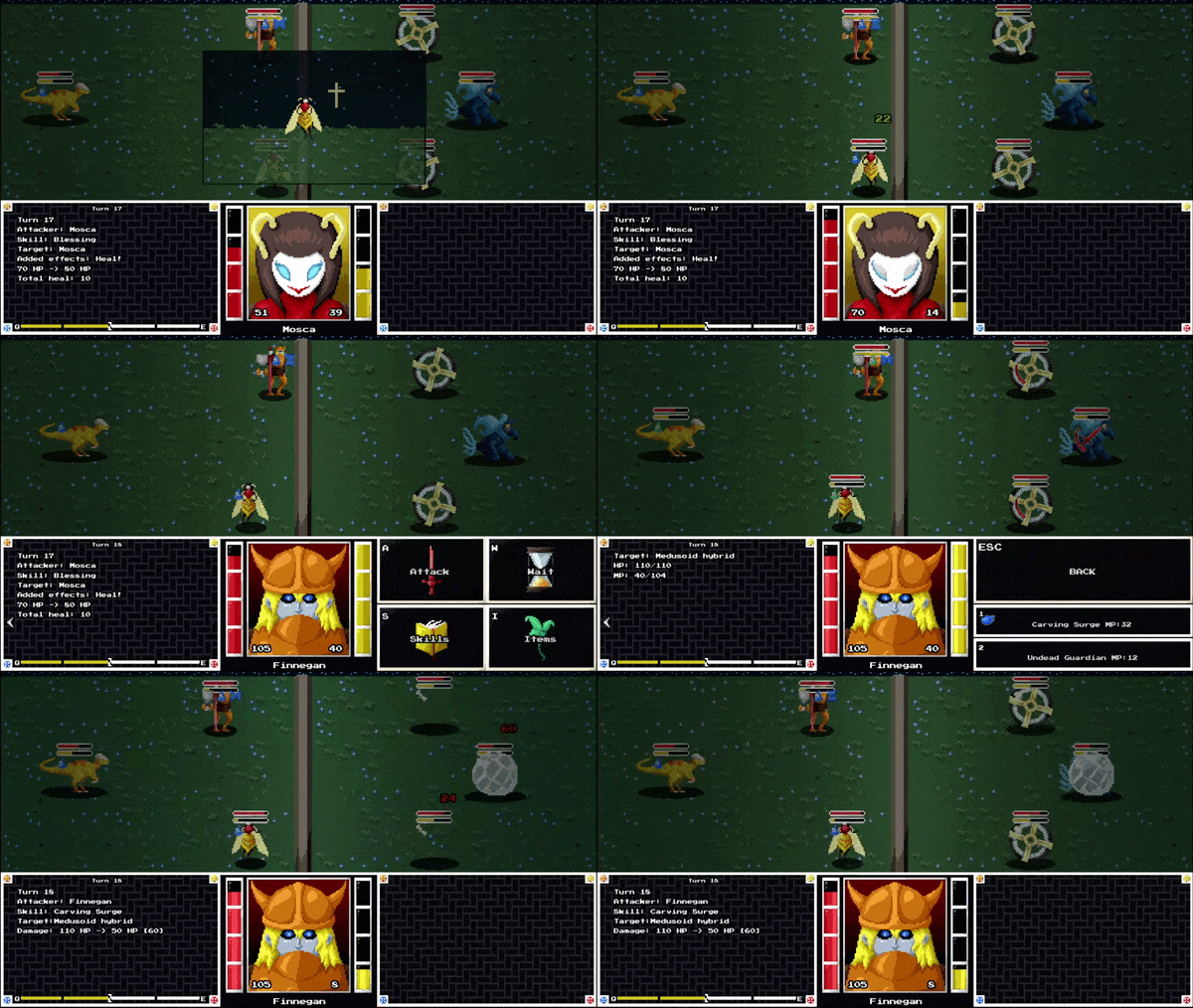
The guy who revives and does massive amounts of damage kicked my butt.

There was a point where the battle felt hopeless and I wanted to restart, but found no way to open a pause menu to do so. Am I missing something?

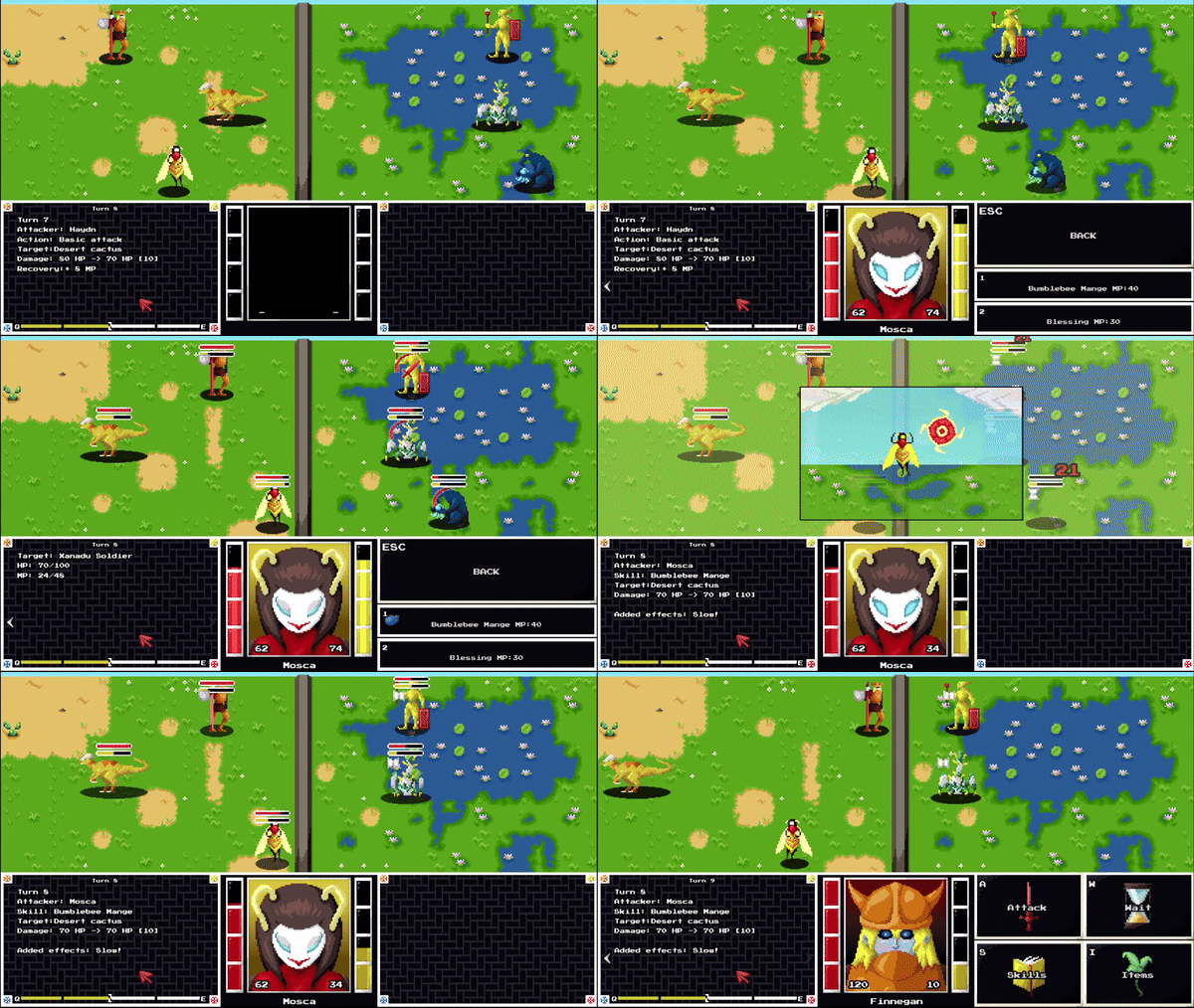
After the crash, I tried a run osur suggested to me, which was mass slow with mosca. This does absurd damage compared to anything else in the game + a slow that stacks and acts a defensive move. So yeah, attack and defense. Might be too good.

The game bugged out by the end in a real weird way, you should check out the video.

Always nice to see AG in demo day, keep up the good work!

Developer(+1)

Thanks for playing the game again.

You get the weirdest issues for some reason, I could never recreate the no skip warning issue for slide cinematics you reported last time. I'll look into it but you should consider skipping the level since you can always go back to it later with the level selector.

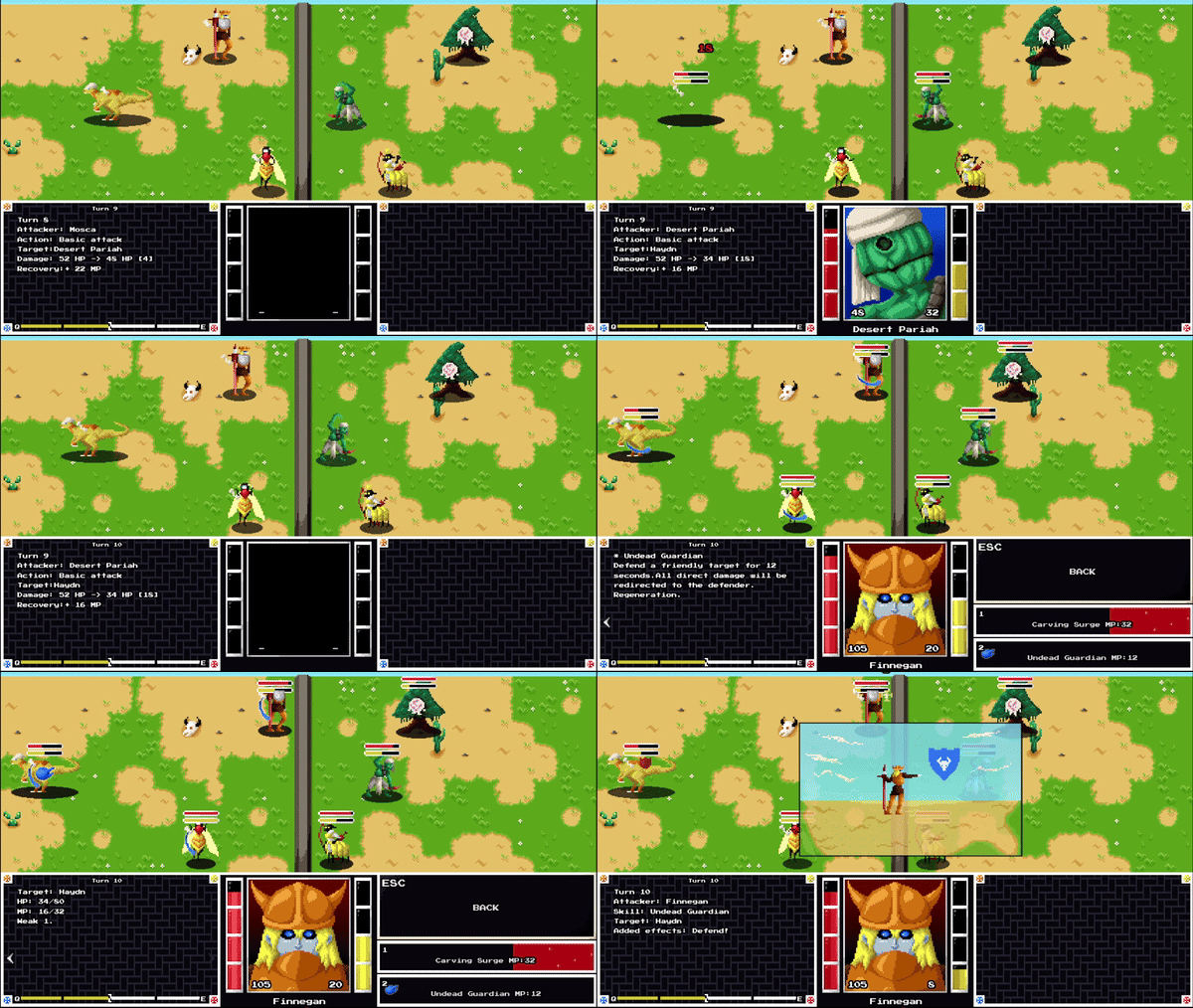
The pariahs are meant to kick your butt, that's intended. The idea is that, if you can't kill them in one cycle, it's better to either debuff them or leave them alone because their damage scales as they take damage so a Pariah at low HP can one-shot a unit. You can't leave them alone forever either because their skills inflict recoil so they will get stronger regardless. You only need to defeat a single one to unlock the bestiary entry on them. 

It's actually one of my favorite enemies despite how many issues it has caused.

Anyways, thank you for the feedback again. 

Submitted(+1)

First impressions are good. I like the custom cursor and the background music. Skip dialogue is a great feature for when you accidentally run a conversation twice.

I've never played this kind of a fast pace turn based combat game before, but I was able to pick it up easily. I went through the first round of fights and didn't lose any of them. Not sure if the difficulty is unbalanced or I just need to go further in the game before I'm challenged.

"bug" report:

  • I can sometimes tell when the music loops
  • Pressing the number keys to use an ability or item doesn't work
  • I have to right click and press "skip dialogue" before every fight even though there is no text. Maybe this is where you're going to tell me how much money I got?

Great game overall, I had fun.

Developer (1 edit)

Thank you for playing!

Balance is difficult with 70 different units so I prefer to lean on the easy side, but there are a few intended difficulty spikes at certain points.

Pressing the number brings up the tooltip, it's necessary to press enter to select the skill/item. It was made this way so people playing with keyboard only can read the tooltips too without using the mouse.

The third bug is really weird, I'll definitely look into it.

Submitted(+1)

Your game has charm.

It reminded me of Roadwarden. something about the comfy vibes, similar relaxed music outside of combat and art. 
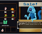
the menu UI being integrated in the game world is fantastic. 

Developer

Thank you for your kind comment.

I think I'll check out that Roadwarden game. 

Submitted(+1)

Having sad piano title music was an odd choice. Why is the start button bigger than the others, but text the same size? The textbox is too low on the screen, should be a bit higher and more centered. The intro music is also odd and doesn't loop. There needs to be a sound effect to indicate new text appearing. The intro text needs to be condensed to the most important information. I don't need to hear filler information about what food the cast is having in something so narratively important. 

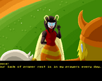
The hitbox for the "back" button in the controls menu is messed up.  Character text is again hard to read, it's too high up and causes eye strain. Teaching the player the game through the bee girl giving exposition is not good. Players learn better through doing than reading. The tone of the game is just odd overall. The music and setting is clearly trying to be melancholic, but the visuals are bright and not depressing in the slightest. I honestly think dialogue would be better if the protagonist was silent and you could only hear his thoughts described in 3rd person. If the game is melancholic, why is the battle theme so action-packed? 

The first combat is too complicated. it should start off simple (e.g., controlling a single character only), and gradually increase in complexity. Characters should start with one/no skills and gain them over time. As it is, the combat is completely overwhelming to a casual player. The combat is clearly inspired by Medabots, and you should take note of how it did it. Maybe this combat gets good when you learn it, but the introduction is awful and made me quit at the second fight (which looked the same as the first).

The game is filled with style and soul, but the style is odd and inconsistent. The gameplay does not sell itself and is introduced poorly. For the UI the biggest issue is eye strain, as it's really bad (besides other problems like the mana bar not being clear). The writing is amateur but it looks like there isn't much of it, so it doesn't really matter. There's a lot of effort in this, but I do not see it being a commercial success. 

Developer (1 edit)

Thanks for playing! That's a lot of feedback. I'm open to UI suggestions and such but a lot of these things touch upon fundamental aspects of the game that I don't think I'll be able to change at this stage of development. I'll keep them in mind if I make another game.

Also, I assure you the ham scene is crucial for establishing the characters. It may not be the best way to do it, but it's the way I chose to do it.

Submitted (1 edit) (+1)

This game kind of blows me away.  Love the art, the music, the menus, the character designs, the medabots gameplay....  It all feels super cohesive and fun.  I did skip most of the dialogue, but that's probably just a me thing.  I did like the *dinosaur noises*

Only small nitpick I have is I wish I could double press an abilities number to activate it, rather then having to press the number -> enter.

But yeah, 10/10 amazing work.

Developer(+1)

Thank you for your kind comment. 

Your suggestion is interesting. I think I would rather have a single button be the "confirm" input, but I'm open to different configurations in the future. 

(+1)

good morning! i bring ill news - reaching the first sanctuary room on level 19 crashes the game! i have a save file right outside, and entering that room will always crash the game. there are some other minor things but i'll save that for the full proper review

Developer (1 edit) (+1)

Oh man, there's nothing special about that rest area so it must be some kind of stupid oversight.

I'll fix it as soon as I get off work. Thanks for the heads up.

Developer(+2)

Rejoice! I fixed the issue, and it was so stupid that it made me wonder how come my ancestors didn't get eaten by cave lions.  

The updated version is live right now because I literally wrote more text for this post than for the fix.

Thanks again for telling me so fast, I would have probably taken a nap or something if I didn't know I had to fix a crash.


(+1)

i have beaten the demo. i remember reading about how you felt like writing was giving you a hard time, and i can tell you that i greatly enjoyed what is there. i'll again refrain from saying anything too specific so anyone here doesn't get spoiled, but i think you tackled Enkidu's part of the plan well - he went and we as the viewers are left in the dark like the characters (instead of now playing as him or something similar).

so here's some bugs for you to get triggered by.

Haydn has a lot to say despite not being in this conversation. where did he learn to speak, anyway?
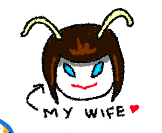
something to consider (that might be a pain) is a "back" button for next - to go back one slide. i did accidentally double press next and i wondered if i could go back ,but evidently not.

something about the game really doesnt like be using the windows snip tool. might be a new OS thing (11) but i had to mess around with it to be able to actually capture the screen. i don't think this is tied to the game (maybe godot?) but it's worth noting that screenshotting is hard.

Peter's attack sound is really weak compared to his visuals/damage/abilities. he's a big guy with a man-sized halberd/bardiche/naginata thing, and when he swings it it makes a weak swing sound. at least give him finn's blunt swing sound.

xanadu solider animation is a bit weak, noticeable when he's an ally. i think speeding it up x2 might fix it?

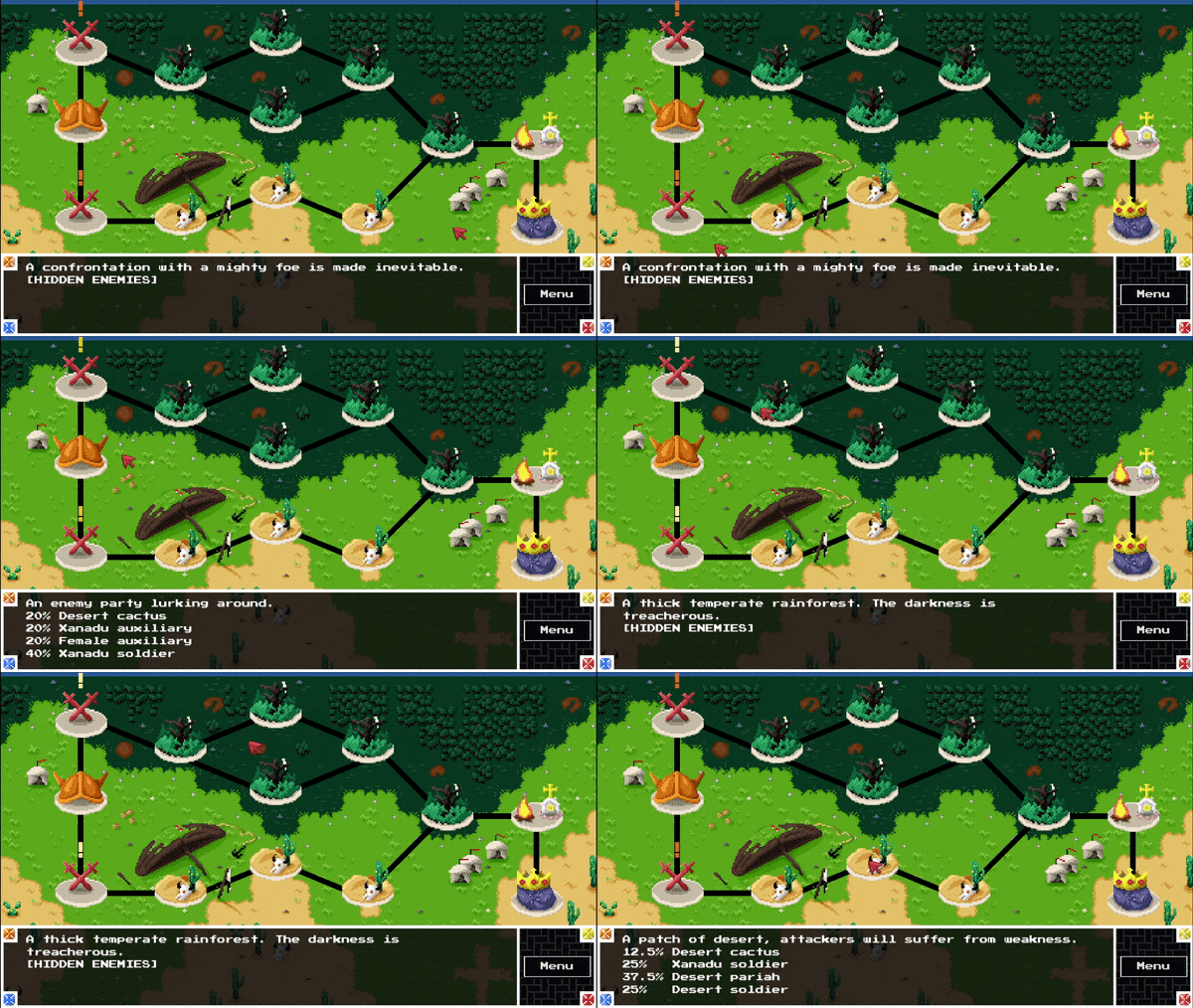
last level map (Finn / Gaz's side) is confusing. it feels like i'm zoomed in or that the bottom side of the screen is cut off.

Finn's attack is also slightly too loud when compared to everyone else's. 

silly issue: i noticed Mosca got 1-turn-KO'd when faced with the first desert assassin encounter (For me it was assassin + 2 audience members). i also noticed finn was rather weak - until i realized they're level 1! probably something to do with saves or whatever, but they remained level 1 until i reached a holy ground and leveled them up. you probably wont ever have this edge case in the actual game, but perhaps a mandatory "level up" screen should be imposed on the player if the game detects a character is level 1 at a late stage of the game.

"...amount of champions increased geometrically" says the Taurian Knight to Finn. kind of a weird expression - does he mean exponentially? maybe i'm ESLing it.

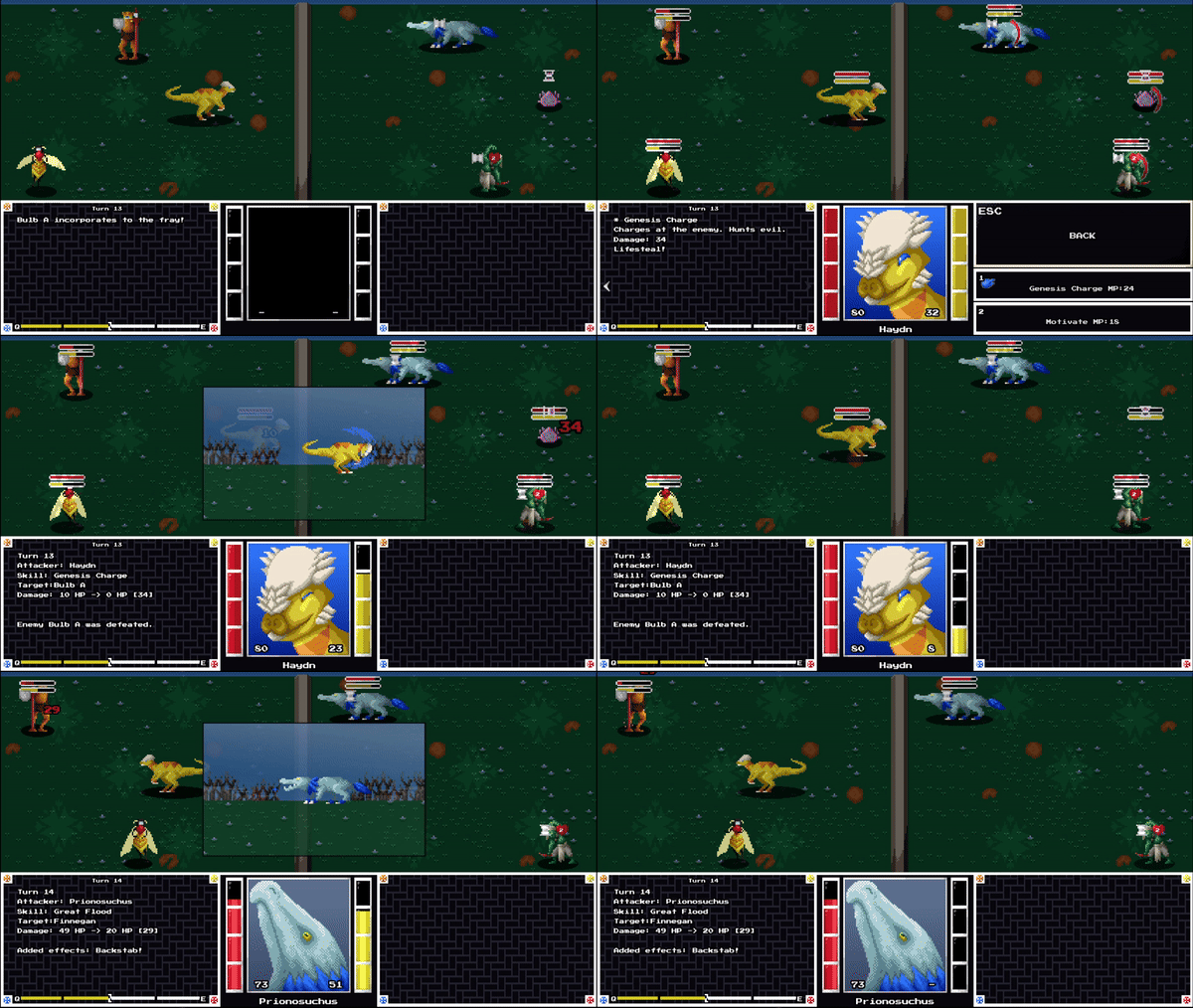
at the last fight (for which the intro was very cool, by the way) - i killed 30 foes, which unlocked the dreaded 4th lane bug, where enemies started spawning beneath the bottom-most row. i didn't want to mess with it more so i bit the dust there. maybe you can reuse the timer mechanic, where after a certain time the fight auto-ends saying you held out long enough.

perhaps tied to the 4th lane bug, but ending the demo, your dev-avatar shows up and softlocks the game! he has nothing to say, auto/escape/next don't work either. my only option is to alttab and close it. i'll never know what message you may have had for us, a pity.

as always, you know what you're doing, so simply keep doing it. 

Developer (1 edit) (+1)

Thanks for the feedback.

A back button would be easy to implement I think, I already have something similar for the combat journal. Perhaps some sort of archive like VNs have could work too. I'll consider it.

I don't have Windows 11, but I blame Windows 11. 

Sound effects could be better in general, I agree. I can't think of many that I really enjoy hearing. I think the prionosuchus chirp is my favorite.

I'm still adding animations so I'm thankful for any comments about them. 

All of the "machine" levels have a predetermined layout which led to that section in particular being just a little too vertical for the camera. I'll look into it.

One of the compromises that I made with the method that updates save files is that it respecs characters. I made it this way so I could more easily re-balance them and also because I'm generally incompetent. This update Finnegan got a buff to his maximum resistance.

If you ever find yourself in that situation you can level up/respec from the orb at the main hub, although you can only do it at the start of the level to discourage players from min maxing every single encounter. 

Geometrical is correct in this context. If champions increased exponentially there would be thousands of them after 12 years.

Finally, I think I probably messed up something during the final transition, but restarting the game should fix it if you really want to read the message. Just continue the save file as normal and it should take you to the last main hub.

Thank you for the feedback again.

Developer (2 edits)

Nothing in life is certain except for death, taxes and Demo Days. 

Here's what's new since last time:

2 brand new stages! Bringing the total up to 20/22. As always, these can be accessed from the level selector for those who want to continue from where they left off last time. The first new level is 19.

Since last time, many issues and bugs have been either sorted out, exterminated, exorcised, drowned in the bathtub or politely asked to leave depending on their severity. You can read all about it in the following 2 devlogs or just take my word for it.  You can safely ignore the third one since it's accurately summarized by its title.

https://bakar.itch.io/afterlife-gladiator/devlog/668830/devlog-22-declaring-war-...

https://bakar.itch.io/afterlife-gladiator/devlog/676978/devlog-23-come-rain-or-s...

https://bakar.itch.io/afterlife-gladiator/devlog/685620/devlog-24-writing-is-har...