Wonderful game, I can't think of anything to improve
dsilvert
Creator of
Recent community posts
Pretty fun, I like the apparent balance between realism and arcadeyness (I've never driven a real tank). During my first try at the tutorial, I damaged the main cannon and wasn't able to defeat the one enemy with my backup gun.
The mouse movement also feels weird, I don't believe the aim is moving based on raw mouse input. I'm not sure how to describe it but it seems to move in steps.
I'm excited to see where this game goes.
Thanks for playing!
You're right about delivering eggs. That will be reworked. The eggs getting stuck are an artifact of the colliders I used, and the multiplier racking up should only need some smoothing on the flip detection.
I really want to get working on multiplayer, but unfortunately I have to deal with marketing and all that nonsense for now.
Thanks for playing!
The pan movement needs some tweaking, especially when you have to go across the whole stove. Angling the camera made an immediate improvement to the perception, but I'm still going to add a target or similar for where the egg will land.
Delivering eggs will get a rework. Mouse clicks are an interesting idea, but I'm also leaning towards E for egg. Maybe both.
Lamentablemente, solo huevos. (google translate)
Eggs have to be delivered in order to score, which can be done by pressing the number above it, but this is a major usability mistake on my part.
I used to not have pan movement (just rotation), but I was able to throw the eggs so I wanted to be able to catch them. Moving to catch eggs also challenges the player to not drop eggs. This entire game is about being unreasonable.
Thanks for playing!
Thanks for playing!
I've taken your advice and adjusted the camera upwards. A relatively small change made a world of difference, but I'm also going to add an indicator for where the egg will land.
I noticed you have a 144hz monitor. Did you happen to notice whether it's running at 60hz or 144hz? Despite the dropdown, I haven't actually implemented refresh rate switching, and I might just auto-set it to the highest instead of offering a choice.
Thanks for playing! Good news is burnt eggs are on the roadmap. As a gameplay feature they'll burn if you leave them in the pan too long, so from there it will be easy to burn them if they're on the stove. I think I'll add a smoke effect to burning eggs so it'll be a permanent punishment to drop an egg. With that said, I'm going to add an indicator for where the egg will land so they will be easier to catch.
The massive multiplier just needs a bit of smoothing to ensure the egg is properly and fully flipped.
VR probably won't happen because I don't own a headset, but motion controls might be added.
Delivering the eggs is indeed obtuse, with no explanation. That will get a rework.
Pretty neat, I enjoyed it. Not an original concept, but it's implemented well and looks nice, so it's fun to play.
I was slightly frustrated by the friction caused by walls. It would be nice if you could be angled slightly inward to a wall and propel yourself up it, but instead the friction causes the sheep to rotate and propel directly into the wall.
Controller support would be nice.
Neat concept for a game, I think it has potential. Love the hat. Currently it lacks motivation to make profit, but I assume that will come later in development.
I had some issue with my controller at first. Steam will let you use the controller to move the mouse/keyboard, and somehow this meant all items would be picked up by twos, and the button legend in the corner always showed mouse/keyboard buttons unless a controller input was active.
Combat seemed fine I guess, though there's no motivation to choose anything over anything else. I really don't like the sprint button (why does he slow down first), and having to slide to get through the holes is both unintuitive and frustrating. Definitely the hardest part of the game.
I also found it a bit frustrating to set prices while haggling. I think you need to implement angle snapping on the controller so up/down movements aren't conflated with left/right. I missed which items I am selling vs buying, but that's on me.
First impressions are good. I like the custom cursor and the background music. Skip dialogue is a great feature for when you accidentally run a conversation twice.
I've never played this kind of a fast pace turn based combat game before, but I was able to pick it up easily. I went through the first round of fights and didn't lose any of them. Not sure if the difficulty is unbalanced or I just need to go further in the game before I'm challenged.
"bug" report:
- I can sometimes tell when the music loops
- Pressing the number keys to use an ability or item doesn't work
- I have to right click and press "skip dialogue" before every fight even though there is no text. Maybe this is where you're going to tell me how much money I got?
Great game overall, I had fun.
Neat game, I like how it's simple enough (I chose an easy coven) that I can play it without reading any of the abilities. Volume select in the tutorial was neat but I think it lacks the precision you really want from volume controls. I also don't know when I've captured a coven, other than checking it directly. Maybe it should change colour?
Music is pretty solid. Game is fun overall.
It won't start for me. I gave it ~5 minutes and it just sat in background processes until I killed it from task manager. Logs:
Mono path[0] = 'C:/Users/MYUSER/Downloads/Cult of Damaskus 0.55F WIN/Cult of Damaskus 0.55F WIN/Cult of Damaskus_Data/Managed'
Mono config path = 'C:/Users/MYUSER/Downloads/Cult of Damaskus 0.55F WIN/Cult of Damaskus 0.55F WIN/MonoBleedingEdge/etc'
[Physics::Module] Initialized MultithreadedJobDispatcher with 15 workers.
Initialize engine version: 2023.1.11f1 (fbf46ad88f3d)
[Subsystems] Discovering subsystems at path C:/Users/MYUSER/Downloads/Cult of Damaskus 0.55F WIN/Cult of Damaskus 0.55F WIN/Cult of Damaskus_Data/UnitySubsystems
Split Graphics Jobs are not supported on Direct3D 11. Reverting to Native Graphics Jobs instead.
GfxDevice: creating device client; threaded=1; jobified=1
Direct3D:
    Version:  Direct3D 11.0 [level 11.1]
    Renderer: NVIDIA TITAN Xp COLLECTORS EDITION (ID=0x1b02)
    Vendor:   NVIDIA
    VRAM:     12139 MB
    Driver:   31.0.15.3623
Begin MonoManager ReloadAssembly
I do love a mech game. That said, this feels very early in development, so I'll critique what is here rather than what's missing.
The tutorial is good in the sense that it focuses on the right things. You aren't going to move at all unless you press wasd, so that's going to be obvious, but then you have a sign to press shift to sprint, which the player might not know about.
The mouse movement feels a bit rough. I don't know exactly what's going on with it, but I think it's a symptom of not using raw system mouse input. This was especially noticeable when using the scope on the rail gun. I also found the middle mouse as the scope button tricky because I usually scroll with my index finger and so I couldn't hold it to shoot intuitively. I'd suggest a setting to toggle scope on button press vs holding it (I didn't check so you might already have this.
I have no idea what fortress mode does, but it sounds intense. I also enjoyed the secret room.
This looks like quite an ambitious project, you've got lots of content here.
I think there's too many tutorial books to read, and that's caused by the companion movement being too complicated. I think the companion should either follow completely automatically (unless stopped), or you shouldn't have companions at all.
Water movement is janky. Left/right plus up/down only results in the left/right movement, not diagonal. If the left/right key is released but up/down is held, the player moves diagonally.
I really enjoyed this game. Took me a while to get the hang of, and it's definitely one of those games you have to play once and get wrong the first time before you can fully embrace the thinking elements. A few feedback points:
- I'd prefer a comma between the big money numbers and the small ones, or possibly just a B instead of the small numbers. Not unreadable, just looks awkward to me.
- There's currently no way to cancel a building or other action if you get halfway in and realize you don't want to do it. Less of an issue the more you understand the minor details of the game.
- It seems like a good idea to depart at 60% stability. If this is your intended strategy, I'd recommend dropping by increments of 10% so the game lasts longer and the player ponders the risk a bit more
No stability issues. I maximized the window at first launch.
Thanks for playing, and thanks for the in depth report! It's interesting to see someone else's creativity, and confirms how I feel about the potential of this game. It's obviously very bugged in its current state, you especially seemed to get hit by the attachment points getting into a bad state (they're supposed to disappear after a piece is attached). I have some plans to address Unity's so-called "fixed" joints acting as springs because the current state of the physics is absolutely unusable for anything more than 10 minutes of goofy entertainment. I really don't want it to be like Elastomania.
To clarify the strange colours, they are supposed to show when the spot you are attaching to is ambiguous. In the case of the hinge, you can either attach to the hinge or attach to the same point the hinge is attached to, which would alter the behaviour of the new piece. The colours are chosen at random in a way that maximizes contrast, and the player needs to select one of the coloured groups of parts to attach the new part to that group. Not selecting one puts it into a bad state as I currently don't have safeguards. I also need to make the UX of it way more intuitive, as with the entire rest of the game.
As for the keybindings, you can change them for each part simply by clicking on the letter in the bottom part of the UI. This UI needs work too, I'm currently thinking of a vertical controls menu on the right hand side, opposite the parts list.
You're the second person to suggest being able to place a part repeatedly, so that will definitely happen. I also want to make a system to store pre-saved groups of parts that can all be placed together. Any added parts will have to fit into a pre-defined build area, preventing both placing inside the level geometry and any advantage placing the robot closer to the goal.
A long way to go still, but you've given me a bit of inspiration. Thanks for your efforts.
Great game, I love the physics of flying the rocket. I played with a controller and it worked well.
I don't like the behaviour of the third person camera. It feels like when I turn, the camera reacts and then the rocket follows. It should be the other way around, I want to feel like I'm controlling the rocket. First person camera works great, but it would be cool to have a cockpit view.
I only played on Knife Fight. The first round, it seemed that once my troops got wiped out the first time, I didn't stand a chance of getting back in. Lost by a landslide. Second round, I made sure to get in first and the exact opposite happened. I won by a landslide. I'm not entirely sure what the strategy of this game is, I feel like it lacks depth at the moment (I'm not sure how far along in production you are). I couldn't find the special orders, so maybe that's why, but the AI also didn't. Great concept though, and it seemed to be bug-free.
I wasn't getting ore faster than just holding, so sounds like that is working properly.
I did turn the UI zoom up, but only to where it was reasonable to read. Higher might work better, there's definitely room for it.
An undo function isn't entirely what I mean, I'm just looking for things to not fall as soon as I click. I can grab structures and place them without them falling until I move, but if I click a structure to move it
As an example, in the attached pictures, I right clicked part of the bottom frame, and everything fell immediately. I would only want this to happen once I actually move what I grabbed. Specifically for the case where I grab something and then go "hmm, nevermind".
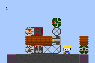

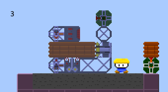
Great idea for a game. At first it looks like just another terarria clone, but it brings Incredible Machine vibes to totally change the game.
Personally, I got stuck at the arc furnace tutorial. I couldn't figure out how to automate building a bridge across that gap. Maybe I'm stupid, but I'd prefer a simpler machine as the first machine, maybe one that just involves the mantler and pusher without trying to also make copper bars.
Bugs/improvements:
I repeatedly left clicked an ore and it gave me already extracted minerals, making the extractor useless and meaning I only need one ore to get unlimited materials.
Browsing the blocks on the screen on the left was hard because the details for the block are way over on the right. Might be ok on a laptop screen but it was too far away on my 27" monitor
Default zoom level seemed way too far at 4K, but that's easily fixed once you reach the point in the tutorial that tells you.
If I right click to move some blocks, they come out and other block fall right away. This is a problem if I missed my click or didn't realize a block was still welded to another, and I want to "undo" my right click to leave the block in place. The way it is now, a misclick means I have to rearrange my entire machine because all the parts fell down.
Remember, any game where you can build a giant dick will be a success!
Thanks for playing!
The walking used to be the same speed as the bad guys, but I slowed them down to make testing easier, and you're right the player should also be a little slower.
Being attacked is something that does need to be fixed, but I think I need a more complex solution instead of just a cooldown. I plan to buy Dynasty Warriors to take a close look at the AI behaviour, especially while being swarmed. Currently, the collider for bad guy attacks is smaller than the player's, but that isn't enough.
Thanks for playing.
Regarding the walking jitter, do you notice it only when walking downwards (screen downwards) or in all directions? I have an open bug relating to this and I think it's only in the one direction.
I agree with your point about the lack of content. I will be adding boss fights, but that doesn't solve the issue about the sphere. I'm lacking ideas.
Punch will be adjusted for DD41
Thanks for playing! I know it's an extra step or two to play a mobile game, and I appreciate the effort.
Currently there is no death because it's way too easy to lose health and a bit too hard to beat enemies, so you would die too easily and not be able to really play the game.
The spin is charged up by killing the enemies. Currently 4 hits to get a spin. I could probably make it a pie chart to unlock instead of fading in, similar to a lot of cooldown icons. I intend to have an effect when you hit an enemy, so maybe some kind of particle can float towards the spin button to indicate to the player that the spin is charging.
The tap to attack definitely needs polish if I'm going to keep it in the game, but I'm not really sure what to do about it. The intent was to make one-handed controls, but it seems the game plays better with two handed controls (virtual joystick and attack button), and those are landscape only because I didn't think it would work well in portrait (I may be wrong).
Never played this type of game before, but I really enjoyed it. I was able to figure everything out pretty quickly, and the cards don't have so much text that I don't want to read it (unlike some deck building games out there). Nice art style. I made it to the winter, but then it felt a bit unfair when the goblin boss sent about a dozen snowballs in a row and took me from 28 health to 0.
Also the deck screen scroll seems to start at the bottom, and you can't scroll if the mouse is over a card.
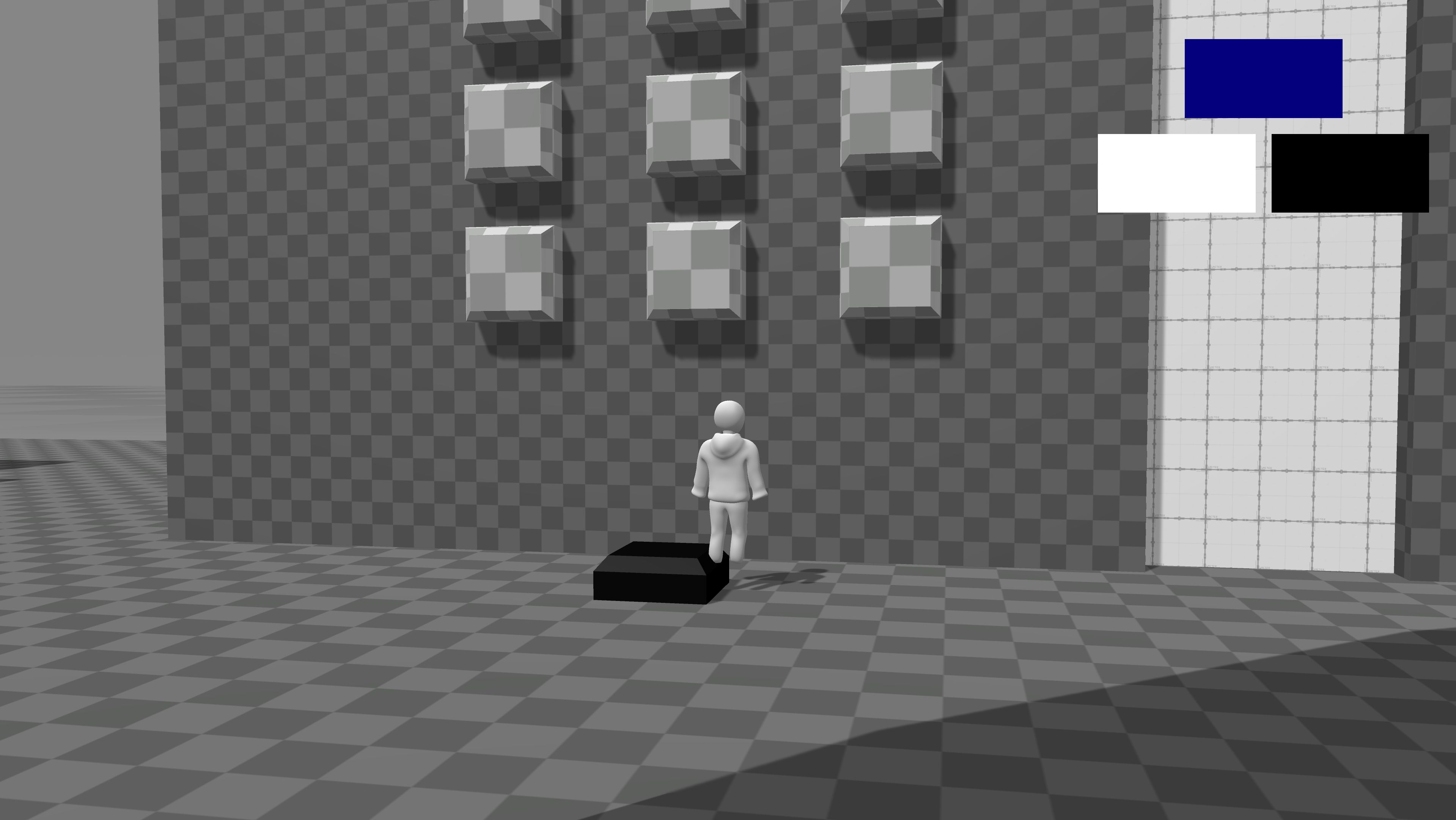
As another dev with an ambiguous blob character, I really like your character design. Hoodie and nose are a nice touch.
Gameplay seemed to work climbing and jumping gaps, and pressing F to let go worked for me. I collected the little game piece behind the walls, and then spammed buttons until it disappeared from my inventory. I couldn't interact with the numberpad thing, and on my second visit to it I got stuck on the black square thing. Pic related. Could still move the camera but nothing else worked.