Play game
The Legend of Prisma's itch.io pageResults
| Criteria | Rank | Score* | Raw Score |
| Fun | #70 | 3.267 | 3.267 |
| Theme | #85 | 2.867 | 2.867 |
| Visuals | #94 | 3.133 | 3.133 |
Ranked from 15 ratings. Score is adjusted from raw score by the median number of ratings per game in the jam.
Leave a comment
Log in with itch.io to leave a comment.


Comments
Interesting and fun mechanics, great job.
I shuffled around a bit with the keys, one to pull the bomb, one to throw, another button to jump and the mouse attack and launch, maybe reducing the buttons and centering was a good idea.
Great entry! - The colour-changing mechanics work well, although as others have mentioned, you can die quite easily while trying to massage the colour wheel to what you need...
Have you thought about perhaps just starting off with an easier to use simple RGB or RBY tri-colour wheel, then later on it can be made gradually harder by adding the 'mixer' colours in between, possibly even 1 at a time, 'overlaying' the colour change areas? (obviously with say, a different graphic to show, and different angle values for each stage of progression?)
Great entry though! - loving the Zelda vibe/influence, and good tutorial!
Hi, thanks for the feedback. I though about introducing the colors gradually, unlocking them with currency you get from defeating enemies, but as the deadline approached I wouldn't have time to build the whole thing so I scrapped it. I'll take notes of your suggestion, it's a great one, but for now I think I'll move on to something more puzzle centered. Again, thanks for playing my game and for the critique. Cheers!
No worries! - I know that feeling!
I'm only just managing to add Online Multiplayer leaderboards to the own post-jam version of my game, but I love your game so far!
Hopefully you get a chance to re-visit it at some point, and well done... :D
This was great! It’s cool to see someone else’s take on the color-cycling combat mechanic, though you definitely put in more mechanics than I did. I thought using the mouse wheel was a great way to swap between colors, but it felt like there were a bit too many to cycle between - it was a little frustrating to have to pause and find the right color with those small enemies that moved quickly.
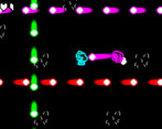
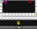
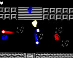
This game looked and sounded really good! It’s clearly well made and quite polished, and I’m really impressed with it. The style is cohesive and well put together, and I like the contrast between the black/white environments and the bright neon colors on the enemies and projectiles. The black/white colors did make the light meter a little hard to see sometimes, and I also had a difficult time figuring out where I could move and where the pits were. Minor nitpicks though, very well done!
Thanks a million abbas! After playing for some time I also felt like there were too many colors to select from, now I feel that four colors would be enough probably. Thanks for mentioning the polish, but I have to admit that I actually spent more time tweaking little details (camera shake, particles, etc.) rather than focusing on level design, which I wish I had done better in terms of signalizing clearly environmental dangers. But I'm glad with the overall result, I hope I get more feedbacks like yours before the end of this Jam, really I appreciate it. Cheers!
Cool idea, interesting! Nice that the music changed if you started the stage over. And nice music too! :) I noticed that you will not move with the moving platforms if you shoot!, your x & y is not affected by the platform while shooting i mean.
I liked this game! Cool stuff :)
Hi Kimmsoft, I didn't noticed that issue, these moving platforms took me some time to figure out but I think I know exactly how to fix that. Thanks for playing my game and for the feedback.
This was a blast!! I think this game would do well with maybe only 3 colors instead though. To many to cycle through IMO. Great work though! Some incredible effort was put into this and it shows! Also big props for gamepad support! I love playing with a controller if possible so thank you!! haha.
Amazing work! :D
Thanks dude, I spend many days adjusting the game feel until I was mostly satisfied with it. I agree with you, at first it seemed a good idea but as the game gets faster and more dynamic things might get out hand when managing the colors. Thanks for the feedback, really appreciated it.
Neat game! It felt a little weird to me to have attacks for this kind of game mapped to the shoulder buttons. I would've preferred the attacks, dodge, and interact mapped to the face buttons. Maybe custom input mapping could be implemented in a future revision.
Thanks a bunch! After some playtesting I noticed that changing color with the left stick and using the face buttons was a little overwhelming, that's when I though about the "Enter the gungeon" control scheme using the triggers, but I have to assume that it doesn't feel very intuitive. Button mapping is something that I'll definitely keep in mind, thanks for the feedback and playing my game. Cheers!
This is a really cool game, it has some very well made mechanics, and graphics, the gameplay feels polish and also the random level is a very nice touch and feature, pretty cool project good job, I hope you get more attention this is a really good entry!
Thanks a lot dude! I've been coding on GMS2 for roughly six months (no programming background) and I thought it would be a good opportunity to give it try. I can't stress enough how useful the feedback from the community has been so far, really motivates me to move further. Again, thanks for the feedback and playing my game. Cheers!
Just added a new version with better control schemes for keyboard + mouse (gamepad still recommended). Got rid of some bugs and improved pacing with different difficulty tiers and a "recovery chamber". Let me know any other bugs or ideas for improving this. Thanks.
Woah this is really cool!! I love your animations and characters!! The effects are really good too!!
Thanks, most sprites were drawn Johan Vinet (Canari games) and I think he did an amazing job. I tried to use particles for most effects (including neon) but it was a little challenging since I've just started learning particles. Thanks again for playing my game.
Oh yeah, the particle system in GMS2 can be a little tricky. You did a great job!
Well done game!
Good luck in development =)
Found it a really fun game! I wasn't able to play on keyboard as I wasn't able to get past the start screen. Maybe was clicking the wrong button. Worked fine on controller. I liked the light switching mechanic. Had some issues knowing if the environment was hazardous and fell through a hole on accident at some point. Also I think a warning indicator on exploding enemies would have been a nice quality of life. Unless you wanted players to figure out some attributes by trial and error which is fine too. Really felt compelled to play more and always exciting to clear a room and pick your next upgrades.
Hi I'm really happy you enjoyed it. It's my first release ever haha. I mismanaged my time and spent far too much of it building a game that is modular and, because of that, half of the levels were made in the last day of the Jam. I was intentional about the behavior of some enemies, as a "roguelike" I thought would be nice to offer an extra challenge for players to learn and memorize what each unit does. Thanks a million for your detailed feedback, means a lot. Cheers!
The neon graphics are spot on! Nice job!
Hey, thanks for playing it!