Play game
Facet Fury's itch.io pageResults
| Criteria | Rank | Score* | Raw Score |
| Theme | #157 | 3.444 | 3.444 |
| Originality | #169 | 3.389 | 3.389 |
| Presentation (graphics, audio) | #202 | 3.278 | 3.278 |
| Fun | #265 | 2.722 | 2.722 |
Ranked from 18 ratings. Score is adjusted from raw score by the median number of ratings per game in the jam.
How does your game represent Mode?
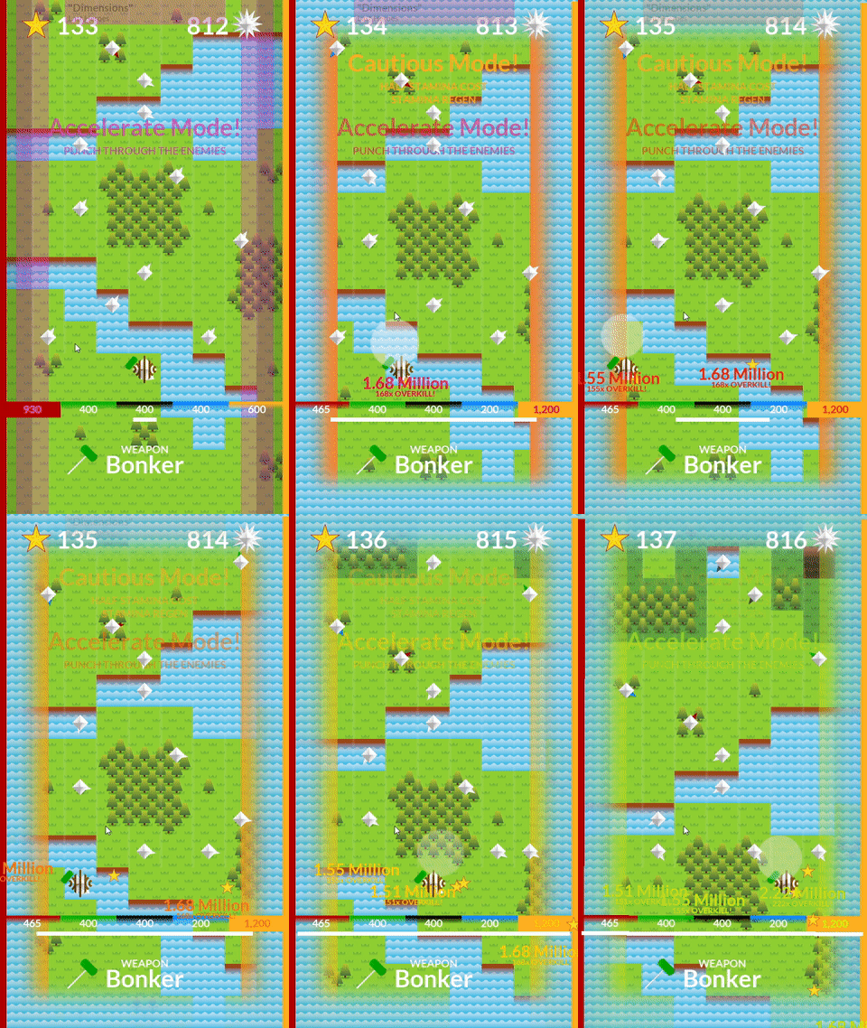
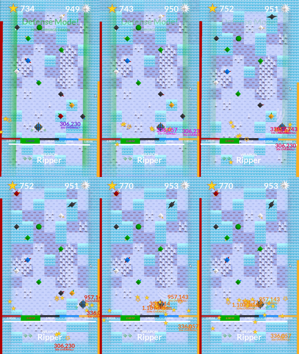
The player can switch combat modes on the fly to best tackle approaching enemies.
Leave a comment
Log in with itch.io to leave a comment.


Comments
I don't what is happening but the I sure am getting those points.
I have not a clue what I am doing, but I am sure having a lot of fun doing it.
But in all seriousness, the game looks and feels great to play, the soundtrack selection is awesome, and the concepts presented in it are novel. It took me awhile to intuit that the game is secretly kind of a brick break stacking game, and whether or not certain things damaged me. Brute forcing things and taking things slow will eventually make you feel more powerful and get you further in the game, it's just that I'm so not confident in my understanding of any of the mechanics to feel like I've really gotten a knowledge powerup, which is a shame, because I absolutely would play this a bunch on mobile or something if I knew what I was doing. :p I got to the ice area and will likely revisit it. Do you think you'd be up for coming on my stream and explaining things for me while I play it, and give some developer commentary so that other people can understand it better too?
Thank you for the feedback. I need to make a bit of a revision to the onboarding. It's mostly knowing what the stats and enemy colors actually do that is the problem. (That and there is alot happening on screen at once.) I'm considering removing the auto-advance timer so the player has more strategic control over moving forward.
I would be happy to be on stream, although I will not show my face on webcam. I have a vtuber avatar I can use for that, if you need something that moves.
oh, you don't need to be on cam at all, i don't even need you to be in voice chat, but if you have a way to have your rig on my stream i wouldn't be opposed hooking that up. my stream is small potatoes, but it's been growing faster than ever by giving people space to talk about their projects. :]
you can find me in the big mode discord under the same name more or less!
It seems like there's a lot of interesting stuff here but I'm having trouble piecing it together. I'm not sure when is the right time to switch between modes or weapons. I hope you'll have a chance to continue on this project since it was still pretty nice to play and I managed to get into a flow with it.
I think the game really would benefit from some sort of onboarding period. (That and not pushing the player forward.)
This is a fun one, I like the juice/screenshake a lot and the weapon variety is fun to see and use. I was really impressed with the popup that tells you which Kevin Macleod song is playing, that's a brilliant way to attribute the music. It's crazy how I didn't understand half of the intricate mechanics going on but still had fun in the game, that's an amazing accomplishment, and I enjoyed the experience of having to piece together what was going on as I went, it reminded me of classic arcade games.
Thank you. I did enjoy how the game started to feel after I implemented the screen shake. Yeah, the attribution dropdown was an idea I had for my main project, which I was glad I was able to test here. (For the record, only half of the music is Kevin MacLeod. There are songs from other artists in there. :P)
I'm about to post a devlog to the game page which has a video explaining all of the mechanics.
I was trying to resurrect the feeling I had playing old flash games with incremental systems. I think I did well there. The game has alot of hidden mechanics and secrets. Some I didn't have the chance to fully implement before the due date. However, I think I'll be making a substantial update the the release version after the voting period.
Definitely needs a tutorial, but nice overall gamefeel!
I feel I didn't quite manage to get how the game works sadly. I haven't rated yet but might try again to play it later
Followed this games development a bit so I understand what’s going on more than most here. And once you do know what’s going on the game is a blast, definitely make a tutorial when the jam is over so more people can enjoy this.
Thank you, really appreciate that. :P
I dont know what is going on.
Guess the game would have benefitted from a tutorial or some onboarding huh? ^---^;
I agree with what's been said. Seems well made, but I don't understand what's going on, whether I'm taking damage or not, or what the little orbs do.
HP bar is the red one on the left side of the screen.
Orbs double the stat of their color, only one can be activated at a time.
Your character's color indicates which orb is active.
It looks cool but I didn't know what was going on, a tutorial to explain the mechanics would've helped.
Too much, too fast. Nowhere on the game or the itch page do you explain any of the mechanics of this game. The game feels like it was built to be a slower turn based game but to many people thought it was "boring" and so the developer forced the player to move. You can hover over enemies to get descriptions from them but because the game forces you to move you can't finish reading the descriptions in time without moving your mouse to track the specific enemy. Then you have 5 states which briefly flash large amounts of text telling you what it does, and to top it all off a shit ton of weapons that seem functionally similar. This is pushed on to you as the player all at once. When you die it forces a permanent progression on the player you don't understand based off of mechanics you don't understand.
Fair.
I've added some information to the game page, including controls and base mechanics. For the mode switching I doubt you'd want that text to be present any longer that it already is, considering how frequently the mode switching might happen. Thank you for the feedback on that, too late to fix now. Maybe later.
"...forces a permanent progression on the player..." Is feedback I don't entirely understand. You get a new weapon if its better than the one you already have equipped.
But yes, I did throw alot at the player at one time. Then again, the game happens over multiple runs with very low stakes. Consider it a learning experience.