Play game
BONE CITY, New Orleans's itch.io pageResults
| Criteria | Rank | Score* | Raw Score |
| Presentation (graphics, audio) | #138 | 3.683 | 3.833 |
| Originality | #175 | 3.363 | 3.500 |
| Fun | #183 | 3.122 | 3.250 |
| Theme | #193 | 3.283 | 3.417 |
Ranked from 12 ratings. Score is adjusted from raw score by the median number of ratings per game in the jam.
How does your game represent Mode?
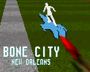
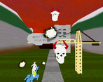
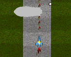
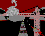
The game is a bullet-hell type of shooter that requires the player to manually switch between two modes of play. A top down play style and a 3D play style.
Leave a comment
Log in with itch.io to leave a comment.


Comments
I love the style of this! I feel like I want to stay in 3D mode mostly though. I feel like there should be some parts that work better for top down mode. The graphics are so cool! I love the skeletons and realistic images pixelated!
Never been to new Orleans. Hope this is lore friendly
new Orleans is not real, it cant hurt you
Great work, there are a lot of things I liked in this game. For one thing, I loved all the art design - the spooky dithered landscape, the flat shaded 3d graphics, the music, the billboards, the retro UI and the leaderboard, everything was just eye candy. The game itself is very fun, especially in the 3D mode. It reminded me of classic starfox games. Overall, the game is really unique and interesting. Nice job!
thx <3
easily the prettiest game in the jam that i've seen so far. the sounds and 3d models really give a lovely presentation. and even though im not very good at shmups- i still had some fun.
but i do think that there should be some reason to not just stay in 3d mode, especially when going between the modes is really snappy and polished.
ye that was one of the struggles during development, giving reason to the player to change mode back and forth. Interestingly enough some people prefer 2d Tohu mode over and 3d Starfox mode and vice-versa.
Very very well put together. I tried and tried to get the high score, but ended up at 29k pretty much every time. Switching perspectives is really awesome and the music/sounds really fit the theme. Love that you get points for near misses as well as the screen getting darker the more you get hit. Just adds that extra layer of polish that stands out. Great job.
thx!!! Gonna be honest, I did not get that high score myself just chose an arbitrary number.
What an insanely unique concept! Loved it. Very hard to dodge the skull attacks hah.
Very cool! Did not expect the mode change to go from 2D to 3D, but what a cool surprise :)
wowsers thx for playing
Very much dig the vibes on display, and the gameplay felt crunchy too.
ye its all about the vibe my guy
Really cool mechanic! I was confused as to the purpose of top-down until i realised it makes it easier to shoot stuff. Really like the visuals too. Changing modes to discover the guy riding on the rocket was awesome. Also, I have no idea how you implemented this, since the two modes are so different but seamless. Can't have been easy. V cool stuff.
thx <3. Changing modes were masked by a quick camera pan, and hiding changing the player's position in that pan. It also went from orthographic to "normal" (I forgot what the camera mode is called).
Oooh the switch mechanic is really cool! I REALLY like that! My only problem as that it was impossible to see when I was on low hp- there also was barely any indicator that I WAS getting hit besides that (that I noticed while playing at least) I also liked the graphics a lot
thx. I think if we were to further development we would need a better indicator in 3d for getting hit.
I looked up an example of Starfox for an indicator of getting hit but it just showed Fox doing this dance