Play Kitty
Chaos Kitty Knockdown's itch.io pageResults
| Criteria | Rank | Score* | Raw Score |
| Art | #81 | 3.765 | 3.765 |
| Music | #89 | 3.412 | 3.412 |
| Overall | #127 | 3.441 | 3.441 |
| Originality | #131 | 3.471 | 3.471 |
| Black and White | #151 | 4.353 | 4.353 |
| Theme | #168 | 3.000 | 3.000 |
| Gameplay | #202 | 2.647 | 2.647 |
Ranked from 17 ratings. Score is adjusted from raw score by the median number of ratings per game in the jam.
Leave a comment
Log in with itch.io to leave a comment.


Comments
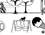
I loved the art and music, it's so cute! I loved how the lines of the objects in the level acted as the platforms. (I also love black cats which is a bonus!)
Super cute art and fun music! Definitely felt like the chaos kitty, and it was fun to see how different things would react to the cat smack.
Really nice cute little game! The music suits the game very well, the loop theme condition is met, jut got a little confused about what thinks needed to be hit.
Anyway, excellent job! Congratulations!
Always nice to play with cats! The graphics are cute and the music is fun, I just think it could have a better indication of where the ground is and what objects can be hit. Good job! :)
I really like this game! The game was very short and I would love to see more! Since I LOVE cats, this game was very enjoyable for me :D Would love to see more levels!
I'm glad you enjoyed the game! The team also loves cats very much uwu
It would be fun to return to it, fix some bugs, and create more content for the game. But as of now, we'll be leaving it as is since it's a game jam game.
I couldn't play the game, it is too big for my screen and there was just a blue rectangle shaking on the screen.
I'm so sorry to hear that.
May I ask what platform and/or operating system you're running the game on (e.g. browser vs windows build, mobile vs pc, etc)?
The browser resolution is set to 1280x720 and the windows build is 1920 x 1080, which should fit most standard browsers and monitors. The browser version also only works on desktops and not on mobile devices.
windows 10, laptop, screen resolution is around 1400 by width, playing web version.
Hmm, the game was meant for screen sizes of 16:9, and we hadn't tested other screen ratios. For the blue screen, there are a few settings that we can change in Unity for the web browser to test if that would fix it. However, we won't be able to update the game during the rating period.
If you haven't already tried it, see if the game runs on other browsers. Plus you could even download the Windows version which should have fewer issues than the web version. But you're not obligated to either. Other than that, I have no other solutions. Apologies for the inconvenience and thank you for trying. I hope you have fun enjoying the rest of the game jam games.
Haha very cute! Love the art and concept, it was fun! Reminds me of my naughty cat :D Very chaotic, great work!
Thanks for playing! I'm glad we were able to channel the cat energy very well uwu
Really nice polish- the ink/doodle style art fit the black and white theme perfectly. Art had a really lovely charm. The audio had a lovely playfulness to it which was really fitting.
Design- I wasn't exactly sure as to why the loop/timer was necessary; I feel like the core emotion/pillar of annoyance/playfulness would have been better served if the game was presented in a more sandbox/toybox format where there was no "real" objective, or maybe they are hidden information. Also, I understand that the indicator for what can be knocked down or not was planned but couldn't make it- I felt like in certain cases the affordance for what could be knocked down or not wasn't clear. Finally, level design- representing a 3D space in 2D is really hard, and though the artstyle largely masked it I found it a bit difficult to distinguish between platforms I can stand on and ones I can't stand on.
UI- Certain button placement (pause menu or settings for example) felt a bit random, a bit all over the place. This delivers on the theme but sacrifices usability- meaningful sacrifice for some but not all. If button placement was standardized it would've been better I think. One minor thing was button highlights- I felt like the button wasn't highlighted enough when it was already selected. If it was completely blacked out or greyed out it would've been better.
Overall incredible game. Exquisite polish and great tone, though some mechanics I feel like can use some iteration.
Thanks for playing the game.
Game Design
In response to your feedback, we incorporated the loop to fit the game jam's theme "loop". Initially, we wanted the player cat to knock down to their heart's content then try to leave the level, only to realize that they're stuck in the same level and there are new things to knock down. However, due to the time constraints, we were not able to fully realize our vision.
I also agree that the fun of the game comes from the annoyance/playfulness you mentioned. I actually spent most of my time repeatedly knocking things down instead of completing the level. In that respect, the game might have greatly benefited if it was perhaps a sandbox instead.
We //mostly I// kept on putting off talking about how to indicate knockable objects and platforms. If I had brought it up sooner, we might have been able to design the art in a way that shows that type of information from the get-go while still staying true to the ink/doodle art style.
UI
UI placement could have used some work (e.g. showing a button was selected, more orderly button placement/design). However, some of the UI (e.g. pause and options button) was placed in a way to not obscure the gameplay view and/or detract from the more important elements on the screen.
And thank you for taking the time provide some feedback! 🐾
That was fun ! I was a bit lost a the beginning but then it was fun to annoy everyone x)
I tried many times but i couldn't figure out how to achieve 100 % of progression, even after making the bench guy angry ...
Anyway that's a good work ! Well done !
Thanks for playing!! And haha gotta try knocking everything ;)
Thanks for playing!
We were running out of time so we weren't able to show indicators of what could be knocked down for each loop. During the "Down with the hoomans" objective, make sure to knock down all the humans. The last objective text didn't show up either, which should be something along the lines of "Time to knock down all the
clouds."Thanks for the tip, i'll definitely check this out !
Knocking the fruits off the trees was satisfying
Glad you enjoyed 😸
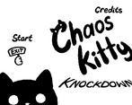
Wow the main menu is super noice and the cat is super cute~
Thank you, I really enjoyed doing the art for it! The writing was hand drawn and I’ll probably just make a font next time 😅
I guess it's for if you like cats.
Yep our team is pretty into kitties 😹
Very cute, took me a bit to figure out that I can climb back up from the bottom but I enjoyed the choas. An ending screen would be nice because it was bit confusing when I won.
haha thanks! Appreciate the feedback!