Play game
Komori's itch.io pageResults
| Criteria | Rank | Score* | Raw Score |
| Originality | #10 | 4.375 | 4.375 |
| Overall | #23 | 3.993 | 3.993 |
| Theme | #37 | 4.000 | 4.000 |
| Art | #42 | 4.042 | 4.042 |
| Black and White | #50 | 4.750 | 4.750 |
| Gameplay | #80 | 3.417 | 3.417 |
| Music | #99 | 3.375 | 3.375 |
Ranked from 24 ratings. Score is adjusted from raw score by the median number of ratings per game in the jam.
Leave a comment
Log in with itch.io to leave a comment.



Comments
Fantastic game! Only criticism is what most other people have said and that's keep the guide circle (Or have the option to turn it on and off).
I see it's been said already, but the game did get way harder without the guiding circle. I kinda like the difficulty, but it seems less intentional and I admit I couldn't get much further without it.
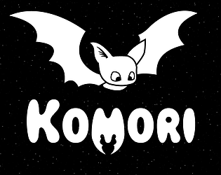
Otherwise, super cool stuff! It's a neat take on the Loop theme, the art (especially the bat) is cute and stylish, the music is good and I always like having different themes for different levels in a short game. Even with the circle thing, moving the bat feels responsive and quick. Nice job overall.
A very unusual way to move in a game, but made for a unique gameplay experience.
Also the design of the bat was cute.
Nice work!
pretty wild
I love the game play! It's tricky without the guideline but that is what makes it fun! It reminds me of an early Neopets game !
The art and sound of this game was really cute and very well done. The mechanic of adjusting the radius of the bat's flight really captured the feeling of how bats fly. It's a very clever take on the theme
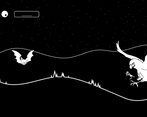
The main mechanic is inventive and fun. I wish that the preview of the ring around the player stuck around longer, it was much harder without it and sorta of removed the puzzle feeling. Overall the game is fun and well presented!
Excellent concept, I haven't played anything like this before! However, I couldn't find it easy to continue playing after the first level, because removing the circular indicator for my movement was very disorienting and felt like a large step-up in difficulty. Maybe make that an accessibility option for less experienced players? Great job nonetheless!
I never would have thought a game with controls like this in a million years. You really ought to put some info on your page though! I thought it was broken at first!
Nice concept! It's amazing what you got here with just two buttons, I've never seen a game with those mechanics. The art is great, the bat design is very nice!
I'll suggest to maintain the circle path, because without it, is too difficult to predict where the bat will go.
Nice entry!
Wow I love this game! Takes me back to second-year differential equations haha.
The only thing I suggest is maybe you could also have controls that change acceleration? I think that would add more of a risk-reward tradeoff in the player's decision. Like do you want to stay conservative and orbit slowly, or do you want to speed up and dodge the first owl only to run into the second one? That would definitely drive up the adrenaline!
The concept is really interesting! I think the art is definitely the highlight here, I love it!
I like the concept but still feel like I am not really in control. The bat is unable to avoid enemies traveling in a horizontal line, which happens pretty frequently. Cool game!
What I liked:
Suggestions:
Overall its a cool game, visually pleasing, and the player mechanic is pretty cool. Congrats on submitted your game!