Play game
Dan The StormBreaker's itch.io pageResults
| Criteria | Rank | Score* | Raw Score |
| Theme | #48 | 4.000 | 4.000 |
| Overall | #290 | 3.368 | 3.368 |
| Audio | #291 | 3.316 | 3.316 |
| Fun | #304 | 3.368 | 3.368 |
| Graphics | #369 | 3.526 | 3.526 |
| Innovation | #511 | 2.947 | 2.947 |
| Game Design | #537 | 3.053 | 3.053 |
Ranked from 19 ratings. Score is adjusted from raw score by the median number of ratings per game in the jam.
How does your game fit the theme?
More or less, but yes
Did you write all the code and made all the assets from scratch?
Most part of it, and the ones that I didn't make are in the description of the game.
Leave a comment
Log in with itch.io to leave a comment.


Comments
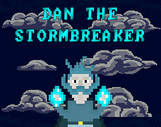
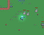
I like the design of the main character but I do wish he was more expressive for mow big his is on screen.
I'm glad you liked the character! And you're absolutely right about the expressiveness, I'm still in the early stages of learning pixel art, so I really appreciate the feedback!
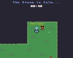
Dan is the man! Really liked his character design! The mechanics of the game are great, and really fit the brief for the theme of the jam. Really like the exploring aspect during the "calm" section, searching the areas for upgrades and power-ups. Great work on this one :)
I'm glad you liked the exploring aspect and Dan's design, thank you for playing!
Great game Dan!! Like the upgrade phase being more about exploring rather than just some button. Made it more interactive and fun.
A few bugs I noticed:
1. The mouse icon shakes/vibrated/glitches when the character is moving.
2. Triple shot is not that useful since when fired sideways; it does not spread but go in a single line. I think you already know this.
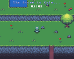
3. Some weird hitboxes when walking on thin paths
Apart from that, a really solid game. The art and music are also very well integrated into the game. Had lot of fun. Played like 8-9 waves before reading the rest :D
Kudos!!
Thank you for playing and the feedback! :D
Very Cool!
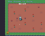
Pretty fun to play. I think the movement is a little sluggish at times but otherwise it's a nice wave survival. Good job!
Cool combination of exploration and battles! I personally liked the exploration part more. The first few battles lasted too long, but then I got damage and triple shot upgrades and the last few battles went down smoother. I got all the chests before wave 4. Few more chests, and different enemy types or a boss fight would've been awesome.
Thank you!
Had fun playing the game, I forgot to use sprint, lol. Overall I liked it, I think more enemy variety would've helped later levels become more dynamic as well.
I'm glad you had fun! Thank you for playing :)
The gameplay is really clean and fit the horde survival genre very well. Although, even more impressive than that was the artistic side of the game. The visual artstyle is really charming and the music is simply stunning. Great submission :)
Thank you! :D
Hey! Congrats on submitting, this is success by itself and will make you better overall! Here is my review:
GJ! Keep it up!
Thank you for the review!
I totally agree with all the statements and glad to see that the main flaws are principally cause of running out of time haha (Ran out of time for testing the difficulty and times between waves, also I had a Volume to add a "storm-like" setting during the wave but with build I messed up some graphic settings).
It is fully understandable and i don't write these reviews to diminish the game! It was very well done and most importantly COMPLETED! Even without the ending at wave 5 the core game loop was done so GJ.
Enemies are too slow and its too easy to dodge their bullets. Overall game looks great. Good Job!
Thank you you! I went for the easy design but I think it resulted in it being too easy haha