Play game
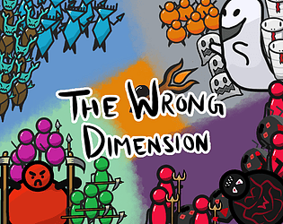
The Wrong Dimension's itch.io pageResults
| Criteria | Rank | Score* | Raw Score |
| Audio | #116 | 3.381 | 3.500 |
| Game Design | #183 | 3.312 | 3.429 |
| Overall | #221 | 3.094 | 3.202 |
| Graphics | #229 | 3.312 | 3.429 |
| Fun | #248 | 3.036 | 3.143 |
| Theme | #277 | 2.829 | 2.929 |
| Innovation | #314 | 2.691 | 2.786 |
Ranked from 14 ratings. Score is adjusted from raw score by the median number of ratings per game in the jam.
How does your game fit the theme?
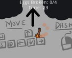
There is a timer. When the timer reaches 0 then the player is teleported back to the start. And the map changes everytime the timer reaches 0. So, every time there is a new zone to explore.
Did you write all the code and made all the assets from scratch?
Yes I made all the assets from scratch but I did reuse some of my code from past projects.
Only some of the sounds are made by me.
Leave a comment
Log in with itch.io to leave a comment.


Comments
Thanks for submitting your game to be played in the stream! You can see my reactions over in the vod down below (games are separated into chapters with yours being the thirteenth chapter)
The stream was great Man!, Thank you so much for playing and the feedback you gave during the stream. This time I didn't get the game playtested so some issues were unknown to me. But yeah, definitely saw some things that need to be fixed. Once again, Thanks a lot!
A fun top-down Dungeon-Crawler.
Pros: commitment to the aesthetics works really well, simplistic concept that lasts just the right amount of time, simple but fun combat mechanic, really cool use of the theme
Cons: the dashing felt like it should follow the mouse and not the WASD direction but that might just be me, the collisions were a bit janky, the powerups felt a bit useless and the one that makes your torch bigger actually made the game harder.
Overall this was a really fun experience that was above average across the board. Nothing about it was particularly mind-blowing but every aspect was very fun and enjoyable to play. Really solid entry.
Thanks a lot for this critical feedback!!
It's always great to see and learn from these mistakes/experiences for my game. I will keep these kinds of things in mind for the next jam. :)
I love the way the theme was used here, with an actual end to a timer taking you to a new beginning!
Also the art reminds me of Blackthornprod, which I enjoy quite a bit! I think it could've been more unique, but that's not the type of thing I'd concern myself with in a game jam, only if you wanna further develop this into an actual release or something.
There were a few issues I had with the game though.
The first is probably the most major issue in my opinion: I don't think you can "lose". You just get swarmed by a bunch of enemies and all they do is crowd around you. An actual losing state would've made this more than a walking simulator where you have a torch.
Another issue I have is that the game's music feels a bit unfitting, with just one track constantly playing all the time. Maybe keeping the same melody with slight instrumental changes as you go dimension-to-dimension would've livened things up a bit. Though I don't mind too much since you did only have a week to make this.
My other issues were more of control ones. The player moved very slow, meaning that the dash was my primary means of movement, when it really should be a special one. Maybe having some sort of recharge meter could help alleviate this, and also speeding up the base player.
On the subject of the dash, I don't know if it's just a me thing but I found it weird that the dash doesn't go in the direction of your cursor. I feel that'd make things a tad more intuitive. Or have options for both in the settings.
Though overall, I liked the concept & art and had a bit of fun here! I definitely wanna see what games you make in future. :)
Thanks man for the amazing feedback (every bit helps a lot!).
So, yes the art style is inspired by BTP, It is fast to animate in the engine.
I am relatively new to game jams (this is my second ever), so, I am still learning to manage my time. I didn't save enough time for the sound effects, something that I will make sure to do next time.
Many people have told me about the player base speed being too slow and just clicking the mouse button the entire time for dashing. I will definitely update it after the jam ends.
Finally, the dash moves in the way you are moving. If it was towards the cursor, then people might accidentally dash into the enemy while attacking them as the weapon also follows the cursor.
Originally, there was a health system in the game, but I had to scrap it whole as it presented a bunch of bugs that I couldn't find the right ways to solve.
Again, Thank you so much for spending your time to give me this feedback. :)
the art style is cool kinda like blackthornpord art style which is well done for my opinion (feel free to review out games in your game comment to get more views and review)
Your artstyle is similar to something but I don't remember know but you picked a really good one to learn. But anyway, I have few things which I think can be changed or tweaked.
The main thing I would change is Player object. Without any health game is just a brute force simulator. I just pushed forward and rushed straight to the Eggs. Also dash should be on cooldown and it's properties too. My idea is to increase time before changing dimensions to 1.5 minute, put 3 second cooldown on dash and slightly increase movement speed. The dimensions could be a little better too. You can add more enemy types, more puzzles and/or boss enemy. And UI text could be a little better. I don't know much about Godot but try to look "How to make text look good" or something like that. In Unity there is normal text class and TextMeshPro text class. Maybe there is something for Godot I wonder.
I think your idea has potential but needs more work. If you want more help don't hesitate to write to me or to anyone in the community or on forums! Don't be shy and talk about your problems. It's very important these days.
Oh man! Thank you so much for this feedback. I really wanted this kind of critical review. The art style is similar to Blackthornprod's.
As for the text, Godot has a RichTextLabel Node that is pretty useful but I just didn't have the time to implement a good font with it.
Moreover I have been working in Godot for a year and now thinking of switching to Unity. That's not because Godot is bad (I love Godot so much <3), but because Unity has a much larger community and a few more reasons.
If I feel like working more on this idea later then I do have some things to add, and I will definitely take your advice. :)
Can you help me with some Unity forums or Discord servers or QnA sites you recommend? That will be great help.
Again, Thanks a lot!
Nice game, really like the art style and looking for the eggs was suprinsingly fun !
Adding sounds would make this so much better, anyways, well done !
Thank you so much Man! And yeah the sounds were a bit lacklustre. Next time Definitely!
I think the Ice-Dimension guys look kinda like Hornet from Hollow Knight, anyways nice game overall, pretty basic but good take on the theme.
Haha, didn't notice it until now. Thanks for the feedback tho
Nice game! I like the look of the enemies and the splash effects! I was dashing constantly so maybe increase base movement speed and give the dash a bit of a cooldown? Just a thought, cool game overall.
Thanks bro. I wanted the game to feel juicy so that people would constanly dash and kill enemies here and there and feel like a total badass. That's why the base movement speed is a bit slow. :)
Love the Blackthornprod-inspired visuals!
Thanks Man, This game takes inspiration from their game - "The Game Creation Recipe"
Loved the art style!! The time mechanic was good, but with only one egg left became kinda pointless. A couple of them were also particularly hard to find.
Had fun overall, great work!
Thanks So much for the feedback!!, And Yes, it actually becomes pointless with only one egg left. I was planning on having 2-3 more zones but keep the total eggs needed to 4 eggs, so it remains interesting, But I was running out of time and needed to do the UI elements for the game. I am so glad to hear that you liked it :)
I would love any kind of feedback for this game :)