Play game
Pocket Horrors's itch.io pageResults
| Criteria | Rank | Score* | Raw Score |
| Theme | #13 | 3.167 | 3.167 |
| Game Design | #21 | 2.667 | 2.667 |
| Overall | #21 | 2.667 | 2.667 |
| Fun | #28 | 2.167 | 2.167 |
Ranked from 12 ratings. Score is adjusted from raw score by the median number of ratings per game in the jam.
Leave a comment
Log in with itch.io to leave a comment.


Comments
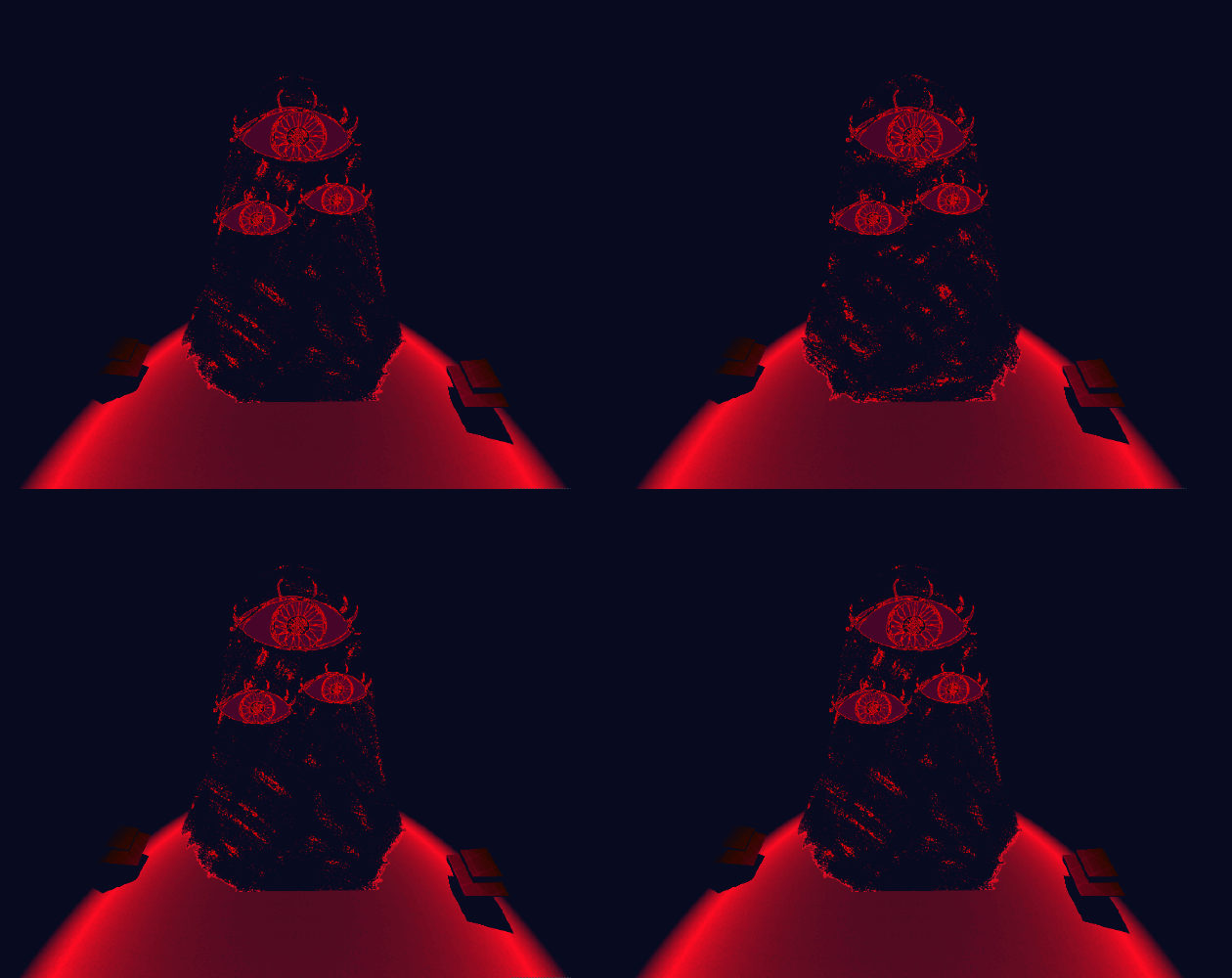
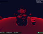
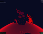
The visuals are fantastic! I love the restricted color pallet and the visual design of the enemies and the playable character, thematically really great.
In terms of gameplay, was definitely a little confusing. I had fun running around trying to kill everything for sure, but I didn't really understand why the move bound to E kept changing, and it took me a sec to realize that the moves were all dealing different amounts of damage. Maybe I'm just dumb, but it's definitely beneficial to lay out to the player what exactly is going on.
I also immediately started in a battle, and I couldn't tell if that was intended or not. If it is intended to show the player the battle system, sure, but it's definitely confusing when I went to move around and couldn't and was just taking damage instead. In that vain, it was a bit too easy to accidentally walk into one of the bosses, just to get one shot straight away.
The ideas are all there, communicating everything to the player clearly I think would turn this into a really cool experience, not just visually but in gameplay too!
Thank you for the feedback! Yes, I didn't balance this game great in the end. Lesson learned haha!
And I agree, I need to communicate the controls better and sooner, especially that initial battle sequence. : )
Thematically very strong, but needs some polish to bring out the fun and allow the player to better understand stuff
I agree. Thanks for the feedback! : D
I...was confused by this game a little bit but I liked it. I think it crashed on me, but the battle system and the art style were really interesting. I did get kind of lost at one point--couldn't see any trees or landmarks or things to interact with--but I did enjoy myself. Really unique and well put together. Good job!!
Yeah it could definitely have used a little more polish in the end. Thanks for the feedback! : )
I don't know why but I couldn't steer the character or look around when I tried to play so I can't judge.
Heyo! Sorry to hear you are having trouble! In order to start movement, you'll need to successfully fight the first enemy by using the commands in the bottom right. It's not as intuitive as I had hoped it would be.
In the future I am planning on rewriting the starting mechanics to be less punishing to learn.
The game idea is REALLY COOL. It reminds me of those old ‘feeding frenzy’ flash games where you ate smaller fish to become larger, but with monsters, and you get cool mutations that you eat off your enemies. It’s neat, and the art is cool! Unfortunately, it’s also really confusing, with an un-intuitive UI, difficult to listen to with badly balanced sound levels, and unbalanced in combat when it comes to the larger enemies.
Theme: Not really a horror, but I liked the aesthetics
Fun: Watching the monster grow was fun for a minute or two, but then the clunky UI and visuals made me more confused than engaged
Game Design: Kind of confusing style and didn't really know what else to do in the game other than repetetive battles
ok so, my fingers hurt from spamming e and the map is really nice and open but you cant see anything, nothing far around you and especially nothing right infront of you becouse your player... rock blocks that angle, the only really good things is that it runs really smooth and stable and that the art is really good. all in all good idea and still better then DreamWorld, so well doe!
Thanks for the feedback! : D
Yes, I agree with with your observations haha