Play game
The Eclipse's itch.io pageResults
| Criteria | Rank | Score* | Raw Score |
| Theme - How well does it incorporate the theme? | #20 | 3.864 | 4.000 |
| Completeness - Is it an unfinished tech-demo, prototype or a complete game? | #31 | 3.933 | 4.071 |
| Overall | #32 | 3.616 | 3.743 |
| Audio - Does the game have nice sfx and music? | #52 | 3.519 | 3.643 |
| Gameplay - How fun is it to play? | #75 | 3.243 | 3.357 |
| Graphics - Is the game aesthetically pleasing? | #93 | 3.519 | 3.643 |
Ranked from 14 ratings. Score is adjusted from raw score by the median number of ratings per game in the jam.
Leave a comment
Log in with itch.io to leave a comment.


Comments
I've prevented the eclipse!
This game is amazing. Theme is clear and awesome to play around. Only card and UI design break the illusion of a complete and polished game.
First launch for some reason it didn't show 'start game' and all - just background and music. Restarting fixed it. And couple of times camera would look the other way from the mob, but the rest of the game looked and played flawlessly.
Balancing deck around sun/moon switches and screwing up opponents was fun! Definately my cup of tea right here!
Thanks for sharing :)
Thank you for playing! I'm very happy to hear you had a great time with it. Thank you for the feedback - it's good to know you had some weird technical bugs. The camera thing I was able to replicate, so I will defintely look into fixing that!
A very nice game. I liked having a card game to play for each battle, it made for interesting strategy. Between the quantity of health of the enemies it felt a bit slow but it was fun.
Nice work! A really good Idea but the card part was quite wierd. Overall nice job !!
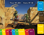
I had trouble with placing the cards consistently until I realized that it wanted me to drag it to the top part of the point, not the middle. I'll admit, the thought of card combat intimidated me until I realized that trick-taking was a concept from normal card games, not modern video game ones.
I was able to pick up how to play without any issue, although I swear there was one time that I thought I should have won but no damage was dealt. The combat mechanics were interesting, although I would've liked another modifier to spice it up by the end.
The final fight got down to the wire, but I managed to pull out a win. Good work!
Thank you for playing! Glad the trick-taking ended up being fun for you. Thanks for the feedback - I defintely need to figure out a more consistent drag and drop.
A fine game.
I struggled a bit with the card game. Sometime I would drag the card and it wouldn't place.
But I do admit that I nexted through the explanation, because TLDR;
Thank you for playing! Yea I need to figure out how to make the placement more consistent and have an interactive tutorial.
The visual style is top-notch, I love the originality and simplicity of the gameplay. I found the tutorial text to be more complex to understand than the battle system actually was, and I had some trouble with hitboxes when placing my cards, often having to drag 'n drop my card over five times for it to be played. Besides that, I had a lot of fun, nice sun/moon duality! I would definitely play a more fleshed out version, the suites could have each a special additional effect. Awesome work!
Thanks for playing! I'm glad you had a good time! Yea, I've defintely want to work on this beyond the jam and will need to figure out how to make the card placement more consistent. I really enjoyed designing this, so expanding it and making a full version is something I really want to do.
Enjoyed this, the movement was smooth (maybe a tad slow) and the audio as well as the style of the game was nicely done.
The combat was slightly repetitive (only slightly) but I managed to get quite far in and unfortunately didn't stop the eclipse.
Thank you for playing! I apprecaite the feedback!
I do play some card games and this is quite confusing to me. Combat is unique about thinking about which cards you should play as it affects consequent turns. The design of the same element block is a good idea to stand a chance against enemies' RNG 0/5 rolls.
However, I prefer a shorter and more informative tutorial. As it is quite a long read before starting the first fight.
Great combat design overall.
Thanks for playing! Glad it had an impact on you and apprecaite the feedback!
Yea, if I had a bit more time, I would have liked to have an optional tutorial battle where you got to learn through playing a fight instead. I want to keep working on this idea, so I hope to have a smoother tutorial.
The combat was really well done and and nicely presented. The use of fonts and layout of the UI was especially pleasing. Occasionally the drag-drop of cards didn't quite seem to work but it was very smooth to play. We also understood what was happening after the first couple of rounds. We did miss the high/low win condition a couple of times though, which was perhaps the idea.
We had quite a few battles, and they were enjoyable, but was there anything else to the game, other than the really well done combat system? Were the any puzzles to solve, keys to find or doors to open?
The audio was very effective, and in keeping with the general style of the game. A volume control would be nice however.
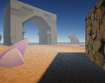
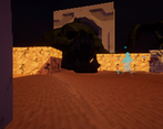
We're really curious about the graphics too. The maze and enemies looked very good and you had shadows and lighting in there too, but it was all really low resolution. The enemy assets appeared as though they were more detailed than we could see as though it was deliberately pixelated and downscaled. Was this a stylistic choice or are the assets really that low resolution? The game itself could have played out with 2D graphics, for example, with no change in gameplay so it felt like the 3D dungeon crawler aspect was almost redundant.
Well done for creating such a polished game overall. As a card based combat game it worked really well and we'd love to see how it progresses. Best of luck with the jam.
Thank you for playing and I apprecaite the feedback!
Yea, I really wanted to add more things like puzzles, keys, etc. but ran out of time. I got pretty lazer focused on designing the combat for this one. I really enjoyed designing it and want to work on a full version where I'll implement the stuff you've brought up.
Also, yea for the visuals, it was a stylized choice. I hadn't used that kind of shader before and wanted to give it a go. I also felt like it was a good way to make the Synty models have some spice since they're pretty generic. Hoping to get better at modeling this year!
Great job!
The look and feel of the environment with the audio was superb!
The movement was a bit slow for my taste but I was able to get used to it after a little time.
The combat was really interesting and I’d love to see a full version of it implemented in a future game.
Overall, loved this entry.
I'm really happy to hear it clicked with you! Thank you for playing! Good to know the movement can be sped up. I had a lot of other ideas I wanted to implement and really enjoyed designing it, so I really want to work on a full version.
I really like the combat concept and would like to see that fleshed out more post-jam.
Nice graphics and audio. The movement was a little bit slow but it worked.
Nicely done :)
Thanks! I really had a lot fun designing the combat and would love to develop it further and also expand how the player can interact with the environemnt. I started off wanting to make multiple classes and more card-actions, but realized quickly I had to reduce my scope. Thanks for the feedback about movement! I was worried it was a bit too fast, so it's good to know I can speed things up.
Looks like we were not the only team that used celestial bodies! :)
The fights got a bit repetitive with time, but I like the concept. You might want to consider removing the shader that pixelates everything (if it is a shader), I think the game would look a bit better without it!
Thanks for playing and appreciate the feedback!
I've prevented the Eclipse.
That was an intriguing use of the theme and the game worked better than I thought it would after the first few fights, it gets fun as you and probably even more as your enemies get Sun/Moon cards and deck modification choices become quite non-obvious.
I think the game contains the right amount of content but it's every part of it is a bit too slow which is the reason why it drags a bit.
It was fun, anyway.
Thanks for playing! Really happy to hear you got into the card-play! Yea I was a bit worried it was too fast haha. Good to know I can pick up the pace.