Indie game storeFree gamesFun gamesHorror games
Game developmentAssetsComics
SalesBundles
Jobs
TagsGame Engines

curlyGoblin

488
Posts
4
Topics
9
Followers
40
Following
A member registered Feb 08, 2022 · View creator page →

Creator of

Recent community posts

Thank you for playing! I'm very happy to hear you had a great time with it. Thank you for the feedback - it's good to know you had some weird technical bugs. The camera thing I was able to replicate, so I will defintely look into fixing that! 

Thank you for playing! Glad the trick-taking ended up being fun for you.  Thanks for the feedback - I defintely need to figure out a more consistent drag and drop. 

Thank you for playing! Yea I need to figure out how to make the placement more consistent and have an interactive tutorial.

Thanks for playing! I'm glad you had a good time! Yea, I've defintely want to work on this beyond the jam and will need to figure out how to make the card placement more consistent. I really enjoyed designing this, so expanding it and making a full version is something I really want to do. 

Thank you for playing! I apprecaite the feedback! 

Really awesome idea for the landing page - looks great! The game has some quality writing and it did a good job getting you into the world. I think it would be cool to see the theme more implemented into the gameplay. Maybe your abilities change depending on alignment? Or you have choices when defeating an enemy that impacts the theme more. Overally great work!

The visuals are excellent! The combat could really use some better choices to make it feel engaging. Otherwise, an auto-battler where the interesting choices are your party members could work too. I think with some tweaks to how you use your party and this could be really cool. 

Really like the idea of brewing a potion for a battle sytem - I think this has a lot of potential and would love to see it developed further. I think the beginning was a bit of a chore since the Chaplin kept healing himself. It would have been a more interesting fight if I had more options at that point, but since it's the beginning I felt like I had to wait for some good RNG to progress. Overall I think it's a cool idea and would be cool to see something like this developed more.

Really loved the spell-combination mechanic - I always love stuff like that, so it was my favorite. It was great playing a more puzzle/exploration focused game too. The use of the theme is really compelling and a really strong entry! Great work!

Really cute retro game! It took me a second to figure how to navigate with the controls, but I got used to it fast. It felt like I could just bulldoze enemies pretty quickly, so some item variety and combat variety could really spice this up. Overally great job!

The art is wonderful and I love the colors. This is probably my favorite-looking game in the jam so far. 

I saw you noted it, but yea some music would have been good for ambience. I think the combat could use some tweaks too - i wasn't quite sure how the battles were going, so some clearer feedback would be great. 

I would also love to see more environmental details to help me orient myself through learning the level instead of being reliant on the map.

Thanks for playing! Glad it had an impact on you and apprecaite the feedback! 

Yea, if I had a bit more time, I would have liked to have an optional tutorial battle where you got to learn through playing a fight instead. I want to keep working on this idea, so I hope to have a smoother tutorial.

Thank you for playing and I apprecaite the feedback!

 Yea, I really wanted to add more things like puzzles, keys, etc. but ran out of time. I got pretty lazer focused on designing the combat for this one. I really enjoyed designing it and want to work on a full version where I'll implement the stuff you've brought up.

 Also, yea for the visuals, it was a stylized choice.  I hadn't used that kind of shader before and wanted to give it a go. I also felt like it was a good way to make the Synty models have some spice since they're pretty generic. Hoping to get better at modeling this year!

I'm really happy to hear it clicked with you! Thank you for playing! Good to know the movement can be sped up. I had a lot of other ideas I wanted to implement and really enjoyed designing it, so I really want to work on a full version.

Great visuals and coom atmosphere! I think the combat was a cool idea, but I defintely felt like I should have blocked stuff, but took full damage sometimes. It has a lot of potential, but the battles could really shine with some extra balancing.

Thanks! I really had a lot fun designing the combat and would love to develop it further and also expand how the player can interact with the environemnt. I started off wanting to make multiple classes and more card-actions, but realized quickly I had to reduce my scope. Thanks for the feedback about movement! I was worried it was a bit too fast, so it's good to know I can speed things up.

Thanks for playing and appreciate the feedback!

Thanks for playing! Really happy to hear you got into the card-play! Yea I was a bit worried it was too fast haha. Good to know I can pick up the pace.

This was really intruiging! I was pleasantly surprised by the ability to swim. I ended up dying my first try since the camera movement was a bit sensitive on my side. It would be great to have a key to press instead to factor for different mouse sensitivties. 

Really neat idea and quite impressive to get this generating dungeon seeds in a week. The transition into combat looked great too. I did have a lot of doors that go to other doors or nowhere in my first run. It would be great to see the randomziation fined tuned a bit more to boost the immersion. I also would have loved some more complex combat choices.

The sprite art was fantastic! It gave me SMT vibes. I love the idea of a dice battler, but I had a bit of trouble figuring out what was good and what was bad at first.  I think a little tutorial or some clearer UI info would really help guide the player.

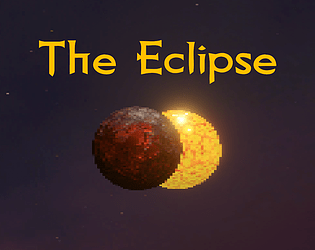
Hope everyone had a great jam! I finished my trick-taking dungeon crawler - The Eclipse. https://curlygoblin.itch.io/the-eclipse

Please let me know what you think ! I'll make sure to check out your game as soon as I can as well. 

Ohhh ok! That's good to know. I think then it would really benefit from some visual queues to show I'm affecting the wolf behavior. Some extra feedback and I'd feel much more engaged!

Solid shmup! It's a bit hard to see the bullets and the enemies are a bit too strong in the beginning. I think the player hitbox could use some tweaking, bc I would suddenly be dead when I didn't even think I'd been hit yet. Some feedback about being hit would be good too. 

Well made! The juice was maybe a bit too much? I had trouble keep track of missiles coming at me, so it felt like I got surprised by attacks a lot. 

The juice was nice! But I wish the combat felt a bit more developed. It felt random, more than in my control. 

I realized I had a typo! I meant dash mechanic! Yea, I think with some extra time and a few changes it could be cool!

Really cool character/world design and movement! The audio was a bit hard on the ears and it would have been good to have some more direction for the world. Even if it made the game short, having some sort of small story or purpose would have really elevated this.

Really great looking game for 9 days! The gameplay feels solid, but I got too strong too fast and with the lack of enemy/level variety I found myself wanting more. 

The desk mechanic was really satisfying! It could use a bit more level design to encourage engaging the enemies. I found myself able to just run past enemies with the dash. Overall great work!

Challenging game! I think it would have been nice to have more control over how you attack. It feels like I'm waiting more than playing at points.

The visual representation of the increasing juice was an excellent touch! Great work!

Reviewed! Thanks!

It's got a ton of potential! Got me to follow because I want to keep up with what you make!

Awesome art style! I wish the game had some sfx for the combat and the combo system was a bit opaque without instructions. 

Very well done with some quality game design choices! I was pleasantly surprised by the gun movement while jumping. I would say the final boss is a bit of a sponge, but great work overall.

Cool to see a TD game here, but unfortunately I think I ran into some bugs that got the little guys stuck and I couldn't build anymore.

Looks clean and has some nice juice, but the aiming felt a bit too random for me.

Really neat idea with lots of juice. I really think the wolves brought down the core concept. The idea of making your way of the bodies of the fallen is interesting, but when I knew a wolf was inescapable - there was no point to continue. I may as well keep dying until there is a realist opportunity to escape the wolves. It ended up making when I could actually play the level design feel arbitrary. 

Really great visuals! It could use more juice I think, but a solid challenge.