Play game
Fading Knight's itch.io pageResults
| Criteria | Rank | Score* | Raw Score |
| GRAPHICS | #62 | 3.154 | 3.154 |
| OVERALL | #75 | 2.769 | 2.769 |
| MOOD | #80 | 2.615 | 2.615 |
| THEME | #89 | 2.615 | 2.615 |
| ENJOYMENT | #89 | 2.462 | 2.462 |
| HUMOR | #108 | 1.769 | 1.769 |
| INNOVATION | #118 | 2.077 | 2.077 |
| AUDIO | #126 | 1.923 | 1.923 |
Ranked from 13 ratings. Score is adjusted from raw score by the median number of ratings per game in the jam.
Leave a comment
Log in with itch.io to leave a comment.


Comments
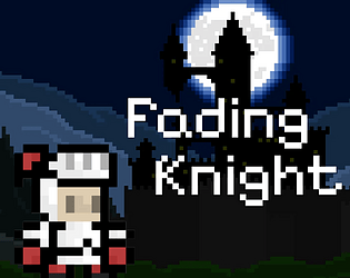
Loved the use of theme! It's a super charming game, I love the graphics.
I thought the decaying player stats was a really cool idea, only it sort of made the gameplay feel worse overtime because I was just slower. I also found it a little frustrating that I got sent all the way back to the start when I die.
For a jam game, this was really cool! Great work. :)
-D
I didn't really notice the fading life mechanic until after I had already beaten the game, so I had to go back and take a look at it again, I think the mechanic should've been a bit more pronounced. Maybe with some sort of audio cue or changes to the player sprite over time. That said, if you were going to make the mechanic more critical to the gameplay, you probably would want to have some sort of checkpoint or level system to balance it out with any frustrations the player may have. That aside, the pixel art is pretty good, and I'd like to see ya flesh out your environments a bit more, good job!
I really like the art, and general mood you made. The triggers on the traps are well timed too!
Would love to have had some music. The game was very slidy, would rather see more control over my character.
I thought it was strange that the spikes would kill me if I slid ever so slowly sideways towards them, even if they were facing up.
I share this link to anyone new to game design who is into tough platformers. It analyzes Celeste - one of the best challenging platformers out there. You probably know all about it, but just incase here it is:
The game is good and getting older as you move is a good use of the theme. But you could have added checkpoints to reduce the frustration of playing the game. I couldnt get past the second level and the hit boxes seemed too big. But Solid for a first game. Good Job
checkpoints are important because it reduces frustrations from failure when its placed nicely
Cool concept, unfortunetely the charakter controls too floaty and to me the spike hitbox seemed a bit too big.
More importantly, dying resets your progress to the first level. I quit on level 2 when I died because of that. Hirrible
Very cool game :D, although lacking some sound effects, even adding a death sound effect would have made the game a lot more enjoyable. Some of the hitboxes and jumps feel strange, but i'm sure you'll get better next time you make a game. Solid entry, given the constraints, 3/5.
Congrats on your first game🥳! For your first game it was very good the only complaints I have are that the characters hitbox feels a bit big and also a walking animation would have made it feel much better. But this is what first games are for so congrats again!
It is the game with an interesting setting, but a bit hard for me, also was upset, because fading doesn't affect gameplay. Nice job for the firs game!