Play game
You're Bad At Math's itch.io pageResults
| Criteria | Rank | Score* | Raw Score |
| Sound/Music | #32 | 2.917 | 2.917 |
| UI | #35 | 2.750 | 2.750 |
| Art | #42 | 2.750 | 2.750 |
| Overall Fun | #44 | 2.500 | 2.500 |
Ranked from 12 ratings. Score is adjusted from raw score by the median number of ratings per game in the jam.
Leave a comment
Log in with itch.io to leave a comment.


Comments
Just made my let’s play on your game as a regular player (so it’s without voice comments). I hope it will be useful for you to see how fresh players may started your game for the first time :) I’ll provide text comments later, probably after finishing the videos for the other projects :)
I like the concept, but I didn't quite understand the game.
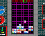
I played a game where the goal was to get 7. I put 2 and 5 next to each other but it didn't disappear. Maybe I needed 3 blocks? It would be good if 2 blocks would work, like 4 + 3.
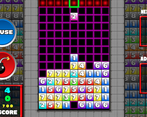
Also, it's really hard to choose where to place the next block. Being able to control the blocks like in Tetris would be easier to play potentially.
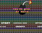
For the main menu, it was odd that it needed two clicks to start the game etc. Maybe have the option (like quick start) highlighted/become bigger when the mouse is over it, instead of requiring a click, so a single click starts the game etc?
Alright...i am the dev who is really bad at math
But anyway as a concept it's really great, you are getting high ratings from me
It's just not my game genre
Nice idea, essentially Tetris plus quick calculations. I was just struggling a bit with the game-play:
- It would be much better to move the tiles like in Tetris and not to chose where the next one will fall down. If you think about it: why do they fall down if there destination is already predetermined?
- The controls are too fast: I could rarely get the blocks where I wanted them to be.
- The game starts too fast for beginners.
- The help text shouldn't be displayed in these super huge bold upper case letters.
- Bombs could be automatic or actually just play without them, like in Tetris.
- When you play on the webpage and press Quit, you get to a menue where you can choose Quit, and then Exit.....
Overall a cute idea that can be made into a nice game!
Pretty cool but I think that the block that is about to fall should also be displayed on the board(under the arrow) so that you can more easily think ahead.
Really fun concept - and you're right, I *am* bad at math!
A couple of suggestions for improvements:
1) Could the number of the next tile be displayed where the arrow is? I found I was looking at the right waiting for the perfect number, only to discover I had lined the arrow up in the wrong place!
2) I'm not sure the distribution of numbers is very helpful. My target was 9, and I mostly got 6 and 7 tiles, which made the game very difficult.
This one's got some potential! Just a few thoughts:
While on my journey to complete basic math, I find myself having a bit of a hard time aligning the top arrow with where I want it and I think I know what might help, I notice the controls are kinda slippery; it's not as snappy as you'd expect it to be, but I think this could be an easy adjustment. Being able to hold down the arrow to smoothly move left and right actually feels like it makes things harder. I think players will enjoy being able to just manually tap left and right.
Also, I think I've seen puzzle games do a thing before where the entire selected column has some sort of highlight/glow to make it more clear what column you're picking, cuz you gotta keep up your momentum and having to manually check where your arrow is up above and looking all the way back down to see the blocks takes just enough time that it makes it harder to get much done.
You know the "next" number block on the right side? I think if it was also color coded like the blocks already in game that would help a bit too. I think the music and art could get a lil bit of a boost as well, currently it's all "okay", but maybe you could find a specific style that stands out a bit and dive deep into it, whether it's something futuristic and synthwave-y, or more urban with bricks and graffiti and a more jazzy or hip-hop soundtrack, or maybe something very "Y2K" aesthetic like CROSSNIQ+, which funny enough is also a puzzle game!
Nice work so far!!!
Nice game, I like the idea a lot. I feel with some changes it could work a lot better, but I'm not smart enough to know what those could be hehe. I have a few suggestions though:
- The controls need to be tighter: not sure how to fix it but right now its too hard to move accurately. It may be the speed, the arrow movement may not be "jumpy" enough (jump each square), maybe it's just to many columns.
- This may help with the previous issue: the feedback on when the next block is coming isn't great. Maybe you could use the music, since its a constant beat, perhaps an animation of the arrow getting filled or something.
- 0 block could be fun, so you can kill 2pieces that already add to the value.
- When you add to the correct value at the same vertically and horizonally only one of them explodes, (I think its vertical?), I think it would be more fun if both of them did.
- The UI could use a lot of work. I'm not good at UI design, so I may be wrong, I think it needs more feedback for the player everywhere
- I don't like the bomb mechanic as it is implemented right now, I don't know how I would changes but right now I don't think it's fun or adds anything interesting to the gameplay.
Thank you for making this awesome game, very enjoyable! Keep working on it, I'd love to play it again as it evolves.
Feedback:
Overall Fun: The game is not super well explained before starting it. The left and right arrows are too sensitive, it's hard to easily select a column.
UI: Simple and functional
Art: Colors are not super bright. A bit depressing. Not sure if that was intended!
Music: A bit repetitive, could be interative based on the actions of the player
Hey! Great effort on the game! My thoughts on each category:
Overall fun:
While I can imagine people having fun on this type of game as it is in the same thread of extremely popular games like Tetris, unfortunately it's not my type of game (I also don't like Tetris, blasphemy I know!). I will try and compare it to Tetris for how fun I think it is, but take it with a pinch of salt given my personal preferences.
It has a simple mechanic of trying to add together 3 numbers to make a number. However, the time you get in between blocks falling is extremely fast for a new starter to the game. I would have expected on campaign mode for it to start out very slowly and maybe get quicker, like Tetris? I can imagine that when you are practiced at the game it, the fast pace is what you want. However, as a beginner, having to see the number you are trying to make, then see the next number coming, the see where you cursor is, then look at the board and see where the number would fit, then decide where to put the number, then move the cursor to the location, all before the couple of seconds you get is quite allot. I found myself starting a game, and before I realised what was going on, I had a large tower in the middle. I also don't like the was you select a row, then cannot change while the block is moving. I feel like this is a vital mechanic of games like Tetris, as it adds tension but also delays decisions for some moves, while allowing a quick reaction for others, helping the pacing of the game.
UI:
The UI in menu seemed to fit the casual theme of the game, yet it also seemed a little to basic. While I did like the buttons expanding on selections, I feel like every action took too many clicks. I would prefer each button be one press, which spawns an animation, which then fires the action of the button.
As for the in game UI, because the pace of the game is very quick, the parts of the game you need to see quickly (the next number, the number you are making, the time before next fall, and the selection row) need to stand out allot more. For instance, instead of an arrow showing the selected row, you could highlight the selected row with a nice bloom effect. This would also help with the difficulty without having to slow down the game, as it would be allot more obvious where the block was going to fall as you wouldn't have to look at the cursor, the follow the row down to the bottom.
Art:
The art theme was necessarily basic in a good way. You don't want everything drawing attention to itself because allot of focus needs to be on the current objectives. However, I didn't really like the background. I think having the blocks moving in the background adds to the confusion and complexity, when really the user is just supposed to be focusing on the game. I think a more abstract, washed out, slower background could work better, and not draw attention to the game allot better.
Sound/Music:
The sound effects where really nice. I really liked the sound feedback of interacting with the UI. As for the music, even though there we settings for music, there was no music playing in my game? I'm on Android btw.
Anyway, great effort on the game!