Indie game storeFree gamesFun gamesHorror games
Game developmentAssetsComics
SalesBundles
Jobs
TagsGame Engines

Carbyne.Games

26
Posts
1
Topics
A member registered Apr 04, 2022 · View creator page →

Recent community posts

ARE THE HORSES OK?! Ha.

What I loved:

1) Love me some turn based battle systems. Tried and true.

2) Love the after battle theme.


Some critiques:

1) We receive directions in chat (e.g. east road) but no way to immediately see what direction that is, unless I'm missing a mechanic. The compass doesn't update as you turn?

2) The dialog text is a bit too grating. Maybe a more muted effect or UI sound control.

3) Keyboard way to select dialog? Maybe in general introduce key bindings before we start? Tutorial section when entering the forest the first time before the fire?

4) No confirmation that you've equipped something? I couldn't tell if Father's dagger was equipped or not.

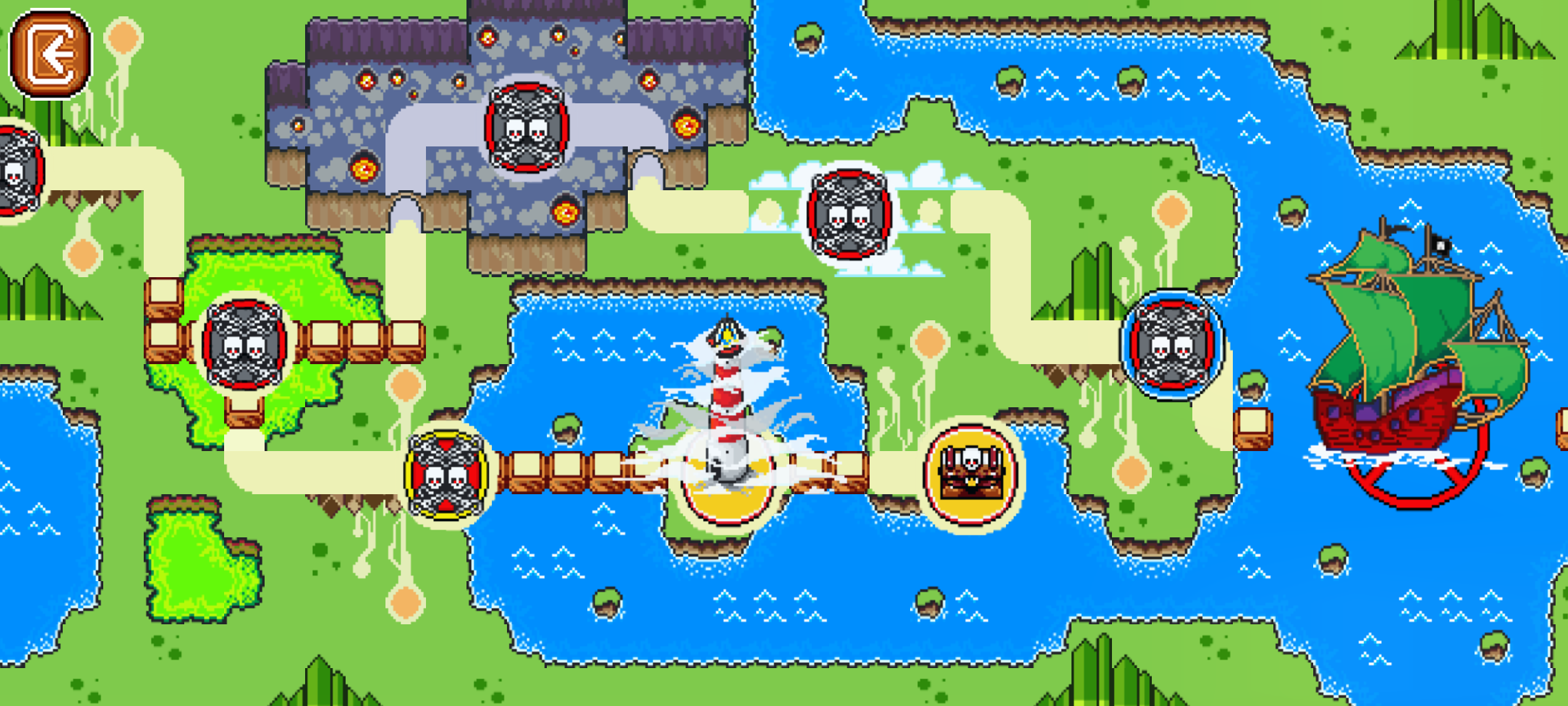
The obvious inspirations from Mario are abundant but that isn't a bad thing! This harkens single back to my SNES days playing Mario World for hours at a time.

Love the simple UI for the demo and I appreciate the accurate control hit boxes when going full screen on your phone. Larger AAA games even have problems with that. Love the simplicity of the artwork on the overhead map and in the levels. It would be nice to have some sort of naming convention showing on the UI however to indicate where you are.

The world map and the levels are accompanied by what I think is the strongest design aspect of your game and that is the soundtrack. Distinct and memorable tunes filled my head and got me humming along.

I only made it to the third level because the difficulty skill is high which is not a negative however some of the hit boxes for the enemies did seem a bit too large and I found myself reaching up to the sky yelling no way more than once!

All in all pretty damn solid with our work to support your pirate twist on a classic Mario formula that does what Mario did best and that is give you a sense of familiarity while playing. Well done I hope you keep up the work on it.

Hey! Thank you!

The best experience gameplay-wise I've had so far in this #feedbackfest. Well done.

Love the style - retro filter - controls were smooth but HARD as hell especially trying to control the box in air.

Better than most mobile games I try. Stuck on level 7.

Left/Right controls only seemed to work 10% of the time making it extremely difficult to figure out the game.

Was into it, until I think I double clicked during the wheelchair sequence and had an overflow error.

I honestly couldn't solve the first puzzle!

My fingers hurt from the repetition! 

Are you able to rotate the blocks at all? I was saying the thumbnail gave that impression.

Windows 10

(1 edit)

Having a lot of performance issues (low frame rate) on the Web GL Browser games.  Am I missing some quick fix here or are the issues game side?  Escape the Ether and Disco Tomb are 2 games that are running poorly for me. Other's aren't.

Feedback:

  • Fun little platformer. 
  • Really hard to control jumps into small gaps with spikes on either side. 
  • Was unclear on the spinning transport thingies were.
  • Attacking is not apparent. Its not clear I'm swinging, and even less so in the air.

Feedback:

  • I mean...I'm not THAT quick at math. Was overwhelmed easily. Can there be a slower timer for folks like me?
  • Part of the issue for me is that looking back and forth from the playing field to the next number to the total number took most of the timer leaving little time to react.
  • Didn't make an immediately connection that you could move left and right PRIOR to the number launch.

Feedback:

  • Took a min to understand what the hook was - very challenging twist on a classic tetris concept.
  • Everything is simple, UI/Art/Sound which is fine for what the game is.
  • I thought you would be able to rotate the blocks based on the thumbnail screenshot.

Feedback:

  • When unzipping I had to create my own top level folder. Minor thing, but anything to make it easier for the player.
  • Consider not starting users in fullscreen mode.
  • Thank you for supporting 2k!
  • Harsh lines on the text scroll reveals - perhaps a gradient fade?
  • Rosalind is hard to hear against music by default. Had to mess with volumes.
  • Rosalind Voice Actor a placeholder? Felt like was reading off a page.
  • Gerhard Voice Actor is awesome.
  • Needs hit effects, no movement or effects to know you hit something. Spider are a bit better.
  • Text box distracting - perhaps fade out when playing?
  • No UI acknowledgement when you complete the mission parameters. I didn't know I was done killing rats!
  • Grass texture is really repetitive. 
  • Music fit nicely. Not memorable but not distracting.
  • Environment details like the spider webs - consider adding variations of height to break up the planes.

Feedback:

  • Took me a few minutes to realize you could move the boat!
  • Simple to the point - gives me my upgrade fix - could ALWAYS use more upgrades if you expand in the future.
  • Not overly complicated fishing mechanic that works. Satisfying catch. 
  • Again if looking to expand in the future perhaps some difficulty catching certain species or certain ways the hooks need to entice them. For the scope it is its perfect now though.
  • Love the progression getting to deeper waters...you actually don't see that in many fishing games.

Nicely done Paul.

(1 edit)

Feedback:

  • "Launch" Missiles typo. Also capitalize your sentences, small things can help with polish.
  • Nice Unforeseen challenge - getting killed by the rotating obstacles on the backend after making it through!
  • Repetitive, even varying sizes of the same obstacles could help a bit.
  • Music left me on edge, could be good or bad, but was a distractor for me.
  • Consider a limited use slow down mechanism?
  • Quit button missing.

Feedback:

  • Consider not forcing full-screen off the bat, really messes with multiscreen users.
  • Wanted to play as the chicken!
  • Was REALLY hoping for some movement based upgrades like speed increases or jumping over enemy abilities. I may not have gotten far enough but then perhaps earlier, other players types would appreciate the speed over weapons.
  • Very clean crisp UI.

Feedback

  • Love the SNES feel to this.
  • I want to name myself!
  • No tutorial? Assuming not implemented yet since I start talking to a knight that says "I've taught you everything you need to know!"
  • Would love to move with WASD instead of arrows.
  • Secondary conversations would be welcome. e.g. talking to the same person more than once reveals easter eggs or other world information.
  • A nice touch I liked was having to interact with a location to enter - typically in these games you automatically enter on overlap but I actually prefer to interact to avoid mistakes.
  • Should offer a UI way to "Go Back a Level" and "Exit" from shop menus.
  • Overworld land could use some work too many square edges. Very sparse, an opportunity to fill with interesting things to do - e.g. broken down wagons and 
  • Favorite time in game was in the cave.
  • During the attack, you should remove the character user frame so we can see the action! Blocks your sweet animations.

Feedback:

  • Action packed soundtrack!
  • Desperately needed control instructions.
  • Aiming and lining up is very linear very mush wanted to fine tune with mouse movements.
  • Secondary weapon would be most welcome - like missiles to counter aiming issues.
  • City level was the most interesting to dogfight in.

Feedback Notes:

  • I wasn't expecting to be taken right into the game after randomizing - would have liked to check out that character roll screen more.
  • The conversations were a bit confusing to me, clicking on a silhouette brought up the topics but nothing happened when clicking on various topics for both Herda and the first NPC. Not sure how to get a recipe from Herda for the quest. Proved a blocker and couldn't continue!
  • Very warm soundtrack fit the static art style VERY nicely.
(2 edits)

Honestly, I wasn't even able to start to playing this - the frame rate is REALLY low. I think I was having fun shooting the fireballs though!

First time - do I join to participate or only if I have a submission?