Play game
Rise of the Soulmancer's itch.io pageResults
| Criteria | Rank | Score* | Raw Score |
| Controls / UI | #8 | 4.429 | 4.429 |
| Art / Graphics | #9 | 4.571 | 4.571 |
| Sound/Music | #15 | 4.286 | 4.286 |
| Overall Fun | #21 | 4.143 | 4.143 |
Ranked from 7 ratings. Score is adjusted from raw score by the median number of ratings per game in the jam.
Leave a comment
Log in with itch.io to leave a comment.


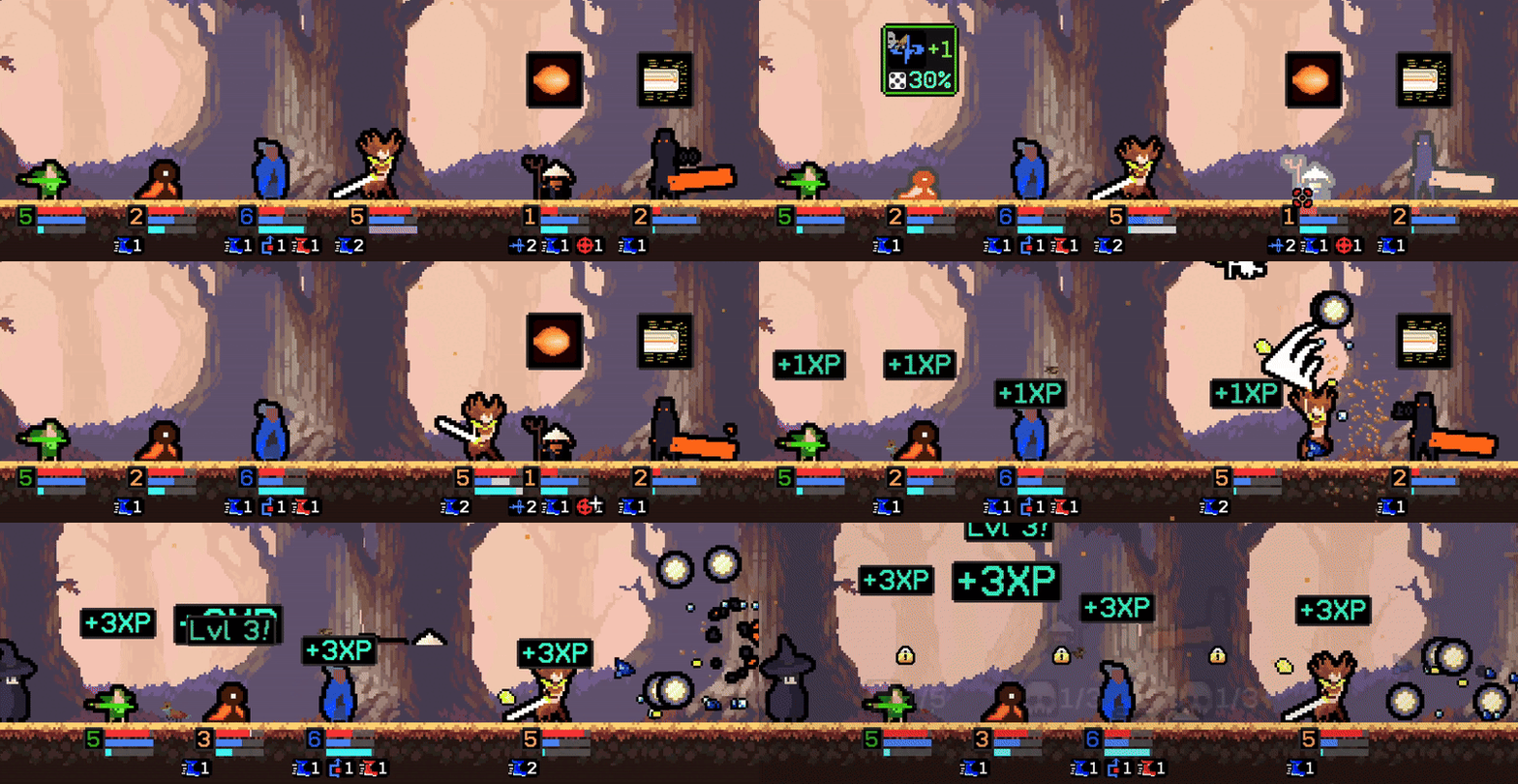

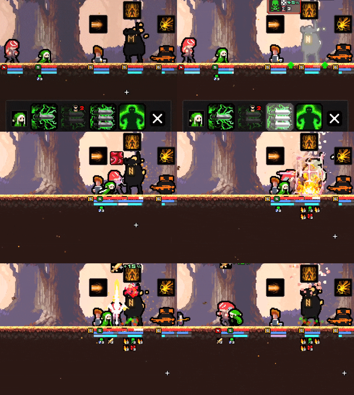
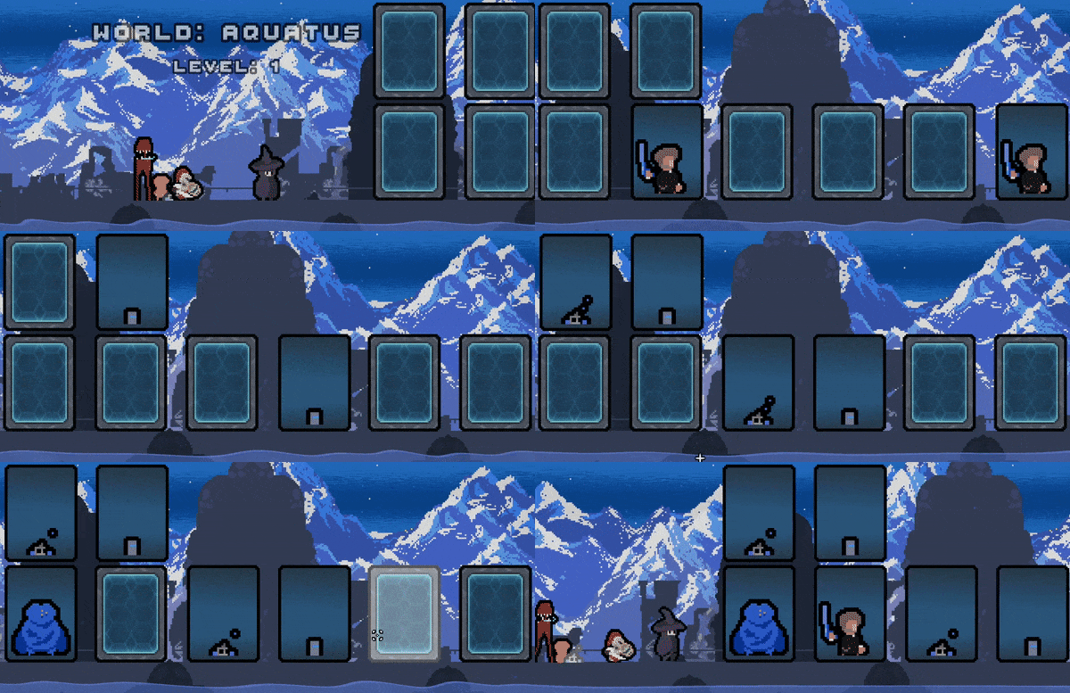
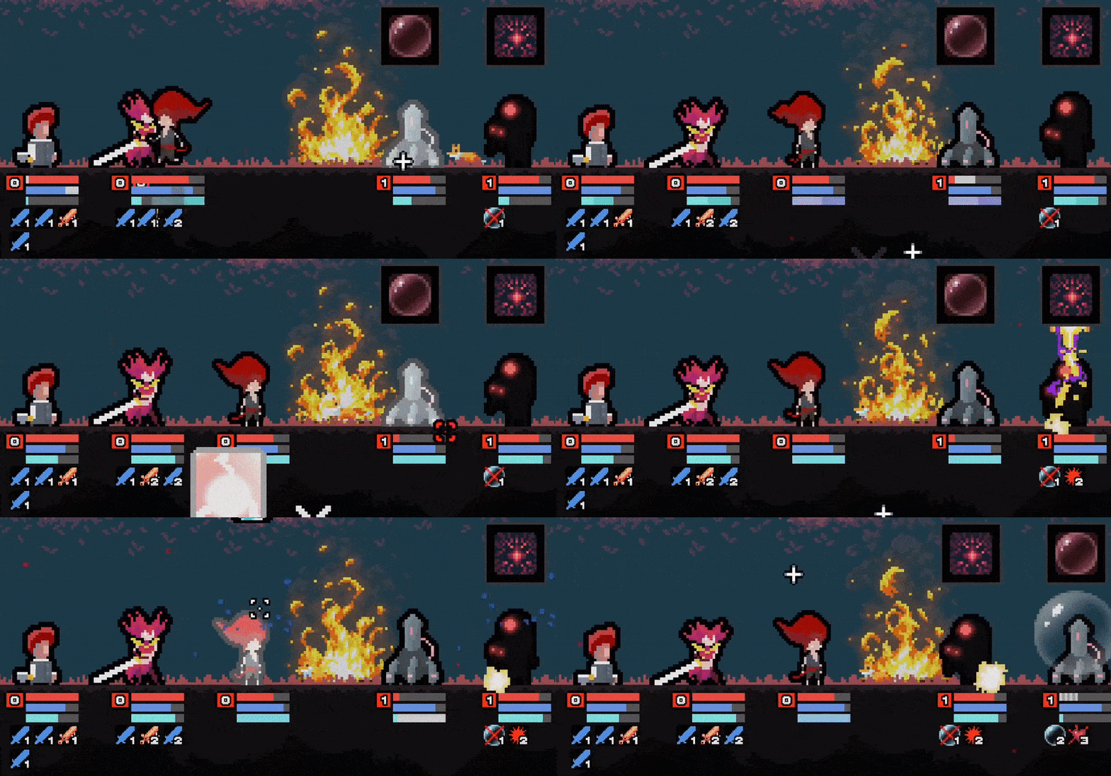



Comments
Starting a new thread for the .80 version.
Happy to report that all of the issues I had on last go-around are resolved.
I'm still not sure what caused the audio to fail before, but I'm glad it's working now because the music and sound design is exceptional. Some of the voices sound a bit strange with the various filters used, but it contributes to the "vibe" of the game (they're from other worlds, after all).
I got decently far this time and was able to see a ton of different area types, which seem to open up as you progress. Great variety with not every node being straight combat. The puzzles and encounters are very cool conceptually, and the reward system is interesting.
Once I got to Spells it also opened up a new layer of depth. There's a ton of stuff going on this this system for sure, and it is extremely addictive once you get into a groove. I had to pull myself away to hit some of the other jam games on my list but absolutely, 100% plan to return to this once there's no longer a time crunch.
I will say that it doesn't currently feel like all units are balanced, but I am also thinking that is intentional and meant to drive the player towards opening up more creation slots and such in order to customize their loadout. If so, then my only negative thought about that is you can sometimes roll a pretty bad party before you start unlocking upgrades. But, it's not like there's a big failure penalty, so it might be fine.
Overall, amazing work and very unique!
Hey Moogle!👋
I'm glad to hear that version .80 worked better for you.
"I will say that it doesn't currently feel like all units are balanced, but I am also thinking that is intentional and meant to drive the player towards opening up more creation slots and such in order to customize their loadout. If so, then my only negative thought about that is you can sometimes roll a pretty bad party before you start unlocking upgrades. But, it's not like there's a big failure penalty, so it might be fine."
Although the goal is to have balanced characters, there is also the idea of working with what you currenty have (which is not always the optimal team).
For rarer monsters, such as unlocked bosses, they do have slight boosts compared to other characters that you unlock. So that's a natural, intentional imbalance that's supposed to be a reward for having unlocked the boss.
Nonetheless, I would like to improve the balancing.
Do you have any examples of specific cases for this? (Usually I tend to think about characters with only 1-2 skills as a possible culprit for this imbalance).
Thanks so much for playing again Moogle! 👏
There's a series of units with what I believe to be gun/blaster based attacks, with one underwhelming damage skill and one support skill I don't recall being particularly useful. Felt like they were under-statted overall, though having a CD-based damage skill with more oomph might also help.
But to your point the units with only 2 skills generally feel worse than the units with 3 or 4, at least this early in.
Awesome, thanks for the feedback Moogle!
This helps. 👏
Hey Moogle! 👋
Current Version: 0.0.0.81
I've added a slight boost to character skills if the character has 2 or less skills (the boost increases more if only 1 skill).
Hopefully this helps a bit.
Thanks again for the feedback. 👏
A very interesting game! Unfortunately I encountered a lot of bugs that haven't been discussed in any of the previous comments and much of my play time was spent wrestling with those.
Is there a known issue where audio will refuse to play regardless of settings? I can't get any sound or music for some reason. I did see some kind of funky Avast prompt the first time it loaded (aside from the regular Windows Defender prompt which I am used to) and wasn't sure if that was related, but closing and re-launching didn't help.
On the topic of how the game launches, it was weird that it opened in full-screen initially but I couldn't see the mouse cursor anywhere on-screen, even though Windows had complete focus on the game client and wouldn't let me click into background processes. I suspect it could be a game engine limitation but I think it would be better to have a windowed mode option.
I ran into one issue where a tutorial dialog tried to run exactly when I clicked something in the home area, so I was stuck in a menu with no way to advance the dialog (left / right click did nothing). Eventually I hit Escape and it took me out of the menu, allowing the dialog to run.
I ran into a problem with an Encounter in which the Bookshelf wouldn't seem to do anything regardless of which skill/outcome I selected. There was a Taunt prompt I believe, which flew by pretty quickly and didn't really help me get past it. I had to exit the area which ended that run, unfortunately.
I'm not sure I like that when only one enemy remains, offensive skills are a single click with no need to use the cursor. I get that it's faster, but it's not consistent and takes some getting used to. it also doesn't mention this in the tutorial unless I missed something.
It seems like you can start with 3 party members, but some of the other creatures are actually unlockable if you go into one of the Upgrade menus, then upon returning to the hiring area you can recruit up to 4. This was super confusing and I don't know if this is how it was intended to work.
I loved the art style. Animations felt punchy even with no sound. Fantastic, amazing sprite work.
It seemed like enemies ramped up in power way faster than players. Are we supposed to clear all 3 areas in a horizontal row before moving to the next row? I think the world navigation could use a bit more explanation or visual cues to have at least some idea what we're doing.
The ideas behind the upgrades, skill customization, etc. all seem very cool but I didn't get far enough to experience much of it due to the various UI and technical issues. There's a ton of potential here and I do plan to retry in the future. I hope this feedback is helpful!
Hello mooglerampage!👋
Thank you so much for playing!
I'm sorry to hear you encountered issues while playing.
I'll attempt to address each of your concerns below:
"Is there a known issue where audio will refuse to play regardless of settings? I can't get any sound or music for some reason. I did see some kind of funky Avast prompt the first time it loaded (aside from the regular Windows Defender prompt which I am used to) and wasn't sure if that was related, but closing and re-launching didn't help."
This is the first time I've heard of this issue. I'd recommend check the debug console (F12 on Windows) to look for any errors.
"On the topic of how the game launches, it was weird that it opened in full-screen initially but I couldn't see the mouse cursor anywhere on-screen, even though Windows had complete focus on the game client and wouldn't let me click into background processes. I suspect it could be a game engine limitation but I think it would be better to have a windowed mode option."
This is also the first time I've heard of this issue. I'll look into providing a windowed mode option.
"I ran into one issue where a tutorial dialog tried to run exactly when I clicked something in the home area, so I was stuck in a menu with no way to advance the dialog (left / right click did nothing). Eventually I hit Escape and it took me out of the menu, allowing the dialog to run."
If you could provide a bit more detail for this one it'd be very helpful (details of the menu), for example:
Was the tutorial about using an interface, or were you in the visible home area with no dim screen?
Do you happen to recall what the dialogue was saying?
"I ran into a problem with an Encounter in which the Bookshelf wouldn't seem to do anything regardless of which skill/outcome I selected. There was a Taunt prompt I believe, which flew by pretty quickly and didn't really help me get past it. I had to exit the area which ended that run, unfortunately."
This likely means you were attempting to target the encounter on itself.
Encounters are about choosing what skill to apply to your own party.
The tutorial mentions this, but perhaps I can be more obvious, or add reminders.
The Encounter should also have a green cursor when you select a skill for it, indicating that you need to select one of your allies, rather than an enemy, but I'll double check to make sure that's the case.
"I'm not sure I like that when only one enemy remains, offensive skills are a single click with no need to use the cursor. I get that it's faster, but it's not consistent and takes some getting used to. it also doesn't mention this in the tutorial unless I missed something."
Ahh yes, this is a good point, I debated with this one for a while.
This is one of those cases where it's difficult to showcase just how convenient this is until you have to do without it, because there simply is no other target to select for in that case, so it's really just more hand movement for the same result.
You are correct though there is no tutorial for this. I've received some feedback to go a bit lighter on packing in tutorials back to back, so I've been weighing what to say and not say, and this one felt intuitive enough that player's would get the hang of it over time.
Perhaps I can try to squeeze in some dialogue mentioning this though.
Thanks for pointing this out.
"It seems like you can start with 3 party members, but some of the other creatures are actually unlockable if you go into one of the Upgrade menus, then upon returning to the hiring area you can recruit up to 4. This was super confusing and I don't know if this is how it was intended to work."
Each slot has a chance to summon a soul, the first 3 are guaranteed (it mentions this in the soul creator's upgrades). The soul creator resummons when you return from the Outerworld, allowing you to select a diversified team, each time.
The amount of slots available can be upgraded over time.
The upgrade menu showcases all characters that are unlockable, once you unlock a character it is available to be created by the soul creator.
The Upgrade menu mentions this when you unlock a character, and the unlock icon on the character unlock progression screen (pops up on the end of battle) mentions this as well.
"I loved the art style. Animations felt punchy even with no sound. Fantastic, amazing sprite work."
Thank you so much, mooglerampage. ❤️
"It seemed like enemies ramped up in power way faster than players. Are we supposed to clear all 3 areas in a horizontal row before moving to the next row? I think the world navigation could use a bit more explanation or visual cues to have at least some idea what we're doing."
The first row is highlighted while all other rows are dimmed.
If you hover over any option those that are interactable will brighten even further (this only happens with the first row)
This is a further indication that the first row is the only set of options for you to choose from.
After passing that row they fade out and the next row is available (1 choice per row).
If you have any ideas for extra visual cues please let me know.
"The ideas behind the upgrades, skill customization, etc. all seem very cool but I didn't get far enough to experience much of it due to the various UI and technical issues. There's a ton of potential here and I do plan to retry in the future. I hope this feedback is helpful!"
I really am sorry to hear that you didn't get to experience the full breath of the game, I'd like to work with you to solve each of these problems so you can enjoy the game more.
Your case is a bit unusual, as I usual don't get this many bugs at once, so if possible, I'd like to know more about your PC setup, and factors related to it. Do you happen to have discord?
Appreciate the quick reply! I realized halfway through typing up my thoughts that I wish I had taken screen shots or recorded a video in order to be able to provide some more/better details.
I'll try to elaborate and clarify on everything I can.
"This is the first time I've heard of this issue. Did you try modifying the audio settings at all?" Yes, I adjusted every volume slider, set my laptop at max volume, and checked to ensure Windows volume mixer didn't mysteriously mute the game client, as it sometimes does for reasons unknown. (this last step was made more difficult by the full-screen issue, which was honestly the main reason I noticed it)
"If you could provide a bit more detail for this one it'd be very helpful (details of the menu), for example:
Was the tutorial about using an interface, or were you in the visible home area with no dim screen?
Do you happen to recall what the dialogue was saying?" I don't recall which tutorial it was, but I am fairly sure it was either the first or second tutorial you can trigger upon landing in the main sanctuary area. Pretty sure it was a dimmed out screen.
"I ran into a problem with an Encounter in which the Bookshelf wouldn't seem to do anything regardless of which skill/outcome I selected. There was a Taunt prompt I believe, which flew by pretty quickly and didn't really help me get past it. I had to exit the area which ended that run, unfortunately." OK, I am 75% sure it was a red cursor and will be completely embarrassed if I mis-remembered. I did take into consideration the green/red cursor instructions from previous battles and thought it odd that the Encounter wanted me to target the bookshelf. The Skill tooltip said something about +1 / -1 CD for all skills so I may have thought it was a party wide effect.
"Each slot has a chance to summon a soul, the first 3 are guaranteed (it mentions this in the soul creator's upgrades)." Oh! I skimmed the upgrades menus, but didn't see this explanation. I wonder if there's any indication you could have on the recruit screen itself that the empty slot was due to random chance. All the other RNG stuff is pretty transparent in how it works, but just a thought.
"The first row is highlighted while all other rows are dimmed. If you hover over any option those that are interactable will brighten even further (this only happens with the first row)" Right, so for clarity I figured that my only choice was the highlighted row, but it wasn't clear if I was able to only select one level from that row or not. E.G. my intention was to "farm" the low level stuff if that makes sense. But I suspect the direction of the game is to continue progressing into harder areas, die, and respawn your party with whatever upgrades etc. you accrued, rather than any sort of grinding loop.
I am on Discord! mooglerampage#6446 (at least until the user name / handle changes reach me) or if it's easier to chat in the Feedback Quest server that works too.
By the way:
Which version of the game were your playing?
Were you using a Sanbox/Virtual Machine?
0.77, not on a VM or sandbox
Also: when I booted it up to check the version #, the audio worked!! Now I am extra confused! :D
Ahh okay, so that's an old version.
The current version should be 0.0.0.80.
In this version:
The encounter cursor should be green.
The provoke (taunt) icon should not show when clicking an invalid target (green cursor on enemy and vice versa).
_______
The audio resolving itself is still a mystery to me because it's the first time I've been notified of such an issue.
_______
Did the cursor issue still occur?
_______
I'm currently adding a slight touch delay when a dialogue starts to hopefully avoid the issue you experienced.
Such a well done game. I'll probably play it again some time, because I only really got to scratch the surface but there seems to be a lot of depth with all of the upgrades and the many characters and skills.
Thank you so much Dire Prism!
It means a lot to know that you took the time to play it. 👏
This has to be the strangest title I have tried, but its definitely an interesting, well put together game. I am unsure what to do with my VOD because it's not the real title of your game, and the lack of cover suggest it's very much work in progress. I will keep it just on Twitch for now.
Overall a very polished game, I enjoyed the animation, fun sounds and the world, tutorial was good, the only odd thing is... the UI seems very well done and polished, but something about it is uncomfortable to read, I am unsure about how to improve it advice wise, since it's pretty established and seems to work in its own way. if others have no issue, it would just be my preference. It's largely a thinking game so I ended up being pretty quiet on the stream.
A tiny suggestion on sound leveling default setting, make sure dialogue is the highest and others weaker, because our ears want voices and want to understand it if there's any human voice, a deep bass human voice would especially be easy to get overwhelmed by other sounds, so it needs a boost on volume while others support. I had to manually adjust it after starting the game.
https://www.twitch.tv/videos/1828135521
Hello Altabestudio! 👋
Thank you so much for playing TBD!
I really enjoyed watching your VOD.
I noticed you were playing on version 0.0.0.76.
The current version should be 0.0.0.78, (I assume you pre-downloaded it earlier).
"...the UI seems very well done and polished, but something about it is uncomfortable to read"
Thank you for this feedback, UI is one of the more difficult areas of this project to optimize due to the amount of information that is in the game. If you do think of ideas, or preferences, please let me know.
"A tiny suggestion on sound leveling default setting, make sure dialogue is the highest and others weaker, because our ears want voices and want to understand it if there's any human voice, a deep bass human voice would especially be easy to get overwhelmed by other sounds, so it needs a boost on volume while others support. I had to manually adjust it after starting the game. "
I agree, I ended up implementing this change in 0.0.0.77, so hopefully it's better now for new players.
____________
Some notes I took while watching you play:
1. Although the dialogue mentioned that when party members are flashing that they have skill points to use, I recognize that in the state of battle, there might be too much going on for newer players to remember this. I think I'll add an additional reminder in the map area. This alone would have allowed you to progress much further and unlock more mechanics.
2. Although the Soul Creator tells you that you can upgrade him, I think I'll need to add an additional reminder that occurs after some time. Upgrading the Soul Creator is what will allow him to create several more characters for you to choose from, ensuring 1) that you can fill all 4 slots of your team 2) choose a team that better fits your playstyle (you seem to like healers ^^) (since you have more options).
3. I noticed you habitually clicked on the characters often in battle, which leads to showing the party interface each time. I'm wondering if I should disable that or not.
4. You mentioned that some of the characters don't have backstories, and this is indeed true, there are around ~780 characters now, my rate of adding them ended up exceeding the rate I added descriptions. I plan to go back and add backstories to each of them over time.
5. You mentioned you don't like puzzles; are there any sort of mini-game modes/activities I can add to the map options that might appeal more to you? I'd like to have a huge variety of options so players don't have to continually pick activities they don't enjoy. If you think of any, please let me know.
Thanks again for taking the time to play TBD, it means a lot to me. 🙏
I am sort of a story driven, slow paced player, the main reason I don't like puzzle is due to my trauma with math class, puzzles remind me of that. There are many other players that like puzzle probably won't mind.
You can lure me into doing puzzles as a player by NOT telling me it's a puzzle, and as long as the puzzle design is one problem at a time I should be okay, then providing hints on each step and reward me after solving it with a mini story or something light hearted, even a light hearted sound would help.
Two puzzle games in this jam tortured me but I enjoyed them, they were sliding hero and so to speak, So to speak I wasn't even aware its a puzzle game until the dev mentioned it, because I enjoyed learning about the information so much, and the whole "vacation trip" aspect covered that up, and of course the famous zelda series with its puzzle dungeons are all good references of games that got me into doing puzzles and by passed my fear.
As for my habitual clicking on characters, maybe just make it partial screen instead of a full screen open that I have to click back from, that might work better visually? Then again disabling that would be easier. lol
Hey Altabestudio!👋
"I am sort of a story driven, slow paced player, the main reason I don't like puzzle is due to my trauma with math class, puzzles remind me of that. There are many other players that like puzzle probably won't mind."
Awesome, this is good to know. I'll work on adding more story bits into the game.
I've wanted to get a fully-functioning procedural story-gen system integrated, but as you might expect, this has proved challenging, but I'm working on it.
"You can lure me into doing puzzles as a player by NOT telling me it's a puzzle"
Ahhhh I see.😊
"As for my habitual clicking on characters, maybe just make it partial screen instead of a full screen open that I have to click back from, that might work better visually? Then again disabling that would be easier."
Noted, I originally had it like that, but added the background screen so the player could focus in on the party interface for better clarity. I'll see about returning to that style.
Thank you for the response! 👏
OK, first off... you had me at CUSTOMIZATION! I absolutely love changing up my main character's physical appearance. Love this already!
OVERALL FUN: This was a blast. I loved the different encounters: battles, boss fights, rescuing villages, puzzles, and scenarios... it helped switch up gameplay, and fighting was a good time. However, I didn't find the encounters too challenging. I was breezing through most of them. Perhaps you include more elite or colossal battles sooner... I'd even reach certain level selections that were all "normal" fights. Maybe more variety per line?
ART/GRAPHICS: Great pixel art from the main character, companions, and enemies. Everything went well together, animations were fluid, and the backgrounds looked amazing. Very immersive game!
CONTROLS/UI: Controls were easy to understand and great tutorial, plus you spread out the tutorial as you play, instead of making us learn it all in one go. Helped break up the monotony. The only thing... sometimes the abilities with all the hovering your mouse over the bottom icon, then drag it up to hover over the target... I feel it would be better if you just had this all pop up when you hover over the icon at the bottom while selecting each skill.
SOUND/MUSIC: Really good. The opening music, combat... it all fit the theme and sounded great. Other sound effects were well done and the ability to adjust each one through the settings menu was a nice addition as well.
FEEDBACK:
1. Love that you have voice acting, but sometimes the voice audio is really low and difficult to hear over the music. This can be fixed by adjusting the audio (which I did) but maybe have default dialogue audio a bit higher so we can hear the opening voice acting better, cause it's really good :-)
2. I was a bit confused why enemies changed positions when you could still attack them regardless of where they were. This would make more sense if enemies in the back or middle could only be targeted by certain skills... or do they move around so they can use specific abilities. I wasn't sure why they shifted around. That part wasn't clear to me.
3. I wasn't sure if there was a pro or con to choosing Firedin or Lightis battles. Was there one?
4. I finally got to a merchant, click on them, and nothing happened...
Hello GrayBard!
Thank you for trying out TBD! 👏
I appreciate your compliments and feedback.
I'll attempt to address them below:
"Perhaps you include more elite or colossal battles sooner... I'd even reach certain level selections that were all "normal" fights. Maybe more variety per line? "
This is good to know, in this next update, I've slightly increased the odds of elite battles at lower world levels.
"I feel it would be better if you just had this all pop up when you hover over the icon at the bottom while selecting each skill."
This is something I've experimented with, unfortunately I've had trouble preserving the clarity that an enlarged pop-up provides while still fitting each pop up on the screen. This problem becomes even larger when there are more than 2 effects being applied to characters, especially characters that are right next to each other.
"Love that you have voice acting, but sometimes the voice audio is really low and difficult to hear over the music. This can be fixed by adjusting the audio (which I did) but maybe have default dialogue audio a bit higher so we can hear the opening voice acting better, cause it's really good :-)"
Thank you, this is helpful, I've since updated the default settings, slightly lowering the default music volume and moderately increasing the default dialogue volume.
"I was a bit confused why enemies changed positions when you could still attack them regardless of where they were. This would make more sense if enemies in the back or middle could only be targeted by certain skills... or do they move around so they can use specific abilities."
That's a fair point, there used to be restricted positions for skills but I found it too restrictive.
Overall, I find the ability to select targets and those that will be affected around the target (for aoe skills) more interactive/engaging.
" I wasn't sure why they shifted around. That part wasn't clear to me."
Characters move as indications of their turn order, where those at the front are closest to taking a turn, and those at the back are furthest from taking a turn.
"I wasn't sure if there was a pro or con to choosing Firedin or Lightis battles. Was there one?"
So there's an entire elemental system, I'm not sure if you were able to catch on to that, but essentially there are elemental advantages, where one element is strong against another and weak against another.
I'll probably add a brief tutorial on this as well, but you can find this info here:
"I finally got to a merchant, click on them, and nothing happened..."
Thank you! Bug catching is crucial, and thus I'm grateful to know this.
I think I've pin-pointed a potential issue that can cause this, but if you do happen to run across such an issue again, a screenshot would be awesome, as knowing factors, such as what world level you were at can help me indicate what goods the merchant would be able to show you (the merchant's goods are based on your progression).
Game Updated:
I went ahead an implemented these updates based on your feedback, so the current version should have some improvements, although you personally won't experience all of them, for instance, once you change the volume settings, the default values are ignored.
I'm not too sure if the merchant bug was fixed though, I'll need to do more testing on all of the different cases that can occur, but I did make a change for one potential merchant roll that could have led to an empty selection of goods.
Thanks again GrayBard, for taking the time to play TBD, it means a lot. 👏
NP at all. I'll give your game another try sometime today. Really enjoyed it. Thanks for the detailed reply, too! I'll give your game a follow!
OK, first off... you had me at CUSTOMIZATION! I absolutely love changing up my main character's physical appearance. Love this already!
OVERALL FUN: This was a blast. I loved the different encounters: battles, boss fights, rescuing villages, puzzles, and scenarios... it helped switch up gameplay, and fighting was a good time. However, I didn't find the encounters too challenging. I was breezing through most of them. Perhaps you include more elite or colossal battles sooner... I'd even reach certain level selections that were all "normal" fights. Maybe more variety per line?
ART/GRAPHICS: Great pixel art from the main character, companions, and enemies. Everything went well together, animations were fluid, and the backgrounds looked amazing. Very immersive game!
CONTROLS/UI: Controls were easy to understand and great tutorial, plus you spread out the tutorial as you play, instead of making us learn it all in one go. Helped break up the monotony. The only thing... sometimes the abilities with all the hovering your mouse over the bottom icon, then drag it up to hover over the target... I feel it would be better if you just had this all pop up when you hover over the icon at the bottom while selecting each skill.
SOUND/MUSIC: Really good. The opening music, combat... it all fit the theme and sounded great. Other sound effects were well done and the ability to adjust each one through the settings menu was a nice addition as well.
FEEDBACK:
1. Love that you have voice acting, but sometimes the voice audio is really low and difficult to hear over the music. This can be fixed by adjusting the audio (which I did) but maybe have default dialogue audio a bit higher so we can hear the opening voice acting better, cause it's really good :-)
2. I was a bit confused why enemies changed positions when you could still attack them regardless of where they were. This would make more sense if enemies in the back or middle could only be targeted by certain skills... or do they move around so they can use specific abilities. I wasn't sure why they shifted around. That part wasn't clear to me.
3. I wasn't sure if there was a pro or con to choosing Firedin or Lightis battles. Was there one?
4. I finally got to a merchant, click on them, and nothing happened...
Hello from tonight's stream.
Any feedback I could've given was lost. All I can say is that you should watch the VOD of this one on YouTube. Don't have a link for ya yet.
Hello hythrain! 👋
Thank you so much for taking the time to test the game out.
I'm sorry to hear that the feedback was lost, but I'll stay tuned for the VOD.
Thanks again. 🙏
Here's the VOD! Your game starts around the 1 hour, 20 min mark.
The reason why the feedback was lost is because my brain lost it. The video will explain much, I hope. XD
This was absolutely awesome!
Probably my favorite video of someone playing the game.
Again Bravoo! 👏
I took note of the bugs you encountered and I'll try to address them soon.
Thanks a bunch, hythrain!
I'm about to sit down and play it some more by myself!
Also, if I can think up a good name for this game, will you use it? :)
Hey hythrain! 👋
Thanks for playing TBD some more!
If you have some naming ideas, I'll add them to the list. 👏
Well, a more generic name would probably be "Souls of the Chaos" or "Sanctum Souls" but I think this game deserves a more stand-out name. Is there anything you can share about the goal of this game that I might not have seen yet?
I like both of those. 👏
I'll add them to the list, Thanks hythrain.
I think Souls of Chaos is a bit more preferred over Souls of the Chaos.
Goals:
The player should feel like one of a few entities in the entire universe that has the ability to command souls against the Chaos.
Each playthrough should feel unique (working on adding more map options to help with this).
The game doesn't need to take itself too serious at all times (as you saw).
I do have a preference for a variety of different progression paths (not sure where you are in the game but here are the current progression paths):
1. Skill Tree
2. Equipment Grid
3. Orb Zone
4. Companions
5. Spells
6. Soulmancer Abilities
7. Auras
I do have something called the Path of Chaos that I'm working that's a bit more of an Epic Showdown vs. the Chaos that could be viewed as the current End Game (time will tell).
_____
This is more of a lifestyle project for me, so it doesn't need to be at a specific place or have a specific identity/genre, etc.
I'm open to all ideas that can potentially provide a more enjoyable experience.
I just want to keep adding improvements to it over time.
____
Thanks for asking, hythrain.
It occurs to me just how this concept could have so many references just hidden away. You could even add characters from other indie titles, providing they're okay with it. If you ever want to experiment with that idea as well (since you did mention about storyline characters, which I 100% am down for), I'd be happy to throw some of the dozens of characters I've made your way. I already know a couple who could fit in with this concept so well.
Interesting idea!
I'm okay with vague references (such as little red-riding hood), but I'd prefer staying away from more specific references (such as super-heroes) to avoid copyright/trademark risks.
Also, I don't think the orbs are working 100% correctly. When I first got access to it, nobody had any slots for putting orbs in while upgrades have been weird.
Ahh, interesting, if you could provide a screenshot for me that'd be a big help in resolving the issue.
In the meantime, I'll check to see if orbs are working on my end.
Updated the game, should be working now (fingers-crossed)
Another name came to me. Souls of the Outerworlds.
I will admit, Souls of the Chaos was intended to have a less generic sound. In addition, in game they always call it "the chaos" and not just chaos, which to me sounds like it could be an entity that could even be a final boss.
I like it! 👏
Adding it to the list.
"I will admit, Souls of the Chaos was intended to have a less generic sound. In addition, in game they always call it "the chaos" and not just chaos, which to me sounds like it could be an entity that could even be a final boss."
It very well could be a boss!
Overall, it's more indicative of the concept of evil in general; a pervasive presence that can course through any entity in the world if their fortitude as not strong enough to resist it.
Very polished and great fun to play. I've not played many turn-based combat games (I'm not sure if I'm naming the genre correctly), so I was especially appreciative of the gentle introduction it gave me. I was kicking butt in no time!
The artwork is fantastic and gives me SNES vibes which I always love. It's also very consistent in the artwork style, which helps immerse me in the world.
Audio is good, nice atmospheric background audio that doesn't interfere with my playing. Great voice work, too to help guide me through the game.
The controls were great. As a new player, sometimes I'd think, "What do I do next" and the UI was always clear with what I should do.
Overall great job with this game, so the big question is... what will you do with it next when it feels so polished and ready?
Thank you so much for taking the time to try it out David!
I appreciate your compliments and feedback.
"Overall great job with this game, so the big question is... what will you do with it next when it feels so polished and ready?"
Thank you for asking such a pertinent quesiton. I've received a lot of feedback recently which opened my eyes to how much more I could polish and improve the game experience. So for now, I've been focused on accomodating to this feedback.
Steam Page:
I would like to begin setting up a Steam page. I just don't want to rush into it too early, so if you have any advice in regards to this, I'm eager to know what you think.
Scaling Up:
Content-wise I have a lot of items and characters that I can add, however I began to realize that this wasn't the priority at the time (Improving the tutorial and interface has been a major focus).
Story Generation:
This is what I'd consider one of the more important, yet more difficult aspects of the project I'd like to improve on. I'd like to have a more dynamic story experience comprised of smaller sub-stories that are generated over-time with the player's progress to where each run feels more distinguished.
Thanks again for taking the time to try it out David, it means a lot. ❤️
Great reply 😊 what i’ve found rewarding has been to get my Steam page up and running and start building up how many people have my game wishlisted. So that once I reach the point where my game is released or goes into early access I’ve got an audience waiting to respond.
Good luck with the next stage I’m keen to see how things unfold 👍
That's a good point, and one I've been considering. Thank you for your perspective.
And thanks for the good luck, I wish you well in your project(s) also David! 👏