Play game
Safe Course's itch.io pageResults
| Criteria | Rank | Score* | Raw Score |
| Art / Graphics | #8 | 4.500 | 4.500 |
| Sound/Music | #16 | 3.917 | 3.917 |
| Controls / UI | #22 | 3.583 | 3.583 |
| Overall Fun | #26 | 3.750 | 3.750 |
Ranked from 12 ratings. Score is adjusted from raw score by the median number of ratings per game in the jam.
Leave a comment
Log in with itch.io to leave a comment.


Comments
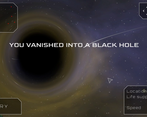
Great experience. Relaxing. It felt quite rewarding to finish all the levels. The music fits the game very well. The black hole effect is super cool. Maybe, tt would be better to hide or blur the ship when the user expands the minimap. Otherwise, seeing it in the center of the screen is confusing. You think it represents your position on the map, but it’s the tiny triangle you must look at at that moment.
You could also add a playback speed option.
Thanks for the praise !
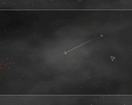
I see what you mean about spotting where the player is on the expanded map. I'll consider blurring the background / ship or something, for now I just added a blinking effect upon expanding the map, that should help a bit :
It's a great idea but the UI needs work. Dragging the cargo bar to to the bottom doesn't set it to 0% for some reason. Same issue with the heading. Also, I think there should be a way to speed up launches.
Oh, I see how this might be confusing playing on the computer but the heading and cargo are not actually sliders. You just swipe right/left or up/down anywhere on the screen to change their value. Its also purposefully kinda low on sensitivity so players can easily select precise values.
Thanks for playing :)
Really interesting game idea, nice UI. Destruction of the ship effect and black hole effect are great.
Thanks !
I Really liked this game. Relaxing, fun and interesting theme. Controls can be better for PC, but like dev said, its for mobile. All good.
Thanks for playing. Glad you liked it :)
the best thing is the blackhole distortion visuals, the gravity is very interesting, wonder if life support lasted longer we could do real crazy manouvers or end up in different paths for a future ... perhaps story mode?
great entry!
Thanks ! I'm not sure about story mode given the type of game it is. But who knows... In time maybe.
Superior Art, Nice Audio, Great Concept. I'm not sure what is wrong with gameplay, the ship is literally rotating toward the asteroids no matter what angle I am launching at... Maybe I misunderstood something.
Depends on the level and situation but try reducing your cargo to be less affected by gravity.
I'm aware the big thing missing right now is a tutorial and first levels with a more progressive difficulty. I'm working on it :)
Thanks for the feedback.
Very nice game and interesting concept. I like the gravity mechanic, I even made a game with the same idea. I went in a completely different direction, though, in case you want to see it: Astrobrawl (please forgive me for the self promotion :) ). I really liked the black hole effect, it’s very cool to see the ship stretching. I feel like the overall feel and speed of the game is good, but when you’re trying the same level for the 15th time adjusting your heading just a few degrees each time you kind of want to accelerate the gameplay a bit. At least I do. Maybe a way to speed up time could help.
Glad you liked it. I see your point about the game's speed. I'll think about increase it a tiny bit or maybe allow the player to accelerate time or something.
Thanks for the feedback !
Hello, I have liked your game and will give some ways that I think that the game could be improved.
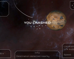
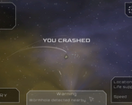
I find it annoying that my ship crashed, and I cannot immediately get back into the action / can't hit retry when the ship crashed for a small bit. It makes the game feel a bit sluggish, I felt like adding some people talking about Super Meat Boy and how they like the immediate respawn, but I can't find it, but it is important, no matter how small it may seem.
The Minimap should explain by itself that it can be enlarged by clicking on it. I would recommend having a plus button near the map. Some examples of this would be Example 1 (World of Warcraft) or Example 2 (Terraria).
You could have "cargo" be named "cargo / force of gravity" or something else more concise to make it more understandable.
Being able to see not just the direction and cargo of my last attempt, but maybe one or two more may be helpful because if the players changes the stats and then the outcome is worse, they can go back to the previous attempts' data and change it based off of that instead of trying to remember how they changed it.
Being able to know what direction or orbit the rocks are taking might be helpful, especially on the big levels where you do not see everything in one go. It's annoying to think you have the perfect plan to only be blind-sighted by a new rock because you never saw the rock and didn't know its orbit/direction of motion. Kerbal space program might have a good solution to look at. However, I think a better idea would be to have the moving rocks be arrows (on the Minimap) going in the direction they are going to move into with a small red line for the orbit the rock is in. If possible, if not, it should be fine.
P.S. I just noticed that you could access the enlarged Minimap while the ship was moving, and it would update in real-time. However, I still think my point still stands in my previous paragraph.
I wish you a nice day and I hope people enjoy your game.
Thanks for the detailed feedback. I'll definitely implement some of these suggestions in the near future.
The + / - buttons to zoom on the minimap is a good idea and shouldn't take long to implement.
As for having data about all the previous attempts, I actually had the idea from the start but decided to simplify things to avoid information overload. I might make a whole "Flight Logs" panel that you would have to turn on I think...
For the annoyance of not being able to retry right away, you're actually not the first person to mention that^^ I just pushed an update that makes the retry button always active.
Thanks for playing ;)
Really good concept, art and level design! I've always loved gravity games like this, and this one does it really well!
I love the effect on the black hole, very cool! Also satisfying lining up a shot and watching it go as planned. My favorite level was Sector A level 5. You do a good job of making each level a puzzle rather then randomly throwing out your ship.
- Issues and bugs:
Game did not quit in browser, I had to alt + f4
- feedback
The ship could move faster. Especially on long maps I felt myself getting bored waiting for the ship to fly.
With I could see farther. Maybe a button to just pan around the map before hand
Not sure what cargo does at all. I just stopped messing with it.
This is really cool, I could definitely see this on the app store with not much more work, just a bit more polish! Great job!
Hey, thanks for the feedback !
I'll see about the game not quitting in the browser. It's a common problem I think but at least it's quitting properly in Chrome for me.
I get your point about the game feeling too slow at time. I was going for a chill / contemplative atmosphere but I guess I could speed things up a bit.
About seing farther, the fullscale map (you can click on the minimap) was meant as a way for players to plan their route beyond what they could see. But letting the player explore the level freely before the launch is definitely an interesting idea :)
For the cargo, I understant it might not be obvious, it's making your ship heavier / lighter. I'm thinking the game needs a tutorial and at least one situation where they have to adjust it to succeed. Like being near a blackhole and needing to reach escape velocity by setting the cargo very low...
Thanks for playing !