Play game
Styx's itch.io pageResults
Criteria | Rank | Score* | Raw Score |
Fun/Engagement | #16 | 3.250 | 3.250 |
Overall | #28 | 3.203 | 3.203 |
Audio/Music | #30 | 3.063 | 3.063 |
Theme | #32 | 3.438 | 3.438 |
Art/Graphics | #38 | 3.063 | 3.063 |
Ranked from 16 ratings. Score is adjusted from raw score by the median number of ratings per game in the jam.
Judge feedback
Judge feedback is anonymous.
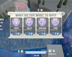
- Cool gameplay loop. Upgrades, better boat, profit.
Did you work alone, or as part of a group? (If in a group, list their names)
Marc, Mafesto87, Wirepaw
Disclose if you used any public domain assets or not.
Greek Temple asset pack, sound effects, galaxy img
Leave a comment
Log in with itch.io to leave a comment.
Comments
I like the game, but the soul spawning is 2 predictable they stay in the same place and the rings on the ground are 2 predictable, maybe add a cool-down timer for the wind dash but other then that this game is awsome.
This is a gorgeous game - love the art work here! The music was good, though a bit repetitive. The game play was good, though somewhat confusing on where you should and shouldn’t go. I went behind the portal area to see if there were any souls there and I started losing health for no apparent reason. Great game, tying in the theme of “guide” nicely.
I like almost everything about this game, its inclusion of the theme, the interface, the sounds and the gameplay.
good job!!
Guiding souls is smart take on the theme, the controls were nice and the upgrade system felt fun to use. One problem I had was that it was hard to tell where to go, and I got lost a few times because the background is sort of stationary. I'm glad that dying was not too punishing, very nice.
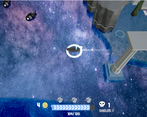
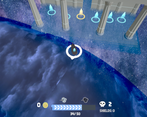
Agree that the world is confusing to navigate. In case you didn't know the circle around the ship functions as a compass with the pointy end always pointing to the home portal
Oh dang I didn't notice! That's my bad then lol.
I like the visuals(especially the UI) and take on the theme, though collision is weird and it's hard to tell where you are and where to go.
Another excellent take on the theme, Really like the visual style, and the music/sfx (even though they bugged a bit), needs more stuff to explore like the temple to the north, but overall a great submission for jam.
Fun game! I like how the theme was tied in, and the UI looked really clean!
Hello there!
Overall, it had a fantastic take on the theme. However, I have one criticism to offer: the collider of some obstacles was off, causing me to bump into invisible walls. Also, there was nothing stopping me from leaving the 'play' area, just like in my entry.
Feel free to leave some critical feedback.
I do want to know what immediately strikes you as akward/ clunky/ unintuitve etc.
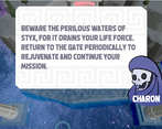
i mean how could i not like this game :) i like that you implemented a little dialogue explaining the story and the controls feel very responsive. very well done ! edit: and the picture of charon looks so nice :)
Thank you
Our games ended up quite differently after all :D
I love the concept and how you tied the theme together. The game is well balanced and enjoyable. Great job! ⛵
Thanks very kind.