Play game
Founded in Fellowship's itch.io pageResults
Criteria | Rank | Score* | Raw Score |
Innovation / Originality | #24 | 3.554 | 3.864 |
Graphics | #53 | 3.052 | 3.318 |
Game Design | #56 | 2.718 | 2.955 |
Theme | #60 | 2.885 | 3.136 |
Overall | #60 | 2.857 | 3.106 |
Sound / Music | #63 | 2.676 | 2.909 |
Gameplay / Fun | #73 | 2.258 | 2.455 |
Ranked from 22 ratings. Score is adjusted from raw score by the median number of ratings per game in the jam.
How does your game fit the theme?
You play as a friendly witch tasked with helping a town grow. Gameplay focuses on friendly conversations and actions.
Did you use any assets?
Nothing outside CC0 or Public Domain.
Leave a comment
Log in with itch.io to leave a comment.
Comments
That's one really feature-creeped. I need to play it thoroughly, but the scope is impressive.
I had the same 8x8 cursor problem, try to play your game on DMG, it is near impossible.
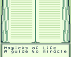
You are pushing the engine to the limit, that's always good. Would be great to have a cartridge with all the text dumps as an actual grimoire (also a copy protection!), the text is really dumpy even for that old-school type and an avid reader like me. I definitely WILL be inspired by your work for my very old idea for Spectrum or Pico, as GBC is too low res and AB does not have enough buttons for the flow, sadly
I appreciate the feedback! Thanks for the heads up on how the game looks on a DMG, I have to test on hardware to see what you mean.
That's a cool idea having the books printed with the cartridge. I was inspired by old 80s/90s point-and-click adventure games, so having some printed lore to use with the game fits right in!
I am flattered my game inspired you! I look forward to playing what you develop. :)
You also should do some tests with color mode, which way is better for the game feel. For example, you could tone sunrise in pink and sunset in orange, all that first-year art school tricks with the palette.
I would like to elaborate 8x8 thing, I use the 16x16 cursor now, and it is not helping sprite-count-wise, but I had the least frustration with triangle-ish 16x16 cursor. Not sure if hovering works this way, but you also could change the form of the cursor context-wise
I liked the atmosphere of the game, which seems quite ambitious to me! On the other hand, I don't think my English is good enough to enjoy the game over a long period of time! But I can see the hard work behind it, and I appreciate that you did it, bravo!
Thank you! Apologies for the text heavy game, I appreciate you taking the time to try it out!
Very intriguing and ambitious game for 7 days!
I might be echoing some previously made statements but I did feel a bit overwhelmed at the onset. The amount of things to remember became a bit daunting when I looked at your page for info, but it is an impressive entry nonetheless!
Thank you!
I really love the concept. Also I am a fan of complex games. So I was really looking forward to this game. However having to learn the right words to a spell for each season really put off to be honest. I felt like I would have to go through the whole bookshelf to read every book and create a long excel sheet to have all the information available to start having fun with this game. I feel like this makes things more complicated than they should be and makes the games less accessible than it could be. From what I saw, I can assume that the game mechanics are already complex enough. So I would probably omit this system. Also I would probably start with fewer locations to visit in the beginning to make sure players are not overwhelmed. That being said, I believe the game has a lot of potential and might be very intersting to play, once a player gets past the initial hurdles.
Thank you for the play and feedback! On the design, it was a constant back and forth for me trying to balance fun, depth, and do-ability in 7 days. With the seasonal spells, my aim was to keep the game fresh as you played by adding variety and some more of a puzzle to each season, but I can see how that ended up overloading the mechanic. Good point on the number of homes at the start too. Early on I did have an idea to increase the number of visit-able townsfolk (as well as the number of houses on the map) as the town grows, but didn't have time to implement for the Jam. By starting with fewer homes to visit and increasing them over time, I think that could help reduce beginner fatigue while also making it more rewarding when the town grows. Overall I think I need to reconsider and re-balance the mechanics so that the variety comes through in different and less overwhelming ways.
I do like the idea of changing seasons though. They might really help to keep things fresh. I am not sure whether you have already implemented that, but the probability of certain needs of the villagers could be changing according to the seasons. Like in spring people think more about finding love, while in summer/autumn the harvest is usually more important to them.
I could definitely see myself revisit the game in the future. And I am looking forward to seeing what kind of changes you are going to implement.
Very unique setting/aesthetics. I've always found it weird that there aren't more games that take place in old America.
Thanks! Agreed, especially outside the civil war and old west.
Could you please give some more information on the assets used?
*Music, Graphics, anything else?
Sure! Music was made during the jam by my brother in GBStudio.
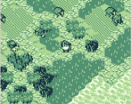
For the map, I recolored this tileset from OpenGameArt https://opengameart.org/content/basic-hex-tile-set-plus-16x16 and used it to make what you see.
Icons and other UI elements were also recolored CC0 OpenGameArt assets from a number of pages. For example, used these for some of the item and UI icons:
https://opengameart.org/content/16x16-food
https://opengameart.org/content/100-smiley-faces
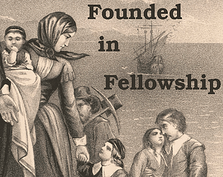
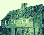
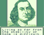
The other graphics (townsfolk portraits, potion bench. beach, forest, graveyard, house screens) are cropped, scaled, and color adjusted public domain photos and portrait paintings from wikicommons.
All the writing and scripting was done by myself.
Thank you for giving the details! :)
This is such an ambitious game. I wondered how you managed to do this all in 7 days! Granted I didn't get to finish it because it was pretty overwhelming to memorize all the spells and figuring out what offerings to use etc.
But having said that, this is such an awesome effort! I really enjoy management games and its so cool that you gave it a twist and set it in an era where witchcraft is frowned upon. The portraits really added to the historical feel too.
With more time, I'm sure you can add more elements to help the player along and the game's current difficulty won't feel so overwhelming. (suggestions: indicating which is YOUR home or separating Winter, Autumn, Spring and Summer instructions into different books)
Good job overall!
Thank you for the feedback and kind words. I am glad the depth came through! Agreed on the need for more to help the player along. Yours and others' feedback already has me thinking of ways to improve this for this title. :)
I think the core game mechanics have a lot of potential for an enjoyable game! I enjoy some of the cryptic aspects and it was cool to try and figure out what combinations work. The biggest opportunity for improvement is in the presentation (graphics) and UI. The map was hard to move around and keep track of everyone (though good idea with pressing B for the name), and then the act of casting spells was slow. Some rethinking/tooling in how the player could interact with the different aspects of the game, and also some kind of HUD for the seasons could make this really engaging. This took a lot of work to complete, great effort.
Thank you for the feedback and I am glad you enjoyed the mechanics! That's a fair point regarding graphics and UI, I have to revisit that. I wonder if adding more flavor to the magic that would reduce the text and introduce more symbols (eg, runes) for variety and to make that all be more distinct between spells/seasons/etc. I think a HUD would be a good improvement and a seasonal HUD is a great idea!
This is a quite interesting and original game idea. Its a little hard to wrap my head around whats going on though.
Appreciate the feedback! I was worried it may have ended up a bit more cryptic than I would have liked. I plan to add a better overall primer in the itch.io page description to help players get going.
It could also work to have an option or something ingame for a tutorial too, but I appreciate the intent to make it clear how to play
Agreed, an in-game tutorial would be helpful. In original design plans, I wanted to include a way to "call to your mom" as a tip mechanic, but that ended up getting scratched due to lack of time, but that could help as well. Thanks again for the feedback and thoughts!
This is an interesting game which I need to spend a bit more time with. It’s nice to see a point and click.
Thanks!