Play game
LOW BATTERY's itch.io pageResults
| Criteria | Rank | Score* | Raw Score |
| Gameplay / Fun | #4 | 3.857 | 3.857 |
| Game Design | #6 | 3.571 | 3.571 |
| Theme | #6 | 3.857 | 3.857 |
| Overall | #7 | 3.508 | 3.508 |
| Graphics | #14 | 3.476 | 3.476 |
| Innovation / Originality | #19 | 3.286 | 3.286 |
| Sound / Music | #21 | 3.000 | 3.000 |
Ranked from 21 ratings. Score is adjusted from raw score by the median number of ratings per game in the jam.
How does your game fit the theme?
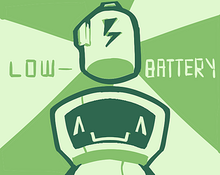
Players battery acts as a countdown timer; if the charge reaches 0, game over. It is also set in the future, as the robot player had been deactivated for eons.
Did you use any assets?
No.
Leave a comment
Log in with itch.io to leave a comment.


Comments
So you made it to the 7th place.
Let me know how I can contact you or send an e-mail to tronimal@web.de if you want me to send some free stickers to you! :)
Hey, hope it’s not too late! You can contact me at nieto.aidan.1@gmail.com about the stickers. It was fun participating!
Sorry, I wasn't logged in, for a few days.
It's absolutely not too late, I just sent you an e-mail! :)
Very fun playing through this one :)
The level design was very enjoyable, and I thought it was really neat when you began to remix the mechanics and combine them (for example, having to avoid the mushrooms when trying to swim to the bottom).
The art seemed to vary pretty drastically, in some cases it looked super polished and in other spots it felt a little tough for me to understand exactly what I was seeing. On a similar note, the first level or two has the battery HUD on a black background and I couldn't tell if the battery was full or not until seeing it against a white background. I think a white outline around the battery HUD would make it readable for any situation!
Overall, nice work, and well done for such a quick jam! I would love to play an expanded version as this was fun and has a lot of promise for more levels :D
The stage level design is pretty much perfect. The pacing is great for introducing one new mechanic per stage, but not only that they start to interact in unexpected ways. The bounce that helped you is now your enemy and so on.
It was all very well balanced by the timer mechanic.
Not sure if it was a glitch or a feature, but the spikey death balls let me pass if I had recently jumped on a mushroom.
I had this (passing through the spiky balls after the mushroom) happen with me as well.
really cute! I really enjoyed it! I hope you make more! It reminded me of Chibi Robo if it would’ve been originally released on the GB
This was fun! Nice little platformer. Original artwork and music, I like your style. You should definitely further expand and polish this one. Made me want to play more of it.
A very fun game, I like it.
i was mixed on this one. on one hand, the character sprite and the overworld map look really nice, but on the other hand, the levels themselves look like they were thrown together without so much as a tileset. it feels like a completely different game than what i had expected given the presentation before hand, which is a shame. it controlled nicely though, and the constant pressure of needing to recharge through the stage is a good use of the time theming. the music left a lot to be desired though. very all over the place with not much consistency. maybe if this becomes a full flushed out game those short comings could be improved? i think it was fun despite them.
this concludes my analysis of this entry.
if not for "Fixing my Heart" existing first, this one couldve been my first [hp slowly drains, gotta go fast] game in that genre on gb studio. i like the idea of it being a robot on low bat tho, cute pic too [^ _ ^]
This was great fun to play. I'll add some feedback and say that the mushrooms seem let you skip taking damage from the spiky balls.
Can't rate, but pretty fun!
I enjoyed that, wish there were more levels
I enjoyed that, wish there were more levels