Wow, first of all, I LOVED the sound design of a game, especially if it was intentional to use the 3D sounds for each ear. I think if there was additionally a calm, but mysterious music in the background, then the game would be more dynamic and brilliant. But overall, one thing that I didn't like is the time required for the respawn, maybe you can decrease the span between dying and respawning? Good game, though, keep working on it!
Play game
Time Quest's itch.io pageResults
| Criteria | Rank | Score* | Raw Score |
| Visuals | #16 | 4.250 | 4.250 |
| Audio | #17 | 3.800 | 3.800 |
| Overall | #24 | 3.850 | 3.850 |
| Mood | #31 | 3.850 | 3.850 |
| Gameplay | #50 | 3.500 | 3.500 |
Ranked from 20 ratings. Score is adjusted from raw score by the median number of ratings per game in the jam.
Engine
Source
https://drive.google.com/drive/folders/1l99Vx7Tv8WEvDb__QG9SxJxV-IWWJkaA?usp=sharing
Comments
The 3D sound was intentional (but I had some problems with it, I had to not push it or sounds would disappear, I think it needs a bit of polishing). Thanks for the comments about the sound. Originally I wanted to add music to the levels. In fact I had half-setup a system where the background music would trigger just before the tricky part of each level. :) But totally ran out of time.
DO NOT change the controlls for me floaty controlls are the best aspext of the game. The only thing missing to perfection is simple music at the background, not only environment sounds.
Also if you have time, try my game
Hi! I wanted to come back to this because the visuals looked amazing- I couldn't manage to fly at first, lol! It's wonderful, it just became too hard right at the 3rd level (at least for me ) because like some others said, I found it very hard to control the flying. Try to fix that and you'll have an amazing game on your hands! P.S: I also like how you integrated time by adding stars we could obtain by sticking to a time limit!
Thanks Irene! Yes, I'm thinking about what to do about it. Maybe even just slowing down the turning (or making it configurable) would help. Or having several lives before you die. Or making only parts of the level obstacles, and the rest you can touch safely. But I'm thinking maybe the best would be to change the input system completely, just not sure how, it potentially changes gameplay completely. Thank-you (and everyone) for your feedback, this is super helpful. :)
This is some next level flabby bird right here! :D it was fun trying to move around like that.
Nice level design, it has some interesting challenges. I like the way it looks, especially the particle effects - very magical :D
At some angles it was a little hard to see, where the boundaries were. Probably because it's 3D. I died a lot at the end of the key-level, because I kept bumping into the ceiling. Or maybe I'm just too noob, heh :)
But I really like the concept, it has a ton of potential. Btw, the star rating is a nice touch too!
I don't know whats going on but all my toon does is somersaults.
Movement appears to be broken.
2nd attempt - realised you have to keep hitting space rather than just hold it down.
I really don't like this way of moving.
This game could be even greater if the gameplay mechanic was a bit different. It doesn't have to emulate physics so much the way it does now. You rotate the character left right, upside down even... too much! and why does the character die if they touch the surfaces...? it seems out of context.
The feel, music, art all look great. But under different mechanic this would make it a very good platformer. it could still be skills based but this is beyond skill... you need flightschool skills to navigate the damn thing! :)
Thanks CodingRook! Ok, one more vote on the 'too bloody hard' front, noted. :) Interestingly it was even harder before the launch version, but after loosing a friend or two to it, I decided to ease a bit in a few places... I guess not enough! You're probably right, a different approach to movement and a less unforgiving environment might make the game more successful.
I really enjoyed this game. The level designs, ambience, and subtle SFX and VFX just made this game pop. And the lighting is beautiful. And just when I thought level 8 was hard, I then got to level 10's top left spike, haha! And I stopped there.
I have to to admit I sat on the first screen for a while expecting to load to the next scene, then realised that I had to navigate to the hole. It took a bit to get use the the controls. The right/left controls are very sensitvie or maybe i'm heavy handed, but I can see how that fits in the game mechanics.
Guiding the character through the 3D overlay maze was a bit tough in a couple instances. It was hard to judge some gaps and I found myself almost skewered a couple times ony to realise the spike wasn't in the background.
Maybe add a protection bubble for level 8 and 10. And maybe the square could be a slow time for environment, I found myself avoiding that buff otherwise.
Overall a great tidy game! I can see this on mobile or even console, or at least with a console controller.
Thanks Dubhan!
The sitting on the first screen I thought I had covered: after a number of seconds (I think 30), a message suggesting to go into the hole pops up (it actually says whole, which I found out after release and was too lazy to fix). But it might take to long to pop up. I had this same comment from 2 other people, so obviously an issue to fix/adjust.
Same with the slow powerup, multiple people say that doesn't work well. That was my gameplay element for the jam's theme, but it looks like it didn't work so well. I'll keep that in mind for a future version.
Glad you enjoyed the game, and thanks for the detailed feedback!
This seriously looks AMAZING but I've had so much trouble with flying! Help me Obi Wan! I want to play and see the awesome levels!
A flappy bird with narrative 3d game; but doesn't make you want to throw your computer into the incinerator. The music and the level design was kind of elegant to keep your mood calm, but the game was still hard and challenging. It's very skill based. But it helps to know that there's a god mode and level skip if you find it too hard. I managed to clear level 5, but then on, I skipped the levels to reach the final level. Some criticism I have is that it's quite hard to know the depth of narrow areas to know how far you can touch the walls, without actually dying. It's a problem with a 3d perspective but if a player played enough 3d games, he might be able to get some intuition(It was a bit hard for me as I don't play much 3d games). The art and music was equally good.
One of the best I've played so far!! Great level design and difficulty curve (loved the level where you got the key and then the whole level changed and level 12 rush to safety under the lowering caves)
Few things that got me really frustrated and would have probably quit if I weren't a perfectionist like I am :D
1) The goal area trigger/collider could be a bit bigger, since at least when trying to get 3 starts you have to speed up in every possible area and speeding up to the goal after a perfect run and then only to hit a small wall when you think the goal should have already been there, was very annoying.
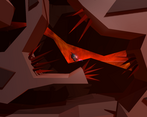
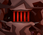
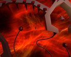
2) Although I loved your level design and the look of the levels, some of the walls were really hard to see which part kills you and which part lets you go "through" it. Especially level 12 was annoying with the spikes at the end almost not visible and the red tube thingy which was cool looking, was set that way that in end half of the map you thought that it was just on the background and then it hit you...
3) This is more of a personal thing, but I didn't like the time freeze power ups, I only used them in level 12, where you pretty much have to use it, otherwise I just skipped them completely :D So hard to control when it is slowed. Also you should put a music or something on the power up, so that you know when it is about to end. I had this happen to me few times that I was vigorously pressing space and then it got back to normal time and I hit the walls :D
But overall I would say that it is an amazing game, maybe spice up the end scene a bit more, to make us feel more rewarded at the end, since I took maybe like 30 tries to make it on the last level :D
Thanks! This is really good feedback. #1 and #3 I totally agree, noted for a future version. I like 'vigorously pressing scape', maybe that should go into the game tagline: "Vigorously press space through 12 challenging levels to recover the Time Crystal" ;)
#2 I actually quite like! (in level 12). I was deliberately aiming at using the fact that the game is 3D, despite movement being just 2D. It's designed to make the player think: "where do I have to go now?". But if it's annoying, then it's annoying... let's see if I get more feedback on that. Maybe there's a way to make it more obvious.
Yes, I agree that the end scene could be cooler. That's partly lack of time, partly lack of 3D modelling skills. ;)
One question: did you do level 10 without the slow powerups? That's some fine skill...
You're welcome, I really enjoyed your game so wanted to give a bit longer feedback! :)
Yeah I only used slow powerup on the last one where the rotating blades were just way too fast. I thought that otherwise they made the game harder :D
I agree with your comment on #2 that I like the fact that it is 3D and not just basic 2D, but just little fine tuning that makes it a bit clearer for the player, since it was quite frustrating after multiple tries and then hitting something you thought was not on the same level, or maybe I just can't tell things apart :D haha.



Leave a comment
Log in with itch.io to leave a comment.