Play game
A Walk Through Time's itch.io pageResults
| Criteria | Rank | Score* | Raw Score |
| Visuals | #91 | 3.429 | 3.429 |
| Gameplay | #108 | 2.929 | 2.929 |
| Overall | #124 | 2.839 | 2.839 |
| Mood | #133 | 2.714 | 2.714 |
| Audio | #148 | 2.286 | 2.286 |
Ranked from 14 ratings. Score is adjusted from raw score by the median number of ratings per game in the jam.
Engine
Unreal
Leave a comment
Log in with itch.io to leave a comment.


Comments
Great work!
Like some of the others stated, my PC also is not very smooth when playing :(
I also found it a bit confusing at first what to do but after figuring it out, it was good :)
Thanks for the feedback!
I am working on performance, unfortunately I was informed about the performance not long ago and due to working full time so it's hard to get quick fixes. But, I know the part of the problem is to do with the lighting originally being set to moveable, and correcting this hasn't just straight up worked, so I've been trying to understand what to do (since we haven't really learnt about lighting before this)
Also away things might not being as clear, are you able to elaborate on what was confusing? We're in the process of solidifying the dialogue and such since we're change it for voice. But having a better understanding of what people are struggling with will help shape the rework.
Its awesome that you are still working on it and improving it. Keep it up!
The confusing bit for me was after unlocking the first door, I did not press the scanner, and I just went straight to the main room, picked up the dinosaur and brought it back onto the scanner and pressed the button, and then the skull disappeared and it said "the item is 30 billion years old" and the timer started. To me it felt like it was just telling me about the item I just scanned and did not know what the timer was for. After seeing the skull had re-spawned and repeating this process twice, I figured "oh I am supposed to press the button and then collect what it is describing within the time".
Maybe keeping that main door locked until the player presses the button and the timer has started will help? That is only the first suggestion that comes to mind; there might be better ways to help guide the process.
Anyway, I hope this feedback helps!
"To me it felt like it was just telling me about the item I just scanned and did not know what the timer was for." This is great! Because this points out a couple of things. 1. the skill is the first thing you see so I can see that it looked like the scan result (maybe if it was more hidden it'd been more obvious if you scanned a really different item) 2. It highlights the initial idea to have players look around for items is misleading to the player, what we were going for was to have players look around to get a feel for item locations but a lot of people just went to pick up items and now that I know that flow it makes a lot more sense to me why people were getting confused. Even though the dialogue says to check the scanner pc again that's taken in a different perspective.
Your idea would have been perfect! However, since game jam is completed, I'm now going to look at reworking the way the game is presented to be better because I have time. The main change entails removing the timer and focusing more on self exploration with voice audio so it becomes more immersive. :)
Thanks a lot for clarifying what was bugging me with the confusion haha, it really does make sense now though. :D
interesting and unique game. I feel the game lack feedback and sound, which would have added to the experience. It would have help to have a glow or some sort on items that the player needs when they are close and looking at them. Also, it was quite difficult to understand what the goal of the game, which added to my frustration but this game has potential.
Thanks for the feedback. We're aware of game feedback sounds which I have added for the next update, however, I've wanted to fix performance before updating.
Regarding item indication, we are going to have the cursor indicate what *can* be picked up. But not which item to get because the player is supposed to find the right items based on history (hence the clues to give player some direction)
We are going to improve the dialogue in some areas to make it *clearer* but do you still not understand the goal of the game? Or did it become clearer as you played? since he do have dialogue that walks you through what is going on, did it not make sense to you? (Just trying to understand what was confusing)
After playing for a bit i understood what i was suppose to do but that was becuase of trial and error and context clues . The Dialog did make sense, maybe its just me being silly and not being very perceptive
Sorry for the delay, not sure why but I didn't get notified of the response.
If others have the same perceptive issues, then it's not you being silly but rather it not being 100% clear :) - At least the dialog make sense. Since the game jam has just concluded I'm not looking more closely at the design flow to provide clarity so hopefully it's more fluid to understand what is expected.
Thanks for the feedback!
I red the comments but still didn't understand how to put a card on green area. I found the area, but then didn't know what to do
The mechanic has changed since the comments you are reading. Now you just interact (Press E) on the PC you used to regain power once you've picked up the card. (It's also stated in the dialogue)
This was quite an enjoyable game, well done! I really liked the idea, but felt it could have used a bit more audio, maybe some music? Also it didn't run very well, I have a pretty decent pc and the framerate dipped into the 20s quite a few times.
Thanks for playing and the feedback :D.
I have a Ryzen 3700x and a Radeon rx5700 with 16gb ram. You're right that it definitely seems to be where there are a more lights. The first room is particularly bad. I'm happy to give it another go for you though :)
Wow you put a lot of work into this one . ill be adding to my collection well done.
Thank you, we're glad you enjoyed it and appreciate the recognition! :)
My first time trying it just now, I nearly ignored this one because I didn't find the title screenshot interesting, what a mistake that would have been.
One of the best games of the jam, just so interesting and so much work put into the details, I'm very impressed and I will play this through to the end.
Thank you so much mate!
I can respect why you thought that and agree honestly. The title screenshot being bland is attested to one of our weaknesses in terms of eye catching/marketing presentation since we're both programmers. I wasn't sure what to put for it since I hadn't prepared for it when I uploaded the game initially, and I didn't just want to put the main menu, so I tried to use the main menu backdrop but obviously without playing the game you wouldn't know what it was haha!
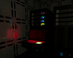
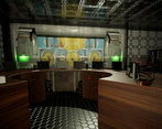
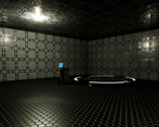
It's why I added some extra screenshots when I updated in hopes if people see the dashboard it's got more references.
We're still not sure 100% what would make the title image be more appealing. I might have to look at reference game title images. Do you have any ideas about what images are good references? OR possibly ideas to improve the image/dashboard overall?
And I sincerely appreciate your feedback, it means our effort in the past couple of days has been worthwhile. Part of me just hopes people that might have tried before and had it be a lack luster experience see it's updated and retry it. :)
I'm no expert on title images but maybe look at all the others and see what you like.
cheers :)
Liked the visuals but it'd be good if it had some visual feedback for the pad too. Kindda hard to find. Keep me updated o/
Hey, the visual pad was the area *glowing* green on the PC, you were supposed to wave the card over the area.
However, new update is LIVE (finally haha)! Should be A LOT better, hopefully. So let me know how you go :D
Woow, it certainly got a lot better! Good job taking the feedbacks and implementing them to make your game better.
Show's how much love you are still putting in your game! Congratz! o/
Thank you so much, mate! We appreciate all the feedback. Glad the effort shines through :D
I couldn't get out of the starting room because the key card kept getting stuck inside the desk when I tried to pick it up. I really wanted to see what was going on though!
Yeah, we've done a rework and going to upload an update sometime tonight (for us) after work.
Currently working so it's a bit difficult to bang out a solid fix quickly.
I'm expecting the rework to be A LOT more enjoyable. We've taken feedback and even we find it better to experience! ^.^
Sorry for the issues!
Let me know when you upload the new version so I can check it out!
The update is now live! It should be A LOT better since we made a lot of improvements. Hope you have a better experience, let me know how you go :)
That worked much better! I hate to admit it, but I got stumped on the last item for a little bit, haha. Good job!
Awesome!! I'm glad to hear it!
Got to have a good challenge in there somewhere ;P haha - When we have more items to pick up we are planning on having items both laying around and integrated into the scene just to make it interesting and hence it helps encapsulate our vision a bit more.
An improvement we are considering for a future update might be for the cursor/crosshair changing icon to indicate something can be interact and can be picked up as a QoL but will see how we go after adding more content and how it all fits together to be the most fun!
Thank you for playing!!
Nice game, great visuals. I couldn't figure out, though, where the heck this "pad" is the protagonist was talking about. Pretty sure I found the key card at the desk. Some sort of visual highlight of the pad would really help. Would love to see more of your game!
Thanks! Sorry for the delayed response time was just working hard (between updating this and actual work haha). The pad was glowing green on the pc. You were supposed to just wave the card on top of the area.
But, given multiple people were getting confused and the mechanic was buggy we changed it up a bit.
Update is LIVEEEE!! Should be A LOT better. Hopefully. Let me know how you go! :D
I see, then I did the right thing but it simply wasn't working becasue of the bug. It worked now in the new version however and the game is quite sophisticated, only lacking some polish. I'm very impressed!
One thing that's a bit strange though, I got the same scanner message for all the items I put on there, something about Ancient History and that the item is 30 million years old, even the magazine from the rack.... I guess it's not supposed to be like that? :D
Thank you for the feedback overall :D - helped drive the improvements!
The perspective might have been slightly misleading. What kind of polish do you feel is lacking? Just so we know how it can be improved.
That dialogue message you are seeing is the task you have to complete in the time frame. If you run out of time you have to redo that task. Each item has a description you have to find the right one per scan :)
There should be a dialogue message saying that the item didn't match, is this happening for you when you try the items?
Hi, thank you for your submission to our jam. The rules state you must also include your project files (source and everything else needed to compile the game locally). Please edit your submission to include a zip file with your source or else I will unfortunately have to delete this entry.
All good, I only submitted it without to avoid forgetting before submission time ran out. Since I was in the process of packing the source into a zip to post to the dash. haha :)