Play game
Bone Yard's itch.io pageResults
| Criteria | Rank | Score* | Raw Score |
| Interpretation of the Secondary Theme | #105 | 4.004 | 4.182 |
| Soundtrack/SFX | #125 | 3.395 | 3.545 |
| Gameplay | #132 | 3.220 | 3.364 |
| Overall | #186 | 3.307 | 3.455 |
| Graphics | #218 | 3.307 | 3.455 |
| Gameboy Soul | #316 | 2.611 | 2.727 |
Ranked from 11 ratings. Score is adjusted from raw score by the median number of ratings per game in the jam.
How does your game meet GBJam's theme?
Dead bones in a four-color palette, what could be more spooky?
Leave a comment
Log in with itch.io to leave a comment.


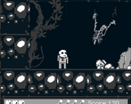
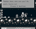
Comments
Very nice!
Thank you!
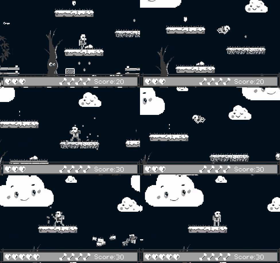
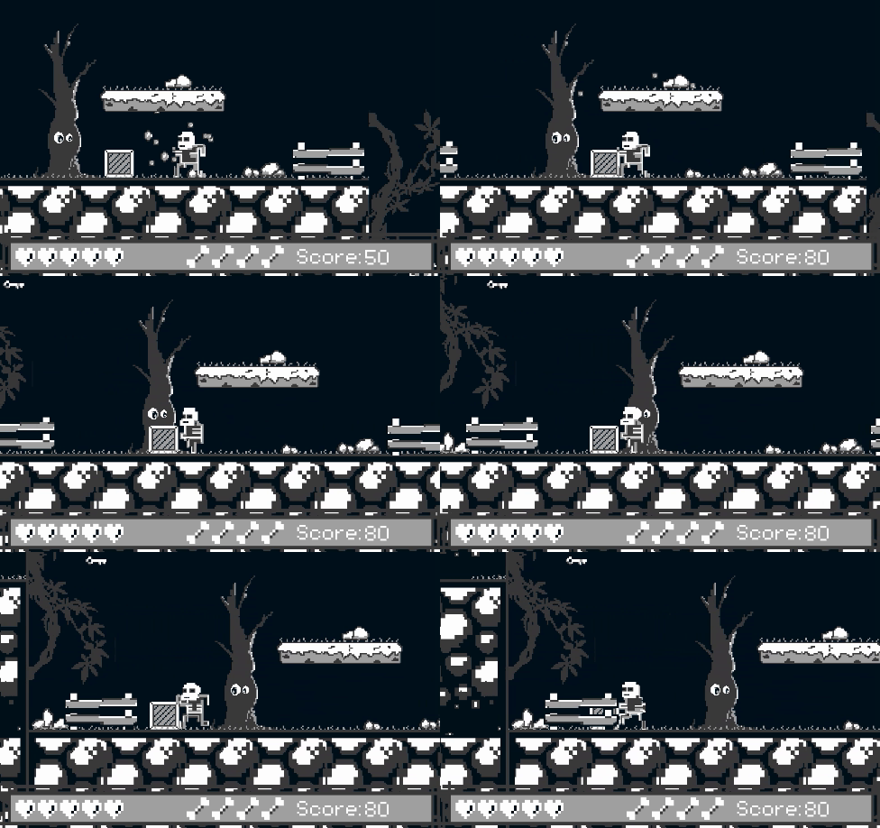
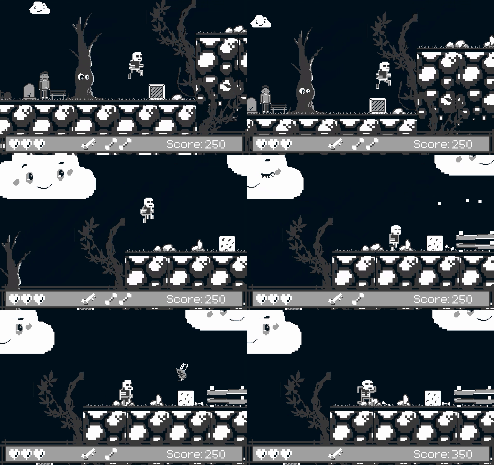
Most of the things that felt like highlights (the rotating sprites, the charming tree, the winking cloud, etc) seemed to violate the 160x144 screen size constraint. In this case, the screen size for the game was 640x576, but both the rotating sprites and several static sprites treated each pixel as a drawable unit, instead of each 4x4 block as a drawable unit. In short, everything looks so detailed precisely because the game treats the window as the full 640x576, rather than appropriately upscaling a 160x144 window; and the loss of fidelity to reduce it to that size would thwart the graphical prowess on display here.
Outside of the jam, the screen size constraint no longer plagues you, so I think you could take this and run in a non-GB direction with it easily.
The limited projectile mechanic seemed interesting, and makes using them be something thought through rather than wantonly thrown at all times. The physics are only a little janky, and the sprites that did follow the 160x144 screen constraint are identifiable and competent.
Thank you for your comment! I didn't quite understand you, you first scolded me and then praised me)) Did I do something wrong?
I drew all the sprites adhering to the screen size restrictions of 160x144 pixels, the game was created in a 160x144 pixel window, only when compiling I increased the screen resolution by 6 times, which seems to be allowed by the jam rules, but the original images remained at the same resolution.
I apologize in advance if I did something wrong)) I am an amateur and far from an artist, I just like pixel games, that's why I participate here and I would not compete with a professional like you in pixel art)
I'm doing a little more digging, and I think your engine is applying rotation after upscaling, for one. Take for example, the skeleton in shackles in the background of this screenshot on your page.
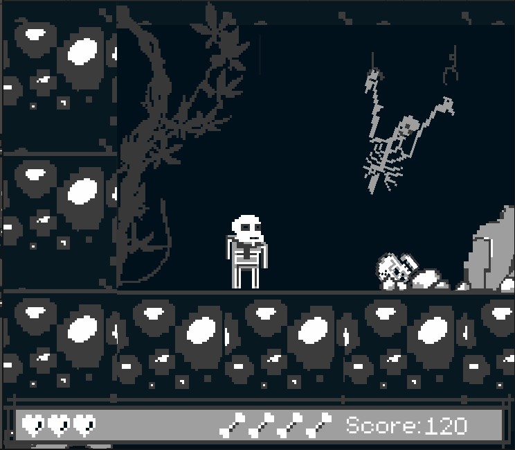
I can see the blockiness of the sprite, but it appears to have been rotated to simulate having a broken manacle. As a result, the sprite stops aligning with the 4x4 blocks needed for an upscale, If we zoom in, it looks like this.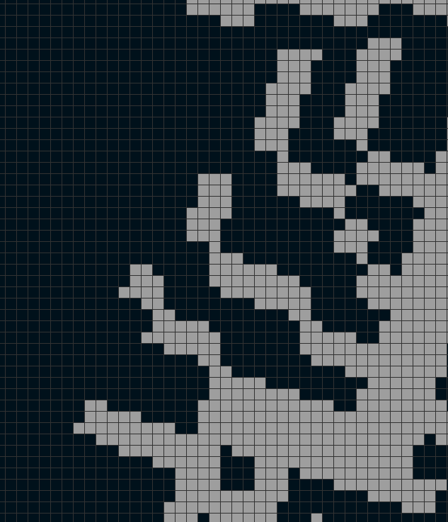
See how the 4x4 pixel blocks have broken down? There's a lot of angles that adjust one pixel at a time, meaning the sprite is treating the 640x576 output window as unscaled.
Hope this clarifies a little. I have a bad habit of being too verbose and opaque when trying to explain things.
Now I seem to understand you, thank you for paying attention to this, I don't know why this can happen, because I never thought about it, the only thing I did during the development of the project was that I turned off anti-aliasing for sprites so that the picture would not break into shades, observing the palette. In the next jam on GB I will try to pay attention to this))
The skeleton is indeed different from the one in Photoshop. That is, sprites are smoothed by default in my engine, I turn off smoothing and the picture starts to split into a palette, then the main color is taken, and all the others are deleted, because of this, a torn image is obtained. That is, the conclusion is that I do not import sprites correctly or my screen resolution seems to me to be erroneously correct.
Loved the physics on this; the jump especially was very satisfying to me! I did get caught up on some things though, so maybe some changes to collision boxes could be good. This was super polished though and I loved the visuals. Awesome work and congrats on completing the jam!
The art and music were awesome. I never successfully hit anything with thrown bones. Like someone else said, it'd be nice to have the option to jump on enemies. The physics were a bit off, (physics aren't easy). When I hit a corner of a platform the character would get stuck in a roll and just hang there. All in all, it's a cute game and it'd be interesting to see what you could do with it with more time.
Nice polished game! I loved the art style
Nice atmosphere! Aiming the bone throws was quite a challenge.
Unity physics can be tricky to work with. You could use raycasts to detect walls and stop applying forces forward, that might prevent you getting stuck on walls.
Cool entry, congrats!
Cool game, loved the spooky art, very whimsical yet totally fits the spooky theme. I would have loved to be able to Goomba stomp the enemies! I also had an issue with sticking to walls while jumping, but all in all it was fun. Thanks for making this!