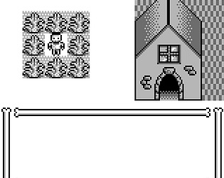
Well-polished "point-and-click" (well, a menu instead of using the mouse). Didn't go particularly far, but it seemed mechanically sound. Art was good, the sound effects were on-point.
For whatever reason, the menu options would change in weird ways when you tried to go a direction you couldn't, leading to choosing an unintended option.
SilverNexus
Creator of
Recent community posts
All around good game. The controls felt good, the soundtrack was fitting, the sound effects were on-point.
The fact it took so long to break things open added to the mood of the game.
The one time one of the monsters pursued me, I hid in a locker and they just waited outside. I don't know if they don't have a wander mode for idling or if they actually have object permanence, but it mechanically made the lockers unhelpful.
Couldn't get past the pong, for whatever reason pong against myself was too disorienting to score above about 350.
The music is decent, the graphics look nice, but would not translate well to a GameBoy screen. The if we exclude the weird JPEG-like background noise, I count six colors easily. The sprites (for Pong) are built for what seems to be around a 250-300 pixel wide screen area. (There's about 4-5x upscaling into a 1000+-pixel-wide screen area.) And there's a bit of anti-aliasing in there to boot.
Functionally, I'd prefer having the option to choose minigames instead of having to beat one to play another one.
The game was mechanically sound, I will give it that. Some QoL, rendering, and sprite tweaks and it'd be right there with a GameBoy feel.
Charming little game. The realistic cat sound was a nice touch.
I died a little on the inside when I saw Alt was a control (I detailed on another game how my Window Manager gets overexcited when I press Alt and a direction and simulates a continually-pressed key). I desperately searched for an alternate binding, but grudgingly accepted my fate when I found there were none.
The jump is a little stiff, but otherwise seemed decent.
I didn't get particularly far, but it seemed the amount of cats was intentionally ludicrous.
I'm not sold on the color palette in use here, tbh, but it looks like you made do with it as best you could.
Story-wise, I can only conclude that the player is a villain. An indigenous revolt against a colonizer? The colonizer is the villain there. You are sent with the express purpose to quell the rebellion, making you an accessory to the colonizer. Not sure what the sinister thing beyond that is, since I couldn't find the second key in town, but from what I got of the story you do not play a hero. What better horror than realizing you are the baddie, no?
Music is spooky, and loops well. The lack of sound effects made the game feel like it was missing something though.
In all, a solid entry.
If you fullscreen the window, the upscaling that is done by the engine anti-aliases the render, making it very blurry.
Additionally the Amazing Ghost text on the title screen seems to be drawn to the 320x288 upscaled window as if that was the screen size, rather than drawn to a 160x144 window and upscaled later. Once you enter the gameplay, though, everything is the right scale.
Taking corners is very unforgiving, and the moving enemies will get you if you get stuck even briefly on a corner, making for a frustrating experience. With some forgiveness on those corners, it becomes a fairly enjoyable little game. It combines the puzzle solving of figuring out where you can reach to open up another section with the reflexive play to avoid the moving enemies.
The controls on the page mentioned something about shooting black crystals? I didn't go particularly far, but I didn't seem to fire anything when pressing the specified key. I'm guessing that wasn't implemented in time for the jam?
The momentum of the dive is janky -- if you hold down a direction key, the swallow careens into the side of the screen, suddenly accelerating in the direction pressed very quickly.
The viewport is really small; if you had any post-process upscaling for it, it didn't work.
The death sound got rather grating very quickly, since it is rather difficult to not hit every obstacle on the way down.
It is, however, a functioning game, which is more than I managed to make.
The number font in the corners and the lighting effect absolutely disregard the 160x144 and 4-color rules, but it appeared the rest followed it well.
I quickly got annoyed that running into a wall blocked movement parallel to a wall as well. You had to back up a step to move any other direction.
There seemed to be something to collect while avoiding the weird monster thing, but it was unclear to me what or how much of the things to collect.
I found the puzzles to be on the simple side, once I figured out the doorway wasn't a waterfall when the door opened and I wasn't carrying a soul fire.
Spritework is solid, though for some reason your game is rendering a full spread of grayscale rather than 4 colors. I took a screenshot and it indexed to about 200 colors, and they smoothly went from dark to light gray. So, that seems to be a bug there. (EDIT: I re-checked the screenshot and all the colors are from antialiasing on the text, and a slightly darker dark gray around the key count. The rest seems to be working right.)
The lack of sound effects and music was a detriment, but you already knew that, given the statement of the game page.
Ended up playing until the room where the platform goes slowly around the room, and decided I was too impatient to wait it out.
The extra-blocky graphics for some of the text game more Atari 2600 vibes than GB vibes. It also made the text very hard to read.
The browser version was scaled at a factor of 2.5x, which made for some janky distortion in the sprites. It properly nearest-neighbor scaled from 160x144, but it wasn't a clean scale across the screen due to scaling a non-integer factor.
The controls for which direction the up/down pumpkins would throw seemed inconsistent, or at least unintuitive. A better approach would probably have been to make one pumpkin on A, the other on B, and choose your direction with the D-pad.
The gameplay was simple, though the difficulty seemed to come from trying to throw lanterns in the correct direction. With some more polish, I think this could have been a more enjoyable experience.
The horror of only ever being asked about the number of colors allowed, despite that being very directly addressed in the jam rules.
If Discord existed in the GameBoy era, this would absolutely pass as an in-era parody of GameBoy games, instead of a parody of moderating the jam (and retrospective parody of GB games). Though I suppose replacing Discord with IRC would accomplish most of that. But I digress.
The game is well-crafted, actually managed to get Unity to behave and output 4 colors, and has a catchy soundtrack. The only question that seems to come up is the colors one, but considering the number of jam entries I've spotted that got tripped up by their engine in the color or resolution departments, I think I understand why its so common here.
The amount of sprite glitching made it extremely hard to tell when an enemy blew up or not. Projectiles are hard to dodge, especially once bosses start throwing out homing projectiles.
I kept counting 5 colors on-screen, despite it sounding like you used GB Studio for this. Not sure how that happened.
Though the ring section made me go "Oh no, is this Superman 64?" for a second, only for the game to go a completely different direction afterward. Kind of a funny little bait and switch there.
Definitely noticed some spelling errors, as others have mentioned.
The green background for the text box during parts of the story had lackluster contrast with the text, making reading the story more difficult than it should have been.
With some polish, this could be a decent game. But it's current state was a bit underwhelming.
One thing worth fixing as you continue forward with developing is the viewport.
The game opens in fullscreen, and deviates from the aspect ratio of the GB screen, as well as insufficiently upscales the imagery. It seems to be the case that it was not designed with this in mind, since I can see part of the space between maps when I load in. Incidentally, the space between maps is a different color from your main palette colors.
Looking forward to future, more complete builds. I want to go on this adventure as the (incredibly speedy) cat.
Very simple mechanically.
The little monsters looked like they have no thoughts in those heads of theirs and I love themb.
Rotations were, by what I could tell, handled in a ways that stayed true to our dimensions for a GB screen. Though I'm not fully sure if the duck was supposed to fly farther if you were hit multiple times in succession or not, it was funny to watch them spin away.
The music was a jam, though it sounded more like what I'd expect from a DOS game (or maybe a GBA game) than a GB game. Very 16-bit feel. One of the instruments in the non-boss section sounded exactly like something I worked with when I was using OpenMPT a few years ago. I think it was a sawtooth wave? It's been a little bit. Though, it's worth noting that were weren't required per jam rules to make 8-bit music, so I don't count that against the soundtrack.
The pacing was on the slow side, but the music was jamming enough that really didn't bother me.
I think the boss wasn't causing me to drop ducks and just pushed me around? I mostly dodged stuff and the couple times I failed to I didn't lose the duck.
In all, a good, albeit goofy, entry.
The follower was always somewhere else when I needed them, it felt like. The game seemed to expect I'd need them, but they were often lagging behind so much that I couldn't use them.
The float jump was nice, just the right amount of floaty to it. The sound effects were competent, albeit a little repetitive without background music to complement them. The platforming felt intuitive and forgiving, at least as far as I could get before dying to jumping on too many monsters.
In all, a solid entry.
A well-rounded entry. Music is solid, and doesn't do anything to make it obvious when it loops, so it kinda fades into the background a bit. The graphics are distinct, recognizeable, and detailed.
This feels like something that could have been on the GameBoy, although it appears to be a re-engineering (and improvement, by what I could tell) of the version of Ghostle Luife made at a different point.
The biggest issue is that while rotating, the tile sprite treats the upscaled screen as if it were not upscaled, making for a smoother rotation than would be possible on a 160x144 screen. While they are stationary, they follow the proper alignment, just not when they're rotating.
Huh. If I unfocus the window to do anything else for a second, and then come back, all of the controls stop working.
And it performs awful on my 4-year-old laptop. The further I go, the more often and longer the pauses in responsiveness are. I assume it's having to garbage collect more often or something. My computer heats up like I'm running a game from like 2018, and I'm capping 4 CPU cores when it pauses like that.
Took some screenshots to make sure scaling was right (it was) and found out Unity is being stinky and giving you four visually distinct colors, but with multiple different versions of each color. It reduces to about 30-ish colors in a palette, even though it visually looks like four. Even from one color variant to the next, it looks the same, but they have slightly different hex values. It seems these slight color variations are mostly on the edges of objects and such.
(TBH I'm noticing a pattern where Unity keeps tripping up people trying to adhere to the color and screen size requirements. This is relatively minor, since it still looks like 4 colors, but something to tweak if you move forward with developing this.)
The atmosphere is spooky and unsettling, tho. Really nails that feel that something is off (aside from the corpses and rambling of who I can only assume was their killer). The minimal background music adds to the mood. The visuals look good, too. The slow drip of information as you progress though the same hallway again and again is perfect for the mood this sets.
It seems dubious this would run at any usable framerate on a GameBoy, though, even with better optimized code.
I kept thinking floors were walls for some reason, especially when the floor was different around the edge of a room. Kept throwing me for a loop.
I'm not a fan of the tank controls in a top-down environment, either.
The soundscaping was on-point, and the art was competent. The limited light and dynamic shadows were a nice touch. In all, a solid entry.
I ran out of bullets, ran away, stepped into a corner, and the game softlocked itself. Just, like, it stopped accepting inputs and the monsters chasing me stopped attacking.
The mechanics are there, but the monsters you encounter are quite tanky for having only eight bullets. I did not see a way to reload the gun, which seemed odd to me. Considering the monsters block the space they stand on, it's rather difficult to dodge around them, which I can only assume the game was trying to encourage.
The controls worked well, despite firing being a two-button thing. Makes it hard to accidentally fire a shot you didn't mean to. The strafing is a nice touch, too.
I must admit the monsters are very friend-shaped, though. Shame they're too angry or hungry to let you vibe.
The fact that a jump was programmed, but is like 2 pixels high is hilarious.
Instead the game builds around the "jump" built in to the transformation, and sometimes the flight being a bat grants.
The flight is vaguely clumsy, but in a way that feels satisfying.
Though some background music could help the game out. I assume you just didn't have a composer on your team, which happens.
Somehow, our wonderful fast food employee is more lively than the (clearly undead) customers. The true horror here is working food service! /lh
Managing the shop is a steep learning curve, but I was starting to make sense of it after even a single run. The graphics are fantastic, the soundtrack solid. Very much PlateUp or Overcooked energy in this one.
I'm doing a little more digging, and I think your engine is applying rotation after upscaling, for one. Take for example, the skeleton in shackles in the background of this screenshot on your page.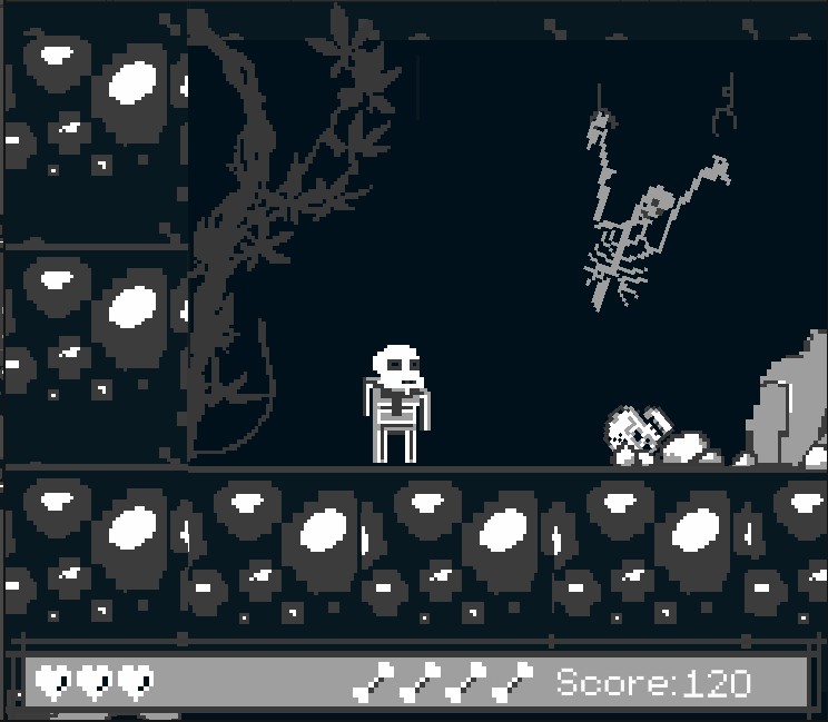
I can see the blockiness of the sprite, but it appears to have been rotated to simulate having a broken manacle. As a result, the sprite stops aligning with the 4x4 blocks needed for an upscale, If we zoom in, it looks like this.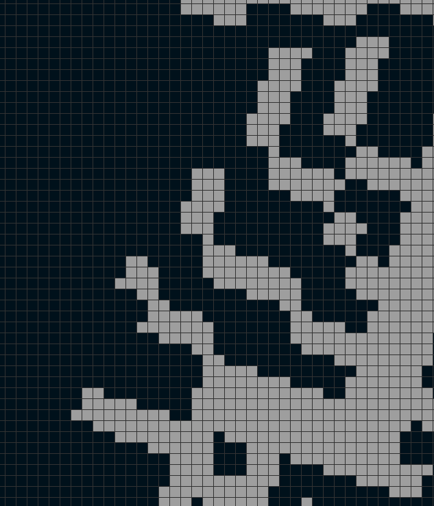
See how the 4x4 pixel blocks have broken down? There's a lot of angles that adjust one pixel at a time, meaning the sprite is treating the 640x576 output window as unscaled.
Hope this clarifies a little. I have a bad habit of being too verbose and opaque when trying to explain things.
Ah. So it never did unquarantine for some people. (A friend of mine pointed out it was quarantined by itch right about when the jam ended. I considered removing the entry entirely, but left it to see if it would lift the suspicious activity marker on its own. Some people commented on some assets only in the files so it must have lifted for some people.)
I don't think itch liked that I made the account three days before posting it to the jam. I can't think of any other explanation. It's literally a few indexed pngs and a text file.
Made it through two bosses.
Died to a spring next to a pit.
The jumping Kappa in the first sections of the game seemed to be the biggest contributor to lag spikes in the game. I think the descending spiked platforms also did to a lesser degree, too.
But overall, the game played well, looked fantastic, sounded great. If someone told me it was some long lost GameBoy game, I think I'd be inclined to believe them. Well done.
Most of the things that felt like highlights (the rotating sprites, the charming tree, the winking cloud, etc) seemed to violate the 160x144 screen size constraint. In this case, the screen size for the game was 640x576, but both the rotating sprites and several static sprites treated each pixel as a drawable unit, instead of each 4x4 block as a drawable unit. In short, everything looks so detailed precisely because the game treats the window as the full 640x576, rather than appropriately upscaling a 160x144 window; and the loss of fidelity to reduce it to that size would thwart the graphical prowess on display here.
Outside of the jam, the screen size constraint no longer plagues you, so I think you could take this and run in a non-GB direction with it easily.
The limited projectile mechanic seemed interesting, and makes using them be something thought through rather than wantonly thrown at all times. The physics are only a little janky, and the sprites that did follow the 160x144 screen constraint are identifiable and competent.
I'm used to working in a 30-color palette, so I've had a bit of practice dithering to make halftones and textures. Grayscale was a change of pace, but a welcome one.
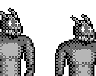
Though the monster here was larger than almost every other pixel art I've tried before (and I think the largest I've completed to-date). It was somehow both liberating and daunting to have that much pixel space.
I've always thought of myself as an over-ditherer; compared to nearly every other pixel art style I've encountered I dither more. So it is refreshing to hear that it works for people to have that much dithering in my art.
Linux build for the LOVE engine crashed out when I beat a cat and pumpkin in the house where the door gets locked behind you.
Classic Final Fantasy-esque combat system worked well here. Faster monsters were always the most flummoxing.
Considering there seems to be no developed magic system, I'm not sure Fireball needed a separate menu from the scissors and punch. It worked just like any other attack.
And I wanted to pet the cat, not fight it :( /lh
I like the way the controls were visualized as the spots the enemies appeared in. I found it intuitive and creative to represent the control scheme like that.
Also the animations were wonderfully smooth.
Sound would have been a nice touch, but that is harder than it looks (about half the sounds I made for Skeleton Crew were accidents trying to make a different sound)
Definitely a good start. Some variety in basic enemies, the addition of puzzles on each floor, and a couple things like that would significantly improve the basic gameplay loop. But those are things that take time, and often get cut for a game jam due to limited time.
The default window size was too large for my 1920x1080 screen resolution, spilling off the top/bottom of the screen, and fullscreening it caused it to stretch funny, but fit on the screen.
Also the game froze on me partway through a second attempt and I have no idea why.


