Play mini-metroidvania
MICROVANIA's itch.io pageResults
| Criteria | Rank | Score* | Raw Score |
| Overall | #225 | 4.071 | 4.071 |
| Design | #296 | 3.901 | 3.901 |
| Originality | #346 | 4.074 | 4.074 |
| Adherence to the Theme | #377 | 4.238 | 4.238 |
Ranked from 202 ratings. Score is adjusted from raw score by the median number of ratings per game in the jam.
Leave a comment
Log in with itch.io to leave a comment.


Comments
That's a cool little concept!
It was hard to know what killed me a lot of the times, felt a bit random occasionally, but otherwise it was enjoyable!
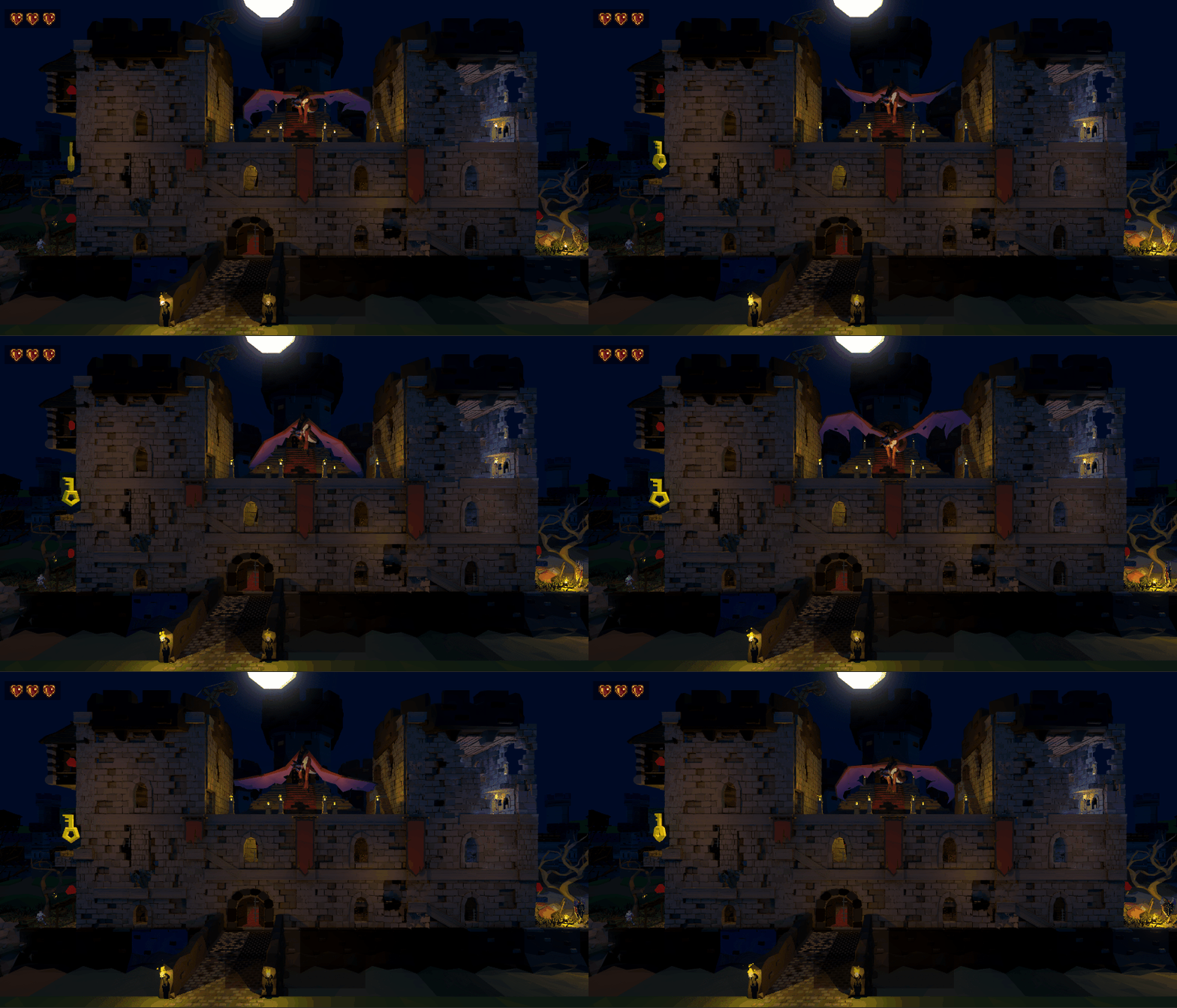
Really nice concept. Maybe adding some procedural sugar here and there, and we could have a winning formula. Kudos for such ambition during a jam! Don't know if the castle was supposed to collapse in the end, but I guess that was it. Also, a less realistic visual style may help with readability.
Check our game! https://cerosware.itch.io/one-stick-shooter
I don't know if you have ever played Castlevania: Harmony of Despair, but having the zoomed out camera really gives me flashbacks to that! Very cool and I love the art style! You could totally turn this into a full game having multiple zoomed out levels! I'd play it in a heartbeat! Polish this bad boy up! :D
Would love if you could check mine out too! Or not, no pressure ;) https://itch.io/jam/gmtk-2019/rate/462672?after=20#post-876644
Great little concept and cool setting.
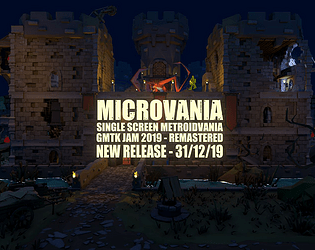
The zoomed out camera is great for showing where the dragon is at all times, but hard to see what the player character is doing. Would be excited to see how this is addressed - possible approaches would be to make the character stand out more (either bright colors or some UI helpers) or switch up the camera so that the player is more the focus, and adding an event camera whenever the dragon makes a move - a picture in picture approach could avoid taking the focus away from the player.
Really cool concept! Sometimes though I found it a little hard to see what was going on, and the controls were a bit laggy sometimes. But other than that I like the audio and graphics, and you made a pretty immersive game because I would always have a rush of horror when I was in the middle of the castle and the dragon came, or I would be very excited when I got a new upgrade. Overall, well done! :)
I would also really appreciate it if you played and rated my jam entry, Sheepherd Dog. Thanks in advance! :)
Great concept, great level design. Dragon was a very cool threat that kept the tension up. I always had a good sense of where to go once I got an upgrade like the jump boots. I would play more! :)
Ah cool idea! Impressive looking too! Despite some things being a bit hard to see (ladders mainly), it looked great to see the whole game in front of you - like playing on the map screen. Great work!
I enjoyed this one A LOT. Some details were harder to spot (specially the ladders) but I could complete the whole castle... EXCEPT for one coin! x)
Although a bit buggy, it can be fully enjoyed! Great job guys!
How did you get rid of the dragon? ^_^
The last coin was likely hidden with the item that gets you the alternate ending
Well, I just walked next to it with the sword and it collapsed. Not very heroic, but satisfying... x)
Haha, yes! We didn't have time to do a proper animated ending.
The last coin and secret "Good" ending is in the sword room if you have a keen eye! ^_
There is a lot of growth potential here, cool game!
Not gonna lie....I spent a lot of time at work playing this :) I feel like it needs about 40-50 more feral hogs but I'm cool with the dragon instead. Had a lot of fun from this!
A Great Game 👍
A quite neat little game, somewhat "game-jammy" here and there but that is to be expected being a game jam project :) very impressed by what this team accomplished in two days!
I really like the idea of a one screen metroidvania and I can picture how this could be expanded upon with multiple one screen levels as part of a huge castle/dungeon that ultimately could add up to a full game!
I think the one screen works quite well, giving the player an overview of all the relevant environment, allowing them to see, plan and think about how to approach and handle the environment in order to progress past obstacles and ultimately complete the level.
I played it on a fairly big and bright screen and did not really have any issues with the level being too dark or the view being to zoomed out as some have mentioned in the comments. However, since many are commenting about it I'd say investigate it and adjust the lighting and maybe add a zoomed view toggle button so the player can toggle between zoomed out and zoomed in view.
Well executed!
Awesome design and aesthetic
Pretty good game. Needs more dragons. 4/5
Really liked the design and I'm a huge fan of dragons. Only thing I needed was a little more light but amazing job!
Great game! The environment is super detailed.
Nice. Great quality for such a short time.
If you'd like to rate/try my game: (just a warning, 2 players. seems to be a problem)
https://itch.io/jam/gmtk-2019/rate/461347
Excellent work, I really hope you continue to add to the game.
It's like a cross between Neighbors from Hell and Castlevania. Who would've thought that could be fun? Just wished the castle was designed better to accommodate the zoomed out perspective, it was very easy to miss things and not know where to go or what to do.
----------
Hey, we made a GMTK game too. Check it out!
Just the right amount of design to make you feel real smart.
Very souls like in the sense of slow down or die to learn.
Would love to see a series of these goal based, mini dungeons with heavy design.