Play mini-metroidvania
MICROVANIA's itch.io pageResults
| Criteria | Rank | Score* | Raw Score |
| Overall | #225 | 4.071 | 4.071 |
| Design | #296 | 3.901 | 3.901 |
| Originality | #346 | 4.074 | 4.074 |
| Adherence to the Theme | #377 | 4.238 | 4.238 |
Ranked from 202 ratings. Score is adjusted from raw score by the median number of ratings per game in the jam.
Leave a comment
Log in with itch.io to leave a comment.


Comments
It's interesting but really hard to see things or even understand right away what these things are used for or whats needed. I died a few times when there was no indication for it, and I survived a few things for some reason. it just doesn't work right really.
I smell potential, and I can see that it was made with care, but I still think it would be a lot easier if I could see a magnification of the screen. It was hard to spot some of the ladders. I also think the dragon mechanic is a bit random, and therefore unfair. Maybe you could give it a pattern (or does it already have a pattern?)
Thank you so much! We really poured our love for the genre into this one!
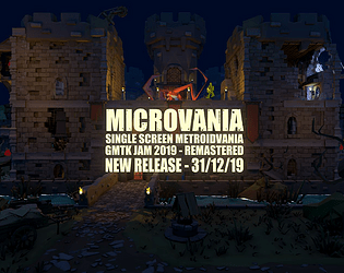
The ladders are quite difficult to spot! We've got a newer build that, I'll release after the contest, that has improved visibility for the ladders and makes the dragon a BIT more fair.
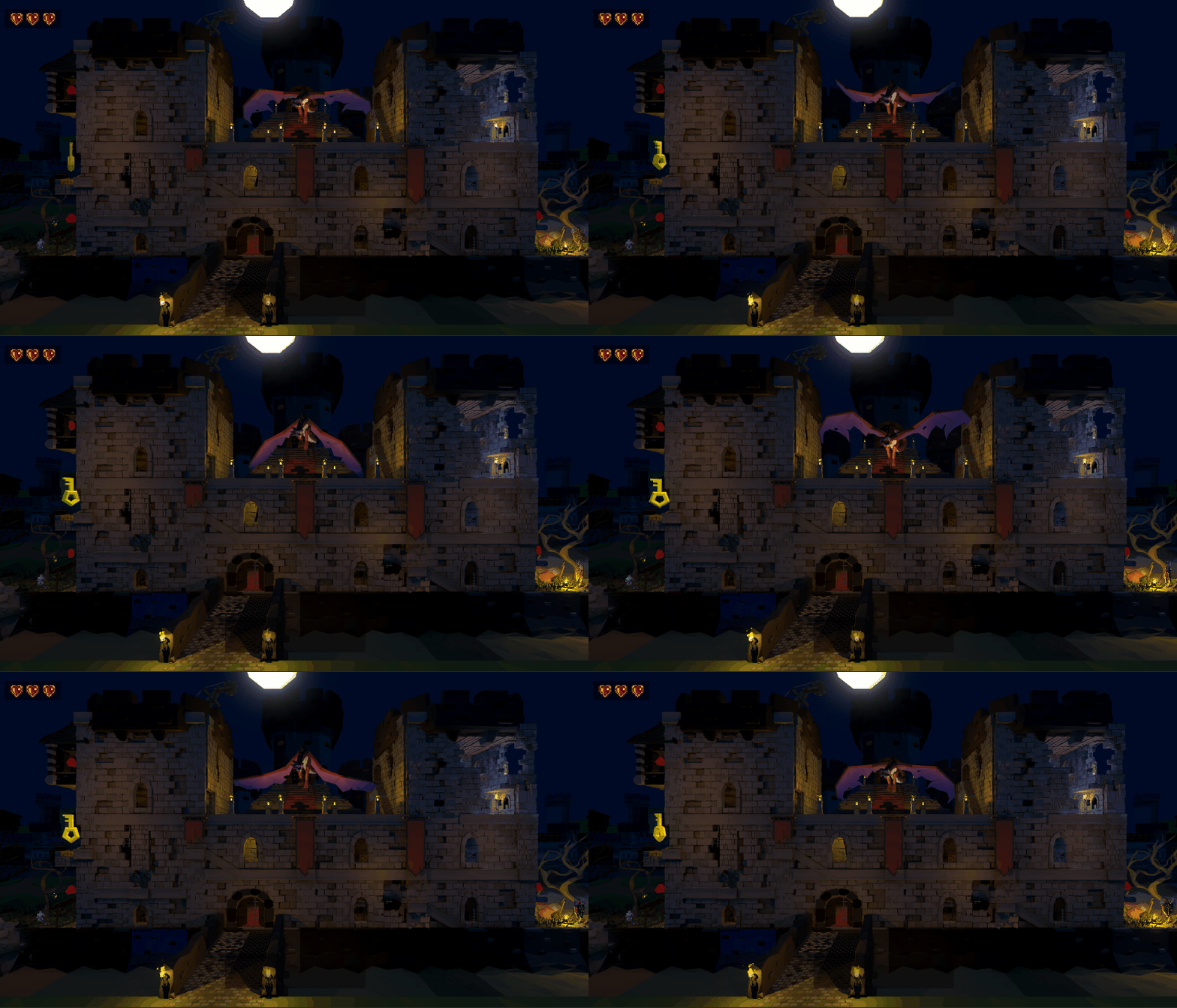
Currently, it does have a pattern. Any of the center windows will hit horizontally. Anything in the towers hits vertically.
This is still super confusing though, and I didn't notice the pattern one of our coders put in, so in the newer version we've improved this a lot!
Really great work! Single-room Metroidvania was one of my first ideas for the theme, but I quickly decided there was no way I could make it work. Kudos on doing what I couldn't! :) My main complaint is that death is a bit too punishing. I also didn't really understand how the electric trap thingies work. I got hit by them a bunch of times without anything actually happening and then at some point later one of them killed me. I guess they do some amount of damage that's less than your full HP? But without an HP indicator, it just seemed a bit random. (Unless there was a message at the bottom of the screen. I kept missing those. :D)
Haha, thanks! We threw out a ton of ideas before eventually deciding on tackling a single screen metroidvania for the design challenge of it!
Yeah, we didn't have time to display the player's health. I don't mind the death being punishing, because once you know where everything is, you can just blitz through the whole game in about 90-120 seconds. And I think the insta-kill from the fire heightens the anxiety when the dragon heads your way.
Thank you so much for the feedback though! We're actually continuing to iterate on the game and I'll post a new build once the contest is over! I'd really love to see your thoughts with the new stuff!
Cool, I'll try to remember to revisit it after the jam! One more thing: the area affected by the dragon isn't always entirely clear. For example when he hits the floor where the torch is, you can hide in the place where the jump is found. That kinda makes sense since it's just below the floor, but the fire animation actually extends to that area so it looks like you should get hit.
I loved this game! :D Really fun to figure out the mechanics and find all the secrets! It was very satisfying to find the final clues and see both possible endings!
A few small things bothered me. The platforms were a little hard to see on the far right and left sides, and it was a little frustrating to keep missing those. The bomb and key mechanics confused me; at first I didn't realize that I had unlimited bombs and unlimited keys after getting the initial one. It also felt like the bomb took a long time to explode, I wasn't sure if I was supposed to light it with the torch or initiate the explosion in some way.
Thanks so much for playing!
We actually spent a bit of time iterating on the game after the jam!
I'll post updated after the voting period is over, but I'd love to hear your thoughts then!
This was quite fun!
It took a bit of time to find all the secrets but it was worth it in the end!
The sound effect when you lose is a bit too loud but I'd still give this game 5 stars!
------
Hey, we made a GMTK game too. Check it out!
Very cool 3D models! Lagged for me a little bit. Bad computer :(
solid
That was hard. It is really hard to jump in this game. However, I still won in the end. It was really fun and the idea of a one screen metroidvania is interesting but everything becomes tiny. The 3d models and lighting are beautiful. I still have to go back and find the last hidden item.
Finally finished it. The first time I played it, it bugged out after a few deaths. But after restarting it, I was able to collect everything and beat the level.
No idea what you mean with multiple endings. Either the dragon kills you or you get to him with the egg.
Or you get to him with the sword! (But the egg is the good ending!)
You succeeded in what you set out to accomplish, but I feel like fundamental aspects of the concept itself is flawed. I love metroidvanias, and I appreciate what you were trying to do, but everything was so zoomed out, I could hardly tell where I could go, let alone where I was supposed to. Once again, I see where you were going with it, but I assume the time constraints took their tole. On the upside, it was very original!
While the entry is in, we're working on improving some of these concerns now!
I'll push some changes post-judging and I'd love to hear your thoughts then!
Really? Wow! That's great to hear! I'd love to see a later rendition, and it's great that people are taking feedback!
Yeah! I'm actually stoked to show you them! We're still zoomed out, but I think we've improved the visual language for things!
Impressive for a weekend project. Putting all in all screen can give you a new way to play while missing the perks of the old ways. Not sure if the tradeoff is beneficial as I believe it's really up to the player.
Anyway, nice theme interpretation and lovely visuals.
Nice work!
Great and nice game!
I died a bunch because I got stuck in a platforming area when the dragon came, but overall its very unique! I really like how the dragon justifies the single screen. And that is has a happy and a sad end :) Cute!
I liked it. For only one screen, there is a lot of exploration and even backtracking involved. This puts this game apart from a lot of the other "one screen" games I have seen so far. I think the only issue I have with this game is visibility. Because everything is very dark ladders, doors and even the torch item blend right in with the rest the environment. As a suggestion, I think starting with the the game with the torch might solve most of these problems.
I spent the day improving a lot of lighting issues and improving some gameplay elements!
I'll wait til the end of the judging period to post, but I'd love to hear your thoughts!
Nice work! really liked the tone you put together with the music and the lighting. The platforming feels a bit slidey but you don't do any precision platforming with it so it's not a huge detraction. Good job! :)
I liked the theme and progression, but the 3D display and the darkness (even with the torch) made it really hard to see. Especially some of the platforms: I just had to jump around by feel because they weren't quite where they looked like they were? But maybe that was just bugs? At one point in the bottom center my character ended up mostly behind the wall, so you could just see some ghostly bits poking through. And the dragon stopped flying down and flaming after a while (maybe after I died and restarted one time?): was that intentional?
At the beginning it took me quite a while to figure out what to do: I didn't see my character on the left. Some sort of effect to point that out would be nice (maybe the camera zooms in there for a second, or there are some particles that start on the whole screen and zoom to your character, or a flashing arrow or something?).
I also didn't pick up the torch until I had explored every other area that was accessible at the very beginning because it looked like a spiky pile of pulsating darkness so I assumed it was an enemy.
Some feedback about your character's health (you have three health, right?) would be good.
I liked how in the early game there was always an easy way to get out of the way of the dragon's fire but then it got harder (like the right tower).
The platforming was a little floaty, and the friction on the sides of platforms was annoying (you can't just hold sideways and jump because pushing into the platform makes you not jump as high).
Overall it was good!
Thank you so much for the lengthy feedback!
After work this evening, I got so caught up further developing things that I didn't get the time to play any games!
I'll wait til the end of the judging period to post, but I'd love to hear your thoughts!
I'll be spending some time later this week to play through others though and I'm very much looking forward to checking out yours!
Couldn't figure out how to beat it once I got up to the dragon, but a super cool game nonetheless :)
There's some unexplored rooms down in the dungeon once you have the key.
Down there you'll find the good ending and the bad ending. ^_~
Really detailed for a 2 day game. I like the idea of it being 'micro', it really adds to its appeal
All on one screen makes it a little hard to see, but it's because there's so much there. Good progression. Had a few things I couldn't figure out, but I think that's more on me than on the game.
My team and I spent the evening making some updates to lighting and player movement!
This should resolve the odds of getting 'lost' and improve some of the more frustrating parts of the game!
I'll wait til the end of the judging period to post, but I'd love to hear your thoughts!
Solid game with easy-to-understand concept. Controls don't feel floaty and there actually can be some tense moments when it comes to keeping an eye on where the dragon is. The game does well to encourage exploration and rewards the cautious player. It also looks nice too, and plays smoothly to boot. The extra ending is pretty neat too ;)
Like the homage to Metroidvania gameplay....(especially the Chozo statue reference...nice!) Strong graphics...love the shadow-playing off the walls. Nice job!!!