Indie game storeFree gamesFun gamesHorror games
Game developmentAssetsComics
SalesBundles
Jobs
TagsGame Engines

I want to see updates!

A topic by dzamani created Aug 07, 2019 Views: 329 Replies: 18
Viewing posts 1 to 9
Submitted

Hey everyone!

I know the updates are closed during the rating period but since we are here for a bit let's make it interesting.

Some of us received a lot of constructive feedbacks, so they may have updated / fixed their games, I wanna see that.

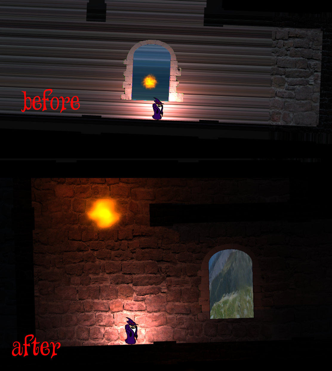
Show us before / after of your games!

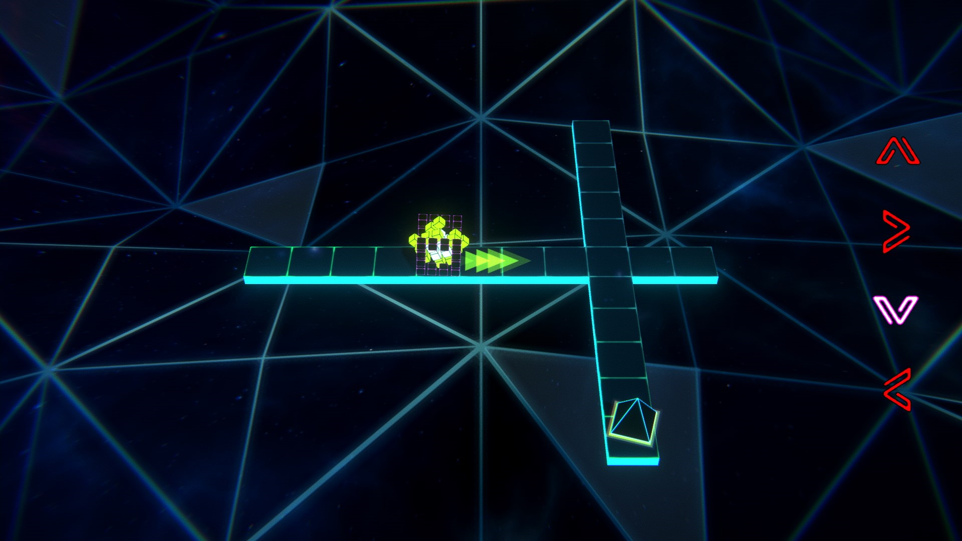
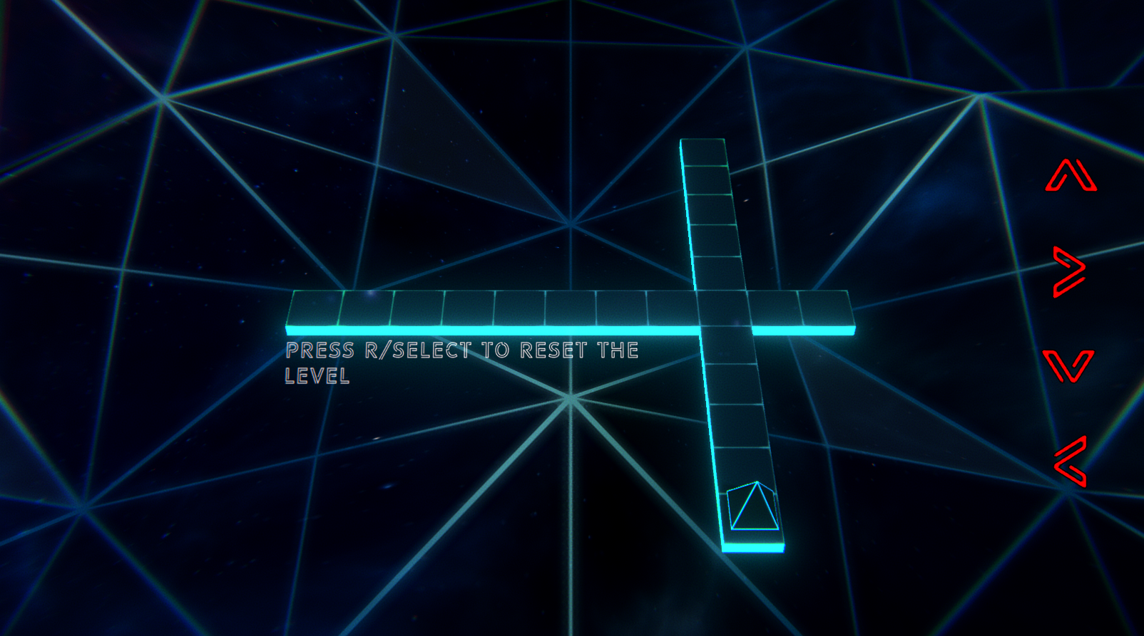
I will start small, we added some tuto text on the levels, next one will be how we completely changed the teleporters!

Before
After

The game if you wanna check the previous version: https://itch.io/jam/gmtk-2019/rate/462077

Updates please!

Submitted(+1)

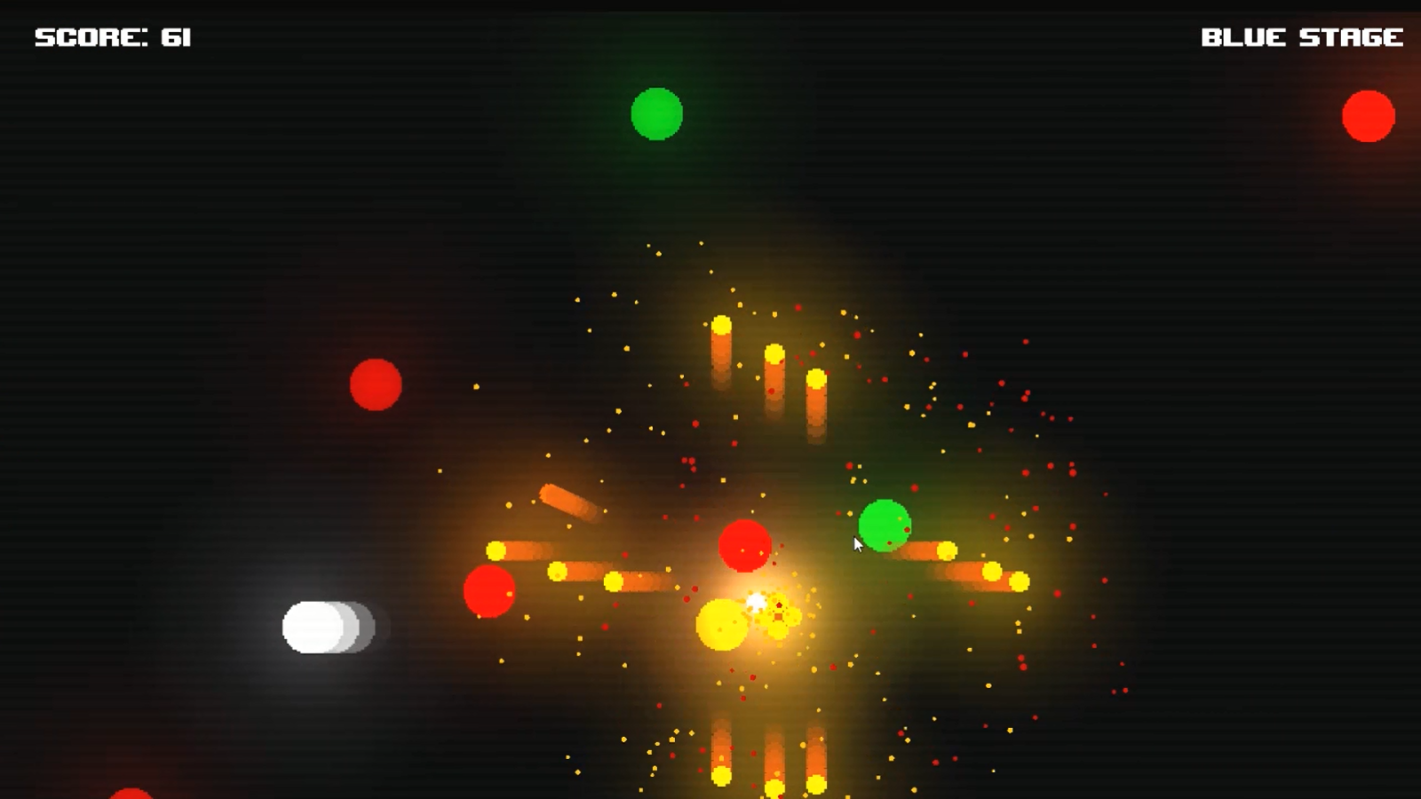
for me the version that was uploaded before the deadline had the texture tiling broken, and the fireballs moved WAY too fast which made it pretty much dumb luck if you could survive, for the update i fixed the texture tiling, made the fireballs slower and physically larger, als i removed the global light cause local lights only looked much cooler.  a victim of no playtesting online before the deadline... my fault for time management. but the newer one is much more fun to play.

Original Version

New Version

here is visually what the two look like.


Submitted

It's so frustrating to upload with an issue you could so easily fix in a few minutes but yeah time management is a pain be it on game jams or real projects.

Submitted

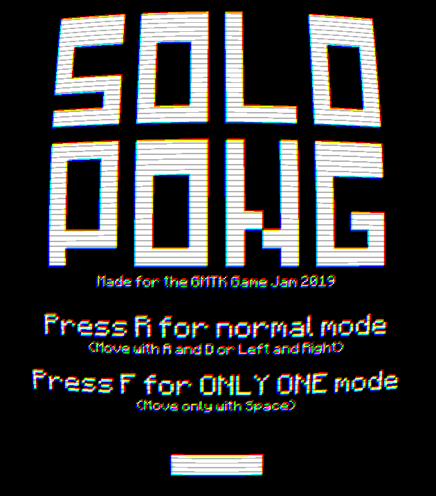
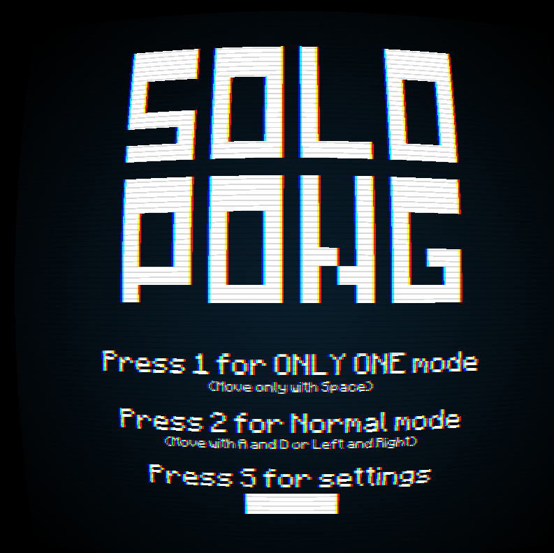
Graphics: I was not quite happy with the CRT look i was going for so i added the blue gradient background.
Gameplay: The controls were way too sensitive so i added some acceleration/deceleration to the paddle.
Polish: Added screenshake and sound when going through the menus and also screenshake and a sound when you loose.
Updated features: Refined the menus. Added a settings menu for turning screenshake and shaders on top of changing volume. You are also able to see your best score after a game for each individual mode. The settings and highscores will be saved locally. 

BEFORE:

AFTER:

Submitted

Definitely better now, the real retro feel is there!

Submitted(+1)

Only thing i need to do is add some sort of colorbleed and bloom effect to really finish it off!

Submitted

My game is called One Shot In The Chamber, a wave based survival game where you must fight off hordes of enemies with the catch being, you have only one bullet. Fortunately, the bullet is magic and you can summon it back to you or teleport to it. Using this unique ability, you must survive as long as possible in the chamber. Here is a screenshot of the game and the link to the game page: https://mark-auman.itch.io/one-shot-in-the-chamber

Submitted

Do you have new screenshots / gifs ? That was the point of this thread, your game is cool though!

Submitted

oh sorry it must not have linked properly, I'll try again

Submitted

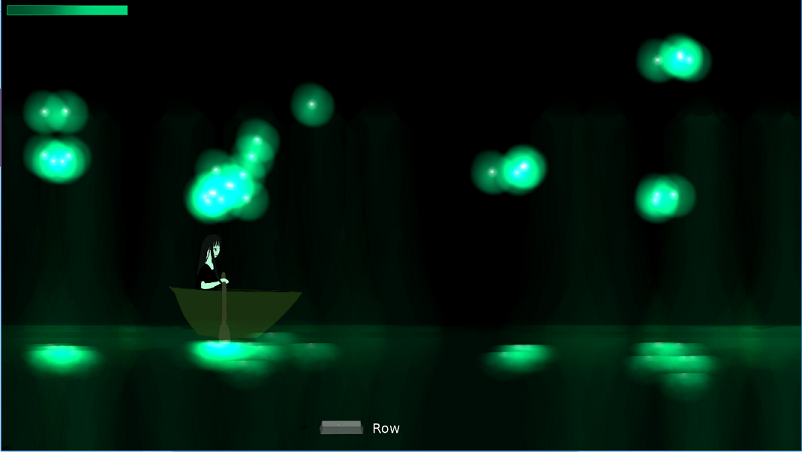
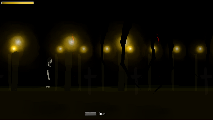
Literally the only suggestion I've had for improvement is more content. I've also been told elsewhere that initial idea I had to use multiple gameplay bits in progression is more interesting. So I have been slowly working on the other bits that got cut. I can now verify that giving up 6 hours before the deadline and just seeing if there were other tweaks I could make was the right idea as this 2nd portion doesn't even work as designed and now needs to be rethought. It does show off a lot more that I was intended the calm atmosphere to then become disturbing though:

section in the upload (scaled down for thread convenience):


the section that comes after it, currently a bit too dark for my liking partially due to some of the texturing particles not working:


Submitted

I feel like a depth fade effect would make it even more cool!

Submitted

My game: https://itch.io/jam/gmtk-2019/rate/459874

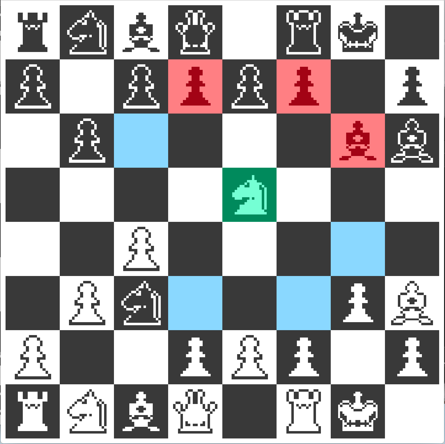
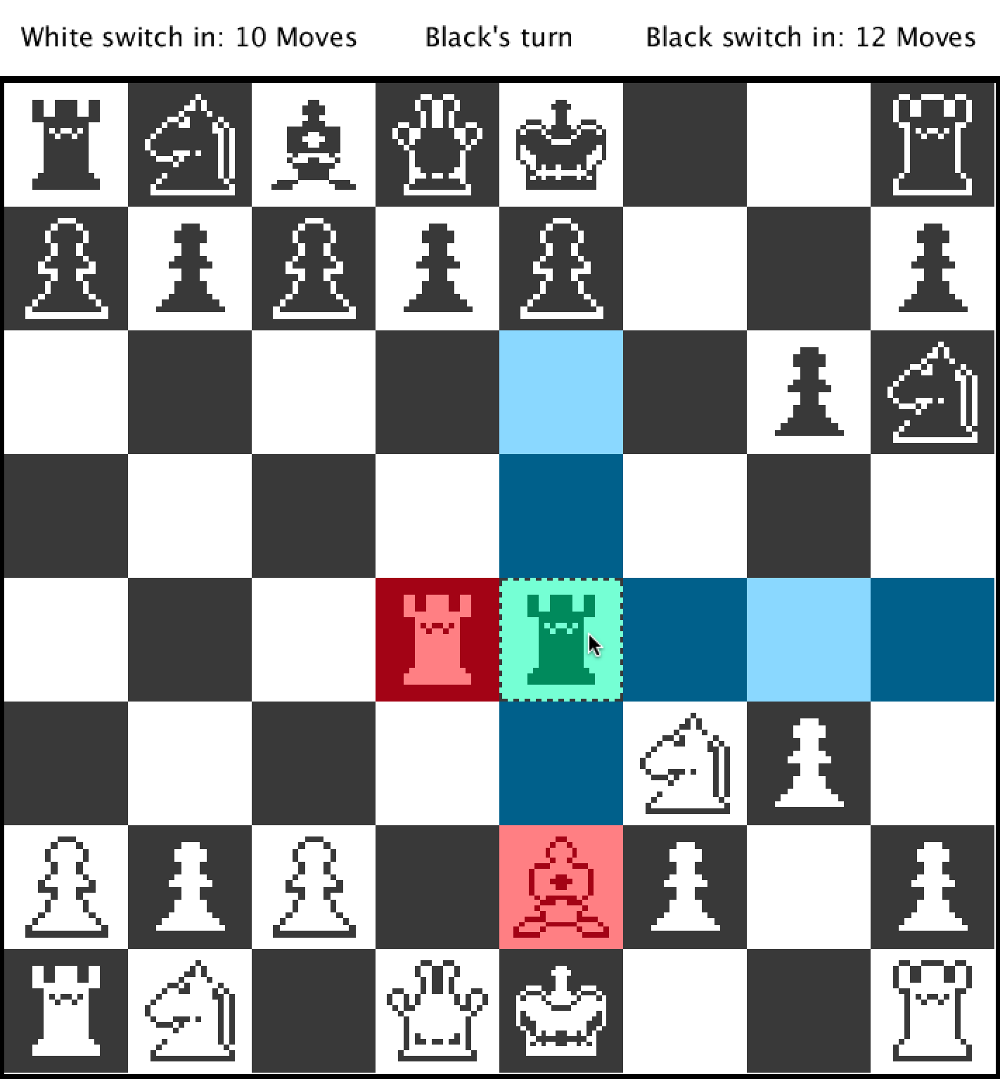
Before:


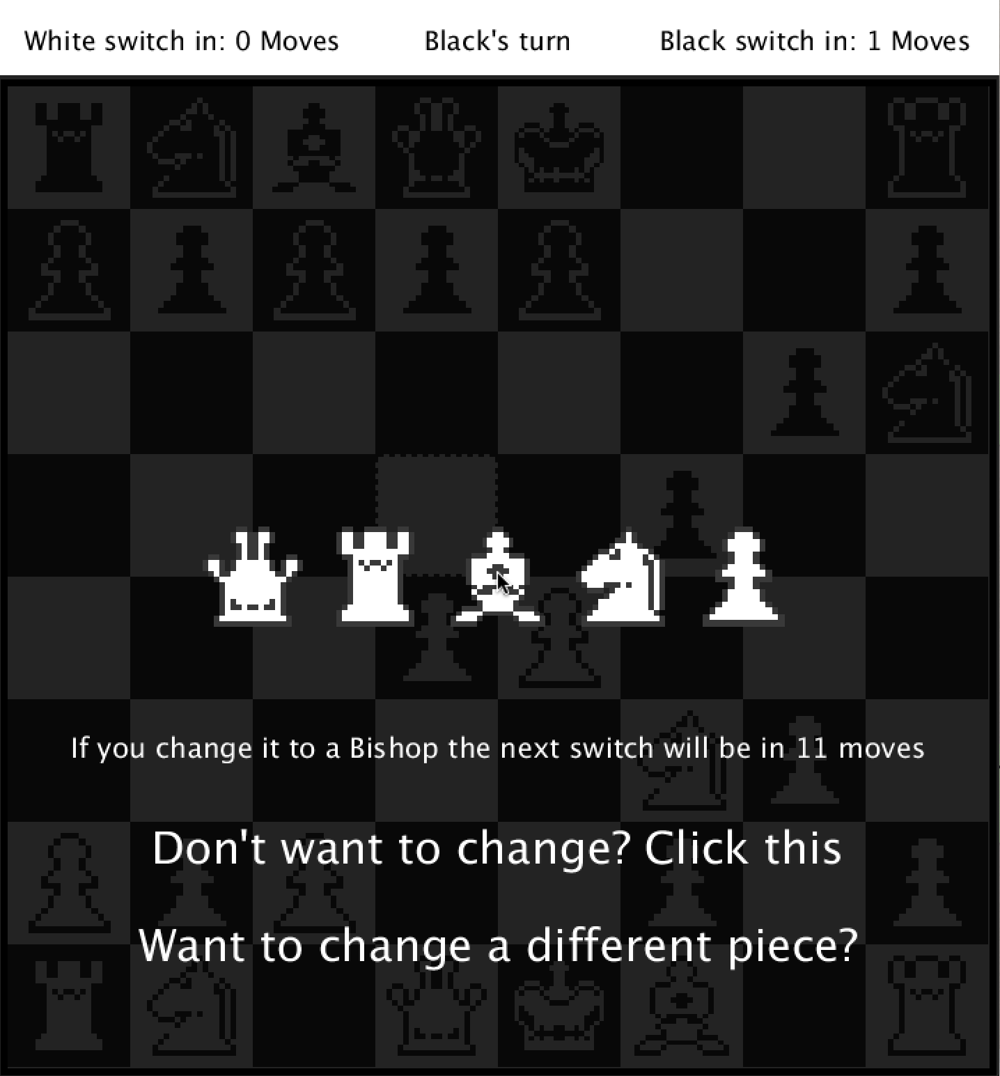
After:


And of course there is much more to come (AI, Keyboard controls, and more!)

Submitted

Nice!

I would love a frame a over the chessboard to makes you feel like you are really commanding your troops!

Submitted

What do you mean exactly? 

Thanks a lot for the feedback!

Submitted

So the chessboard is taking the whole screen, maybe you could add a border / frame all around (the UI band on the top not included), it would reduce a bit the size of your chessboard but would definitely be worth!

Submitted(+1)

Oh. I did add a 5 pixel black outline but I guess something more "grandiose" or just more interesting could be nice. Thanks!

Submitted

We made some updates but are related with balancing the game: https://black-mamba-studio.itch.io/mocho-vs-mostros/devlog/93570/post-jam-release-101-bug-fixes-balancing-linux-and-mac-builds

Submitted

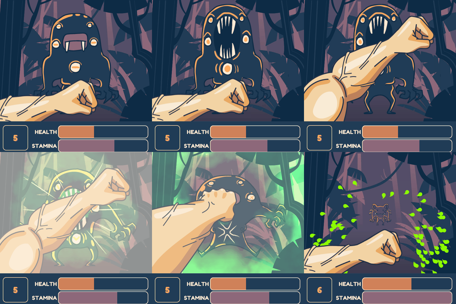
Hey. I wanna share a new version of my game with improved visuals, which is the result of all the invaluable feedback I've got. You can download the new version here and you can rate the game here.

Here's some obligatory screenshots. Before:


After:


Submitted

Hey everyone! 

Here are some updates incoming for our game:

Also a small video (that I can't put in the post since video uploading doesn't work ?) https://twitter.com/dzamanikord/status/1160273294655987716?s=20