Play game
With/Out You (gmtk '21)'s itch.io pageResults
| Criteria | Rank | Score* | Raw Score |
| Presentation | #293 | 4.105 | 4.105 |
| Originality | #1108 | 3.526 | 3.526 |
| Overall | #1171 | 3.360 | 3.360 |
| Fun | #2940 | 2.447 | 2.447 |
Ranked from 38 ratings. Score is adjusted from raw score by the median number of ratings per game in the jam.
How does your game fit the theme?
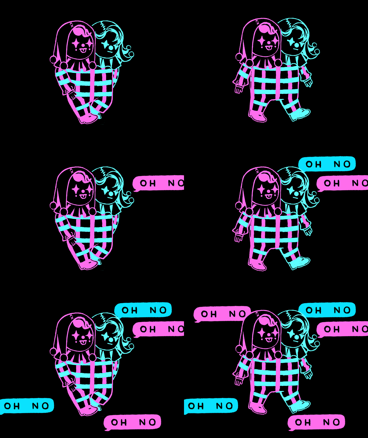
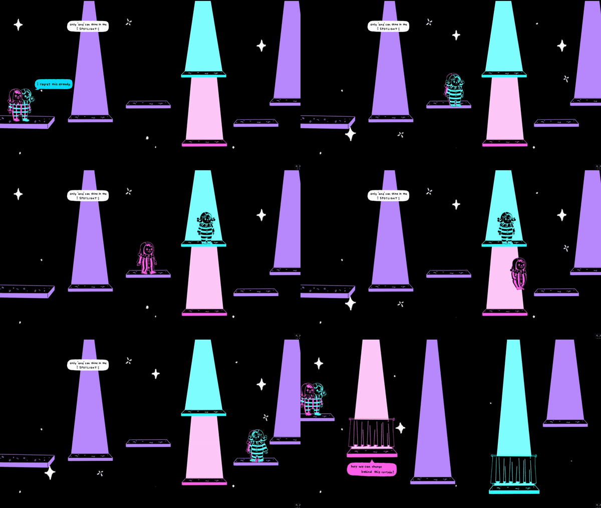
Two supposedly conjoined twins try to keep their job as they perform a show, and try to stay in the (correct) spotlight!
Did your team create the vast majority of the art during the 48 hours?
Yes
We created the vast majority of the art during the game jam
Did your team create the vast majority of the music during the 48 hours?
No
We used pre-existing audio
Leave a comment
Log in with itch.io to leave a comment.


Comments
Cool universe and concept.
hard to play though 🤡
Great game! Love the art style, cutscenes, and music! It would have been nice if some of the controls were explained more in game (especially needing to be conjoined in the spotlight) and I thought the controls felt a little wonky at times (I occasionally could jump on things I didn't see) but it was still really fun to play. Absolutely love the theming as well!
Cool concept! Nice art and music! Welldone!
Good game, with nice animations (especially the first cutscene). I found the controls a bit too rigid, but nothing that can prevent to play. Was the spotlight overlapping the player intended in the second level ? Anyway, great work !
Thanks for the feedback! Yeah I didn't realize I didn't do 'send to top of layer' for the player until now, I'll keep that in mind as part of the game to fix after this jam lol
Such a beautiful game, woderful anim and music. I think if the tutorial page could wait me longer that it will be better( i read slow) btw, level1 confused me but i still love this game.
looks very pleasing!! struggled to finish the first level - I was not sure if I was doing smth wrong or the level by itself was broken.
Thank you! The purple spotlight means you need to stand there conjoined, and the pink levels can only be stood on by the blue and pink player respectively. I'll probably make a clearer set of instructions afterwards
Cute game, I love the art. I was very confused how to get past the first screen for a while. I thought I was trying to get the characters onto the platforms of their color. Some arrow or something more intuitive would be helpful to direct me to reaching the edge of the screen. The platforms were also a bit finnicky, but the game has a nice charm to it.
very nice art
AAaaaa this is one of the cutest games ive seen, amazing designs. really nice work!! I wanna make fan art of them haha
Love the art and the concept is unique and interesting!
This is very cute, and the worldbuilding is great! Love the intro cinematic, and how it gives a very brief introduction to the world of the game. The tutorial screen is very concise as well, but I would be careful with choosing colors that are so close together to represent key ideas in your game. The biggest downfall is the responsiveness and "tightness" of the controls. I'm not sure if that's an artifact of the web version, or construct itself, but I found it very difficult to control the characters.
I'm glad I put the time into making the intro, I think some story adds to a platformer game, so thank you! I agree that the controls are strange, I've never done wasd controls in Construct and I had to match the settings to the arrow key settings.
I loved that intro cinematic bit, was super good! The artstyle felt pretty nice, and the concept was very interesting. The only thing I would recommend would be to adjust the platforming physics to feel a bit better, it felt a bit clunky to move around, but other than that the game was great. Great work!
Fun and pretty asthetics. I like it!
First off I just want to say the presentation is fantastic! I especially love the intro cutscene and your cover art. One thing I think could dramatically improve the game is just to modify some of the platform positions such that players are less prone to getting stuck/glitched out on platforms. (Ex of this might be the purple and blue platforms on level one being too close to each other). Understandably this might be difficult with a fixed jump height but you could assign separate jump heights for each twin. :)
Please take a chance to review my game if you have the time.
love the art and the concept! the level design could be a bit more generous, but i loved the lil dialogue blurbs and the art
Your characters are very charming!
Such a cute aesthetic
I enjoyed the concept. The art is super iconic and well done.