Play game
At Scale's itch.io pageResults
| Criteria | Rank | Score* | Raw Score |
| Style | #1192 | 3.783 | 3.783 |
| Overall | #1528 | 3.478 | 3.478 |
| Enjoyment | #1733 | 3.261 | 3.261 |
| Creativity | #2144 | 3.391 | 3.391 |
Ranked from 23 ratings. Score is adjusted from raw score by the median number of ratings per game in the jam.
How does your game fit the theme?
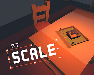
You build scale models, every time you build one, the next level is "one scale" bigger.
Development Time
96 hours
(Optional) Please credit all assets you've used
Kenney All-in-One pack.
Leave a comment
Log in with itch.io to leave a comment.


Comments
A delightful experience, very relaxing. Would have liked to see the edges of the implied diorama going on, might have helped better sell the small scale of things on the last level; as is feels unnaturally confining camera wise. Still though, thoroughly great vibes.
Very chill game, perfect for a break.
When I search throught game jam submissions, I find two potential type of games: lager and bigger projects and great mobile ideas. To be clear: great mobile ideas isn't a downgrade. On the contrary, it shows the ability to create small but smart ideas, perfect for those looking for a fun, catchy and short experience.
Maybe this one is more relaxing, but still can fit casual player who are on a job break or just chilling in their living room. More precisely:
Gameplay:
- Simple, intuitive and perfect for those who like to maniacally order things. Controls are simple, perfect for a chilling experience. There is a progression system that challenges you to get the best score to move to the next level, something perfect for game like these. Maybe the balance isn't perfect, but I will explain it better on the "level design" section.
In the end, with this kind of gameplay, you can create a tons of level, and maybe some extra "power up" or "downgrades" can make the gameplay less repetitive. I've seen something in the "city level", where some placements could be very problematic, but I think there is room for improvement.
Level Design:
- Here comes one problem: I felt no difference between the dinner table and the room. On the contrary, I've found the room easier than the table and it kinda disguided me on the gameplay.
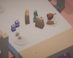
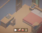
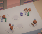
First, at the table, I've understood one thing: similar things nearby = good, different = bad. So I've tried to put the food with the food and the "breakfast" with the "breakfast". Then I've moved to the room and I've just smashed things on one corner, creating the perfect unlivable bedroom. And I've won very easly.
Then I've got to the city and... oh boy, this was litteraly on a different level. Here the table rules came back and harder. In the end I got it, but I think the second level, "room", should be balaced better, to be the perfect link between "table" and "city".
Graphics:
- I can't say much, most of the game is based on imported 3D assets (well chosen, but not crafted by the team). But I can say one thing: the screen indications (points and wrong positioning) are very clear. I don't get why there are negative point when you can not place an object, but still, graphics work.
Music:
- Nothing to say, a perfect and chill background for the game.
Relevance to the Game Jam's Theme:
- Not bad, but I think the "grown" part is a bit forced. I get the idea of "bigger palces", but it's something that affects only the level.
Still, I've enjoyed playing this game.
Great entry! I enjoyed my time while playing! Any chance it was inspired by Islanders?
Very creative! I like the gameplay a lot although the scoring didn't always make intuitive sense to me. Lots of good visual feedback to the player though so I was always able to place things with an informed decision. Nice job!!
Very creative!
I enjoyed this a lot, it's a really cool idea! Almost like if animal crossing decorating was a roguelike 😂. The mood was super relaxing. I thought the mechanic about caring what goes next to what makes things really interesting so it's not just mindless placing. I think this has a lot of potential to be a really good cozy game, you should keep working on it!
Some specific feedback I had:
Relaxing game, it was fun to manage items between all the levels. Great job !
The art and ambiance are really top notch here, especially for jam game. Would love to see this concept more fully explored, or even a whole new game set against this calming aesthetic!
this made me smile. cute islanders-type game. i liked the piano music and it is really pretty. the scoring system felt a little random at times, but for the time given this is very impressive!
i didn't get the logic of the scoring system
just moved the item around to see where the biggest score is
Overall, very nice and unique idea.
A toaster near the shower, in case of sudden hunger.
A fun idea, and implemented very well in such short time, although the scoring system is often at odds with common sense :D
This game is conceptually fascinating. The music and sound design compliments the game very well -- combined with the low stakes and how you can take your time to organize things the best you can, it evokes a sort of zen. I'd also like to compliment the scoring system -- it's intuitive, interesting, and rewards the player for making the right choices without punishing them too harshly.
If there's one critique I have, it's that the game gives the player a lot of freedom in the placement and orientation of objects, and the orientation never factors into the scoring system. I think that neatly ordered constructions should score more highly than a mess of related objects placed in the same area -- although I understand that would be difficult to program. Good work overall!
It was a neat idea, I like how each level gets progressively bigger. I can see the islanders inspiration lol