Play game
EXTRUSION's itch.io pageResults
Criteria | Rank | Score* | Raw Score |
Style | #1801 | 3.500 | 3.500 |
Overall | #2582 | 3.143 | 3.143 |
Enjoyment | #2796 | 2.929 | 2.929 |
Creativity | #3409 | 3.000 | 3.000 |
Ranked from 14 ratings. Score is adjusted from raw score by the median number of ratings per game in the jam.
How does your game fit the theme?
As a lab-developed creature that evolves with the scientist's chemicals, you have been "Built to Scale"
Development Time
96 hours
(Optional) Please credit all assets you've used
see description for full credits
Leave a comment
Log in with itch.io to leave a comment.
Comments
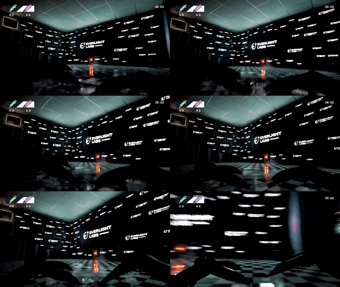
The visuals are really nice, though it can be a bit hard to see at times. I feel like using a timer isn't the best idea, especially as some unpolished areas of the game take up quite a bit of time, mainly the platforming and buttons. I liked the voice acted news broadcast, and smashing through glass was satisfying. With more polish it could become a great game!
Nice job!
I loooved the visuals of this one! It really set a good mood for a horror game. With all the sounds and the light. The vibe really is what sold it for me, and I'm amazed that all that could be built in essentially 4 days!
There are two things I found harder in this game:
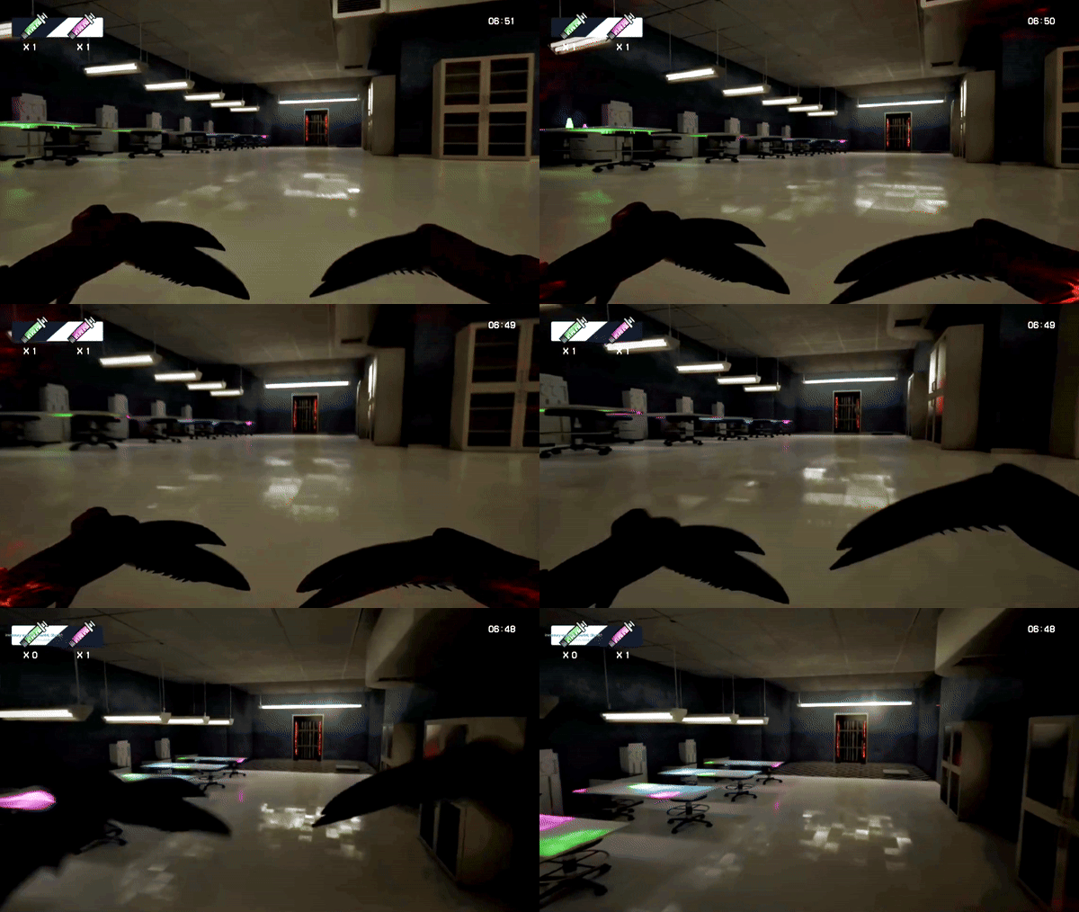
- Mood wise it was so good! But it often became hard to see what was going on. While moving often the camera just panned to a blob of black and/or other neon colors. I initially had a hard time finding the "consumable item" as the syringes were very small, but they also glowed in the same color as some background lamp. I ran towards the lamp first, tried and nothing happened, and just didn't pick up on the syringes because I thought they were shards or something. Similarly the exists/doors were often just really hard to see at all. Not because they were hard to find, but because a lot of it was just a patch of dark.
- I find the controls were a bit over sensitive. One of them I had to jump over shelves that had a big gap in them and that needed multiple tries because even a slight tap of the space key would make me jump overboard and fall into the gap. And the narrow space would become hard to see and finding your way back was a bit dizzying. I think I only got through that part by chance and not by skills. Alternatively, the environment could have been built with the slippery controls in mind so that the jumps won't just so make you fall into the gap.
Overall an ambitious but cool game! Good job achieving all of this in one game jam!
Very impressive! The art style captured my attention instantly.
A little tutorial/explanation window I think would have helped a little confusion in the beginning but my biggest gripe is that you hide the credits so fast!
Has a lot of potential with a bit more polish and a few more mechanics!
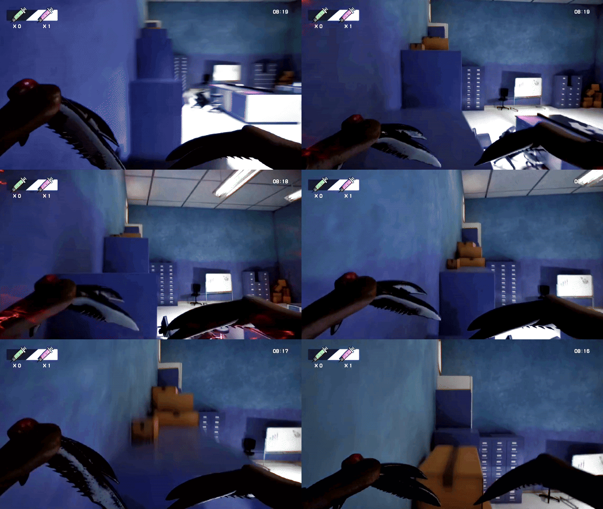
This is so cool. The visual direction is awesome, and any game that lets you play as a freakish thing has gotta be a good one. Although it seemed to me that both sizes only had one gimmick, it was still really neat to have to find the right syringe for the situation. Also each room had a very unique and imposing vibe, and I love the amount of work that went into it. Overall, very neat idea and good execution!
I also have a few criticisms that I hope will give this idea more of a chance to grow, if you choose to go anywhere else with it after this jam. Make of it what you will!
-Syringes: They were very important to the gameplay, but very difficult to find at times. On top of already blending into other glowing green/pink beakers in the lab areas, they were limited in quantity and could easily softlock you if misused. I recommend keeping the usage of green/pink in your visuals exclusive to the syringes so that they can be spotted in a room instead of having to check every glowing spot. Also, perhaps syringes should respawn after a period of time, or upon consumption.
-Controls: It took until my second try to fully understand that either syringe was always selected, and LMB was always consuming something instead of attacking or interacting. Some clearer feedback to the player would have been nice, and perhaps using items also be mapped to a different key. I get it was a jam though, so that's just how it is!
-The Door: This one is kind of minor. There was a single door that could only be opened with E, but I did not realize this until I accidentally walked close enough to it to get the action prompt. Because it looked identical to the other (locked) doors, I didn't expect it to be available to me. Perhaps the amber LEDs could be changed to green, to symbolize it's unlocked and interactable?
Anyway, sorry for the wall of text. Despite the critique, I really enjoyed this game, and would love to see the idea expanded upon!
3D GAME MENTIONED OMG i actually quite liked how yall had a whole creature POV and the idea of stealing the vials to scale even if i wasnt able to find my way thru all of the game
Super ambitious for a game jam! I love this concept and once had considered a similar "become and evolve as the monster" type game... but this is just a fantastic interpretation and way more fun than I thought. The graphics are quite well done. I think with more time and polish it can be a really good game (but for a game jam, I totally understand these things!)
Great work!
Really liked the idea. Good aplication of the theme. A little bit confusing, and had a little difficult time with the mouse sensivity, but i had a good time with the game.
Really liked the game, very cool concept and graphics, but I was a little bit confused. Nevertheless, it's incredible how you managed to create this game in just 4 days. Very well done ;)
Great game, fun concept! could still use some work but great job.