We went for similar games I feel like we both went the opposite direction with the upgrades :P
In yours I get upgrade every 5-10 seconds, in mine you almost feel like you get none xD
If we meet in the middle our games would be perfect!
But with all seriousness! I know how balance can be hard to achieve especially in 2 days.
I really like the portal upgrade system! That you need to navigate the level so that you take portals into consideration! Very smart design!
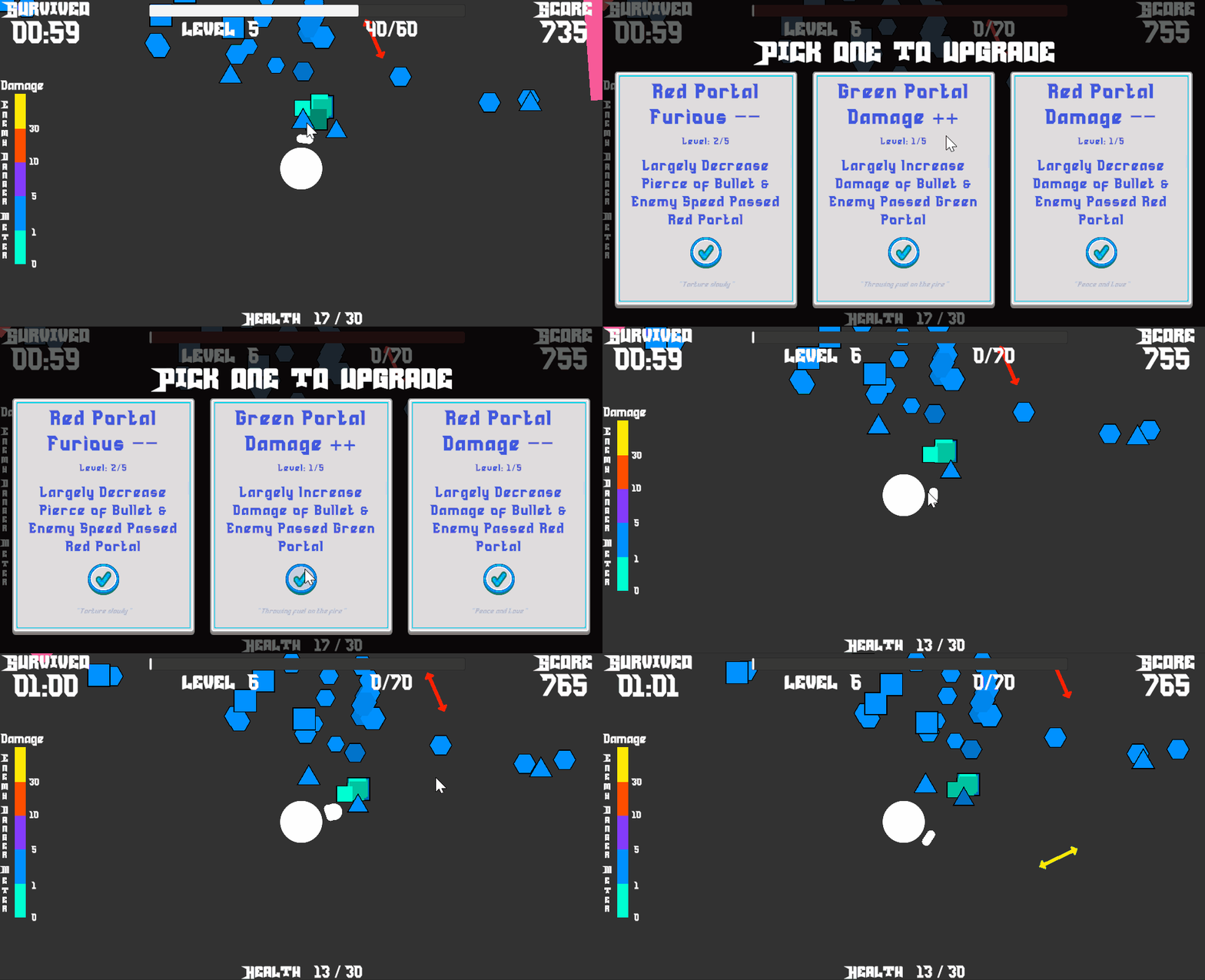
But that upgrade pop-up every 10 seconds was killing me! Let me play the game!
Maybe adding less frequent but more powerfull upgrades could balance things out a little?
Anyway!
Good job submitting such a complex game in 2 days! Did you even sleep?
Play game
cHaOs's itch.io pageResults
| Criteria | Rank | Score* | Raw Score |
| Enjoyment | #2186 | 3.115 | 3.115 |
| Overall | #4113 | 2.692 | 2.692 |
| Creativity | #4798 | 2.577 | 2.577 |
| Style | #4985 | 2.385 | 2.385 |
Ranked from 26 ratings. Score is adjusted from raw score by the median number of ratings per game in the jam.
How does your game fit the theme?
The scale of your bullets and enemy will be constantly changing.
Development Time
(Optional) Please credit all assets you've used
see description for full credits"
Comments
Thanks for playing and commenting first!
You are right that this genre's game pace is a bit off. I also notice this, especially if the first few upgrades aren't that effective. At the same time, I am glad you enjoy the game design of portals and the twisted gameplay. It affects you and your enemies, so you need to navigate around the level wisely.
As you can see, I barely had time to develop the game during this jam. It is already a miracle for me to complete the submission, lol. I will continue to work and polish those designs to make the gameplay more balanced and fun.
This was fun, I also think understanding the upgrades was a little more complicated than it needed to be but I eventually got it and I liked the strategy involved with the portals helping you and affecting the enemies. Sometimes you had to guide the enemies through the portals or you wanted them to avoid them so that kept gameplay interesting. I felt like even after getting a lot of upgrades i didnt feel much stronger, it felt like it took forever to kill one enemy and these types of games are generally more fun when you get more op. Nonetheless it was still enjoyable!
Thanks for your feedback, and I am glad you enjoyed it!
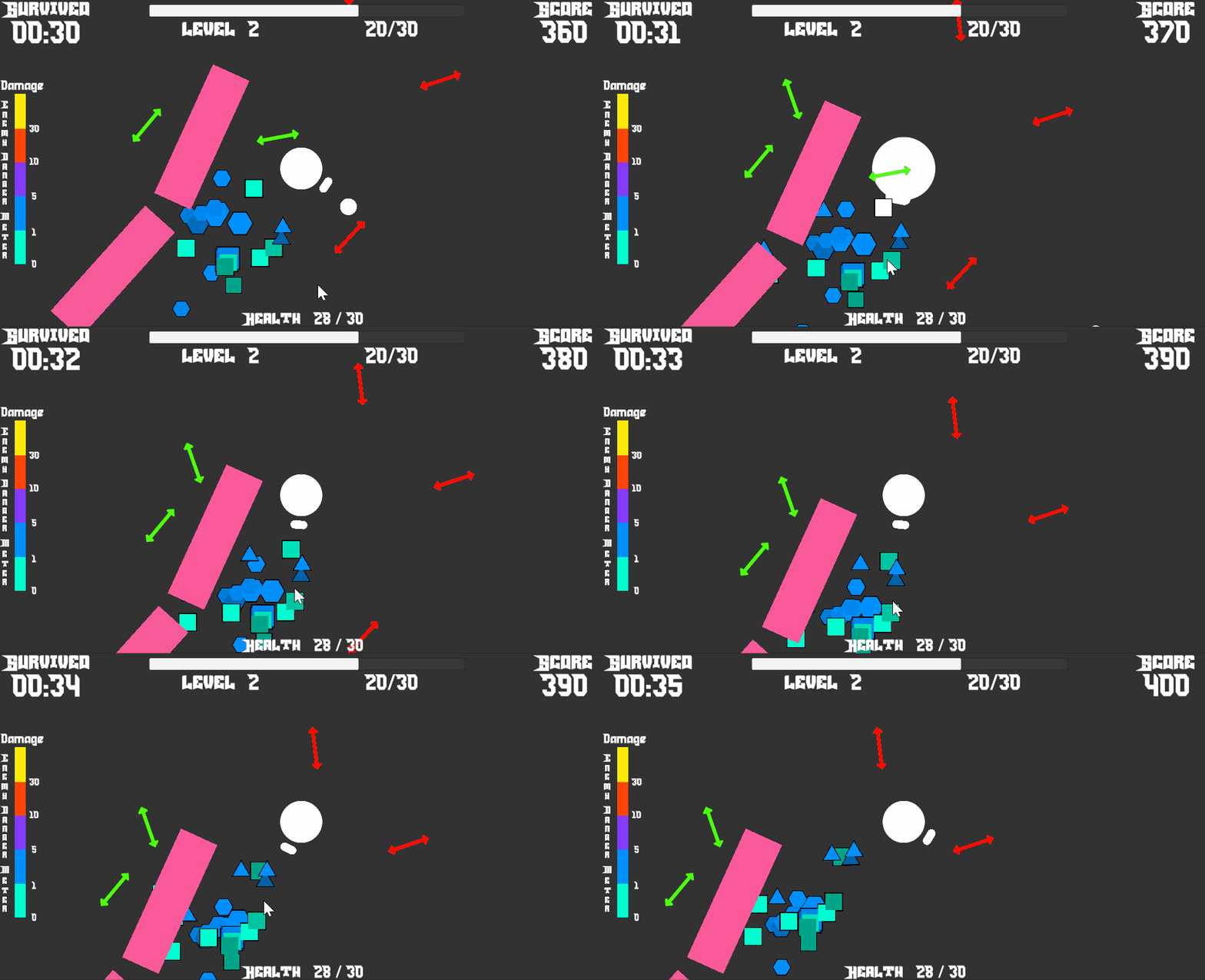
The two main design decisions:
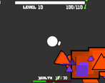
1. Enemies will be affected by your upgrades.
2. You need to guide enemies' paths to let them pass/avoid portals.
They are both what this theme inspires me to introduce to the Vampire Survivor Genre. The fact that it turns out to be unique and fun already makes me excited.
I understand that some upgrades do not feel effective enough and are not able to keep demolishing tons of enemies. These are things I need to solve in the future version, and they are indeed what makes Vampire Survivor Games fun to play with. I will work on the numbers and upgrades to ensure future versions satisfy the players even more. Thanks for playing again!
Understanding the concept and upgrades is a bit confusing at first, but once I figured out that the portals were intended to have both upsides and downsides I was able to get the idea. I quickly discovered that the red portal upgrades were very abusable, especially the size down one that ends up killing enemies instantly if you upgrade it enough. I ended up focusing more on guiding the enemies into red portals and mostly ignoring my gun and the green portals, because it just felt like the most optimal strategy.
Balancing issues aside (I know it's really tricky in a game jam, I had the same problem) the gameplay loop did make me want to keep playing. I got pulled into wanting to see what the next upgrade could be, and it was super satisfying to watch tons of them get wiped out at once by portals.
Overall a creative idea with a good gameplay loop that just needs to be tuned a bit :)
Thanks for playing and for your wonderful feedback!
Indeed, the "Double-balded sword" design is intended to have more playstyle/strategy even with one type of weapon throughout the game. And a satisfying feeling of destroying lots of them is what I was aiming for. Additionally, guiding enemies to go through/avoid certain portals is a featured gameplay I want to introduce to this vampire survivors genre as your movement now matters more than just avoiding being hit by enemies.I am really happy that you discovered and enjoyed all of them!
Lastly, you are right that the current version's balancing is slightly off. Since the double-balded effect now uses the same increment/decrement amount on bullets and enemies, I had difficulty deciding if the buff would make the game too easy (kill the fun) or too hard (hard to beat). I am planning to add more interesting upgrades in the future:)
Cool concepts and really well designed but definitly needs more polish in some aspects. Great work!
Pretty simple but very cool! Just need a little more polish.
It's a bit anoying sometimes getting spam by upgrades while not really doing anything.
Nice music and sound effects.
I felt like the enemies were a bit too tanky, felt like my bullets did no damage.
Good concept, well done!
Simple graphics, simple gameplay idea, but it works well, and the game jam theme is well incorporated.
I like the simple art style, but wish the game in general was faster from the start, maybe increase enemy speed?
The main mechanics is interesting and the simple art is very creative!
I was confused at first but the layout and style was so clean that I quickly got the hang of it! Really fun experience overall!
It starts out slowly but it gets fun pretty quickly! I like how you used scale related shapes to get the message across. Great work!


Leave a comment
Log in with itch.io to leave a comment.