Play game
Dicey Nights's itch.io pageResults
| Criteria | Rank | Score* | Raw Score |
| Creativity | #1587 | 3.286 | 3.286 |
| Enjoyment | #2763 | 2.571 | 2.571 |
| Overall | #2947 | 2.690 | 2.690 |
| Presentation | #4153 | 2.214 | 2.214 |
Ranked from 14 ratings. Score is adjusted from raw score by the median number of ratings per game in the jam.
How does your game fit the theme?
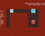
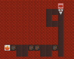
Main character is a Die, when moving he "rolls" revealing a new face. His upper face can activate special effects, so the player has to be aware of how a die moves!
Did your team create the vast majority of the art during the 48 hours?
Yes
We created the vast majority of the art during the game jam
Did your team create the vast majority of the music during the 48 hours?
No
We used pre-existing audio
Leave a comment
Log in with itch.io to leave a comment.


Comments
One of the more original ideas and implementations of the dice mechanic, but a bit confusing for me when trying to understand what move to make to get the desired effect!
I like this game, it's pretty fun and creative! Unfortunately, I was unable to find the secret room. Maybe on my next playthrough. I managed to get a score of 365.
Very fun, very interesting puzzles!
Nice idea and clever puzzles. Gets very tricky very soon. Good job!
Hm, cool puzzles and idea! I like it! But the graphics are still far from ideal :( Btw, i enjoyed! Great job!
(Not bad, i guess?)
21 on level 10 is impressive! Never managed to get it that low! Shame you couldn't find the secret level but thank you a lot for playing it to the end :) (the feedback is also very appreciated!!)
Really cool puzzler with a lot of potential for depth, and top-notch tutorials. I think polishing the art up a bit could really help bring this to life.
Very interesting and unique game concept. Nice graphics. Good job!
+ big plus for the pleasant and easy tutorial; fun but interesting game mechanic, cool characters and enemys; the environmental elements do add up nicely
- struggled a bit with the dice map and understanding which movement leads to which effect, the red is a bit too vibrant for filling up that much space of the screen in my opinion (:D)
Fun concept and challenging puzzles! I do feel UI was a bit confusing to get used to, but it never really impeded me from enjoying the game. Good stuff!
I agree, the UI is a bit hard to guess but not "too" hard, so you get it with some trial and error (so it doesn't block the gameplay!).
Interesting idea that it's on the whole world that the effect on the dice work. Usually, it's much more on contact!
I didn't play too far because there are way too much game to test :p, but I really liked the concept/the idea.
My only true comment about something that would have been able to change during the short amount of time is the too-aggressive background. One more time, it's not ruining everything, it's just something that would improve the overall feeling I guess!
Anyway, congrats!
We already had in mind that the volume could have been too high but we couldn't fix it in time (sadly we realized too late :( ), so we will fix the musics and sounds volume after the Jam period will end.
Thank you for playing and for giving us a feedback.
A strong start to quite an interesting concept, I like how the enemies and environment change based on what face you're on. I'm a little confused by the UI though. When I move around, I don't understand how each direction changes the layout of the dice. It seems almost random, although when I move backwards and forwards, it does stay consistent.
Thank you for the feedback.
We know that the UI it's a little bit confusing, in fact we wanted to add an animation showing the movement of the player to make it clearer, but due to the time limit of the jam we didn't have the time to do it. We were thinking about implementing it when the Game Jam period will end though, with some other changes too.
Nice, fair enough I guess!
Thank you a lot for your feedback and for playing the game! Yes we got quite a few complaints about the UI being unclear ahah
So, basically, it is an orthogonal representation of the die:
The face in the center is the one on top, the ones on each of its sides are the adjacent faces, the one on the bottom is on the other side of the die.
This means that when you move up, for example, the face that was previously "down" compared to the central one would roll in its place.
It's really unintuitive as it is, we would have liked to have more time to experiment with other UIs or to add animations
That's fair enough, glad I'm not the only one!