Play game
D20XX's itch.io pageResults
| Criteria | Rank | Score* | Raw Score |
| Creativity | #450 | 3.815 | 3.815 |
| Overall | #940 | 3.469 | 3.469 |
| Presentation | #1313 | 3.481 | 3.481 |
| Enjoyment | #1428 | 3.111 | 3.111 |
Ranked from 27 ratings. Score is adjusted from raw score by the median number of ratings per game in the jam.
How does your game fit the theme?
The game is about rolling dice and manipulating the rolls you get.
Did your team create the vast majority of the art during the 48 hours?
Yes
We created the vast majority of the art during the game jam
Did your team create the vast majority of the music during the 48 hours?
Yes
We created the vast majority of the music during the game jam
Leave a comment
Log in with itch.io to leave a comment.


Comments
Love your take on the theme! With impressive amount of content too. I really like how you handled characters, and their stats with each having their own set of dice of different kinds. Difficulty curve was a bit steep for me: first two levels were quite ease and then I got demolished on the third, haha. But it's quite hard to make right in such constrained timespan. A solid job for the jam!
Thanks for coming to my stream! Here's a recording in case you'd like to refer to it
thanks for playing!
This game is awesome! Both in the gameplay and visually 'o'
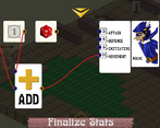
First of all, I like the way you handled the main mechanic: there's a lot of games that went with the "Reroll stats each turn" approach, but yours is a pretty unique way to do it, the ADD card being a central part of it.
There's also a lot of levels with progressive difficulty, that last ones took me some retries to complete!
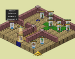
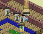
And for the presentation, nothing to say: the game looks good, feels good, you can do things like move around card all over the screen to better see the board below, there are little board animations, etc...
The characters' descriptions are a nice way to add in more identity to the game, you really feel bad losing one of them on the battlefield :c
AND THERE ARE COLOURBLIND SETTINGS!!! =D
I have been blocked in a few games this jam because of my protanomaly, so that option just existing is a free rating star from me in both presentation and enjoyment, thanks a lot! (not that it really needed them though ^^)
Excellent job to the team! =)
thanks for playing! im glad you liked it and glad you found the colorblind settings useful. i always try my best to make my games accessible.
Fun game. Shame you couldn't get more effects done in time.
Very good concept with very nice visuals and tile animations! The stat allocation part was a little confusing, but I managed to figure it out after awhile.
Would love if you can check out my game too!
thanks for playing, and i would love to check out your game, but it is a windows only game. i use linux.
Really complete-feeling experience from this game!
I think the UI for choosing stat allocations is a bit unclear, but that's about all I can think of in terms of improvements.
The presentation feels polished and well thought out.
Good work and congratulations on finishing the jam!
thanks for playing!
i tried to borrow some elements from visual scripting languages to make the allocation a bit clearer, and i think that helped a bit. i agree though that it could have been clearer. we wanted to include an in game tutorial, but we didnt have enough time.
This feels very complete, polished and juicy! (In theme menu with bricks and gears in operation is neat.) Despite the game becoming a little slow sometimes I enjoyed it a lot.
Every attack does need a little attention and time though – this can become a bit of a slog in parts of the beginning, where all opponents where cluttered around my robot which I left where it was to defend the mage, but then my witch had nothing to do, since she can’t cross the water, but the enemies where 1 out of range.
(Also –a very minor point– since your character is selected for you, it was a bit of a surprise –after assigning the dice– when I clicked and they moved there and the turn was just over, since I clicked a square not next to the enemy. It soon became clear what happened though and if you know it’s not a problem. I don’t know wat I expected, really.)
Free level selection is also appreciated.
P.S. Ah of course, almost forgot to say: the music… also very nice!
thanks for playing!
we really wanted to include an in game tutorial but we ran out of time. we had to include it in the game description. of course, most people dont read the description, and honestly i dont blame you! reading isn't as fun as just playing the game and figuring it out.
For what it’s worth, I read all of the character descriptions! I guess I just skipped over that bit of info :-)
(Also tutorials are hard to make, I’ve been struggling for years to get enough time to do one – or even a proper difficulty curve. I finally did a proper one this jam, since my sibling joining the development gave us enough time … but it’s still very clunky and missing a lot of info.)
im glad you liked the music :)
Such a cool concept, and well executed! The world reminded me of the SaGa series a bit, with the mix of sci-fi and medieval archetypes (always a good thing~). Also this may seem silly, but the animation when you hover over a tile is so great and adds such a nice bit of polish. 😙👌
thanks! i was hoping someone would notice the tile hover animation.
I really enjoyed this game. Both the concept and the way it's handled are a lot of fun. Presentation-wise, a bit more info about the units, maybe on their cards, would've made the mechanics easier. Also, discerning between enemies and allies was difficult. I eventually saw that the bases were different colours, but maybe coloured borders or something around the cards would have helped too. All in all this was a really cool game.
i wish we had that idea! we were arguing about how to differentiate the enemies in a way that didn't exclude colorblind people. we decided on the differently colored bases with the players having a much lighter color (since colorblind people can still see values), but yeah, we could have definetly made it more obvious.
Really excellent work. Good concept and execution.
thanks!
Pretty good. Not my cup of tea but I appreciate the concept and effort.
i appreciate the honesty.
I really liked it! I thought assigning stats every turn would get old but it grew on me, although given how often you're doing it, it'd be great if it was a speedier UI than a point and click. I liked the character mechanics, the rogue and robot were my favorite. Nicely done!
thanks for playing!
yea, if we keep working on the game, i definetly wanna store the card layout for each character so you dont have to redo it every time if you want similar connections every time.
Love your game! Big fan of theseTRPGs. Nice combination of dice, node graph and combats.
thanks for playing!
Surprisingly polished, I love the mood of it honestly. We've also delved into tactics + rerolling so it's interesting to compare both approaches, although yours is definitely more bug free than what we did. The scope of things like these is impressive so it's crazy that you've done it that well. I think what I don't like is the separate screen for the nodes, it's nice and original but proves to be gimmicky when you need to do it over and over again. Otherwise I really have nothing, it's a little hard to understand for a jam game but things like ground highlights help. I think I was the most confused with how attacking works, but it got cleared up pretty fast -@h
thanks for playing!
glad to hear you liked it.
Hard to get into but a lot of fun once I understood it! The I loved the presentation and the graphics actually gave me a real big nostalgia feel. Thanks for your submission!
thanks for playing!
we really went for a complicated idea, but i think it paid off.
Not the best graphics, and unreasonable complex... I didn't get it
im sorry to hear that.
some games just don't work for certain people and i think that's fine :)