Play game
Roll Of The Dice's itch.io pageResults
| Criteria | Rank | Score* | Raw Score |
| Top Marks | #1 | n/a | n/a |
| Enjoyment | #41 | 4.234 | 4.234 |
| Overall | #55 | 4.255 | 4.255 |
| Presentation | #93 | 4.468 | 4.468 |
| Creativity | #181 | 4.064 | 4.064 |
Ranked from 47 ratings. Score is adjusted from raw score by the median number of ratings per game in the jam.
How does your game fit the theme?
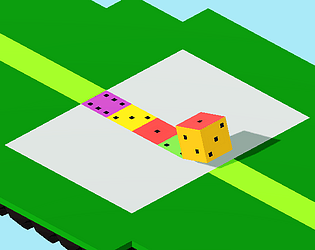
You roll a dice to paint the world and solve puzzles
Did your team create the vast majority of the art during the 48 hours?
Yes
We created the vast majority of the art during the game jam
Did your team create the vast majority of the music during the 48 hours?
Yes
We created the vast majority of the music during the game jam
Leave a comment
Log in with itch.io to leave a comment.


Comments
Interesting take on the roll the dice puzzler that has emerged this jam. Clean and readable graphics. One thing I would suggest is not having the camera at a 45 degree angle to the tiles, since it's hard to tell which axis is which when trying to move with WASD.
I used a 45 degree angle since that was the standard isometric layout and you could see 3 faces in that layout vs only 2 in a standard right-angled layout, but yeah I get what you mean. Will keep it in mind for next time.
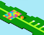
Art really does a good job of differentiating this from other similar games. Liked the simplicity of it (no push blocks, 3d, effect tiles, etc). The fact that you re-paint tiles when you land on them again feels good (though I think level 3 is the only level where this really comes up). The minimap display was super helpful. I think that at least one more mechanic would have helped with level design (perhaps an ink tile that colors the die on that side?).
Thanks! During development I focused on creating puzzles that developed this particular mechanic to its full potential, so I didn't really think of other mechanics to include. I also did not foresee that so many people would develop games with this same mechanic, had I known this I definitely would have thought of something else to include to differentiate it from others.
yeah, same here
Cool puzzle concept. Brilliant usage of the paper-stamp analogy to explain the mechanic effectively. The progression of puzzle difficulty was very well calibrated. I personally don't have a strong intuition for the spatial properties of a dice, so in practice I ended up just rolling around in a 2x2 circle aimlessly until I got the face I wanted in the position I wanted. The kind of spatial intuition I'm talking about reminds me of Rubik's cubes. Since I don't have that intuition, the faces of the die could be in any arrangement and I wouldn't be able to tell the difference. Due to this lack of intuition I was not able to plan ahead, so I wasn't thinking much at all, but that didn't stop me from eventually stumbling into a solution. I was never forced to think carefully about what I was doing and how it would help me solve the puzzle. It's clear that you spent a great deal of time internalizing the theory of cube rotations in order to design these puzzles, but players of your game probably won't reach close to the understanding you have as the designer.
I see. Rolling around in a 2x2 circle only gets you a limited amount of possible orientations, so I deliberately designed puzzles where that strategy wasn't the solution, but it is possible I may have overlooked some solutions when designing the levels. I hope that didn't take too much away from the experience.
WOOOW! The "print to match"idea is just amazing! I also loves how the idea are introduced at the begining. And the visuals are relaxing and brings me back to 00s(which is great!).
Thanks! And thanks for the follow!
Nice concept and beautiful presentation but there was a bug with the UI that shows the required combination so I had to rely on guessing to complete puzzles. Great game though.
Oh damn, sorry about that. What resolution were you using? I realised resolutions smaller than 1920x1080 caused problems, which was why I didn't upload a WebGL build.
It's 1366 × 768; that could be why
Yeah I think that's the reason. I'll probably mention it on my game page.
Nice job! Though I didn't find the puzzles to be progressively harder, I think the art and presentation is really well done!
Thanks! I designed the puzzles such that they built on ideas from previous puzzles, so you use ideas you "learnt" from previous puzzles to solve future ones. On hindsight, I think Level 3 was out of place, way too hard for its position, but at least you could easily skip puzzles.
Takes a fairly obvious approach to the theme, but does it well. Good feeling movement and visually nice. Very difficult, but in a way I can appreciate; it doesn't feel like the game gets in the way of itself at any point- the puzzles are just very hard. I beat 3/7, but gave up pretty fast on the others. I just couldn't wrap my head around the dice movements for the larger levels. Seems like a game with a niche audience, for better or worse.
Well done!
Thanks! I just couldn't think of any ideas for easier puzzles, hard to think of puzzles that require a little less thinking but not be so simple that the most obvious way is the solution, like Level 1.
On hindsight I probably should have modified Level 3, that was too hard.