Play Pilo Paso
Pilo Paso's itch.io pageResults
| Criteria | Rank | Score* | Raw Score |
| Presentation | #939 | 3.700 | 3.700 |
| Overall | #974 | 3.450 | 3.450 |
| Enjoyment | #1083 | 3.250 | 3.250 |
| Creativity | #1306 | 3.400 | 3.400 |
Ranked from 20 ratings. Score is adjusted from raw score by the median number of ratings per game in the jam.
How does your game fit the theme?
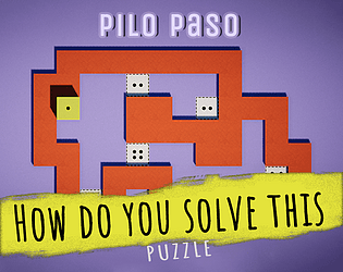
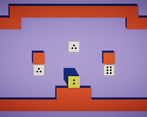
In this game you play as dice, and need to roll around in the map to complete the objective.
Did your team create the vast majority of the art during the 48 hours?
Yes
We created the vast majority of the art during the game jam
Did your team create the vast majority of the music during the 48 hours?
No
We used pre-existing audio
Leave a comment
Log in with itch.io to leave a comment.


Comments
I like the art style, however it was a little confusing at first to figure out that the goal requires the dice number to be facing downwards instead of towards the player. It is also hard to see what number is around the dice.
I loved the art and sound! It is just satisfying to move the dice, well done on that! Maybe the top-down view don't help to predict better the dice movement, but i enjoy the relaxing environment kinda balancing it. Good job!
this game is similar to mine, so I thought the idea is good, but it looked more polished some thumbs up :)
I thought that the puzzles lacked a concept, it felt like "step on those" by brute forcing it, rather than learning to control the die and understanding the level.
Can you please tell me what should I do to add the lacking concept, Thank you so much for your valuable feedback.
try to convey a certain way to solve each puzzle that each unique.
For example, you can convey that the orientation of the die matter, by giving the player easy step one a number tile,
which will make the next number tile impossible, and thus you taught the player the importance of orientation
I liked the one level that the number of moves was extremely limited, it forced me to think carefully.
I don't agree with the comment you should remove it entirely, It really depends on how much it is integral to the solution the number of moves. maybe give an option to play without it.
Nice game ! I dropped at level 6, the dice being irregular was too much for me.
Thanks for playing
I like the art style and level design, well polished, very nice.
The levels are challenging, especially with a step limit.
Funny I finished level 10 at the exact one last step, so I got a "fail" and "success" concurrently.
Yeh, I found that bug after submission. I guess it's too easy for you, I found your game hard that's why. thanks for completing all the levels.
That situation was entirely coincidental.
Maybe you can turn that "bug" into a feature.
If the players got a surprising achievement when they finished in the last step, they must be super happy :) , anyway good job.
Wow, you suggested a great feature. I'll definitely do that. Thanks man Thank you so much.
First of all, props on the art style. It reminded me of stopmotion animation. Really beautiful. I've seen similar games, yours definitely has the most beautiful art style.
One piece of feedback though: Two opposing sides of a die are supposed to add up to 7. So 3 is supposed to be opposite to 4, and 2 opposite to 5. In your game, 3 is opposite to 5 which is really confusing. Especially when you can't see any sides of the die except the top side. It forces the player to memorize the sides which is not hard when the die follows the opposing sides rule, but gets a bit tedious when the die has random numbers on the sides.
All around, great job though. My game has a similar idea, though we used a 2d style.
I have randomized the dice to make it harder to remember, Thanks for playing. 🙂
very nice take on the theme, love the animations and polish , one thing though you could have made the came controllable because it's hard to guess which die face is going which side, a camera which can rotate around the dice would have helped but I had fun nevertheless
I thought remembering where is which face makes it more interesting that's why I choose a top view to show only one face to increase little bit of complexity.
Very well put together, love the clean presentation. Sad the gameplay is one I've seen in many others, but it was very well executed! I echo the need for a scoring system, the current move counts are great for figuring out a level but doesn't pose a huge challenge
Sure it is not hard enough, I have decided to work on it, thank you for your feedback.
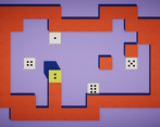
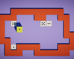
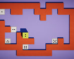
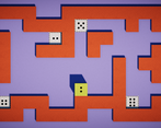
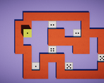
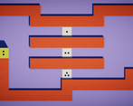
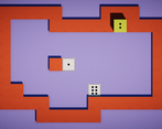
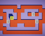
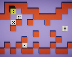
After a while you get idea how to get any side by just rolling around (which you try to decline by adding move limiter). I like the design (sadly the screenshots doesnt represent the real game)! Good job.
Sorry for screenshot it was my old view angle i'll change it.
Simple and minimalistic I like it! Although limiting number of moves kinda makes it hard man could have just added some star rating, like completing in less than x moves gives you 3 stars and if more than x moves then 2 stars or something. Still, I enjoyed the chill vibe of the game yes
Thanks for your feedback man
I don't know if intentional or not, but the level design actually made me understand the way the faces move when rolling.
Alltso feels really polished, good job :)
Simple and good looking visuals and great idea. Good Job!
Another game with this idea :D I’ve already found something like 6 games based on that (including mine), geez.
In the first level I thought that orange tiles are the ones you’re supposed to walk on (they look like a road atop some blue void), and with a top-down view it looks like the dice is standing on one of these tiles, so I tried to move left, up, or right, and it didn’t work (since, apparently, orange tiles are walls!), so I got really confused for half a minute until I realized it is the other way round. Maybe an isometric view would fix that! Btw, your screenshots use an isometric camera, but the game is top-down, why?
Agree with others that level design makes it feel a bit repetitive. Introducing levels a bit more gradually (e.g. starting with a really small map and a single objective), removing some free space (so that the player has a smaller solution space to explore) and “guiding” the player to a correct solution might help.
Another thing is that instead of punishing the player by constraining the number of moves you could introduce some “score” or “medals” that the player receives upon completing a level in less than the specified number of moves. This way, even players who want to play but don’t want to be as efficient as possible can still enjoy the game.
Anyways, nice game, good job!
Thank you so much for your valuable feedback. I'm sorry for that screenshot Initially I was making it isometric but in the end, I found the top view is better than isometric. I am bit lazy, I didn't capture new screenshots that's why. I have created all the levels within 1 hour that's why its not so accurate. I'll definitely redesign all the levels to make it more interesting.
Scoring by moves is very interesting I'll do that.
Thanks again for your feedback
Damn this is some well structured feedback man lemme know stuff about my game too ig XD
Great game with awesome puzzle design. The move limit really increases the difficulty.
I did the same concept, but it is not as good looking as this one ! I feel like there are not many ways to solve the puzzles and I have to bruteforce to solve them. It is a bit repetitive also, there aren’t new mechanics introduced (I played the 7 first levels).
Really nice look and idea, although it can get slightly repetitive.