Play game
Dice Defender's itch.io pageResults
| Criteria | Rank | Score* | Raw Score |
| Presentation | #1450 | 3.409 | 3.409 |
| Overall | #2201 | 2.970 | 2.970 |
| Creativity | #2622 | 2.909 | 2.909 |
| Enjoyment | #2718 | 2.591 | 2.591 |
Ranked from 22 ratings. Score is adjusted from raw score by the median number of ratings per game in the jam.
How does your game fit the theme?
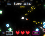
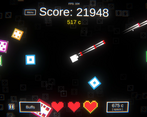
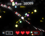
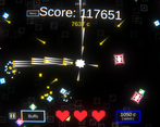
The enemies are dice, with higher numbers being tougher enemies. The main mechanic of the game is to use coins to roll, gaining a buff AND a debuff.
Did your team create the vast majority of the art during the 48 hours?
Yes
We created the vast majority of the art during the game jam
Did your team create the vast majority of the music during the 48 hours?
Yes
We created the vast majority of the music during the game jam
Leave a comment
Log in with itch.io to leave a comment.


Comments
Really cool game, nice concept
Thank you for playing!
The visual effects look great and music is awesome. The core gameplay loop is really solid, even if the effects feel a bit too up to chance at the moment (bullet speed + enemy speed whyyy). Agreed with the commenter below that letting the player choose between 2 or 3 buff/debuff pairs each upgrade would make things a lot more interesting. Either way, it was really fun!
Thanks for playing :) !
It has a lot of polish on it visually which is great. I think it would be interesting to let the player choose between buff/debuff pairs rather than just randomizing it every time, it felt like I was at the mercy of the RNG rather than getting to twist it to my advantage. Feels good to play otherwise though!
That sounds like a very good idea. I do agree it seems a lot up to chance at the moment, so I'll keep that mechanic in mind. Thanks for playing though!
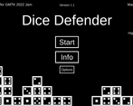
There's some issue with the resolution of the info menu. I definitely didn't get the game. It seemed like I couldn't move and eventually the enemies spawned faster than I could kill them. Also there were no upgrades in the upgrade menu?
I'm guessing I just missed something on how to play. Graphics were good, especially the way the money moves to the character
Hi, the game must be played in full-screen using the button in the bottom right. If that didnt work, can you tell me what resolution you were using?
As for the game, there is a 'roll' button to the right of the hearts, using money you press that to gain upgrades. The 'upgrade menu' you're talking about I assume is the 'Buffs' menu. This shows what upgrades you currently have. As you hadn't rolled at all, you had no upgrades, so the menu was blank.
Finally, it is intentional that you cannot move. I appreciate your feedback and recommend playing the game once more given this info, thanks!
Nice effects and cool idea! I like the idea of getting money after killing enemies to make it easier to kill the more enemies that spawn!
Thanks for playing!
Nice Concept with great visuals! Overall pretty good!
Thanks!
Really neat idea with very good post processing polishing, I feel like movement with a fix camera where it is currently, indicators of where an enemy is coming from and borders to stop the player from leaving the camera pov would be really quite good but other then that this game is really well done,
The atmosphere created here is really nice and the player having to buy back lives is a good idea because the player has to judge whether or not they can afford to buy a buff or not so well done for doing that, good job on this and good to hear you going to continue on this!
Thanks for testing it!
Nice music and love the psychadelic feel of the game. The gameplay is enjoyable and I can imagine coming back to it!
Yeah I went for a retro theme. Thanks for playing!