Play game
Poeli Pass's itch.io pageResults
| Criteria | Rank | Score* | Raw Score |
| Presentation | #357 | 4.120 | 4.120 |
| Overall | #464 | 3.720 | 3.720 |
| Creativity | #755 | 3.640 | 3.640 |
| Enjoyment | #789 | 3.400 | 3.400 |
Ranked from 50 ratings. Score is adjusted from raw score by the median number of ratings per game in the jam.
How does your game fit the theme?
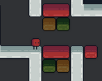
The main premise is rolling the main character, a colored die, which chooses what color is activated.
Did your team create the vast majority of the art during the 48 hours?
Yes
We created the vast majority of the art during the game jam
Did your team create the vast majority of the music during the 48 hours?
Yes
We created the vast majority of the music during the game jam
Leave a comment
Log in with itch.io to leave a comment.


Comments
I think the concept is okay and I really like the art, but I think you could make it more interesting by giving the player more agency, i.e. maybe there are points within the level where the player can choose if they want to re-roll their color. I also think it might benefit the game to lower the number of colors, since having to account for so many different routes seems to limit the level design a bit too much.
I agree, we were thinking about being able to reroll the color while in the level and maybe even something like a dash, but due to the time constraints we had to cut those ideas off. The level design was very challenging and less colors would help a lot with it. The theme was rolling a die which normally is 6 sides, leading to the 6 colors besides the white and black, so we just kept it at 6 colors. Thank you for the feedback!
really cute!
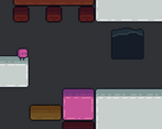
What a cool idea, especially with levels where the path is vastly different depending on rolled color. The contrast for the "dark water" was a bit too low I think, but I understand the decision, since there are already so many colors on the screen at any given time.
Some of the levels where you need to traverse downwards are a bit tricky and require a bit of luck and remembering where platforms are, so I wasn't a huge fan of those. Also a quick method of re-rolling the level would be amazing (just to try different paths!).
Great job!
Edit: one more think that I found super funny and ironic :D In the first tutorial level there's a sign that teaches you to use A and D to move left and right, but the sign is in a place that require you to move there, so you already need to know how to move ;)
Thank you for the feedback! We ended up realizing the same thing with the sign after the 50 hours was up, and looking back it was definitely an unnecessary sign!
Amazing presentation and concept. Really enjoyed playing. Great game!
Thank you
Would you mind checking out my game sometime? :)
Thank you so much! I will!
Nice work! It's a very charismatic game with a solid concept it could easally translate into something great!
Thanks for the feedback!
I love the aesthetics of this game. Everything looks super consistent. Unfortunately, I was already stuck in the first level. I was rolled the red color and had to make the following jump:
I made the jump once only to fall into the black ink a short time later. Then I restarted the game and got the color green. This color has probably the easiest part in this level. I love the idea of the game that each level has different paths depending on which color you roll. But in some levels you had to jump into nothing hoping to fall on a solid platform. That was a bit frustrating. Otherwise I had a lot of fun with this game. The concept is very replayable. Amazing work tough!
Thank you for the feedback! Not the level designer my self, but we agree there is a lot of difficulty in some earlier levels per color. We're still fairly new to game development and this is our first run in a platformer, so any feedback is helpful! We're glad you still had fun! :D
A classic platform game with an amazing art design
Thank you!
Cool game! The dice feels good to control for the most part, and the core concept is great. However, I wish it was better incorporated into the main game, maybe reroll on death to keep the level changing? Music and art were both top notch :) nice job!
Thank you! We experimented with ideas of rerolls but we wanted to keep the flow where you didn’t have to stop everytime you die, which we knew would be often.
Wow! Super fun game and rly impressive game given the time limit. Loved the way the dice mechanic way implemented and the pixel art was on another level.
Thank you!!
Cool game, I really enjoyed it!
Thanks!
Fantastic art and music, and I like your take on the theme!
Thank you so much! (the music is the best part don’t tell charre)
😭😭
it’s not my fault the ost smacks
Cool concept and pretty good execution/style, a bad roll can really push the difficulty curve off though. I feel like a little more deccel strength and a tad more coyote time would make some of the very narrow ledge feel more fair. I got pink on one of the levels with small pink ledges on the side of black death and it was starting to feel a bit harsh.
The difficulty curve is very unbalanced and the levels could definitely be made easier. As I was play testing the levels to see if it would work for every route, I got really good at utilizing the mechanics and did not really think about how hard it would be for new players. Thank you!
A fun little game. The level artwork needs work compared to the menus (I think the other colors should be greyscale when not integrated) and I had a hard time figuring how to start the game. The water also needs to be a bit more noticeable. Amazing amount of replayability, I just wish the concept had been more integrated into the game loop, like stations you need to use to re-roll your colour due to impassable conditions.
I agree! The game could definitely use work and could easily make certain things more clear. Thanks for the feedback!
Like the idea, but the levels really need some work.
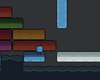
cute game! dice mechanic is cool too but was confusing at times. for example, i often mistook the water for the blue walls
I hear ya with the confusion! It will happen to me sometimes so don't worry. Hope you enjoyed it!
Fun puzzle, very easy to learn with the colors.
Thank you!
A very cool game! The art and music are great, well polished, the idea with the random colors is really cool but I think it’s really hard for the level designer ^^’.
Thank you! Level designing was indeed tough and all of the levels could definitely be improved.
Loved the concept , I can imagine designing levels and testing this must have been a pain - however when playing through the game i can think of maybe a few different things that could be added - the blocks that you can not stand upon to be slightly transparent so they blend back into the background somehow as sometimes I kept aiming for platforms that were not my colour by instinct - as well as implementing the tutorial into a level somehow without the signs even though they are a cool addition. Great Game!
Thanks for the feedback! Charre seemed to enjoy designing levels, the whole time making level 8 he kept saying "everyone will hate me" and was laughing about it. I can see what you mean with aiming for platforms that aren't your color as I do it with blue sometimes.
At the beginning I had a similar idea, but with more content than just coloured platforms. Unfortunately, this idea exceeded my competences, so I developed another game. I like the simple but cute style.
Yeah we would've loved to further more on the color-specific traits of the character (or abilities?), but are still proud of the result. Thanks!