Play game
Upgrading Your Robot's itch.io pageResults
| Criteria | Rank | Score* | Raw Score |
| Artistic | #84 | 2.352 | 3.091 |
| Theme | #101 | 1.314 | 1.727 |
| Design | #102 | 1.453 | 1.909 |
| Gameplay | #102 | 1.383 | 1.818 |
| Overall | #103 | 1.522 | 2.000 |
| Technical | #104 | 1.107 | 1.455 |
Ranked from 11 ratings. Score is adjusted from raw score by the median number of ratings per game in the jam.
Leave a comment
Log in with itch.io to leave a comment.


Comments
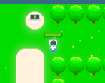
I was a little lost in the gameplay, but I liked the art style.
Great work and style. Keep going!
Great work, even if you had a working keyboard! There's so much work that goes into making a game that people don't know about, just having menus and transition screens can take a lot of time, so you should be very proud of what you've made here.
I hope you win a course, you will do great things with it I'm sure!
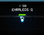
Sad thing about the keyboard, and I really liked the computer screen effects. :)
I manage to find two emerald,
and cute robot btw.
try again ;)
You've got really nice graphics! It's sad that you couldn't finish it because of your keyboard, but the most important it's that you made something. As feedback i can say that will be very useful to you to give a look on the player movement for more consistency. But your art it's really good stuff, i wish you success on your project!
Very good artstyle and visual effects.
Thank you !
good job putting something out there, sucks to see that your keyboard failed you.
I think your input could use some work, it seems like if i start moving diagonally, i cant stop unless i stop moving.
I would take a look at Input.get_vector: https://docs.godotengine.org/en/stable/classes/class_input.html#class-input-meth...
also, the level is really dark and its hard to see whats near me. I can see you're using a light2d to have a visibility effect. I think you should tweak that so you can see the parts near you brightly, but the parts far away are still dark.
Oh also, you only have a windows build. I am using linux, so I had to play your game using wine. Most of the time, this works fine, but sometimes, it can cause inconsistencies and visual bugs. Since this is a pretty lightweight 2d game, i would recommend a web build as well.
Thank you for the compliment and i well check this website.
and sorry for you but i didn't make a linux version >_>