Play game
Scrap dungeon's itch.io pageResults
| Criteria | Rank | Score* | Raw Score |
| Audio | #93 | 2.650 | 2.846 |
| Originality | #111 | 2.936 | 3.154 |
| Accessibility | #115 | 2.220 | 2.385 |
| Graphics | #129 | 2.578 | 2.769 |
| Overall | #134 | 2.414 | 2.593 |
| Controls | #136 | 2.363 | 2.538 |
| Theme | #152 | 2.220 | 2.385 |
| Fun | #158 | 1.934 | 2.077 |
Ranked from 13 ratings. Score is adjusted from raw score by the median number of ratings per game in the jam.
Godot Version
3.5 stable
Wildcards Used
N/A
Game Description
What's the mistery hiding in the dungeon?
How does your game tie into the theme?
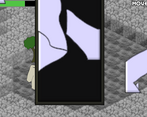
A broken mirror needs to be assembled to make progress
Source(s)
N/A
Discord Username(s)
DamianLDF
Participation Level (GWJ Only)
2 (this is the second one)
My game has an export for Linux, Windows, & Mac and/or is playable through HTML5
Leave a comment
Log in with itch.io to leave a comment.


Comments
Interesting game but i would love to see more animations
I have no idea of what's happening, but the artstyle and the music just make everything nice and good to play!
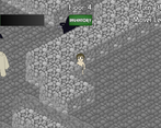
Graphics and sound were very effective and pair well. It's great to see you took a unique direction on movement in the game jam. It's very clean and it all functions properly, solid work here. It took me a moment to figure everything out, but once I did it was seamless. As others mentioned my only thoughts were the transparent tiles were a bit hard to understand when moving around.
Also shout out to those golem designs, I love them.
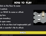
Thank you for your feedback! I'm a bit surprised by the attention the golem is getting, I think simpler designs go a long way. And I will also add at least a screen explaining the mechanics, but I'm glad that it is easy to understand even without it.
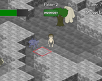
I like the graphics on this one, especially the slow-attacking golem guys. Took me a little while to understand what was happening, but once I got used to it, everything was fairly intuitive. The tiles themselves, specifically the walls ones are a little hard to read though. The fact that they are partially transparent can make it hard to understand how all the walls line up.
I imagine you did that to make so you could always see yourself and enemies behind walls, but I think it would have been fine if the walls were just fully opaque and you could only see the characters' heads poking out from behind them (you could make the shorter sprites slightly taller or just make the walls shorter imo).
Great job overall though!
Thank you for your feedback! Yeah, the transparent walls was a last minute change because the mirror fragments behind them were totally hidden, and I didn't have time to draw shorter walls or implement a different solution. My original idea was to place a cropped version of the sprite when there is a walkable tile behind, I will probably do so in a future update.
Ah that makes sense, I didn't think about the items being hidden. Your original idea sounds like a better solution than mine I think, I feel like that's something I've seen other isometric games do.
You could also try showing the silhouette of items behind walls. There's probably something on godotshaders for that? It's not something I've looked into before. Or maybe you could get clever with CanvasLayers.
That's an interesting idea! I just recently started playing with shaders, I might give it a try.
Very cute graphics. At first it was hard to recognize what tiles were walkable between the walls. The turn based movement was little bit annoying, but other than that I had fun. Is this actually procedurally generated? I assembled the broken mirror and found out what's behind it! :P
Thank you for your feedback! And for completing the level, so I'm not the only one who knows what happens in the end :-D
Now that I see it, I agree that the walls blend a little with the floor, I will come with a different solution to see behind them instead of using transparency. And the level is always the same, only the items and monsters' positions are random each time
Interesting idea.
I would love to see the animated hero and kind of a map so you know where you are.
Well done though!
Thank you for your feedback! I didn't think of a mini-map, that would be a good idea. And I hope I can add animations after I finish some of the mechanics that are missing right now.
Cool.
Will check back later.
Interesting game! I couldn't get access to the inventory for some reason. It was fun to beat those monsters, though! Good work!
Thank you for the feedback! The inventory was not yet implemented, forgot to hide the button.
Nice controls and audio is great for the ambience. But I couldn't figure out how to fix the mirror!
Thank you for the feedback! Now that I think, fixing the mirror is the only mechanic that requires mouse only, so it may not be that intuitive. I will need to think of a way to make it easier to understand.
Game seems like it could have potential; Simple design and controls. I do wonder about the inventory, I don't think I was able to properly use or open it
Thank you for your feedback! Unfortunately, I could not finish the UI for the inventory. Right now, it can only be filled up to 30 items with no way to use them or to throw them away, so collecting items is more bothersome than helpful.