Play game
Nightmare - A Harold Story's itch.io pageResults
| Criteria | Rank | Score* | Raw Score |
| Therese Award for Strength: Combat | #2 | 3.899 | 4.000 |
| Hrld Award for Graphics: Visuals | #3 | 4.207 | 4.316 |
| Harold Award for Excellence | #4 | 3.745 | 3.842 |
| Oldhar Award for Literature: Story | #7 | 3.591 | 3.684 |
| Marsha Award for Music: Sound | #12 | 3.334 | 3.421 |
| Lucius Award for Laughs: Comedy | #18 | 2.668 | 2.737 |
Ranked from 19 ratings. Score is adjusted from raw score by the median number of ratings per game in the jam.
Leave a comment
Log in with itch.io to leave a comment.


Comments
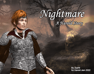
Entry stood out immediately for the 3D assets used (which I usually really dislike), but I think you really knocked it out of the park. The renditions of the different heroes was quite good and they were instantly recognizable.
Combat wasn't world changing, but I found it fun and fast paced for a jam game, with enough variety to make it interesting for the entirety.
Personally I found the story to be most enjoyable. The different Harolds had personality and some history behind them that I wanted to know more about. Oldhar had a rightfully evil plan (although a bit too easily thwarted by the heroes). I'm fascinated by this Harold of Wisdom fellow. Hope we get to see more one day!
Enjoyed it, the switch to rtp was fun. Looked great, good game.
Semi-realistic Harold & friends! I wasn’t prepared, but now I’m glad I’ve experienced it. Fun game with an interesting take on the characters. I loved the style shift of the puzzle section. Some things though:
A great submission - very strong indeed!
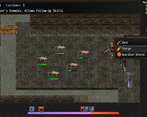
Battles are good, though there may be too many skills given the relatively short run time and few encounters. I still like being able to experiment with stuff and the Follow-Up system is interesting.
Dialog was good, with some humorous references and a bit of very Harold-like goofy irreverence.
Pretty easy, but that's fine for a jam.
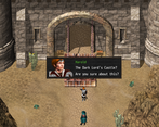
Puzzle section was a bit weird and jarring though that was part of the joke. Functionally the puzzles played OK and provided a change of pace.
Gotta agree this is the best use of those dang 3d assets I've seen in a completed project.
Edit: I forgot to mention that I really liked the "multiverse" approach taken, it was well done.
My biggest issue was that the autosave would occasionally cause the game to crash (twice in my playthrough). Barring that, very enjoyable experience with this one.
While I've never been a fan of these 3D assets, it was very refreshing to see the HTML gang in this style.
This was a fun game and I could easily see this being made into a full game. I enjoyed the battles and the little puzzle (and the gag with the RTP style).
Very solid entry!
This is my favorite game that uses these 3D assets. Everything here is customized and beautiful.
There's even a bit of potential depth to the combat system. The battles were generally easy so I didn't need to get to know the ins-and-outs of the battle system and I never used any of the items I collected, but I could see the intention there and have found it a best practice to err on the side of easy for jam games.
I felt like the menus could have used more sound effects, but the effects and music that are present sound great.
Overall great entry, well done!
I really like this dark fantasy realistic portrayal of the HTML gang, Feels like I'm playing a CRPG!
Why does he look like Pete Davidson. WHY DOES HE LOOK LIKE PETE DAVIDSON.
Excellence: Played solidly and having the names near important items was a great touch.
Combat: Follow-up commands are fun to use and I'm glad you kept them from Day Dreams. Other than that, though, combat was fairly straightforward. Auto Battle is a cool idea for those not into encounters but I didn't use it personally.
Comedy: Not a lot to offer due to its serious tone, but the little Marvel ending was pretty funny.
Sound: Great custom music and SFX that match the effort put into the visuals. Walking sounds added a lot too. Some punchy effects when getting hit in battle would have been appreciated though.
Visuals: Unique and extremely well-done graphics that remind me a lot of Baldur's Gate. The RTP transition is a bit jarring and I wish the game had a custom font to round it all out, but I'm still giving this a 5.
Story: This concept would be at home in last year's Haroldverse jam for sure. Well done with a clear start, middle, and end, but I feel dialogue could have been spiffed up a tad.
Oops, I had to go back and check. The Party menu with auto / options / escape was supposed to be disabled and not usable. Bug!
Someone else mentioned the sound in battles too. Definitely something I have to work on for next year.
I knew the RTP map here was a big risk, but I still wanted to pay homage to the "real" Harold. To me, going in isn't bad, but it always feels like slap in the face when you come back out. One day I do want to revisit that realm and learn to actually make good puzzles.
It's weird, but because I've used PVG graphics since Ace, I immediately delete most of the database and assets as soon as I start any new project. I never actually thought about Harold before last year's Jam. So now Haroldverse is how I think of him and will probably connect to all of my future Harold Games.
Maybe next near I can rescue the remaining Daydream Harold from his dreary life. Is he the Harold of Wisdom? Hmm...
Thanks for the great feedback.
I enjoyed this.
Game play wasn't that innovative but it was easy to follow and engaging for the length of the game.
Combat was not too hard, and it had some variety which gave the player room to breath. I expected the last fight to be harder. I also could not change who I was targeting in the last battle. Was that intentional?
Sound was good and fit the theme!
What can I say, those were amazing visuals and I really liked the vibe. Lucius gave me strong professor buddy vibes and I liked it.
Story was nothing too innovative in the Harold universe, but it did have some emotional wight.
I wish it was longer!
I feel like "Wasn't That Innovative" is a good description of my entry.
I did try to keep the battles on the easy side since I didn't expect turn based battles to raise any excitement in that category anyway. It was more about refining my follow up and buff-induced skill system, and working on setting up the "in-story" tutorials for my battle system.
Apparently I do need to add something new to it, if it wasn't clear that Oldhar uses a Taunt, which is why you couldn't switch targets for part of that battle. One of the Harolds should have commented on it. Thanks for pointing that out.
I am glad to know that you enjoyed playing it.
I think this style of battles could really benefit from a longer play length with a wider variety of scenarios! Have you done other games aside for Day Dreams with this combat system?
Not yet. These are the only two games I've ever made to completion.
Most of my projects have "Attack = 9999 damage" to place encounters, then I decide the story sucks, and they get deleted.
It might get expanded on again next year with the search for more Harolds.
This one was amazing! I would love to see it expanded on and turned into a full length game someday.
Thanks for the kind words.
Sorry, but I doubt I will ever do more with it. This was just another testbed to try a few ideas out, and see how they went over. Which is apparently better than I was expecting.
I'm glad that you enjoyed playing.
The thumbnail alone made this jam entry stand out to me and the use of 3d assets was interesting.
Visuals -
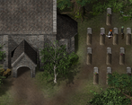
Right off the back the use of the 3d assets in the map design is great, although i wished i could walk around the church scene.
The layout of the battle scene was interesting and location of ui and use of assets is different.
There is something nostalgic to me about the prerendered assets reminding me of the psx era.
The custom sprites and gestures when interacting is a fantastic detail such as the food.
Combat
There's quite a bit of effort in the combat from the graphics to the choice of music and mechanics.
The follow up skills is good and skill useage has had effort put into it.
If there was one criticism i could give the battles is that i would have loved better mapped battle parallaxes and more sounds as battles were overall quiet.
Really good entry!
Lost opportunity, the church map was built to be fully playable, I just didn't see any reason to let the player wander around, sorry.
- Really, I didn't want to have to fill in descriptions for all those headstones - so portal the player away from it.
The sprite animations were something I really did want to work on here, since they are one of the things I love most about using these assets. I'm glad to hear they were appreciated and worth it.
I'll have to pay attention to the sounds of other people's battles, to see how I can improve that. Honestly, all I can think of at the moment is the menu click sounds that most games have that drives me insane, or the "cast animations" before a skill is used. If there's something I'm missing, hit me with it.
Thanks for the feedback.