Play game
Kaiju Run's itch.io pageResults
| Criteria | Rank | Score* | Raw Score |
| Visuals | #22 | 3.400 | 3.400 |
| Audio (Does not apply for Physical Games) | #23 | 2.667 | 2.667 |
| Originality | #24 | 3.000 | 3.000 |
| Fun Factor | #28 | 2.267 | 2.267 |
| Overall | #29 | 2.467 | 2.467 |
Ranked from 15 ratings. Score is adjusted from raw score by the median number of ratings per game in the jam.
Is your game a video game or a physical game?
Videogame
Was your game made solo or in a team?
Solo dev here
Did you use any third party assets, if yes what assets did you use?
Music and SFX from a pack by Sidearm Studios, credit in game description
Did you use choose from one of the optional secondary themes?
Pure kaiju submission
Does your game contain 18+ content (Nudity, Gore, Language)?
no
Leave a comment
Log in with itch.io to leave a comment.


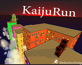
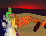
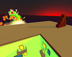
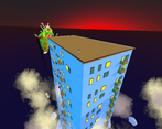

Comments
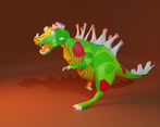
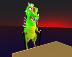
I didn't have the time to play and rate this during the jam voting period, but it looks good and plays pretty nicely, and I love the stilt kaiju. I'll spare my critique of game issues as other people have already pointed them out, so I'm sure you're well aware at this point.
Yeah, I was quite aware of the main issues before the voting started, even if I can't say it wasn't useful the have them pointed out. I'm glad you found the time to play it and appreciate the positive sides, thanks for playing
I like the concept, and the Kaiju on stilts is hilarious!
Like others, I found the inability to know what's coming was too severe for a jump to be anything but luck, but I can see why you went for the chase cam as you did.
Two possible ways you could resolve it might be:
1/ You could pull the camera back a little so that you can see the building just before you have to jump (effectively the method used by Crash Bandicoot), though you'd probably need to cartoonishly oversize the player character as they're already quite small on screen.
2/ Alternately (or maybe even in addition) you could make the procedural buildings spawn from a seeded random number, so that they're the same every time until you try a new "level" (seed). That would at least allow players to learn the sequence and get good at it, while barely changing how you're generating them. This also opens up the potential for comparing scores competitively, if you wanted to go down that route.
thanks for playing and for the comment. I was going with visual clues, like flashing arrows you need to take quickly into account, but the idea of seeding the generation is quite a good one. And the clues can work as a enhanchment to learning the track faster with less frustration. Nice suggestion!
Good game but maybe the building spawning could be refined a bit more. Nice job!
A lot more actually :) thanks for the comment
The art direction felt pretty nice, and having procedural building placement was also nice, but the gameplay had some issues like having the player (for me at least) having to blindly jump and hoping there would be a building in front of where my character were going. I did not get very far because of this, did I miss any controls like moving the camera?
The camera is a weird design choice/experiment, you missed nothing. It should have been backed up with visual clues and other things but time ran out. Thanks for trying it out
With some bug fixes this would be a fun game! I really like the look of the kaiju!
Glad you liked it, the kaiju was very fun to design so seeing it works is nice :)
The controls feel alright and, when you get used to it, the dash is nice too. I did end up having a lot of issues though. The game crashed twice before I was even able to start playing it and once more after I ran into some boxes. The main issue I had was the blind jumps and constant clipping through walls. Based of off my testing it seem that pressing jump too fast when scaling a building launches you through it instead of over it. The camera is also in a bit of a rough position, but not a bad one.
Honestly, a few small tweaks here and there and this could probably be pretty good! When the game did work, it was pretty fun, and the kaiju design was also pretty cool.
Thanks for the comment, glad you liked the kaiju! I didn't experience crashes: was it browser play or downloaded? The thing with the boxes suggest some problem in the code, or maybe collisions going crazy... I'll look into it, thanks for pointing it out.
I played the downloaded version.
Definitely has potential! I enjoy the visuals, and the controls feel responsive.
The camera is a problem. You might want to get inspiration from how other platformers have implemented chase cameras.
thanks for the comment and for trying the game out! The camera surely needs some smoothing, but the angle is an experiment to create more anxiety without ramping up the velocity. I'm thinking visual clues to alert of incoming higher walls or the like... But it could very well never work like this :D
Very interesting concept! I really liked the procedural buildings that was a nice touch! although some of the buildings were to high to jump over I guess it had something to do with the procedural but I imagine just getting that in the game must have been hard, so great job overall!
Thank you for the comment! Yeah, tuning the procedural generation wasn't easy, as of now heights are on a sinusoidal function with some random variations. I added walljumping to recover from falls, but it's tricky as hell :) Glad you liked the building
It's a neat idea with a fun monster design, but it's waaaay too hard since you can't see what buildings you can jump to ahead of time. Maybe having the perspective be from the side would make it easier to see what you can jump to while still letting you see the monster attack.
Thanks for checking out the game, glad you liked the monster!
I went for an unexpected pov to make it a bit anxiety inducing, with high fov and a tilted sky, and to ramp up difficulty without ramping up the velocity. The experiment isn't a success, honestly, but I like were it is going.
Tried it more from the side but it seemed too ordinary looking, so I'll rather try to flash some visual clues for higher levels incoming and rely on a better wall jump system to recover from falls.