A nice little endless driver! I like the 80s aesthetic and the music tracks are good, but I found the controls are a bit tricky. Generally, as soon as I need to make a sharp turn, everything goes quickly downhill and I crash in seconds. Also, as much as I enjoyed the music, I think it would benefit from an option to turn it on/off, so you have the option of listening to your own tunes as well. Lots to like here, overall.
Centauri Interactive
Creator of
Recent community posts
The atmosphere of this one is gorgeous, but it's also got some great gameplay too, and I would happily play more of it.
Pretty much the only gripes I had have already been raised on here by a few others, so I'll just mention what I liked. I LOVE opening the canopy. Even with no purpose, it's a great touch. The bootup sequence, physical interface and all those little immersive touches are sublime.
I think some tanks & tracked vehicles would work really nicely as weaker enemies, perhaps beefing up the enemy mechs.
Hey, thanks for playing!
I get the issues with the controls. I think it was probably also because the style gradually migrated into a more zany tone generally, from a more immersive one; but also that there are many intended improvements; such as auto-recentering the mech rotation to the torso angle; which never made it in. Post-jam version is planned though!
Thanks so much for playing and taking the time to review!
Regarding the controls; there's a number of improvements I'd like to make here as there's definitely much room for improvement. I never quite managed to fixed the scenery damage system such that it carried through your momentum correctly, which can make things a bit hard to handle or excessively flow-breaking.
I played this and rated it but totally forgot to comment! As mentioned on the discord, the main issue I had was finding my way into the level; the direction took some working out, compounded with then not recognising the teleporter (at first). But once I got there, the mayhem of smashing things up was really quite satisfying :)
Incidentally... I'm not sure how my bosses' nefarious scheme was going to work out; if he was hoping to make money selling insurance, he's going to very unhappy when all those payout claims roll in, haha! Oh well... so long as he keeps paying me my £1 a week...
This was a great original idea and—perhaps unusually for very original ideas—it was well-executed to boot; sound, graphics and particularly the animation were all very good. I think my main niggle was in the intermittent responsiveness of the dialogue choices and the swiping, plus maybe one or two UI scaling gotchas (I think the About screen not having a close button, also not sure if the bottom of the dialogue bubbles was meant to be cut off at the bottom of the screen?). But they're all pretty minor stuff and the game as a whole oozes character! Great work.
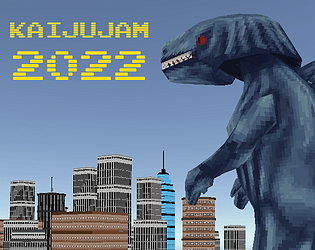
I like the concept, and the Kaiju on stilts is hilarious!
Like others, I found the inability to know what's coming was too severe for a jump to be anything but luck, but I can see why you went for the chase cam as you did.
Two possible ways you could resolve it might be:
1/ You could pull the camera back a little so that you can see the building just before you have to jump (effectively the method used by Crash Bandicoot), though you'd probably need to cartoonishly oversize the player character as they're already quite small on screen.
2/ Alternately (or maybe even in addition) you could make the procedural buildings spawn from a seeded random number, so that they're the same every time until you try a new "level" (seed). That would at least allow players to learn the sequence and get good at it, while barely changing how you're generating them. This also opens up the potential for comparing scores competitively, if you wanted to go down that route.
This entry had some great narrative; lots of work clearly went into worldbuilding and plot. Some minor typos, but that's to be expected in a jam—especially with this much text content.
The other aspect I would mention—which others have noted—was that I felt it was kind of pushing me down a "correct" path, but this too is I think to be expected given the circumstances. That said, occasionally I felt like my character wasn't doing what I intended... and I ended up getting a "game over" scenario without actually realising I'd messed up. Perhaps I'm just a terrible interrogator! But I think it would benefit from branching options within a path; eg. picking "sympathize" but then getting a choice then from, say, 2 dialogue options to say (or to change your mind and go back, if you decide actually neither option is desirable). I get that this is even more branching, but I think it's always good to try and keep a strong bond between what the player is trying to do and what they end up doing.
Anyway, I really liked the art and character designs. Oh and the title screen transformation was awesome :)
Yeah, I felt like doing 3D in that sort of early 32-bit style and it actually turned out alright in that regard. My original plan was deliberately vague, but it would likely have been something to do with making your own kaiju to then rampage through a city and see how much damage you can cause (the model was actually modular, allowing for alternate parts).
As a fan of both RPG Maker and worlds set entirely in the sky (I have a similar setting, Azimuth, in which I released a novel several years ago, called Cloudgazer), I have a real soft spot for this one and glad I got a chance to play it.
I was, I will be the first to admit, absolutely rubbish at it; but the scale and scope are super impressive for 2 weeks! There's some nice worldbuilding going on here and the commitment to the palette is bold & distinctive.
I'm not sure if it was a bug or not, but when moving to world map the "cursor" (which I presumed to be my craft) always seemed to start in the top middle, which sometimes made it tricky to keep in mind where I'd come from.
Overall though, it was very likeable and I'll be sure to give it another try (and not get steamrolled straightaway).
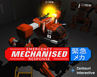
The art here is top notch and holds a consistent style throughout; the sign of a well thought-out plan! So many great little touches; from the user manual style control explanation to the guidance from the prof. But that movement mechanic is probably my favourite thing of it all. The concept is straightforward but gives so much flexibility that crawling through urban wreckage is just fun to do. You managed to perfectly display why mecha are so awesome (while my own, thanks to lack of said flexibility and those damn low bridges, kind of makes them just look Awesome But Impractical... I mean, the fire engines could've been there way quicker, but I was gonna have rubble and obstacles etc. ANYWAY...). Sometimes it takes some encouragement to go over an edge, but it always felt to me like I was working within limits of the machine rather than faulty controls.
Indeed, the only real gripe I have is lack of sound. But, I think it's better to have no audio at all than bad audio. So when your sounds source fell through, going without was probably better than rushing something to spoil an otherwise very polished jam.
I wish I'd got around to all the millions of buttons I wanted to originally hook into it to make it complicated, haha. I even had plans for a bootup sequence, and that winch on the front was not meant to be decorative, but perhaps more to follow soon! On the upside, the current one is very drivable on gamepad. Oh, and the Q/E to rotate may also make it easier, not sure (shoulder triggers on an XBox controller).
Yeah, you can tell the controls were originally intended to be more sophisticated but ran out of time. Hose arm was originally going to be articulated and is structurally set up to do so, but didn't make the cut.
I will say though, that the Q/E torso rotation makes up for the mech's inability to turn on the spot, but is oft-missed due to only being on the game controls page. I didn't find time for a tutorial/control map, but have learned that even a quick F1 "this is how it controls" text dump is worth the 10 minutes dev time.
Hoping to make a few more improvements post-jam, so an invert toggle on the mouse will be one of those for sure.
So I very much enjoyed playing this one, it has tons of great atmosphere (even with cubes as enemies!) and very satisfying feedback for firing and so on. The mech is rightly the best part; I love its look but even more so I love how dependable it is. You can tell it to go do things and it does so very capably, but of course riding it is even more fun. I do wonder if the tap duration for a move order could be a tiiiiny bit longer; I found my natural tap duration too sluggish and a lot of the time it took it as a "look at" order instead, which I felt was less commonly needed.
Also liked how some enemies tried to preserve their vulnerable (I think?) red spot by turning away. Didn't seem to make them slower, but I presume they can't fire while doing so. I liked the tactical choice of focusing on destroying one at a time or spraying an area to make multiple go on the defensive.
Sound design here is great, well worth playing with headphones. Shots, reloads, beeps, all sound spot-on. Turning on the search lamp, I could even hear the hum of the bulb; that's a really nice detail that goes into making the atmosphere so compelling.
I'd love to see this with more distinctive models for turrets, extractors and enemies.
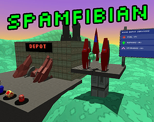
This is visual treat, a really distinctive art style and lots going on. I got a bit stuck in the terrain quite a lot, but I feel that was probably a deliberate design choice. I liked the way you could get in and out of the mech, and it had the various functions inside as a bank of buttons (I'm not sure, but was one of them a sort of "find treasure" ping?)
I was wondering about the R button to enable mech steer, as the A and D keys didn't seem to have any other use while inside the mech. Was there a reason for it that didn't make it in (or I just missed)?
It's gorgeous and original, but I confess I did get quite stuck and relied almost entirely on the indicator, as I wasn't quite following how each step progressed to the next (in the sense of cause/effect or my objectives), though I think I started to faintly grasp it toward the end. In some ways this was refreshingly mind-challenging, but I didn't quite get that "Ah that's what I was meant to do" payoff that normally compensates for a click-searcher puzzle.
That said, I do think this was wonderfully inventive and the sound/visuals as components snapped onto the mech were highly satisfying.
I loved this. It's got a nice retro pixelart style, which with the music put me in mind of early DOS or the Megadrive. It was simple to pick up but still pretty addictive; I ended up finishing the whole thing (which I was not expecting as I'm generally awful at boss battles).
I also really liked how you included the mech pilot aspect. That's something I'd originally hoped to include on mine as well, but ran out of time. It's done really nicely here, with the avatar on the UI and customised paint schemes.
This is a very impressive and visually superb entry, the networking feature is an unexpected win. I really liked the dynamics of the strategy game itself, it was nicely high-level enough but still allowing for tactical ploys.
I did find that the first unit's inability to lead their targets effectively meant I often had a large force missing their target while being destroyed by a smaller enemy. Not sure if I'd count it as a bug, but it was frustrating that they seemed to be incapable.
In all though, a really polished RTS jam!
Something about this really took me back to the Dreamcast. It's shamelessly wacky, impressively varied and a lot of fun.
One issue that stood out: I kind of expected the mech form would be able to turn while not moving... wasn't sure if there was any difference in how the two forms behaved, but a "versatile vs fast" dynamic was my first expectation.
The voice-acting, music and depth of content were outstanding for a jam. Also, props to all the effort in order to build an entire city traffic system within the timeframe!


