Play game
Escape Cave's itch.io pageResults
| Criteria | Rank | Score* | Raw Score |
| Presentation (rate its art, animations, sfx, music, and aesthetic appeal) | #105 | 2.660 | 2.660 |
| Gameplay (how good was the user experience, game design, narrative, etc?) | #120 | 2.319 | 2.319 |
| Implementation (rate the game's overall stability and functionality) | #131 | 2.532 | 2.532 |
| Overall | #141 | 2.370 | 2.370 |
| Theme (how well does the game fit the challenge theme?) | #150 | 2.255 | 2.255 |
| Creativity (how unique or innovative was this experience?) | #164 | 2.085 | 2.085 |
Ranked from 47 ratings. Score is adjusted from raw score by the median number of ratings per game in the jam.
List the Itch usernames of all official team members.
Yamac Yurtsever, honorflies
Team Name
Dioda Production
How does your game fit the theme?
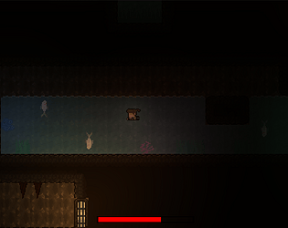
We explored the theme of "Take a deep breath" in two ways. One being taking a deep breath before diving into the water and the other being relaxing after taking a deep breath. Thus, we centered our game around the mechanic of the player holding their breath. The player is in a dark and scary cave where holding their breath on land - via relaxation/focusing - causes time to slow down making it possible to pass certain obstacles, and holding their breath is necessary underwater. In addition, we tried to make the setting of our game scary and included stressful situations (also induced by the air bar decreasing) in order to incite the person playing our game to have to take a deep breath and stay calm in order to beat it.
Leave a comment
Log in with itch.io to leave a comment.


Comments
Ended up playing a bit of this again in stream yesterday, https://www.youtube.com/watch?v=fTHWhdgExgA
Nice! I love the premise, It's like Spelunky but with bullet-time. Faster respawn time would be welcome and maybe more checkpoints, or maybe I'm just a noob. Anyways, Well done!
Cool entry! The hitboxes are really unforgiving, especially on the flames. but i like the concept!
Also idk if it was my screen but its so dark that i could barely see what was going on, even with the flashlight.
Love the art of the game so much and how the torch works lol. Thanks for the nice game~
Very cool game visually, amazing work with the illumination! Gameplay was good too, even if the difficulty was a bit too brutal for me (would have loved some checkpoints)
Great entry!
Infuriating, I love it. I also like the ginyu force mechanic
Glad to hear you liked it :)
Streamers would have a field day with this, hahaha!
This is my comment as a player.
1. The tutorial can be improve. Maybe can put some icons instead of full text.
2. I think can be a fun game to stream or to content as the difficulty is quite good.
3. It is quite difficult for starter area as it makes player lose interest to continue the game.
4.Not sure how this game fit the theme.
5. Overall, it was a fun experience to play.
Thanks for your feedback. We intended for the game to be pretty difficult in order to push the player to slow down time and "take a deep breath" if they get infuriated, but I agree that the starter area could be a bit easier and a proper tutorial would also help. We will be making improvements and adding content in later versions of the game after the jam. Also, you can find how the game fits the theme in the "How does your game fit the theme?" section.
It seems really well made! Very scary premise, it seems perfect for a hardcore gamer who's into difficult platformers! I'm more of a casual gamer, so I thought it was really hard to see at the beginning and I wasn't sure of the controls. I read part of the instructions (very wordy, I find it that the message has to be very visual in games) but couldn't retain the controls. Sorry about that. It's the second time I see the idea of "holding your breath slows down time". In your project that seems to add up to the lighting difficulty and made the game experience scary, indeed! Congrats!
Thanks for the feedback! I agree with everything you said. The game is definitely not for everyone, it is meant to be on the difficult side. Also, unfortunately, we didn't have the chance to make a proper visually appealing and concise instructions section - or a tutorial level for that matter -, we will be adding that in the next version.
Very interesting dual purpose design! 🌊🕔
Thanks!