Play game
Magical Grandma's itch.io pageResults
| Criteria | Rank | Score* | Raw Score |
| Magical Girl Concept | #3 | 4.178 | 4.364 |
| Gameplay Polish | #8 | 3.133 | 3.273 |
| Originality/Creativity | #8 | 3.482 | 3.636 |
| Overall | #9 | 3.395 | 3.545 |
| Engagement/Fun | #9 | 3.307 | 3.455 |
| Audio | #12 | 3.133 | 3.273 |
| Aesthetics | #20 | 3.133 | 3.273 |
Ranked from 11 ratings. Score is adjusted from raw score by the median number of ratings per game in the jam.
How does your game fit the Magical Girl Genre?
The deuteragonist, Cheryl, is a retired magical girl with the powers of bloom. Her granddaughter Mia is also a huge fan of the manga Sparkling Saviors, which is of the magical girl genre.
Which theme(s) do you pick?
[Smoking], [Dragon], [Age]
How does your game fit those theme(s)?
1. Smoking - After the earthquake, there are smoke clouds in the horizon. Cheryl is captivated by this because it slowly triggers her memories to come back. There's also the level where the school is clouded in smoke because of a fire elemental monster.
2. Dragon - The final boss of the boss rush mode is a dragon. A Chinese dragon to be precise.
3. Age - The titular magical grandma is well... a grandmother. She's in her 60s but was once a magical girl in the past.
Were the assets for your game made during the jam? Elaborate as you see fit.
Asset making started prior to the jam, due to time constraints for both creators. Gensun did the overworld sprites and maps, while I drew the character and monster designs, the battle backgrounds, and the CGs. Although 2 exceptions are the final boss design (those familiar with RM2K would recognize it) and the background for the boss rush is from RMMV’s dlc folder.
Some assets were bought and/or taken from plugin providers. Particularly the attack animations and the UIs.
Music and sound effects were also bought.
Leave a comment
Log in with itch.io to leave a comment.


Comments
Great writing, nice use of music and sound effects.
I was really drawn in by the story and concept of this one. It has some cliches, but I'm not sure if we've seen a magical grandma in this jam before. I do wish there was a bit more background, but maybe that comes later in the game.
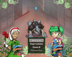
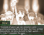
It's an odd mix of very stock RPG Maker feeling (the menus, battle mechanics) and very unique and custom (side scrolling adventure!). Overall it works well enough and is well presented, though. I really like the battle interface with the characters having different portraits as they get hit, run out of health etc. I think the character portraits in general are my favourite though I really like the overworld graphics too.
I'm not sure how useful a map screen is in a largely linear game; was it intended to be more open at one point?
In general I feel the battles are just a little bit too drawn out; the first two started to really drag about two thirds of the way through. It could get better later in the game, it could get worse, I didn't get there. I made it to the fight with the bats and kind of ended up in a hole where Cheryl went down and when I revived her, she was immediately taken down again by the bats. I like the idea of that battle, but waiting for eight bats to have their turn got old fast.
The abilities seem fine. I'm not really an expert on making awesome balanced battles. I really like Mia's improvised abilities, though I did find it odd that they're almost as effective as Cheryl's actual magic.
I don't really have time to slog through that battle right now, but I'm engaged enough by the story that I might come back to it post-jam.
Only explanation I have for Mia hitting as hard as Cheryl's magic is so the party's balanced out and both members have their own niche. Though story-wise I'll just say that Cheryl's age caused her powers to not be as effective as they were before, and/or that Mia's actually quite athletic thanks to swim club, though they may sound like hand waves more than anything.
I did initially have plans for more optional areas but they were a bit too ambitious to include in a jam game, not exactly sure if I (or my brother) would be up to create a larger scaled post-jam version. But there is an optional boss rush where it takes place back in Mia's house, and it unlocks right before the final area.
As for the next time you attempt the Camazotz battle, have Mia tank with Textbook Guard on first turn, it's a lifesaver.
Overall, I appreciate the feedback!
Cool game, had a good time beating it. I liked the characters' pixel art, it looked really good. The colors of the pixel art were different than the portraits. I think it would look more unified if those were aligned.
I'm curious, what's up with the credits.html document? Is it for RPG maker plugins or something?
The credits.html seems to be part of the files by default when the RPGmaker editor exports a project. It's not for the plugins but for a lot of lower-level base code.
I'll start with saying that I don't really like these type of RPG games. They just bore me in general.
Regardless the game is pretty well done (story and gameplay wise). I like the over-world map, although not sure why I went downtown instead of straight to the pool (didn't make much sense story-wise) ...
I lost at the pool, cause I didn't kill the monster quick enough ? That ended my game session right there since I was not going to replay the whole game. Maybe ask the player to save if the ending can be so harsh?
I guess, I'd like to be able to see the monsters HP or would have been nice to see a "turns till friend drowns" so I would have been able to maybe more wisely choose my strategy.
I enjoyed this game! I loved the stye and story. This feel like the start of a full length game. I would love to see this fleshed out or continued. I want to learn more of this world and characters! I also want to see the girl's magical powers in action. Did she get the water element or something? Honestly, I'm surprised she didn't try to befriend the final boss. Maybe that could be a option for her in the future.
I'll give my full thoughts once I finish the snes challenge. For now, I'll just report some bugs:
Big # 1:
This is probably the most major bug in the whole game. If you return to the school after beating the turtle, it would respond you back inside the school. And since you already beat the turtle, you are pretty much stuck in there with no way out. A simple fix to this is change the transfer event location to the front of the school.
Bug # 2:
You can walk into the void at the swimming pool. Unless you plan on hiding a Easter egg in the darkness, this was probably not intended. I simple fix to this is to either set up some invisible walls, or change the tile priority from O to X on the tilesets tab on the database.
And that's it! Overall, good game! The battle system is well balanced and it feels pretty full for a month's worth of dev time. My only cratiqe would be that I want more content despite it being a complete package. That's a sign of a good game!
I’m fully aware of the map teleportation bug but my lack of knowledge in programming and my brother working on another jam that unfortunately overlapped with this one didn’t give us enough time to fix it.
We’re not exactly planning a sequel (at least as of right now) but you are correct about Mia gaining water powers, and I’m glad you enjoyed the game. ^u^
Great pixel art!
We enjoyed the classic JRPG gameplay! The abilities felt varied and balanced, the fights felt challenging and long enough to be worth using buffs and debuffs.
We felt that the several different art styles in this game clashed a bit with each other, something more cohesive would most likely give a better overall visual feel.
Good choice on keeping the game fairly concise with no over useage of battles.
Overall we had a good time playing, good job! (Also the grandma pixel sprite is adorable)
Do you have any suggestions on what can be done to aim for something more cohesive? Preferably a solution that does not require us to cut down to one artist doing the entirety of the work?
A good way to keep assets more cohesive is to decide on a color palette beforehand. Sites such as https://lospec.com/palette-list can be helpful - I find this site useful even though I don't usually do pixel art.
Shadows can make a pretty big difference so deciding on a shading style for all art can also be helpful - soft or hard shadows? Which shadow color? What direction does the light come from? A more technical tip is to use a multiply layer for all shadows with the chosen shadow color.
Being able to adapt to other art styles is a very helpful game artist skill, though that one can take a lot of time to build up. In general discussing what styles and techniques the artists feel comfortable with ahead of time and trying to pick ones everyone feel they can do justice can also be a good approach.
We hope this was of some help and wish y'all good luck in future endeavors!
I really enjoyed it this game (I enjoy using Buffs and Debuffs a lot). The sprite work was fantastic and really cute, and I was impressed by their attention to detail too. The story also kept me hooked throughout the game.
I will play it again just to beat the dragon and see what kind of stuff he was gonna give me lol.
A short review I got from someone in another server