Play game
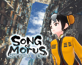
桑之巫韻︰挽天神石 Song of Morus: Skypatch's itch.io pageResults
| Criteria | Rank | Score* | Raw Score |
| Gameplay Polish | #4 | 3.500 | 3.500 |
| Engagement/Fun | #4 | 3.583 | 3.583 |
| Audio | #5 | 3.667 | 3.667 |
| Originality/Creativity | #7 | 3.500 | 3.500 |
| Overall | #7 | 3.556 | 3.556 |
| Aesthetics | #10 | 3.833 | 3.833 |
| Magical Girl Concept | #15 | 3.250 | 3.250 |
Ranked from 12 ratings. Score is adjusted from raw score by the median number of ratings per game in the jam.
How does your game fit the Magical Girl Genre?
Protagonist Song is a taoist priestess who has mastered oriental sorcery aka magic.
Which theme(s) do you pick?
Ore from the Age of the Gods
How does your game fit those theme(s)?
The whole story focuses on Song getting a powerful ore that once an ancient goddess used to mend the sky. It's based on a real life Chinese folktale. (https://en.wikipedia.org/wiki/N%C3%BCwa#N%C3%BCwa_Mends_the_Heavens)
Were the assets for your game made during the jam? Elaborate as you see fit.
Characters/music/ui are self-made but mostly re-used.
Game mechanic is inherited from last project.
3d scenes are modified from purchased assets/scans.
2d art is royalty-free photos processed by AI filter
Leave a comment
Log in with itch.io to leave a comment.


Comments
Finally got to playing this, and not a moment too soon. Overall, one of my favorites that I've played so far!
Overall, I enjoyed the whole experience. I guess rather than say "I liked this part" over and over, I'll go straight to my nitpicks.
The dialogue had quite a few typos and misspellings (in English anyhow, can't speak to other versions.)
Gameplay was good overall, bosses 1 & 2 were my favorites. The zoom never really came in hand for me in this one. The quad jump was nice though. The last boss was really hard, but a lot of that was the incredibly frustrating lumps around the edges of the arena. I have a hard enough time dealing with 3D bullet hell, but those lumps just felt like a thorn in my shoe.
I didn't really understand the collectables that popped out of the bosses... were those for score or something?
All and all, it was another great entry in the series! I'm not sure if I liked it better than "Lament on the Brine". Having a fully arena to move in was nice, but there's something about that one that was really cool. But this is pretty close, and if it was expanded I could see it overtaking "Lament" as my new favorite. Either way, really great work!
Thanks for having a try before the rating deadline.
For the typos and misspellings, I think it's unavoidable as I am not quite skillful on language. But the good thing is that in the future I can use AI to fix it, so maybe it will get improve in next jam.
The lumps in boss 3 are based on the real life building. It makes player not able to circling the boss, so i believe it's improving the game difficulty. Not sure if it's too difficult.
The collectables are just for score. I see many Shmup game has this feature so I decided to add it to my game. Not important for finishing the game but it may increase replayability for some hardcore player. I need to experiment more around this mechanic.
I like this game and "Lament on the Brine" too. I guess my next jam will also use similar system.
Just a small thought on the collectibles... maybe if score numbers popped up while grabbing them it'd be a little more clear what they are? I wasn't sure if they were suppose to heal you, give you shield power back, or just score. Seeing little numbers popping up as you grab them would give a "score" feel for sure, if that's what you are going for!
As for the final boss arena, I get that it added challenge... it just felt more annoying than fun. I had plenty of challenge from the boss's own attacks. But then again, I'm not a bullet hell connoisseur really, so maybe I'm not the right judge. Either way, I managed to win on "normal" so the overall difficult is probably fine.
To be honest, I've always had a complicated view of the Song of Morus games. I respect the hell out of them creatively, but I've felt that they're really not for me. I love the art and incorporation of local culture, I often find the gameplay concepts interesting, but almost every game in the series is way too hard for me.
I wasn't expecting to be able to beat this one, and I didn't, but I got a lot further along than I thought I would. I think it's a little closer to my comfort zone, and I got a lot of mileage out of circle strafing.
Gameplay-wise, it's hard to say what's an actual flaw and what I just don't like. I didn't like that there's no health regeneration mechanic and if you do badly in the first wave, you're screwed later. I didn't like that you could get caught on terrain in the first level. I didn't like how bullet-spongy the enemies were. I didn't like that it was hard to tell when you took damage or why. But I don't know if any of these constitute real flaws.
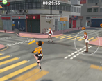
The environments are impressive. I know they're 3D scans provided by third parties, and if you look closely there's a lot of roughness, but in gameplay you don't really notice that. You just see bright, colourful, detailed environments. The character models don't stand out as much, but still look good.
I found the story to be surprisingly compelling. There's some mythological backstory worked in, a macguffin, some new characters, a potentially world-ending plot. The last game kinda had an excuse plot to be honest, so having a stronger narrative this time is much appreciated.
The dialogue could use proofreading- which I know is partly my fault. It's rough in general, but also unintentionally hilarious. The first line of the game is an accidental innuendo, and there's at least one more later in the game. I'm kind of on the fence on this, but I think given the tone of the game and the series it makes more sense to fix this up than leave it.
All in all, some impressive work on display, and I enjoyed this one more than I thought I would.
Thanks for giving me such detailed feedback. It's really helpful.
For the game difficulty, as i feel it's the potential selling point of the game, it's quite hard to lower it more. I do see that the learning curve is not polished. If I have enough resource, It's better to have 2 tutorial levels before current first stage. This game (like other game in series) is expermenting 3d movement, mastering the jump mechanic in air will massively increase player's space to dodge bullet as it's much less dense when in 3D.
For the story, I find a way to keep the workload low, and avoid cutscene, so that i can afford decent amount of storytelling for the game jam. For the punchline, I would like to keep it. IMO, sometimes silly shallow joke can gives the story depth.
I like this submission too. The direction seems getting to somewhere. I may keep expanding this game, probably via next jam
As always magnificent game.
Also as always it's very difficult.
I don't have any major complaints, but sometimes the characters faces distorts where the eyes disapear and it just looks weird.
Keep at it.
Thanks for playing. May I know in which situation you trigger this bug? I remember seeing seomthing like that but quite rare so havn't fixed yet.
For difficulty, as the game is short so i try to expand the gametime by making it more difficulty. You can lower it in the latest version which has difficulty option in menu.
No clue, I just start the story and it looks like this:
oh wow. That's pretty scary. ok need to fix it
Clearly a lot has been taken from previous titles and a lot more effort went into story this time.
The problem is that last time with the boat, the limited space on the boat provided most of the challenge, since space was so limited, the patterns could be created focusing on that space.
This time I found that for most phases or patterns I could outrun anything, the space of the map made it so that I could most of the time hug the corners and shoot from a mile away and almost not have to dodge anything.
My first play through I tried to actually dodge and be sort of faithful to the proposed game play and it was just tiring and got killed much faster.
Second play through I just ran as far as possible and shot from a mile away. This works and sort of breaks the game as I'm not even sure I even cared or noticed patterns / phases anymore.
suggestions :
1) the stage size requires a change in how the bad guys behave ... I think the only phase that challenged the run and shoot from furthest distance was the fox teleport phase. I suggest more phases that the bad guy can cut the distance between player or to use player position prediction as part of the bullet pattern in some phases.
2) I feel like you are missing several sound effects that could be nice to add and make sure some important sounds are louder. You might have to dig into Unity's mixer, to lower
3) Story could use some grammar correction ( sorry I didn't help this time, was too busy with my game). I also think it could maybe be overall better if there were less things, more jam packed? Like you could have 1 stage with the 3 characters and maybe 6-8 phases total and do the story between phases ? That way maybe you could have made something more dramatic with less work divided in 3 stages. The ending was a good cliffhanger and actually starts a good goal for next game ( I think that might be a first in the series?) I just wish the set up had been better instead of just a random package, but maybe that can be tied in to future story (who sent the package and why?)
4) the candy points ... was there a reason to that ? Seems pointless in current version. Same as the score at the end, there is no breakdown of how you got it, so seems arbitrary.
5) Music was nice =] Just maybe along with #2 above, you might wanna lower volume dynamically. This is mostly polish of course.
Anyway, lots of harping on details, but overall the game is a pretty solid submission.
Thanks for playing my game and give me detailed feedback. It helps a lot for my future development.
In my original plan, I want to use this game jam to experiment how to create real world scene in lowest effort. Therefore It's decided in the brainstorm phase that this game will have 3 individual stages. The stage 1 was planned to be a market to match "Where Is That [Bustling] [Marketplace] Now" and stage 2 was planned to be on a hill at night to match "[Starry] [Mountain] of [Tenma]". It's basically the spine of the project. The plotline and game flow is written based on that decision.
Unfortunately, the final result is not impressive. A lot of time was wasted on researching (trying Nerf, 360 lens, searching models from websites). And the 3d scenes I got are not customized for bossfight, which drags down the enjoyment of bossfights. But I believe that if I get more time to try-and-error, I can figure some better attack pattern that suit the scenes.
For the candy score system, I see lots of SHUMP game has mechanic that enemies spawn purposeless items when defeat, and player collect those items for score. Therefore I added this mechanic as an experiment. It seems if a player has a will to gain highscore, this system changes the game a lot. As player will surf in risky area to reach candies, and hoard the shields for generating candies instead of protection.
I feel I will expand this project. I now already has at least 3 new stages of ideas. Maybe next game jam?
This is great! I'm impressed by what you made in the short time allotted for this jam. The visuals look great, especially the character models. Although, I agree with AiSucks that the AI-generated images are kinda bad but because they're in the background it's not bothersome to me. And as was previously pointed out there's a fluctuation in difficulty and minor grammar errors but it's overall well-made.
Thanks for playing my game. A lot of assets are reused. Some are purchased. I tried to minimize the workload as I am just a on-man-band. Glad you are impresssed.
Yes the attack pattern seems need more improvement. Maybe in future update
I played this a few days ago but I just realised you were asking for feedback. The game is surprisingly polished considering it is a jam game. Stuff like the camera movement in cutscenes was cool. But I think there needs to be more variation in patterns in future, for example many patterns were some sort of ring of bullets. The patterns that were more different stood out though so I guess it might just be a time constraint problem. Also the stage environments are really cool.
Thanks for appreciation. Lots of assets are inherited from older projects with minor improvement. Maybe that's why it feels polished
I am still figuring out how to correctly make 3d bullet hell. So far everything is still hardcoded and there is no tool to script the bullet pattern. Also no object pool. So yes, It still needs improvement.
Big Game Jam fan and observer here! I think you almost have something really cool here! But the use of AI, while minimal, still sucks, not gonna lie. I will admit some bias here and say I found this game through Twitter, but yeah... the AI Use is distracting when looking at the backgrounds.
Thanks for spending time on my game. I understand that the AI technology is now aggressively developing and also started damaging people's benefit. The "AI Art" is indeed massively reducing artists' oppotunities. And AI like chatGPT is also showing its hostility to several careers, including programmer, which is my proficiency.
I feel this is unavoidable. We can probably ban it in one or two democratic countries, but it will keep developing globally. Therefore sooner or later, we still have to adopt it. I believe my recent project is demostrating the moral way to use AI tool. I let the AI take care minor non-creative detail so that I can spend my precise time on innovativity. In this use case, AI actually helps small indie team to upscale their creativity.
It may seems upseting, but I would say it's just how reality is.
I like the music, and the design of the pentashade stone. The title screen changing after clearing the game is a nice touch too.
There are a few grammar errors, but nothing too major, the story is still understandable.
Not sure if it's just me, but stage 1 felt more difficult than stage 2 or 3. Especially during the second phase, when the boss teleports into a blind spot and I accidentally run right into his attacks.
Thanks for trying my game, and appreciate the tiny details i added
I was struggling for the scene design of stage 1. Originally I want it to be a real life scene but I run out of time and just use a generic unity asset package. That's why the stage 1 is actually developed after stage 2 and stage 3. And it may be the reason it's harder.
In case you don't know (the menu page fail to display the text), you can press Q to clear bullets.
And ehh... please leave comments. For me, a detailed feedback is more important than a good rating. It will be appreciated if you can share your opinion to me.