Play game
DataRift: The Great Corruption's itch.io pageResults
| Criteria | Rank | Score* | Raw Score |
| Fun Factor | #25 | 3.373 | 3.556 |
| Originality | #31 | 3.584 | 3.778 |
| Overall | #41 | 3.268 | 3.444 |
| Audio | #59 | 2.635 | 2.778 |
| Visuals | #75 | 2.635 | 2.778 |
Ranked from 9 ratings. Score is adjusted from raw score by the median number of ratings per game in the jam.
Is your game a video game or a physical game?
Video Game
Was your game made solo or in a team?
Opi - Artwork, Scripting, Plot Tw33q - Artwork, Level Design. NnyMaray - Character Design (Data Worm, & The Duplicator)
Did you use any third party assets, if yes what assets did you use?
Art / Code 100% created for Mech Jam V, Songs created by Trash.Eater
Did you choose from one (or more) of the optional secondary themes?
Weird Fiction, Resurrection, Signal Failure, Relax
Does your game contain 18+ content (Nudity, Gore, Language)?
No
Leave a comment
Log in with itch.io to leave a comment.


Comments
This was fun to play! I think I killed boss 2, the keycard appeared but the Camera suddenly zoomed all the way out and I couldn't pick it up for some reason (was it intended?)
I like that there are multiple upgrades and quests to do. Once I got a gun, the game became a lot more fun because I actually had much more fighting chance against the robots. Then I saved up and went for the machine gun, which was a really solid choice.
If I may give one suggestion, keeping the pixel size the same would be nice to help with visual clarity/style. Things were a bit far from one another (especially when trying to get to the second boss), and but other than that, the gameplay was solid with all the weapon choices and upgrades. Good job!
Really interesting world building and layout! I think it's cool you can reset at any time to get more credits than dying and losing half, very high risk, high reward. I think it's neat that you were able to get so many different enemy designs and have a boss while still having a lot of customizable weapons and upgrade mechanics.
I will say, it took me a minute to realize I could both double jump and wall climb and reset a few times because I wasn't sure if I missed how to get down originally lol.
Still, a ton of mechanics, the jetpack thing was fun to use , especially since when you dash and use the jetpack you can stay up in the air infinitely since they sort of allow each other to reset lol.
I do think progression is a little hash for a game jam game but I had a lot of fun with it!
Nice addicting roguelite! Portal mechanic is neat and gameplay as a whole feels really good. One thing I didn't like was how the camera lagged behind as you moved forward, kept crashing into enemies as I moved because I didn't react quick enough but overall really liked playing it!
Quite addicting gameplay, the movement mechanics feel very good and are alot of fun to use. Also like the vibe with the sound effects and music that fit very well to the style i think. The portal mechanic is also very neat, because the way down into the city, or to the duplicator would be quite long and annoying to get back to. That beeing said, i also have no clue how to fight him? There are just spawning mobs, but i dunno what else to do other than fight the mobs.
I also think the difficulty scaling is completely unbalanced. When you only have a sword it’s increibly hard and almost unplayable, but once you get a gun, an especially a better one than the first (even tho the first one still holds most of the improvement) it becomes really easy.
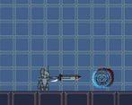
For the visuals, i don’t have a problem with the art style, but there are certain things that are very annoying about it. First is that background glitch effect in the cubes, it makes me kind of dizzy looking at it, and makes the game way more exhausting to play. Also the ground level is very messy, meaning that it is not clear what is foreground and background. There are so many elements and they all blend together with the enemies quite alot, which is not great for visual clarity. Also the font is absolutely abysmal, it’s totally unreadable, i mean the pixel art scribbles on the things are better readable than it xD
Also i tried to level up, but it didn’t work? I tried to click on the plus, but nothing happened, so not sure if that’s supposed to be working at all.
Thank you! This is all very valid and true feedback lol.
1.) Duplicator can be killed by shooting the Arm that spawns enemies, health bars are coming as well as dmg feedback, just ran out of time for the jam :,c
2.) The Sword difficulty curve is another casualty of compressed narrative for time's sake, the sword isn't supposed to be a good weapon until you've upgraded your melee and shield stats at the work bench, but I wanted to lengthen the early quests to not just be "go to boss right away, okay you're done now" lol. I'll work on a way to balance it better in early game :)
3.)"Glitch thing in the cubes" I'd love to fix, but I'm not sure quite what you mean. The darker floor tiles or the blue parallax layer? I think it may be something to do with how the engine is updating frames bcz they're not animated at all lol.
4.) The level up bench i'm 100% sure DOES work, did you have the right amount of scrap listed for the price? scrap not credit. This could also be another issue to do with the bad font choice lmao.
So i went back and loaded the save game and tried again. So obvisouly i did just before convert my 1600 scrap into credits, so yea, makes sense that it didn’t work. Did now go back and defeated the duplicator, then kind of wandered around in the maze behind him, but couldn’t really find the yellow card. It’s quite a maze, not sure how i should be able to find anything there.
There are a few issues with loading the samegame thou. All my weapons etc where still in the amory, but, fore one my portals where gone, and i didn’t have the sword anymore, which confused me alot, since now i could create any new portals either. And the mission state is messed up, it starts again by telling me to talk to the elder, but he doesn’t wanna talk to me now :O.
If you say you don’t have any effect on the the layers, it’s very likely engine jank. It happens to everything that moves, the pixel boundaries are extremely jittery, especially noticable after i use the dash. The jitter appears as long as the camera keeps moving (since it lags a bit behind the player). It happens to the floor tiles and all the other elements the player can stand on (Background is fine), but is most noticable on the darker floor tiles. Typical side effect when engines use a 3d camera for a 2d game, it usually has problems with rendering it pixel perfect (Unity has that problem also). The issue might be exaggerated because i’m on a wide screen monitor, which might mess up the ratios.
Fun game with a lot to do!
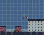
Fun game! Love the pixel art, especially for the city and portals. Music is fun although can be a bit harsh. Don't think I made it through all the content (stopped at trying to beat the Duplicator) but what you've got so far is a solid start.
Thank you for playing! The story currently ends after Boss 2. Music was originally going to be made-to-suit but I ran out of time and ended up grabbing some unreleased songs from back in 2018 in order to have time to make the Jukebox do SOMETHING before submission xD.
I plan on adding volume settings and much more variety after the voting period is done. :)
I didn't think about it when filling this out, but I did use a font "round-digitalio" that is commercially free-to-use. technically still a 3rd party asset.
ALSO:
Controls are listed in the Pause menu in game, once you hit ESC.