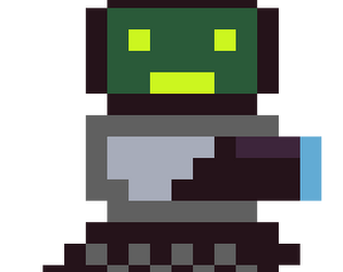
Play game
Tread Defender's itch.io pageResults
| Criteria | Rank | Score* | Raw Score |
| Presentation | #46 | 2.510 | 3.000 |
| Metroidvania | #46 | 2.151 | 2.571 |
| Enjoyment | #51 | 2.032 | 2.429 |
| Overall | #51 | 2.122 | 2.536 |
| Design | #62 | 1.793 | 2.143 |
Ranked from 7 ratings. Score is adjusted from raw score by the median number of ratings per game in the jam.
Engine
Python / Pygame
Team/Developer
Magicalbat
External assets
Song: https://opengameart.org/content/tower-defense-theme, Sound Effect: https://opengameart.org/content/rage-mode
Leave a comment
Log in with itch.io to leave a comment.


Comments
Very smooth controlling and the water canon is fun! I like the art and simple design. Some of the animations and transitions caused a screen jitter that was really jarring and uncomfortable. It's also pretty tough - although your checkpoints are... right on point (lol). This seems like a good start to a fun game!
I'll start off by talking visuals, overall pretty nice. I like the simple sprites with the nice looking particle effects, I thought the water and acid spraying looked very impressive.
As for the gameplay, it felt pretty solid, the movement was mostly fine, although I wish I had a bit more horizontal movement. The combat felt kinda clunky at times, it felt risky getting up close to the enemy and it seemed easier just to avoid them altogether. I do like the variation of enemies, they all seemed pretty unique and distinct. It took me about 30 minutes to beat, and Id say I spent about 20 of those minutes just looking for the ending. There was no clear direction I was supposed to go in. I also thought the boss was just a bit underwhelming and it just has to do with the combat mechanics. I think if my attack had a bit more range it would feel a whole lot better.
Overall, its a solid metroidvania, it has all the mechanics it should have, but some of those mechanics could have used a bit more work. But regardless of all my criticisms, you did a great job :)
Thanks for your feed back so much. I cannot believe that you looked for 20 minutes. I definitely agree that that level design closer to the end was one of the major flaws. I think that there were two or three things I could have done to make the level design more clear. Firstly, I feel that the entrance to the boss area was not memorable at all. Something like the Black Egg Temple from Hollow Knight is important and it sticks in your head. The other thing that I could have done was to make the rooms more distinct. One of my friends played the game in front of me and he kept thinking that he was in the same room when he was not. I need to remember to spend more time on level design next time. Thanks again, have a great day!
ART
Nice cohesive looking game - really enjoyed the particles!
SOUNDS
Loop theme was nice, missing some other sounds and feedback.
GAMEPLAY
liked the mechanics, but some of the text went wizzing by whilst I was fighting scene transitions, Wall kick I could not figure out haha, jumping felt quite nice, though a little unforgiving at times. Enemies were good. I got stuck after getting the wall kick, could not figure out where to go, wandered around for about 10 mins after feeling stuck and called it!
OVERALL
Cool concept that could be taken further, think about player onboarding a little more and if they comeback how will they remember stuff etc.
Great Job on submitting!
Thanks so much for the feedback. I talked about the whole kick incident in a different reply, but I did also mess up a bit of the level. One of my friends also got lost when they played it, which was not something that I really thought through to much. I think that because I designed the levels, I did not think from the perspective of a new player. With more art, I would have been able to make the areas more distinct, but I maybe should have just made it smaller. I did not totally think through the fact that the most important part of a Metroidvania was the level design. Have a great day.
What I liked
Improvements/Suggestions
Overall, you did a good job. Congrats on submitting!
Thanks so much! I very much agree on the kick. I was trying to make a ability that would give a lot of movement flexibility, but I ended up not teaching it to the player very well and more so used it as a more powerful jump. I think that it should have been a jump upgrade/double jump that used the same key. It is also too difficult. You always forget that you are the best player at your game. Have a great day.
A nice and cute little game! I really liked the particles and the interactions between the water and the rest of the scenery!
Nice job!
Really cool! It needs polishing and the controls are a little confusing, specially the jump-kick, super hard to get it right. But its a fun game (the kicking animation had me laughing xD)